Launch Recite Me assistive technology
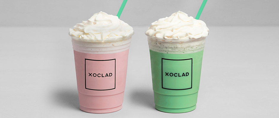
Two plastic cups filled with pink and green drinks, topped with swirls of whipped cream and green straws. Each cup features a black square frame containing the word “Xoclad”.

Graphic Design: Anagrama strike gold again with Mayan-inspired identity

—
Date
12 February 2014

Three times last year we showcased the exceptional talents of graphic design and branding agency Anagrama. Whether the client is an event planner, a tea shop or a dry cleaning firm, the Mexican studio has an unerring knack for visual treatments that combine style and personality. They’ve begun 2014 in much the same vein with this work for high-end pastry and confectionery shop Xoclad, which challenged Anagrama to “communicate the area’s strong Mayan culture in a classy way that could never be called clichéd or tacky.”

Inspired by pre-Hispanic typefaces, Mayan art and architecture, the studio brought these references into a contemporary context with archetypal excellence.

You can find out more about Anagrama’s approach by reading the interview we did them for our Ideal Client project with Represent Recruitment.
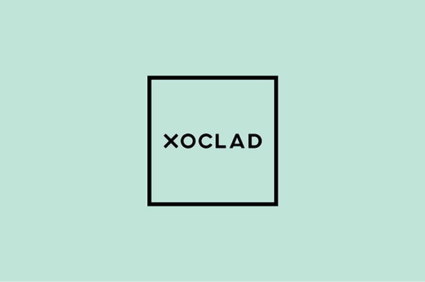
A black square frame contains the word “Xoclad” in a clean, sans-serif typeface. The logo is centred against a pale mint green background.
Above

Anagrama: Xoclad

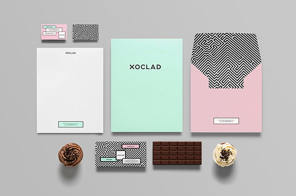
A branding identity for “Xoclad” featuring a mint green folder, a white letterhead and a pink envelope. The set includes a black and white geometric pattern, business cards and a chocolate bar.
Above

Anagrama: Xoclad

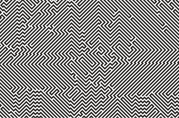
A black and white illustration of a complex, geometric maze. The pattern consists of sharp, diagonal lines that create a sense of depth and optical movement.
Above

Anagrama: Xoclad

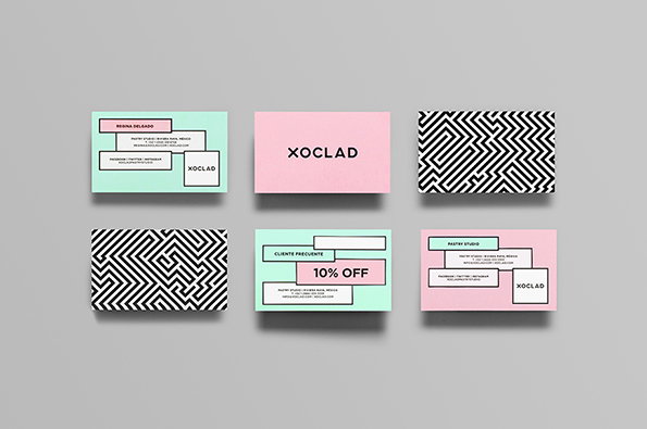
A set of six business cards for a brand called “Xoclad”. The cards feature a palette of mint green and pale pink, with some displaying a black and white geometric maze pattern.
Above

Anagrama: Xoclad

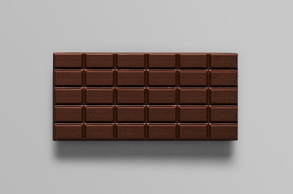
A chocolate bar divided into a grid of rectangles against a plain grey background. Each segment is embossed with the word “Xoclad”.
Above

Anagrama: Xoclad

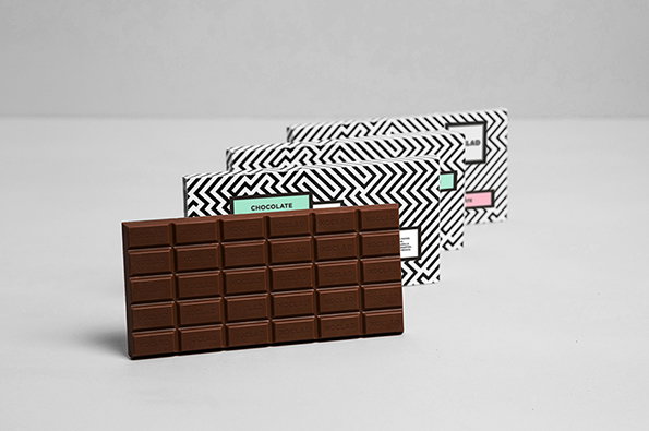
A bar of milk chocolate stands upright in front of four matching wrappers. The wrappers feature a black and white zig-zag pattern with a small green label that reads “CHOCOLATE”.
Above

Anagrama: Xoclad

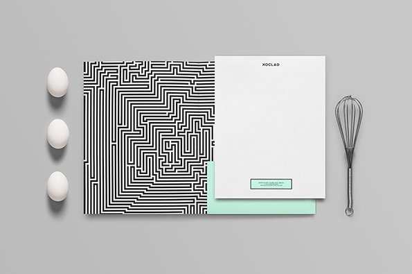
A brand identity layout on a grey background. A black and white geometric pattern sits beside a white folder branded “Xoclad”, flanked by three white eggs and a metal whisk.
Above

Anagrama: Xoclad

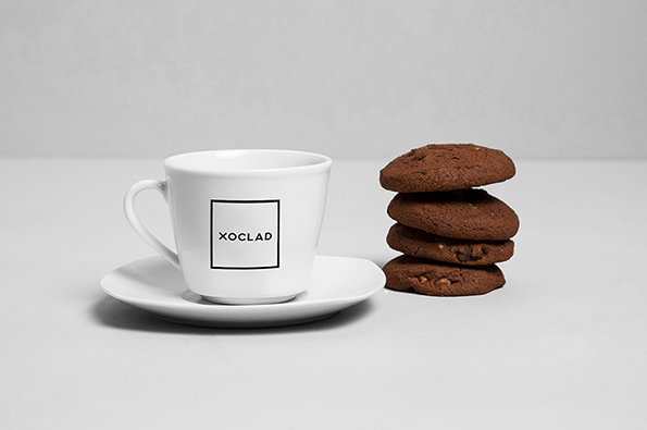
A white coffee cup and saucer sit beside a stack of four chocolate cookies. The cup features a square logo containing the word “Xoclad”.
Above

Anagrama: Xoclad

Share Article

Further Info

About the Author

Rob Alderson

—

Rob Alderson is a freelance writer, editor and strategist. He was previously editor-in-chief of It’s Nice That and WePresent, and editor of Design Week. He publishes the newsletter Undo, which tries to make sense of how AI is changing design work, the design process and the design industry.


It's Nice That Newsletters

Fancy a bit of It's Nice That in your inbox? Sign up to our newsletters and we'll keep you in the loop with everything good going on in the creative world.