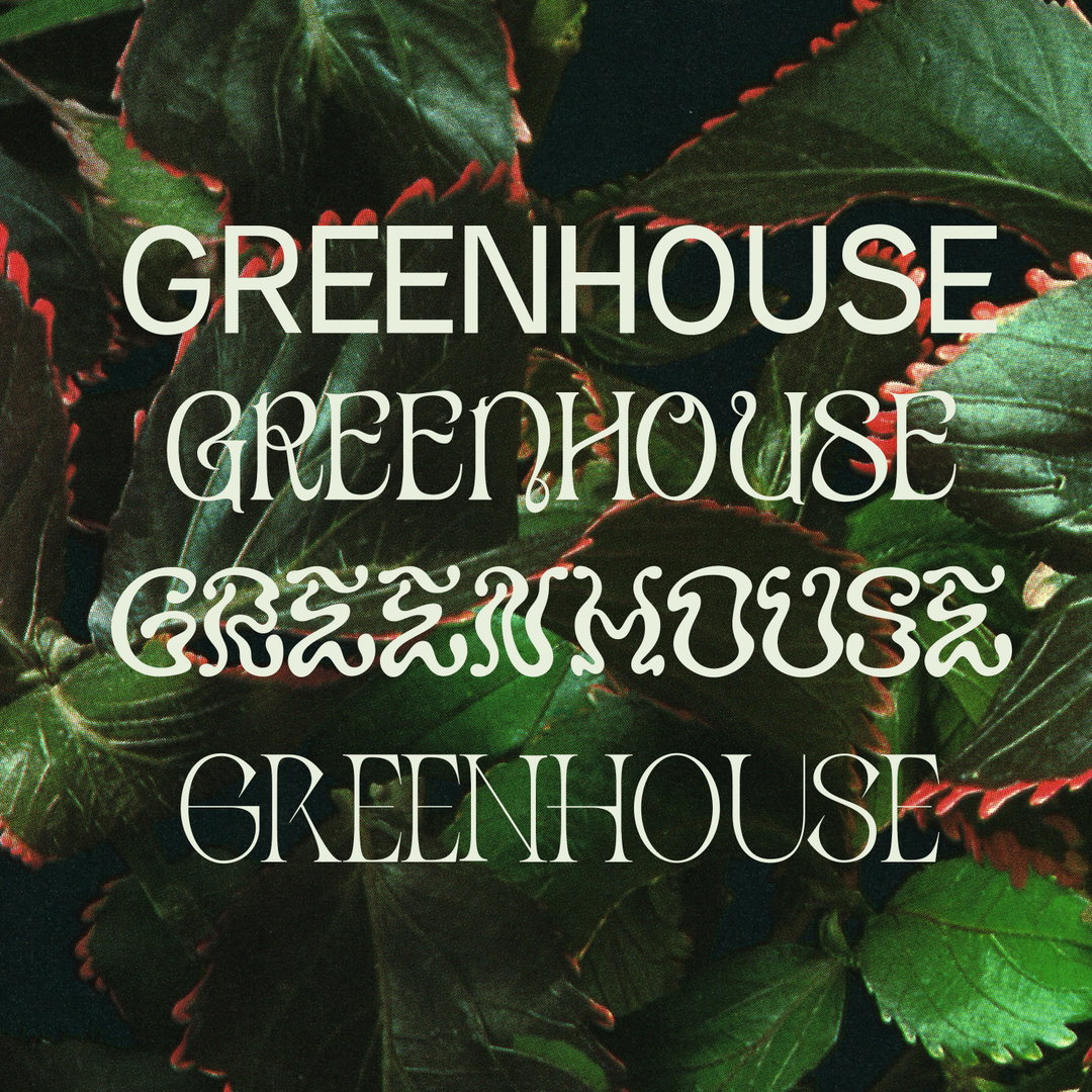
Green-fingered type designer Anna Sing creates a “bouquet” of typefaces inspired by houseplant history
With no previous experience in type design, the NYC-based multi-disciplinary designer embarked on a whirlwind 15-week project to make four beautiful typefaces inspired by the history of houseplants.
Like many of us, Anna Sing retreated into the comforting world of houseplants during the height of the pandemic, channelling frustrated creative energy into growing a protective armour of greenery. During this time, Anna’s final year thesis project was looming. Rebelling against encouragement from tutors to create a project with “deep social meaning”, Anna decided to work on something more lighthearted to distract herself from the hysteria of the pandemic. “I remember looking at some plant cuttings above my kitchen sink, thinking about how I didn’t know anything about the history of houseplants,” she recalls. “Houseplants were trendy again, but when did they become popular? Did a houseplant typeface already exist? Was there some connection houseplants could have to typography or the digital world we lived in now?”
All of a sudden her mind was whirring with inspiration. “Some people didn’t believe that I could make a functional typeface in the 15ish weeks we had, so I made four instead of one!” Anna’s critics had good reason to be sceptical. She’d never designed a typeface in her life and there were no classes in her program on type design. Undeterred, she began “religiously” reading Designing Type by Karen Cheng and reached out to a friend who taught her to use glyphs over Zoom. Hungrily searching for as much advice as possible she sent an email to “to the coolest designer I knew at the time” on a whim. “Leah Maldonado graciously became my mentor”, giving her guidance and critiquing her first typeface, Prune.
With a whistle-stop tour through the basics of type design under her belt, Anna allowed herself a complete departure from computer work. Retreating into her “safe-haven” of vintage books and printed ephemera, she began trawling the gardening section of Half Price books, “looking at different types of plants, the visual language, and reading about their history”. As she became increasingly spellbound by what she read, ideas for her four typefaces began to take root.
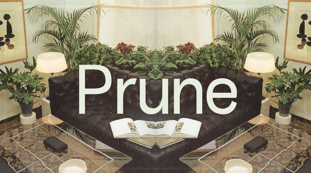
Anna Sing: Prune (Copyright © Anna Sing, 2022)
The first was Prune. It is a sensible, trimmed back sans-serif and was “the vessel in which I taught myself typeface design”, says Anna. Representing the “bare necessities” of a typeface, it summons the aesthetic of a healthily pruned houseplant. A good prune is essential for the future healthy growth of a plant, and accordingly, this typeface became the perfect fertiliser for her creative process to flourish.
Houseplants first became popular in the 1800s, Anna discovered upon reading Potted History by Catherine Horwood. So, mining a myriad of Victorian typefaces for inspiration she dreamt up Aureum – a traditional serif typeface “with a twist”. This elegant typeface is inspired by the forms of “the popular houseplant pathos, a hardy vine plant anyone can grow with just water”.
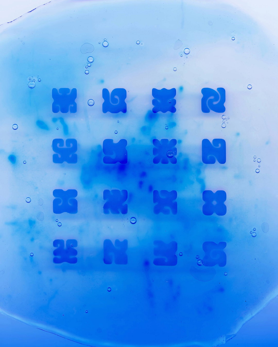
For those of us who just can’t seem to keep a houseplant alive, Anna prescribes her spiky little Sagauro typeface. Its forms mimic the water-absorbing spines of cacti – the perfect option for people who tend to forget to water their plants. Then there’s Orkyd, which “grew out of the mystery of the grocery store orchid, the houseplant that is always for sale but rarely seen in the home”. Taking just three days to create, Anna spent hours on the floor of her room tracing the symmetrical forms of blossoms from a “600-something-page encyclopaedia of orchids”. This bold yet whimsical typeface was her favourite to create and has enjoyed well-deserved success, recently being featured in Monotype’s 2022 Type Trends report and a Paloma Wool campaign.
Since the in-person thesis show was cancelled (“thanks again to Covid”), Anna set herself one final challenge: to brush off her coding skills and create her own website so that Greenhouse Type would function like a real type foundry. She’s now in the process of evolving it into a type-two foundry and is slowly creating a second version for each typeface. While her short term plan is simply to add some “new plant-faces to the font bouquet”, she’s also been “daydreaming about one day becoming a florist in the mountains somewhere”.
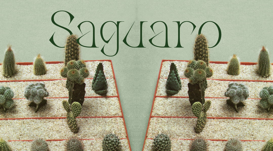
Anna Sing: Sagauro (Copyright © Anna Sing, 2022)
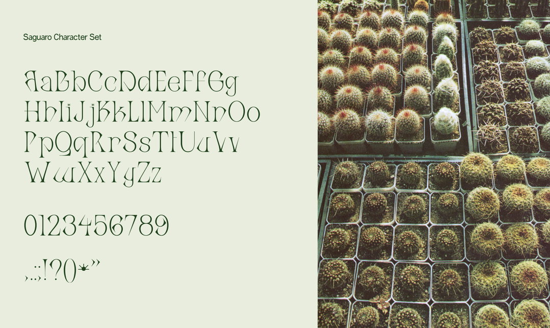
Anna Sing: Saguaro Character Set (Copyright © Anna Sing, 2022)
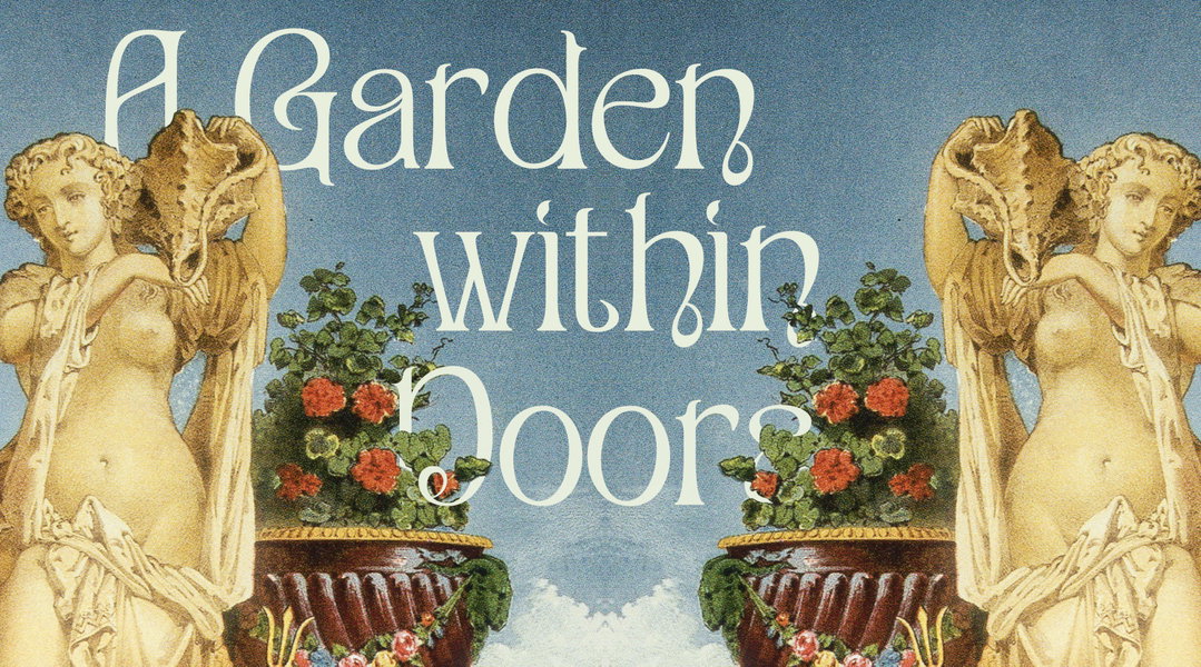
Anna Sing: Aureum in Use (Copyright © Anna Sing, 2022)
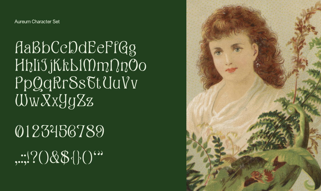
Anna Sing: Aureum Character Set (Copyright © Anna Sing, 2022)
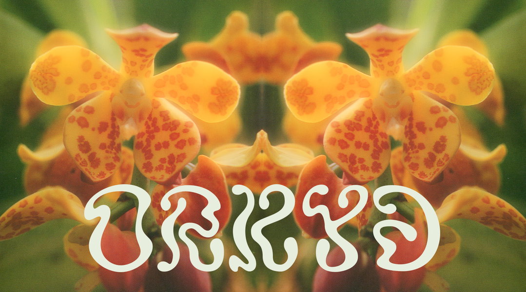
Anna Sing: Orkyd (Copyright © Anna Sing, 2022)
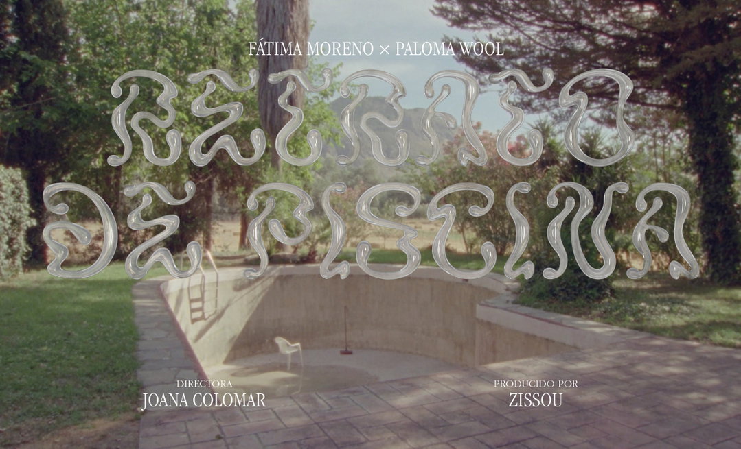
Anna Sing: Orkyd in use for Paloma Wool (Copyright © N-E Studios, 2022)
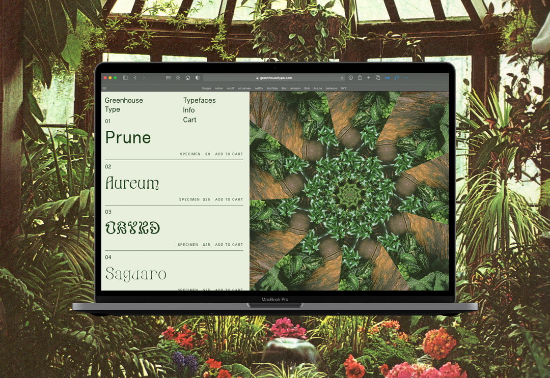
Anna Sing: Landing Page of Greenhouse Type (Copyright © Anna Sing, 2022)
Hero Header
Anna Sing: Greenhouse Type (Copyright © Anna Sing, 2022)
Share Article
Further Info
About the Author
—
Elfie joined It’s Nice That as an editorial assistant in November 2021 after finishing an art history degree at Sussex University. She is particularly interested in creative projects which shed light on histories that have been traditionally overlooked or misrepresented.