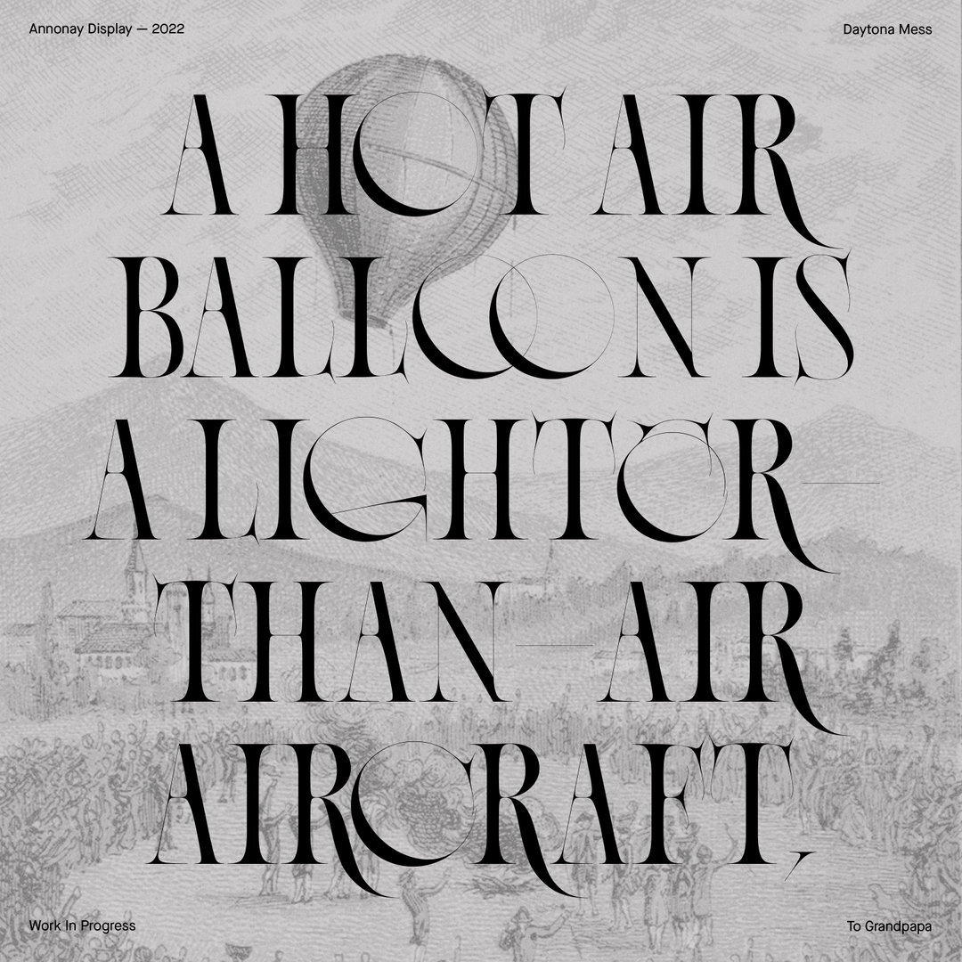
Wistful and weightless, Anne-Dauphine Borione’s hot air balloon typeface is about to take off
The graphic designer, who goes by the moniker Daytona Mess, shares the family history behind her Annonay typeface.
“Ever since I was born, I have been bathing in an environment of memorabilia inspired by hot air balloons,” says Anne-Dauphine Borione. “My grandma collects etchings, decorative plates, posters, fabrics, cutlery, furniture... everything you can think of related to hot air balloons.” Her mother’s maiden name is de Montgolfier, making her a descendant of the famous Montgolfier brothers who invented the hot air balloon. The weightlessly elegant typeface which Ando is currently working on is called Annonay, named after the town in which the Montgolfier brothers made their original invention.
The C’s, G’s, O’s and Q’s of Annonay appear lighter than air, barely tied down to the page by their weightier, silhouette-like strokes. The delicate stems of letters like A and N resemble taught ropes, stretching to secure the letters in place. The overall effect beautifully summarises the lightness of air travel. So we are surprised when Ando tells us that hot air balloons were not in her mind when she first started crafting it. In fact, it all began when Ando was experimenting with contrasts in serifs, “and basically how thin some parts of the letters can be compared to thicker parts”, says Ando. One day, she woke up from a dream with a vision of how she wanted the E to look. She hurriedly sketched it out and, “that's when it struck me: it looked kinda like a hot air balloon”. Though it is still “very, very much a work in progress”, Annonay is becoming a wonderfully wistful typeface that’s sure to take off once it's finished.
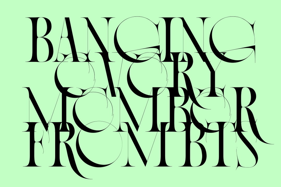
Daytona Mess (Anne-Dauphine Borione): Annonay (Copyright © Daytona Mess, 2022)
Ando’s entry into the world of typography came to her in a similar fashion to the inspiration for Annonay – “like lightning”, she says. Since school, she knew she wanted to get into graphic design, but when she didn’t get into the BA course she wanted, she went to study Fine Art and Central St Martins instead. She finally got her wish to study graphic design when she was accepted into an MA course at ECV in Paris, “and that is when the stars collided”. Her tutor, Marie-Paule Jaulme, introduced her to type. Something Marie-Paul said to Ando sticks with her to this day: “that in type, absolute perfection and ultimate beauty has already been achieved through Roman capitals”. These words had an enormous impact on Ando, “for a very simple reason: it allows me to be extremely free, playful, and to be relieved of the pressure of having to do something 'beautiful', which I felt in my fine arts practice.”
As a result, Ando has developed her typography practice in a way that she describes as “kind of bipolar”. She adds, “I either do what I sure hope is super elegant, classical and precise, or I do much more free and impertinent fonts,” she explains. This contrast is well illustrated if you compare elegant, weightless Annonay with a font like Lithops – unruly, irregular and very much grounded.
Lithops was originally drawn on Procreate, Ando tells us, as “an exercise of legibility and complexity”. She devoted hundreds of hours to its fabrication, seeing how far she could go without any references, “just mindlessly drawing and seeing what would come up.” Over time, loose references began influencing its forms: Art Nouveau, Matisse cutouts and Alzheimer affected brains. The name Lithops, was actually a suggestion from one of her Instagram followers, on account of its interesting resemblance with the pebble-like succulent plants of the same name. Now available on Velvetyne, Ando is immensely proud of her first open-source font: “what started as a spontaneous creative outlet and glyph drawing exercise, ended up being the best representation of my practice as could be.”
While she dreams of opening her own type foundry one day, what you won’t see Ando doing is limiting her marvellously “bipolar” creative vision. “If I had to choose only one style or aesthetic for the rest of my type practice, then I would probably abandon type design altogether," she laughs. “Diversity is beautiful, especially in type.”
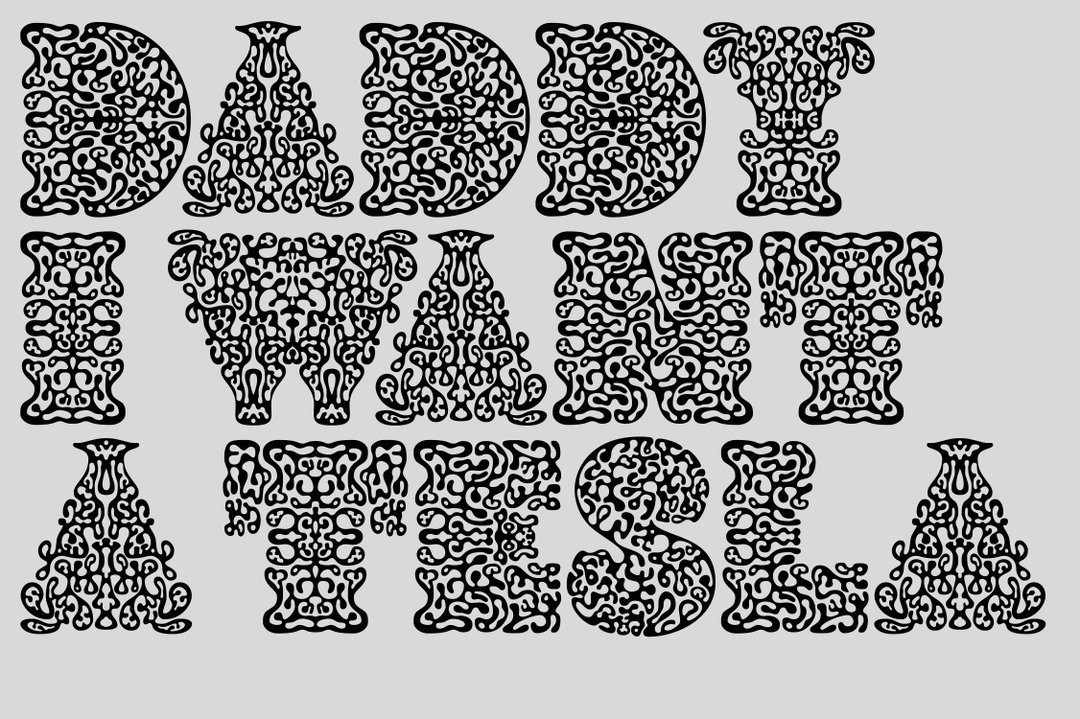
Daytona Mess (Anne-Dauphine Borione): Lithops (Copyright © Daytona Mess, 2022)
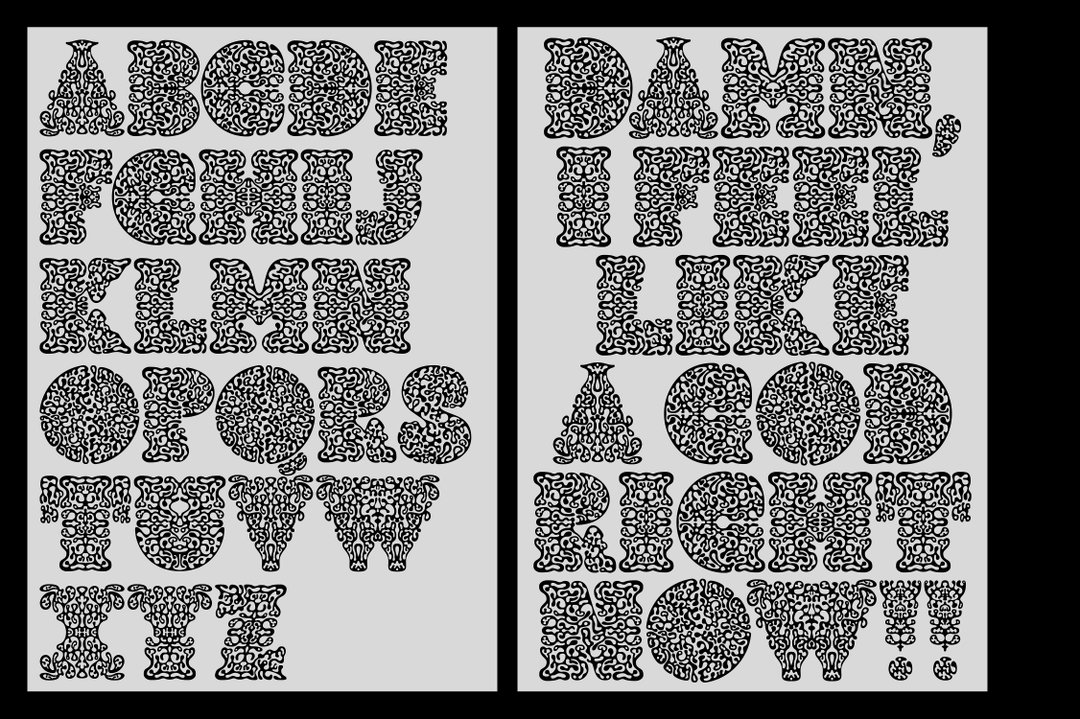
Daytona Mess (Anne-Dauphine Borione): Lithops (Copyright © Daytona Mess, 2022)
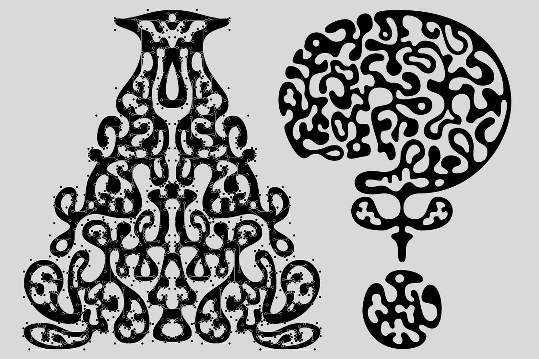
Daytona Mess (Anne-Dauphine Borione): Lithops (Copyright © Daytona Mess, 2022)
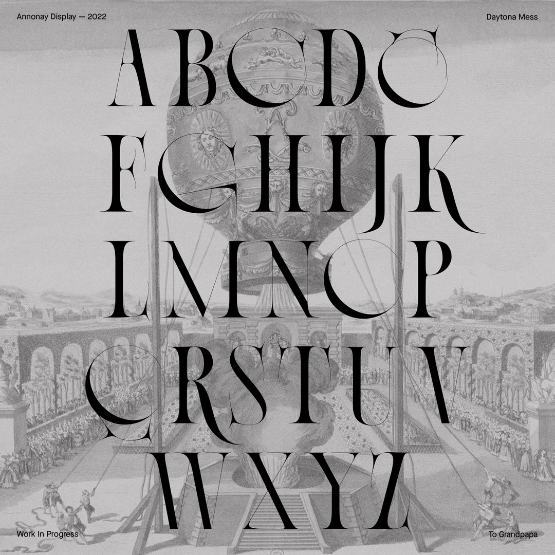
Daytona Mess (Anne-Dauphine Borione): Annonay (Copyright © Daytona Mess, 2022)
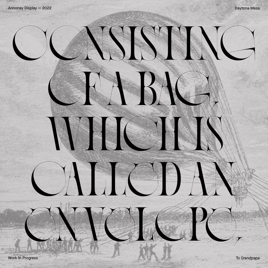
Daytona Mess (Anne-Dauphine Borione): Annonay (Copyright © Daytona Mess, 2022)
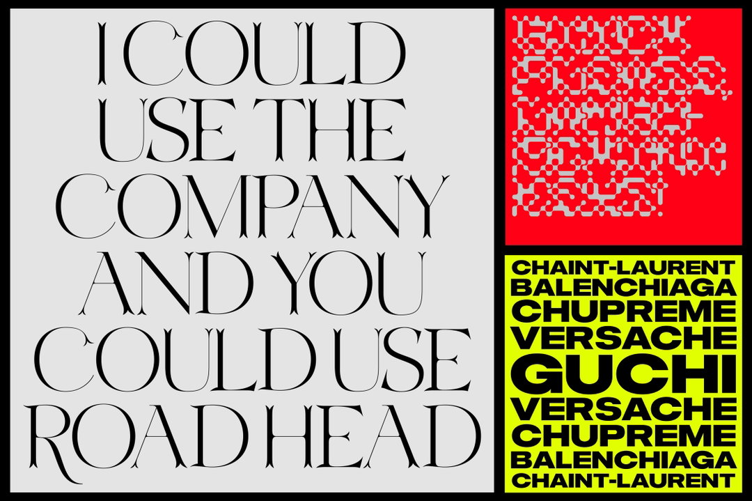
Daytona Mess (Anne-Dauphine Borione): Various fonts in progress (Copyright © Daytona Mess, 2022)
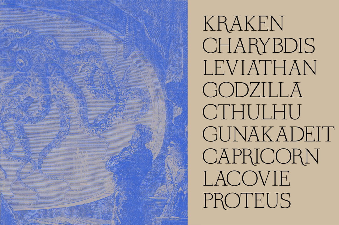
Daytona Mess (Anne-Dauphine Borione): Nautila (Copyright © Daytona Mess, 2021)
Share Article
Further Info
About the Author
—
Elfie joined It’s Nice That as an editorial assistant in November 2021 after finishing an art history degree at Sussex University. She is particularly interested in creative projects which shed light on histories that have been traditionally overlooked or misrepresented.