




Antonia Terhedebrügge and Mado Klümper’s identity for Sehsüchte Festival combines “soft forms and edgy lines”
The Sehsüchte Festival is a film festival which has been hosted by students from the Film University Potsdam-Babelsberg Konrad Wolf since 1972 and has become an international stage for newcomers to the film industry. This year saw its 48th edition and designers Antonia Terhedebrügge and Mado Klümper produced an identity for the event, channelling this year’s theme of “explore”.
Although Antonia and Mado live in different countries and run separate practices (Antonia alongside her sister as Studio Terhedebrügge and Mado as Studio Mado Klümper), they’ve been collaborating on projects since meeting at the State Academy of Arts and Design Stuttgart. “We have a similar approach to design concepts, whilst using different visual languages. This can generate appealing and surprising results,” they explain. “We are already working on the next project together, and there are more to come.”
The brief for Sehsüchte’s identity, which Antonia and Mado pitched for, was based on exploration, the theme of this year’s festival. The organisers’ aim was to allow visitors to discover “movies which surprise with their themes, that inspire you and make you curious. The view into the unknown leads to special encounters with art, movies, society and technology,” Antonia and Mado explain. “For us, exploration means breaking through invisible boundaries, facing challenges, entering uncharted waters and triggering emotions, which we illustrated through our concept and design.”
Antonia Terhedebrügge and Mado Klümper: Sehsüchte Festival
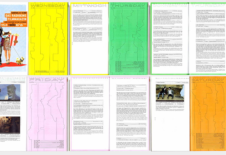
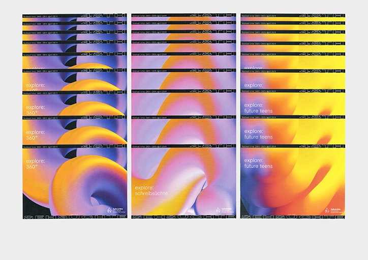
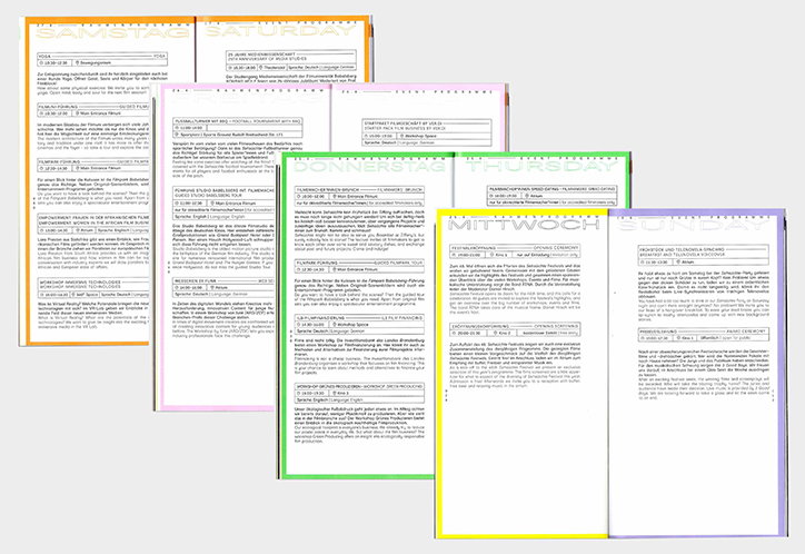
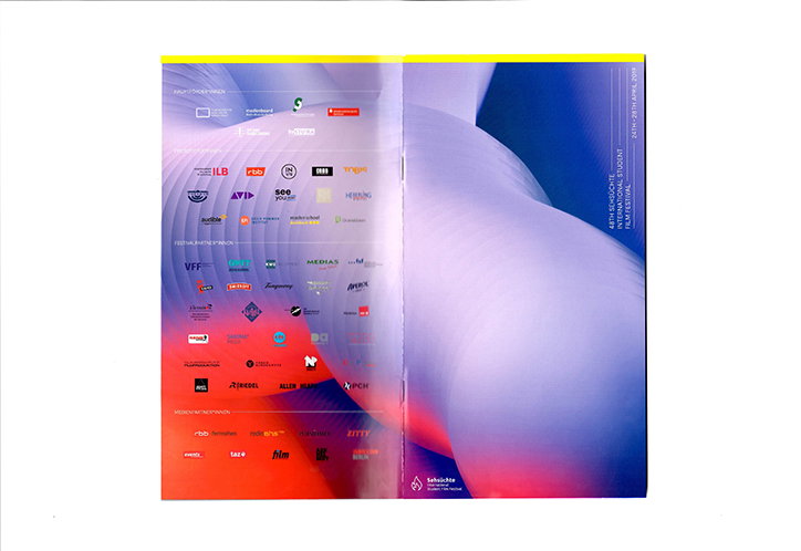
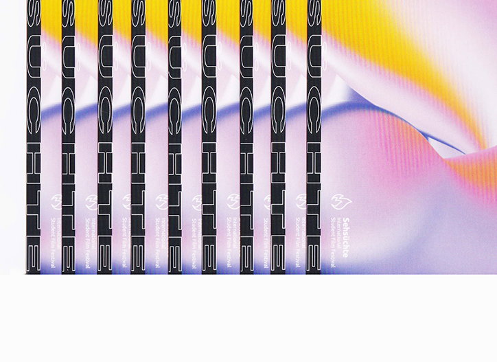
As a result, the duo invented a visual system that attracts viewers with a strong look, but then invites interpretation, “just like movies do”. They used colour gradients of orange, pink and purple alongside a grid system to achieve this. “Through colour gradients, we displayed the individual and undefined ways of exploring this world, which can be illustrated in a million different ways,” they tell It’s Nice That. The grid, on the other hand, was used to represent how our lives are defined by a variety of zones – “geographical zones, cultural zones, linguistic zones, human zones, climatic zones, time zones.” Movies, they continue, are about breaking across these zones. “This led us to create a strict linear grid, as a result of the world’s time zone, which is penetrated by colour mass. It also illustrates a contrast between soft forms and edgy lines and shows different layers and levels to explore.”
These visuals and the grid system were finally combined with Moderat, a typographic choice based on its modern, soft yet rigid aesthetic: “Moderat has this geometric sans-serif style. With an enhanced set of OpenType features and stylistic as well as positional alternates, Moderat is suited for both body copy and display type and was perfect for our bold and straight design approach.”
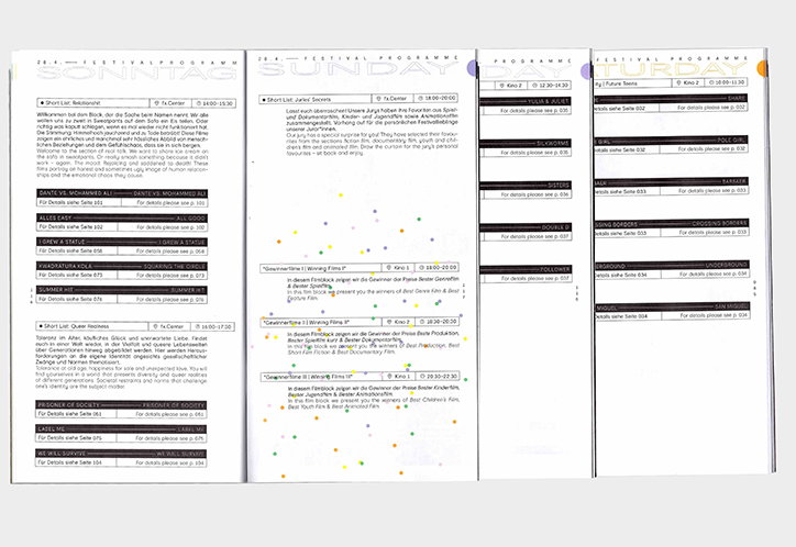
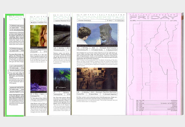
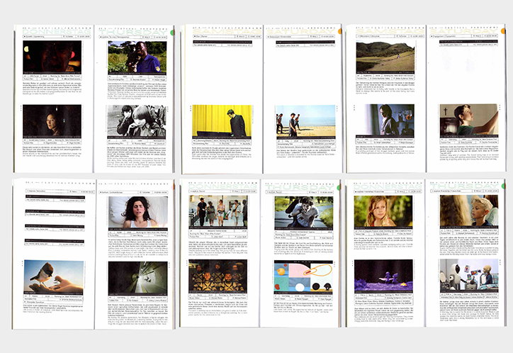
Antonia and Mado’s explanations of their design decisions prove the depth of their inquiry into the topic of the 48th Sehsüchte Festival. While the visuals are appealing and inviting, there is a concept underpinning every decision they made. It’s flexible and contemporary, and fully embodies the fluid nature of film. Their identity was rolled out on posters, a programme brochure featuring a colour system for each festival day, which is recognisable from the bleed of the brochure, T-shirts, jumpers, bags and all accompanying printed matter including tickets and postcards.
Antonia Terhedebrügge and Mado Klümper: Sehsüchte Festival
Antonia Terhedebrügge and Mado Klümper: Sehsüchte Festival
Antonia Terhedebrügge and Mado Klümper: Sehsüchte Festival
Antonia Terhedebrügge and Mado Klümper: Sehsüchte Festival
Antonia Terhedebrügge and Mado Klümper: Sehsüchte Festival
Antonia Terhedebrügge and Mado Klümper: Sehsüchte Festival
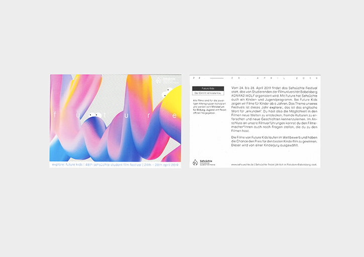
Antonia Terhedebrügge and Mado Klümper: Sehsüchte Festival
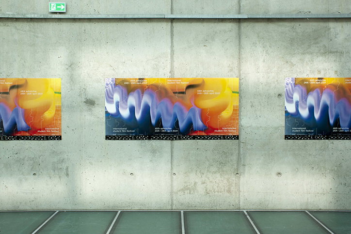
Antonia Terhedebrügge and Mado Klümper: Sehsüchte Festival
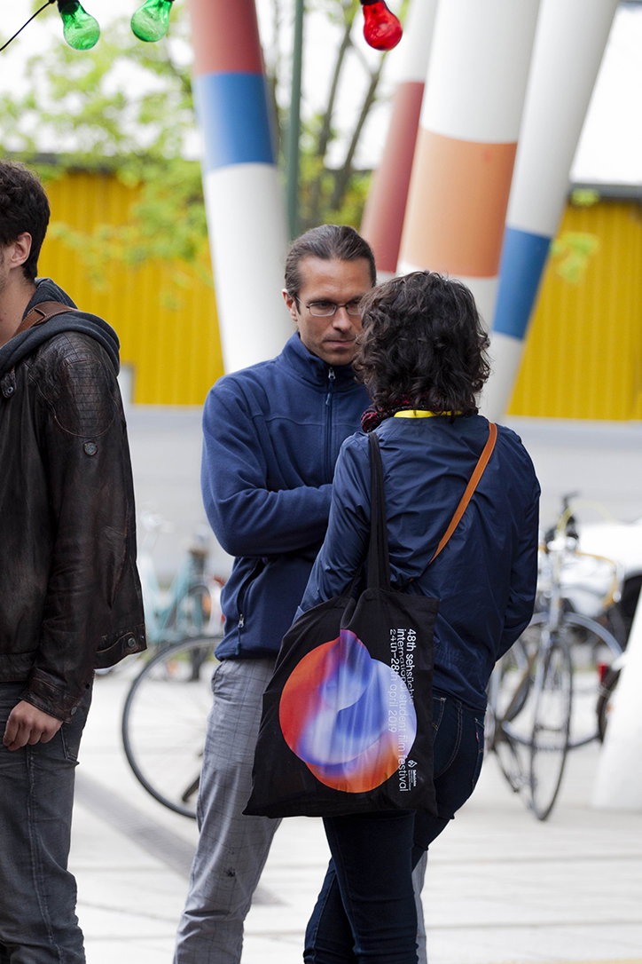
Antonia Terhedebrügge and Mado Klümper: Sehsüchte Festival
Share Article
Further Info
About the Author
—
Ruby is Senior Creative at It's Nice That, overseeing our visual output across platforms and projects. Before that, she was associate editor on the editorial team, after joining in September 2017 following graduation from Central Saint Martins.