In a sleek new global campaign, Arjowiggins showcases its sumptuously tactile Rives paper range
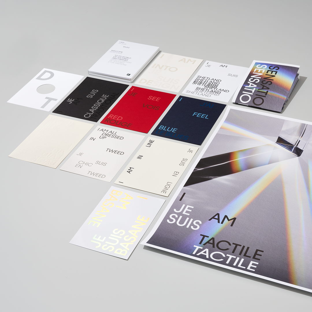
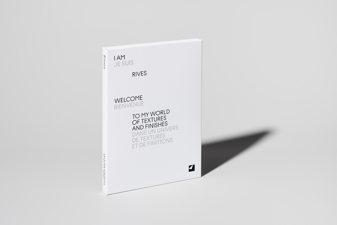
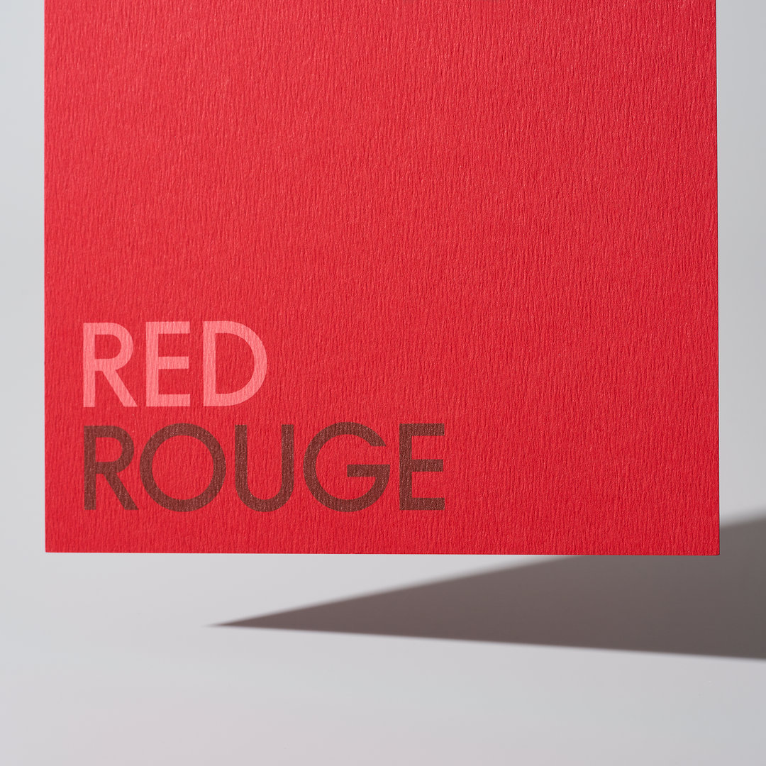
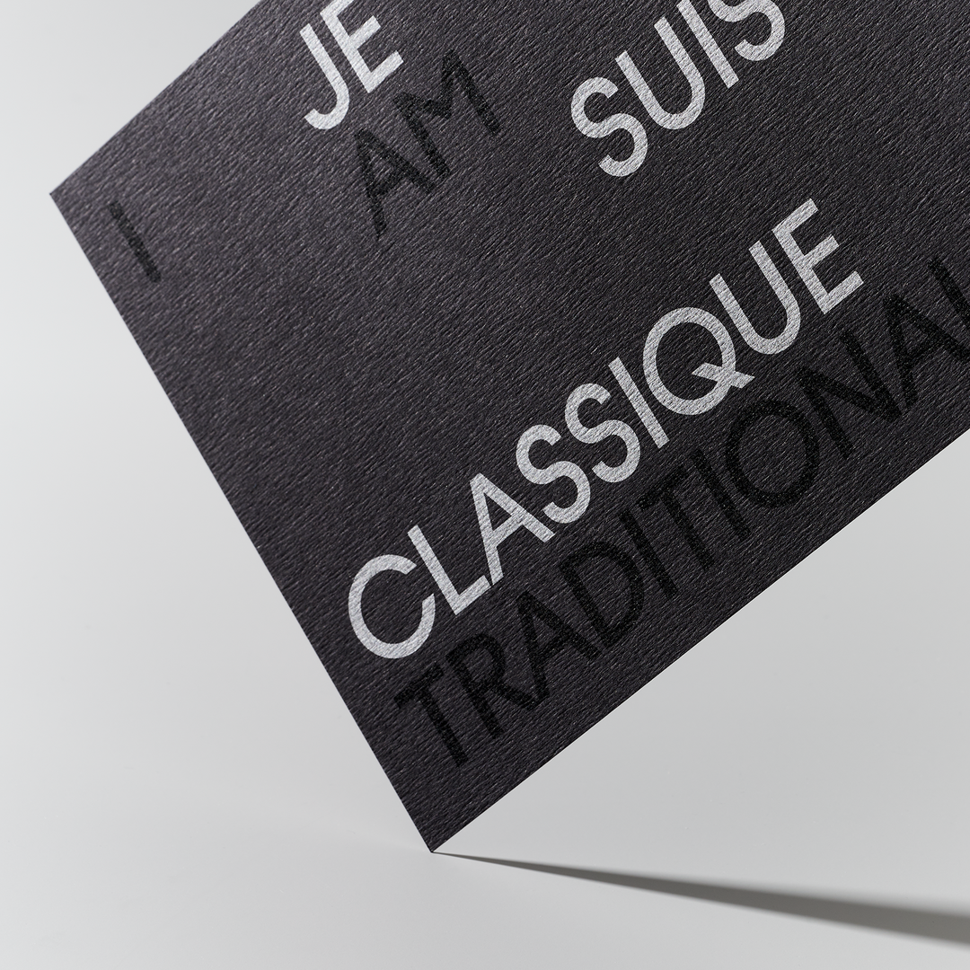
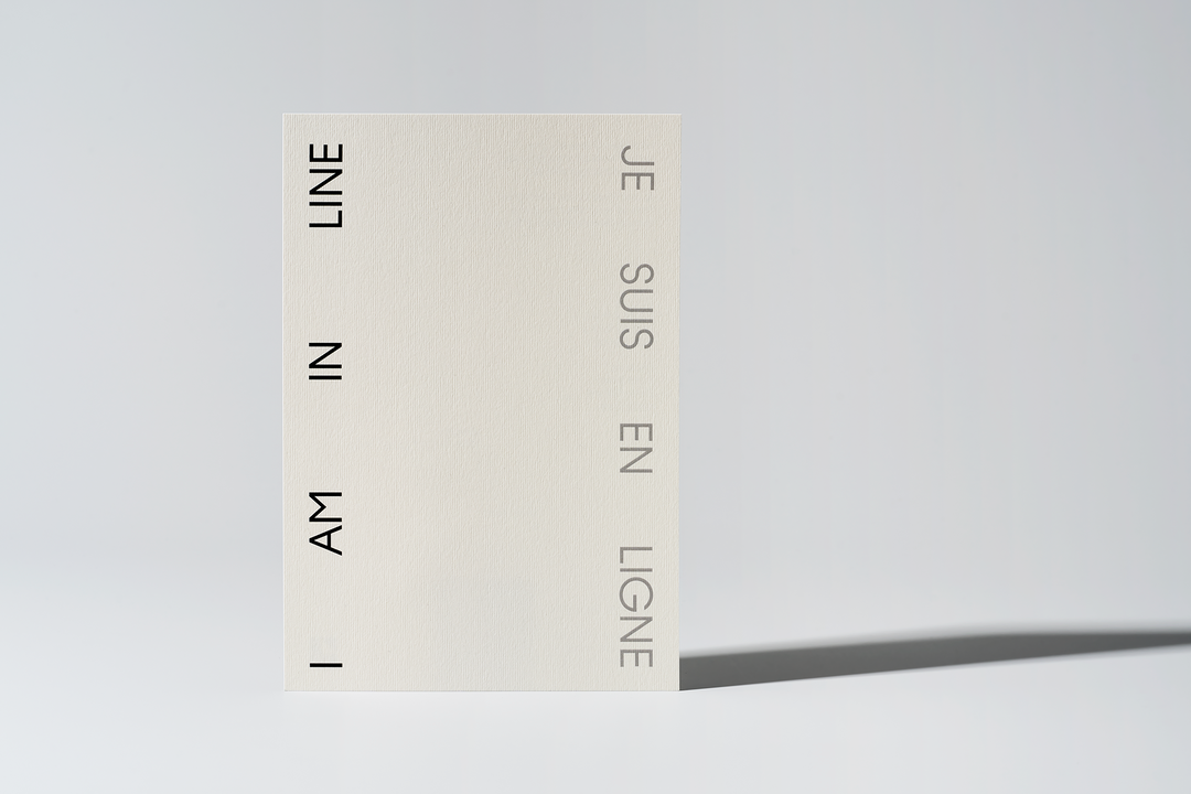
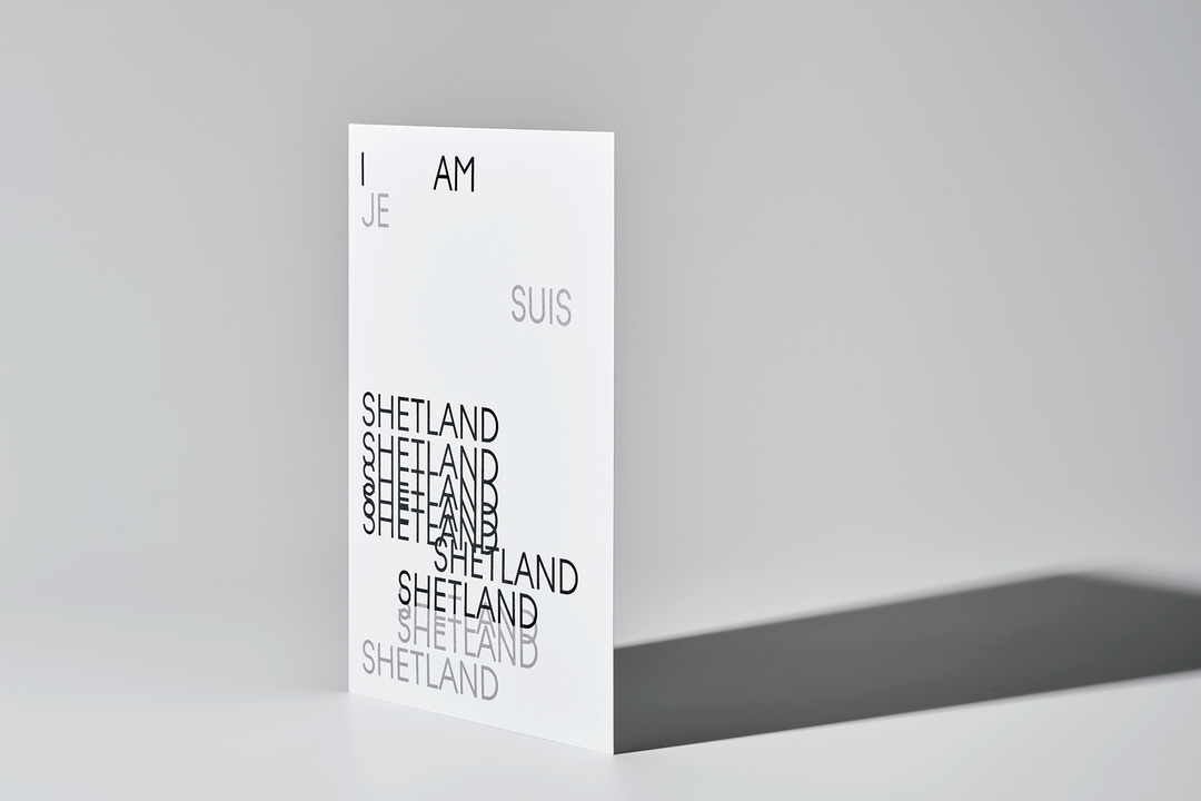
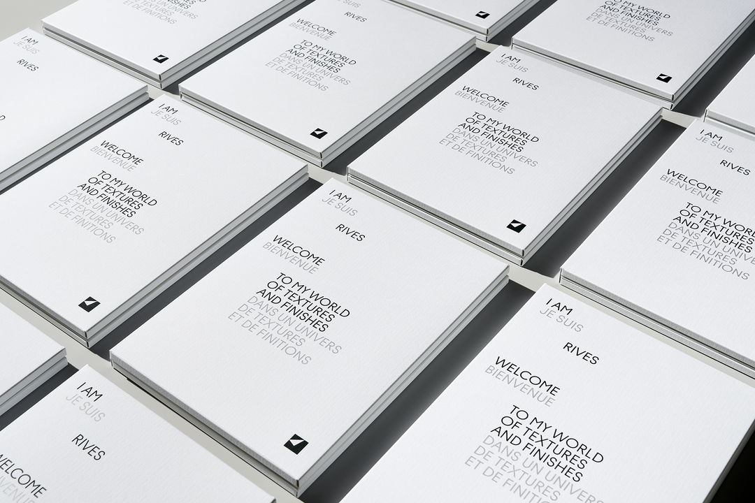
Throughout the I am Rives / Je suis Rives campaign – masterminded by design studio BVD – Arjowiggins uses a plethora of printing techniques to highlight the beauty and elegance of its Rives paper range.
There really is nothing quite like the feeling of holding a fresh new notebook in your hands and leafing through the pages. Now, with more time than ever spent online, physically experiencing tactile, well crafted objects – whether that be publications, packaging or stationery – has become a means to satisfy a very human hunger for touch and texture. It’s this feeling that independent paper manufacturer Arjowiggins has spent its illustrious history seeking to create and facilitate, as far back as the company’s beginnings in the 17th century. With its French papermaking heritage, the Rives range (named fittingly after the town in which it was first created) has fast become a staple of reputable brands all across the world, for its understated textures, combining Gallic elegance and savoir-faire with adaptability across all major print processes.
In a new global campaign I am Rives / Je suis Rives, the manufacturer’s head of marketing, Jose-Anne d’Auvergne highlighted the company’s desire to champion its focus on touch and texture: “We wanted to give Rives a new lease of life with a campaign that focuses on tactility, and specifically how touch and texture can be expressed and experienced through digital media especially in the current global context.” To capture this, Arjowiggins called upon the Stockholm-based strategic design studio BVD. “We decided to make the textures the heroes,” says design director and BVD partner Rikard Ahlberg. BVD achieved this on two fronts; firstly through concept – with a unique approach that makes a play on words using the name of each texture in French and English (a nod to Rives’ french heritage); and then through design, by incorporating the concept in a graphically aesthetic way into the printed pieces of this project. “We wanted to reach out to creatives around the world in a new way and highlight that touch can really evoke feelings and release creativity. Tactility can be a true superpower if you want to appeal to someone’s senses.”
GalleryArjowiggins: Rives Paper Range (Copyright © Arjowiggins, 2022)
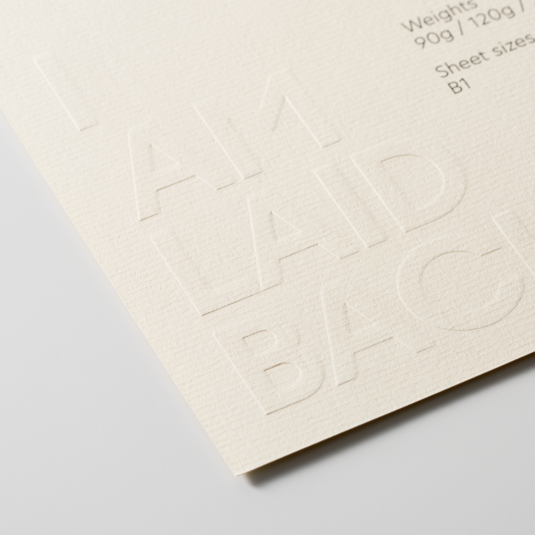
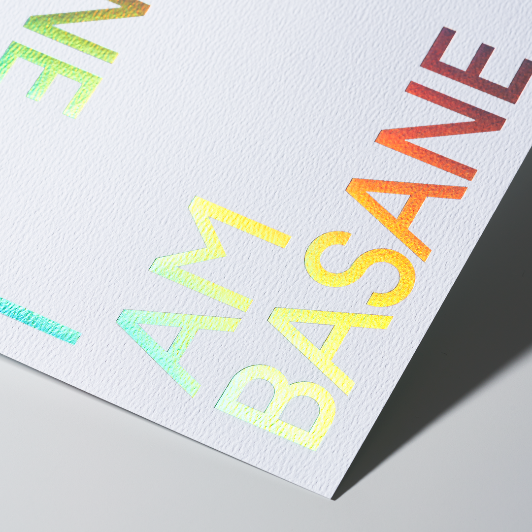
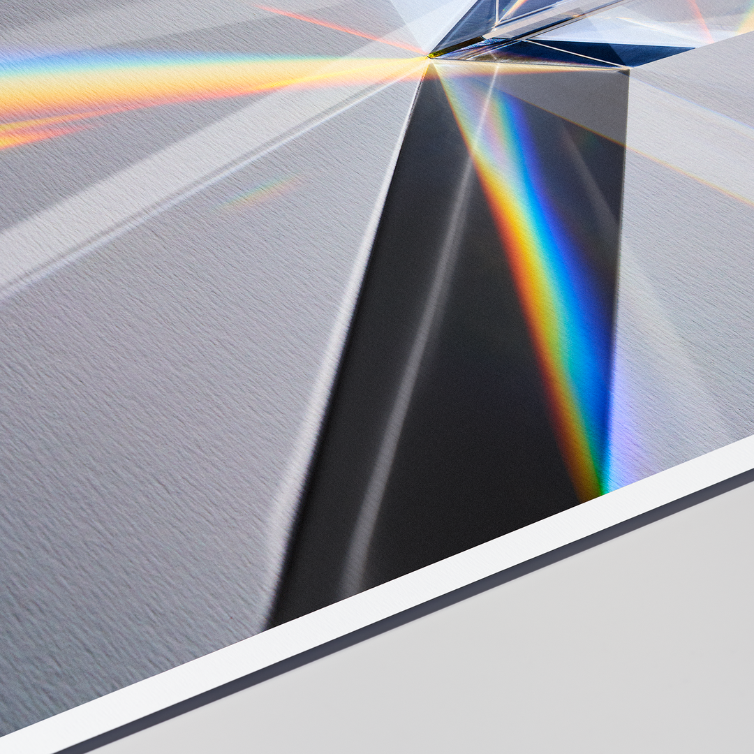
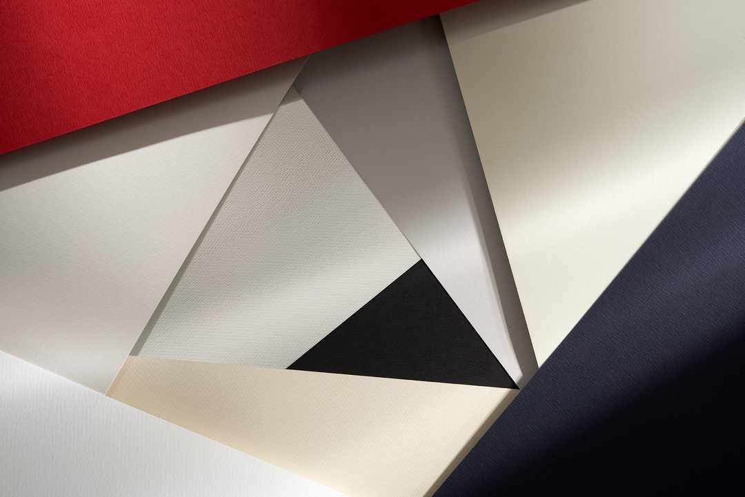
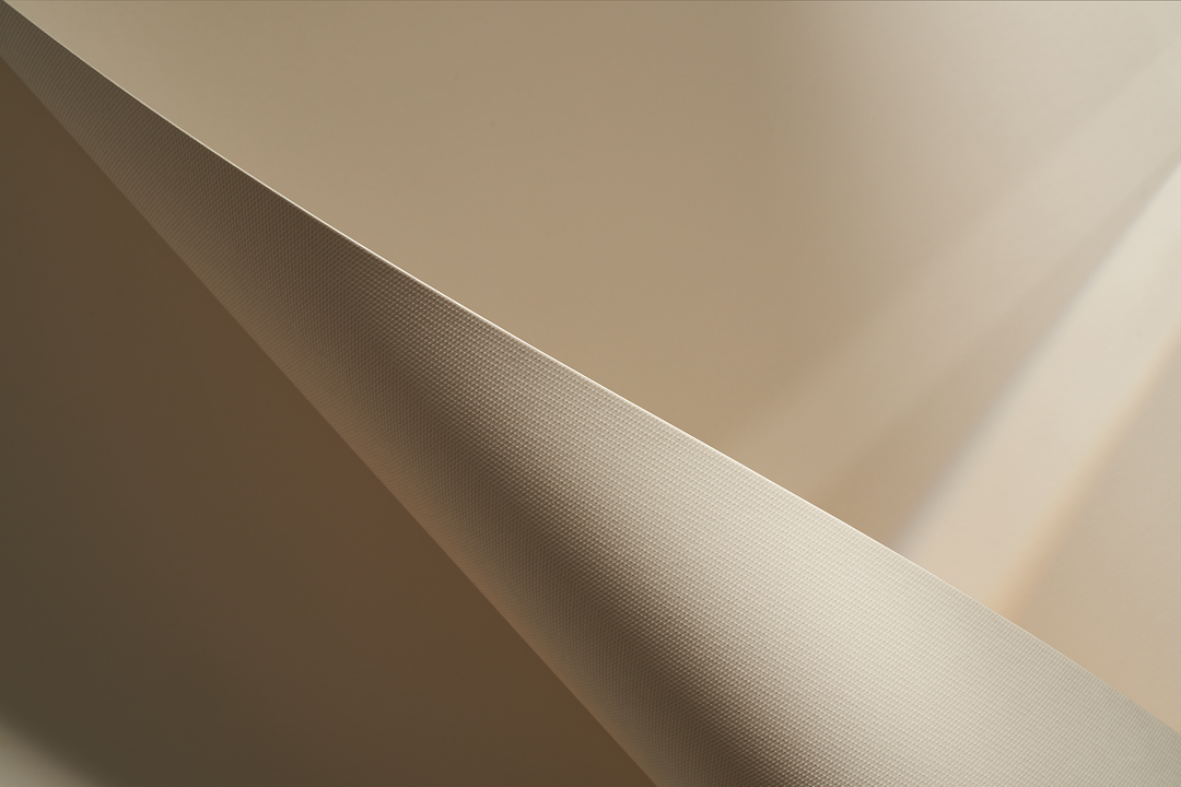
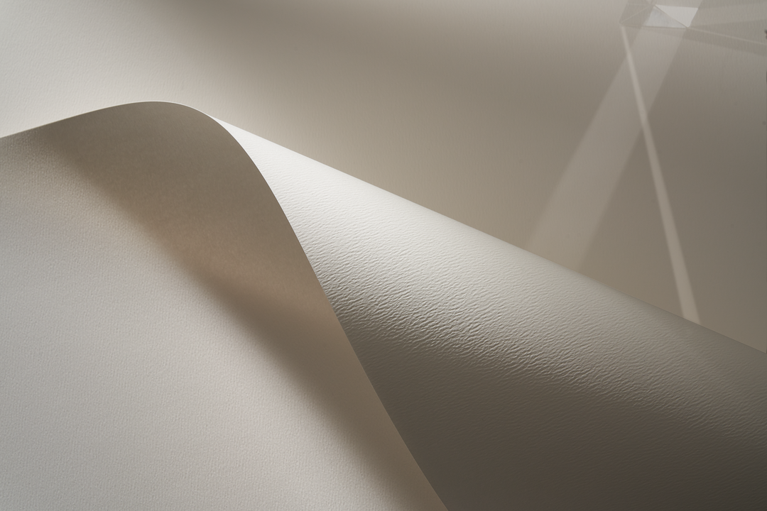
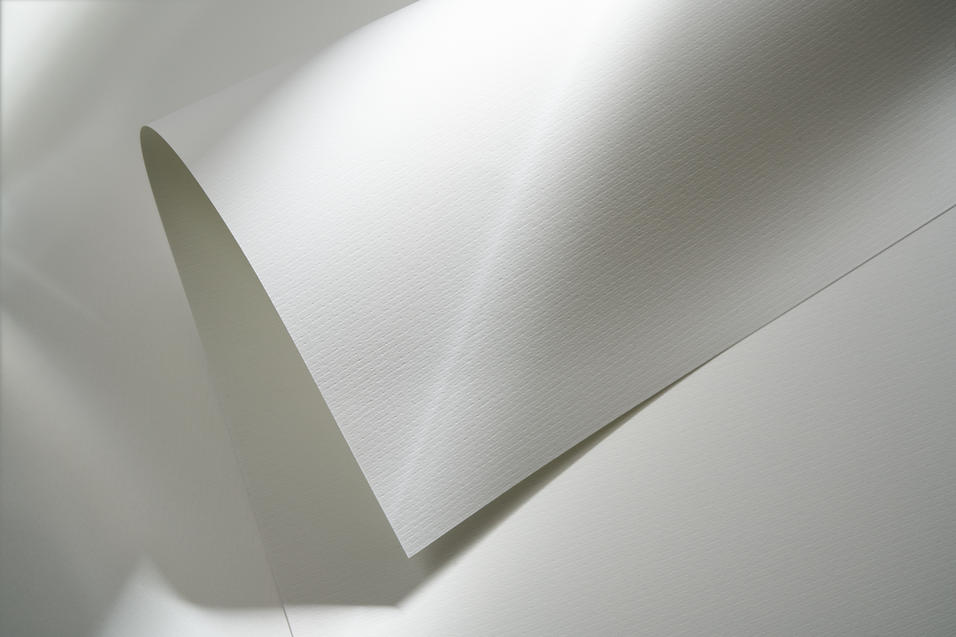
BVD most certainly achieved this goal, and the studio’s visual representation of the paper shows every subtle difference and unique element of the eight felt-marked and micro-embossed finishes that form the Rives collection. With contemporary, classic or geometric patterns adorning the paper, the collection – inspired by fashion and fabrics– has a wide diversity of texture. Arjowiggins’ dedication to creating the most intricate paper finish means that now, a number of its textures – such as Dot, Tweed and Basane – have no equivalents elsewhere in the paper market. Using extremely zoomed in, high-quality images – shot by photography duo Bohman and Sjöstrand – to quite literally get up close and personal with the paper in its numerous forms and variations, Rikard summarises that: “we visualised the soul of Rives and found an expression that touches you – and that you want to touch – no matter what media you are using.”
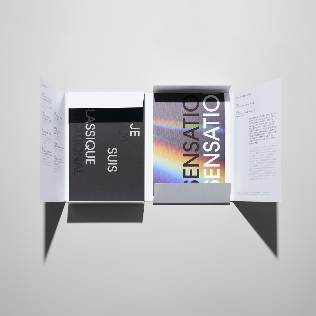
A huge amount of detail and attention goes into every product in the Rives range. For example, the Rives Sensation paper has a patented surface treatment that further enhances ink-lift and drying performance resulting in sharp colour rendering, high-images resolution and homogeneous solid printing. To pay homage to such a breadth and diversity of paper formations, BVD wanted to utilise as many different print techniques as possible, with the campaign including image printing, typographic embossing, die cutting and hot foil stamping as a way of highlighting the best attributes of each texture. Moreover, the BVD team reveals they got inspiration from the Arjowiggins symbol, “with its angles and directions”, which led to the incorporation of a prism into the designs, showing the true “vibrancy in colour and light and capture print complexity”.
In an increasingly online world, texture, tactility and touch are feelings and sensations at risk of being lost. Arjowiggins is a manufacturer fighting against this phenomenon, one piece of paper at a time.
Rives papers are available worldwide through Arjowiggins’ network of distributors. You can order a copy of the new Rives printed tool here.
GalleryArjowiggins: Rives Paper Range (Copyright © Arjowiggins, 2022)
Sponsored By
Arjowiggins
Arjowiggins is one of the world’s leading manufacturers of creative papers with over 320 years of expertise in papermaking and a mission to continually set international standards.
Hero Header
Arjowiggins: Rives Paper Range (Copyright © Arjowiggins, 2022)
Share Article
About the Author
—
This article was sponsored by a brand, so is marked up by us as Sponsored Content. To understand more about how we work with brands and sponsorships, please head over to our Work With Us page.