Designer Aurane Loury breaks down “frontiers between different creative mediums”
The French graphic designer is interested in myriad creative pursuits, including performance, theatre, and objects.
Share
For French graphic designer Aurane Loury, the medium is about much more than putting shapes, colours and letters on a page – in fact, it is as much about what happens off the page as it is about what happens on it. Working with text, she forms relationships with her material whether that be through “an exchange, a re-transcription or a particular interest in the issue.” The idea is to formulate a new experience of that text – for herself and for the audience: “I try to create conditions that push the readers/spectators/watchers to have, in turn, their own new experiences from it,” she tells us.
Originally from Clermont-Ferrand, a small town in France, Aurane was previously undertaking an internship at La MaMa Experimental Theatre Club in New York City where she was supposed to be spending the year after graduating from the graphic design course at ENSBA Lyon. However, Covid-19 ended that early, and so she has returned to France for the time being.
Aurane’s interest in graphic design began when she attended Esaab, an art school in Nevers, central France. But, when asked about why she favours this medium over the other creative pursuits, she is staunch in her position that she does not necessarily just feel inclined to graphic design: “I cannot stick with one media or medium over another. I am now, more than ever, exploring other fields such as performance, theatre, and objects. They all play together as tools to serve as experiences and experimentations around issues and questions I am interested in.”
It’s these wide-spreading interests which inform Aurane’s practice, which is difficult to define. It often revolves around performative projects, where some kind of happening is supported or documented through graphic ephemera. In turn, she describers enjoying when “frontiers between different creative mediums are erased,” asking questions such as “Where can we find graphic design in theatre, objects and performance?” Or “Where can we find theatre in graphic design, performance, and objects?” And so on.
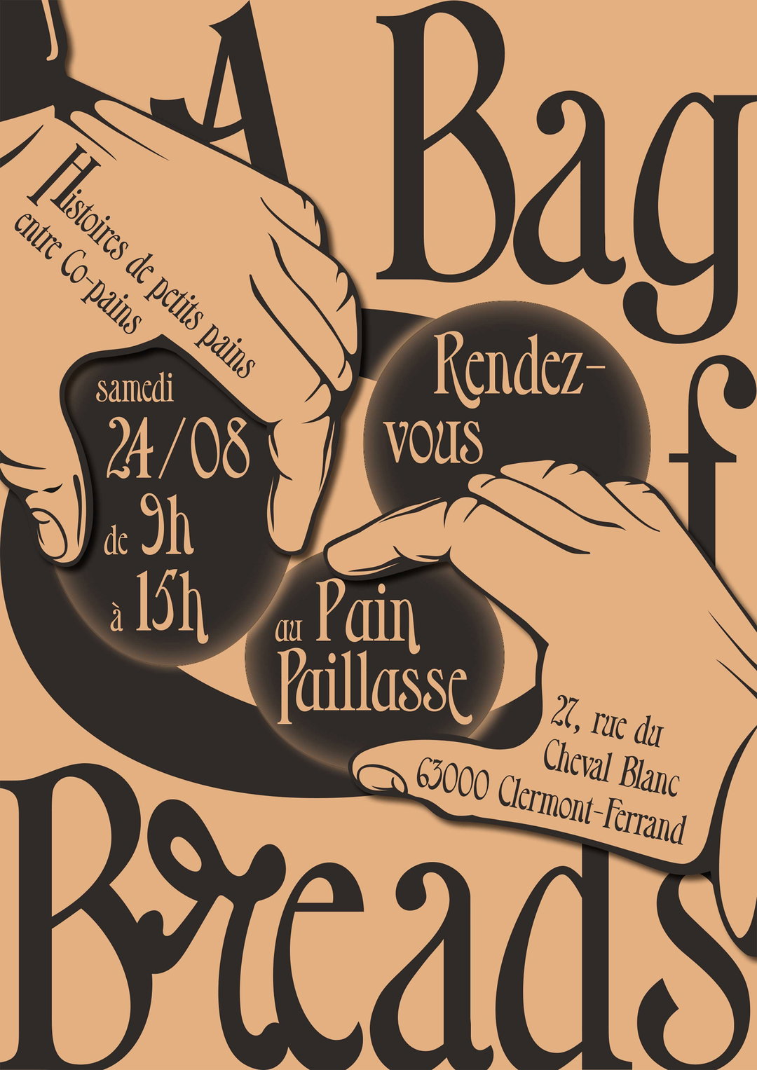
Aurane Loury: A bag of bReads
A project which demonstrates this lateral approach to design is titled A bad of bReads. It first began when Aurane was asked by Approach Journal, a publication created by Ninon Chaboud and Jimmy Cintero, to participate in the fourth issue around the theme of Copain. When translated to English, copain means friend and its origins are in the 18th Century when it was used to identify “the person with whom you share your bread (pain in French). Co-pain,” Aurane explains.
At the same time, Aurane discovered the book Games at the Cedilla by George Brecht and Robert Filliou, published in 1967 which detailed a game called Bag of Beads. “Keeping in mind the request of Ninon and Jimmy I received a couple of days earlier, my head just replaced the word Beads with Breads,” Aurane explains. “Bread in place of Beads? Let’s make it so!”
The result is a somewhat bizarre but utterly charming game which sees players stringing together bread with words stamped on it in order to form sentences, vying for an available jackpot full of money, objects, artworks or any other kind of prize. To win, you must make the best sentence. In order to make this happen, Aurane collaborated with a bakery called Au Pain Paillasse, and chocolate was used to write to words on the bread.
In terms of the graphic ephemera which accompanied this event, Aurane produced large bakery bags which transported the bread as well as support the communication of the project. She is also currently working on a typeface, comprised of the letters which appeared on the actual bread. In turn, it’s a project which typifies Aurane’s whimsical and playful approach to design; her interest in experiences and forming relationships. In her practice, designed objects become vehicles for facilitating said experiences, and Aurane thoughtfully reflects on these.
Having also recently founded a publishing house alongside Galaas Gonzales called Astérisques, there is much to come from this recently-graduated designer. Astérisques will, she tells us, design and take part in “self-initiated editorial objects approaching questions and issues around language, orality, performance, and theatre,” the first of which is currently in the makings.
GalleryAurane Loury
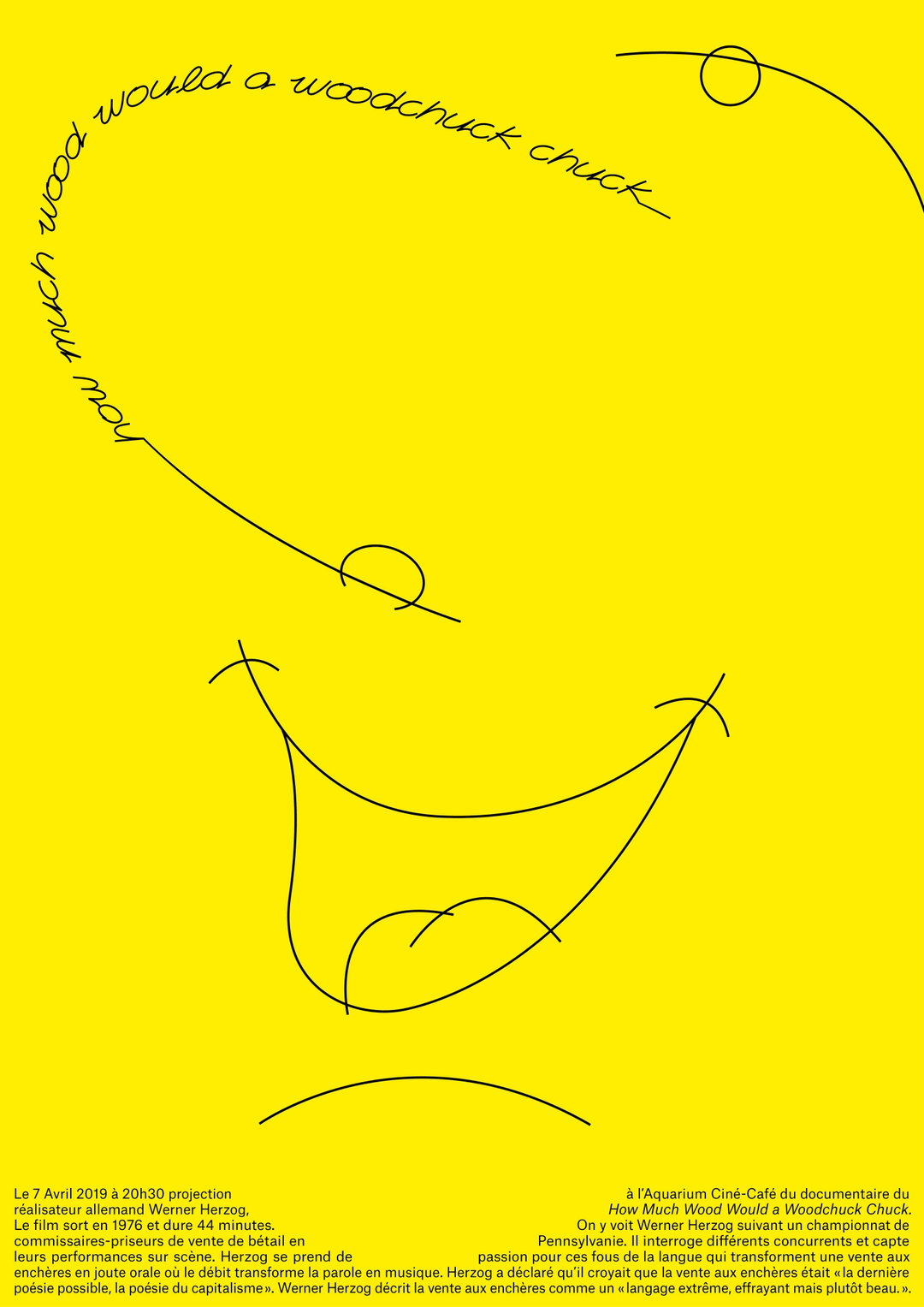
Poster for Werner Herzog’s movie with Clara Degay. Sergio typeface by Jannis Zell
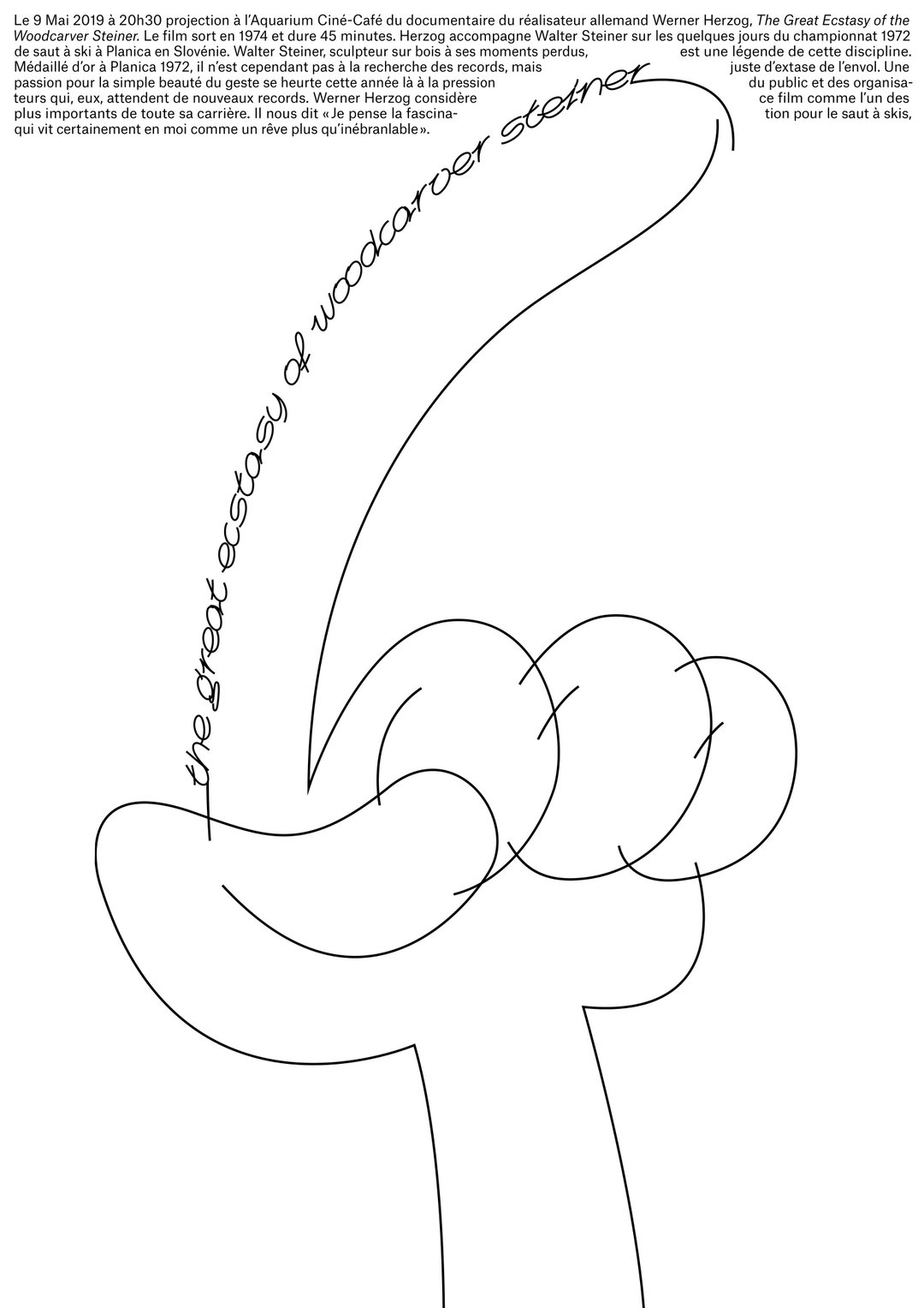
Poster for Werner Herzog’s movie with Clara Degay. Sergio typeface by Jannis Zell
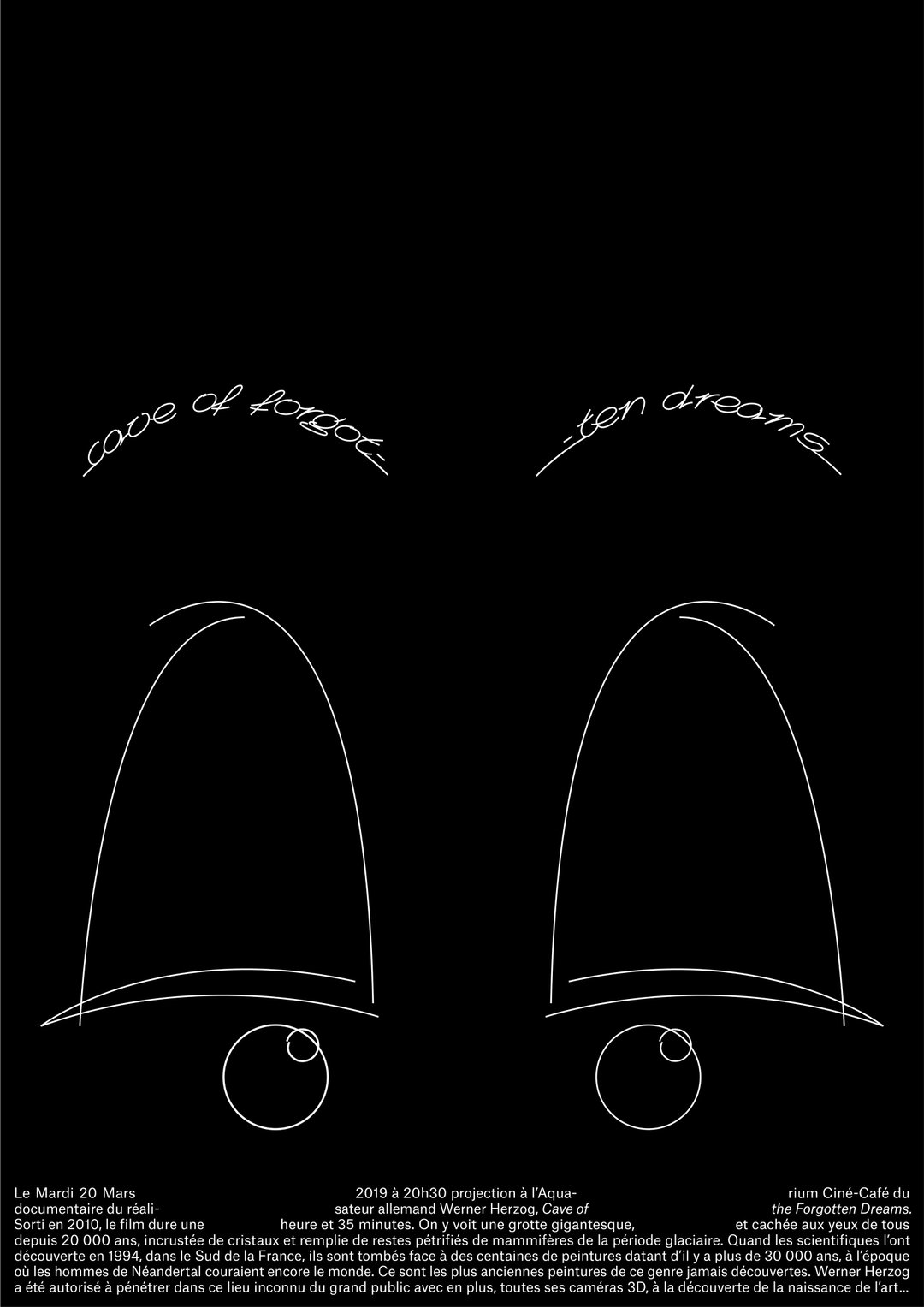
Poster for Werner Herzog’s movie with Clara Degay. Sergio typeface by Jannis Zell
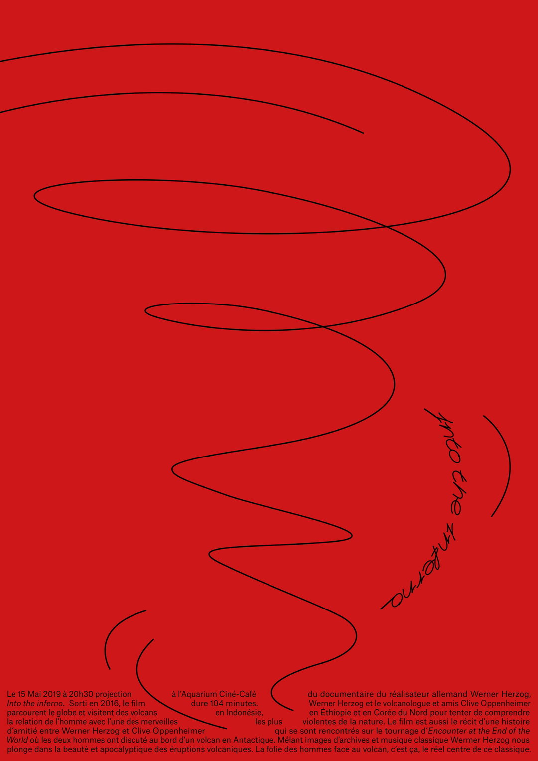
Poster for Werner Herzog’s movie with Clara Degay. Sergio typeface by Jannis Zell
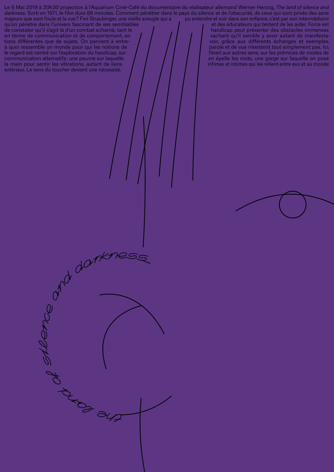
Poster for Werner Herzog’s movie with Clara Degay. Sergio typeface by Jannis Zell
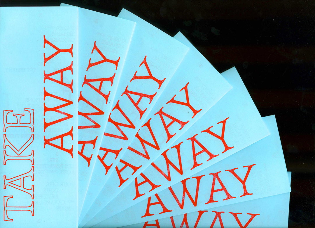
Take Away. Texts by Marine Forestier
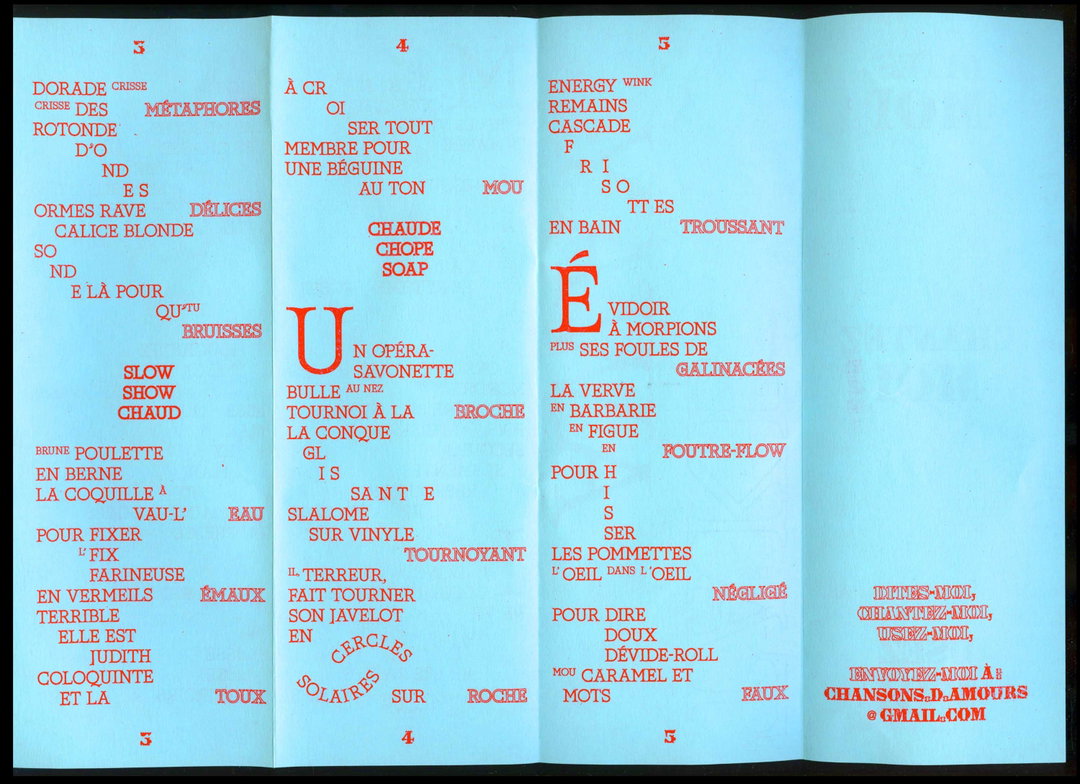
Take Away. Texts by Marine Forestier
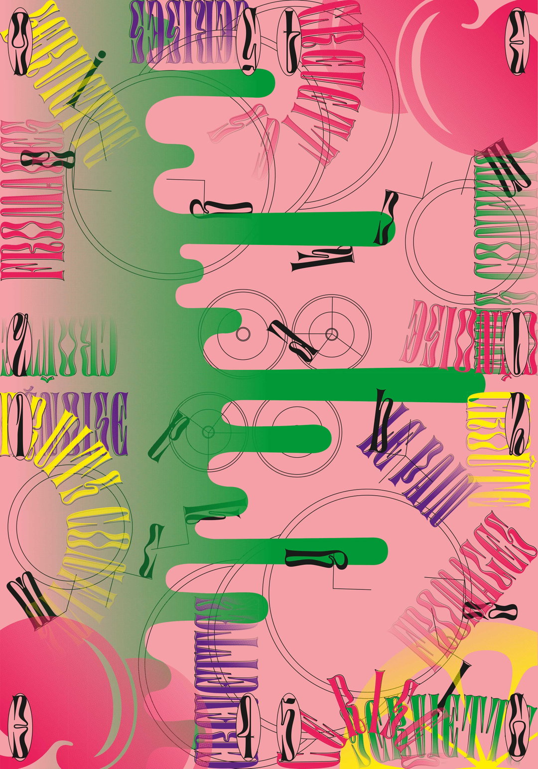
Compasatory Mat. Digestive Typeface by Jérémy Landes
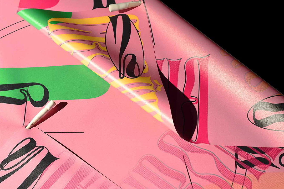
Compasatory Mat. Digestive Typeface by Jérémy Landes
Hero Header
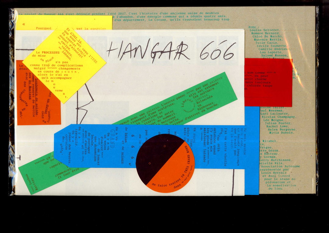
Hangar666 with Marielle Nils
Share Article
Further Info
About the Author
—
Ruby is Senior Creative at It's Nice That, overseeing our visual output across platforms and projects. Before that, she was associate editor on the editorial team, after joining in September 2017 following graduation from Central Saint Martins.