B.A.M's new identity for White Cube is an “evolution rather than a revolution”
London-based design and art direction studio B.A.M recently started work on its identity for White Cube gallery, with an unusual aim: “I have a strong view that an identity, especially for White Cube, should be invisible,” co-founder of the studio David McKendrick tells It’s Nice That. Across its galleries the White Cube houses impeccable artworks and B.A.M quickly identified this as a focal point. In turn, the studio didn’t want to design an identity which would draw eyes away from the likes of Gilbert and George or Tracey Emin, but instead, build the graphic design foundations which would house the artworks, and enhance them too.
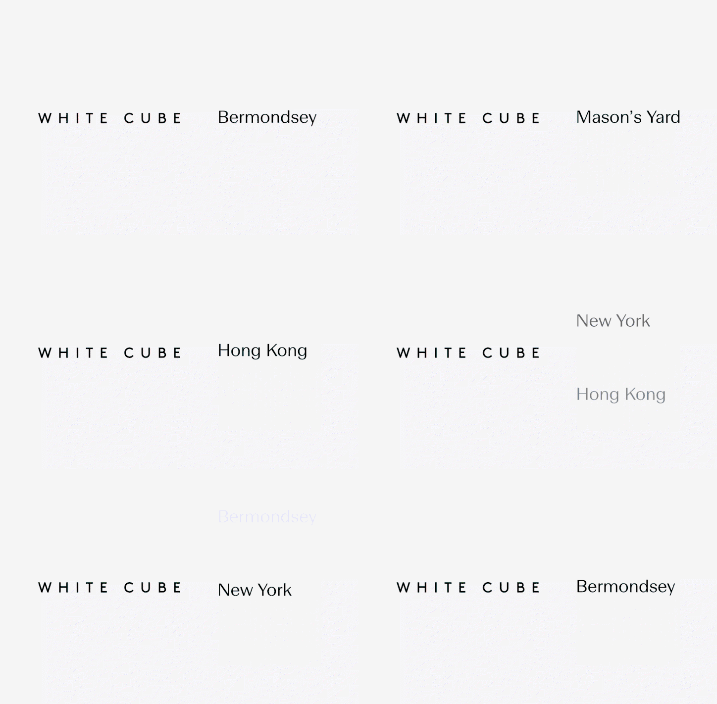
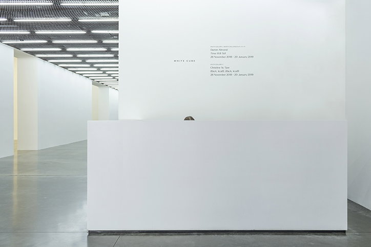
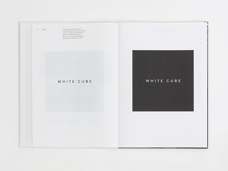
As a result, B.A.M has designed a simple typographic treatment for the gallery; one that is “functioning and enhancing the whole gallery experience,” continues David. Whether it’s “online, in print, on email or in one of the gallery spaces, it should feel at one with White Cube and all it stands for.” After identifying this, being communicative became B.A.M’s incentive for the identity and “rather than an immediate graphic design solution, our initial pitch focussed more on its existing communication,” points out David’s fellow co-founder, Lee Belcher.
At the point when B.A.M was pitching to work on White Cube’s identity, the gallery was working with a design framework developed for print – its old identity didn’t apply itself to the fact that “90% of its communication is now digital,” says Lee. “Our first stage was to tear it up, edit and re-organise its content. Only after that was done could we start developing the visual solution.” It also turns out that this approach – one that zooms in on the actual content and demonstrates B.A.M’s experience in editorial design and art direction – is what set the design studio apart from others in the pitching process too. “We understand content and the importance of handling information to create an appropriate design solution,” explains David. B.A.M approached the project honestly, pointing out to the client that its identity was already strong and, as a result, “needed an evolution rather than a revolution”.
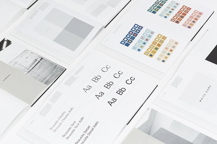
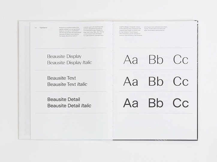
One of the key components of this evolution is the introduction of a new typeface, Beausite, modified for the project by Fatype. The decision to design a custom typeface for the identity developed after B.A.M noticed how the gallery’s identity “required a hugely versatile typeface that would work over all formats, from signage through to a digital invite being viewed on a smartphone,” says Lee. When approaching Fatype about working together the designer was actually already working on Beausite, so while not commissioned specifically for this project “it does have its own unique cut that Fatype created with some super special twists and tweaks,” adds David. “Only the geeks will notice.”

B.A.M: White Cube
B.A.M: White Cube
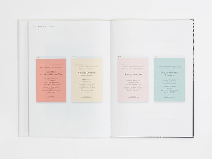
A further new addition to B.A.M’s identity for White Cube is the introduction of a specific colour palette. It’s an element described by the studio as “one of our biggest challenges” as B.A.M was attempting to add the first injection of colour to White Cube in its 25-year history. “The clue is in the name,” points out Lee. Yet, the colour palette sits aptly next to the studio’s typographic treatment in its minimality, and will be subtly used, mainly for social media channels and invites. As two pieces of frequent communication, presented by the gallery to its audience, the importance of introducing of colour was noticed by B.A.M considering how “the frequency of these two areas required differentiation from one to the next.”
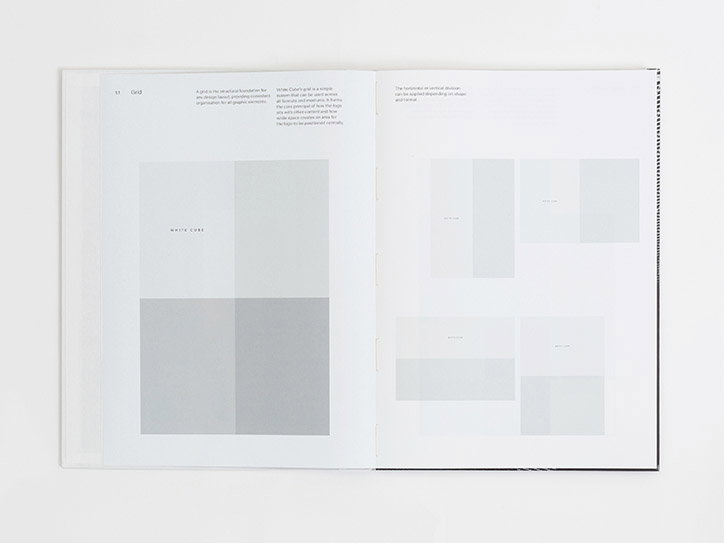
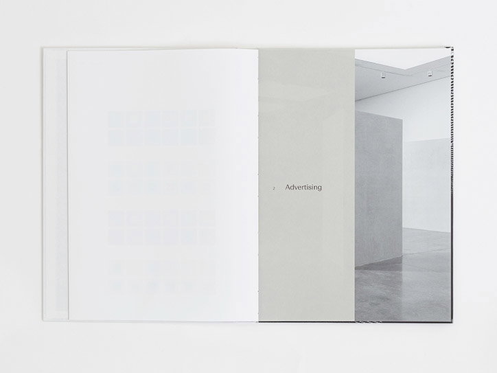
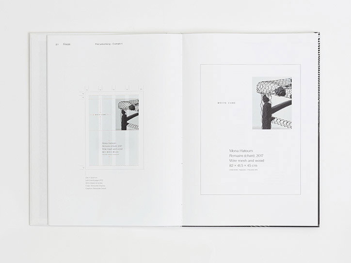
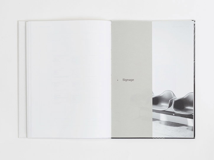
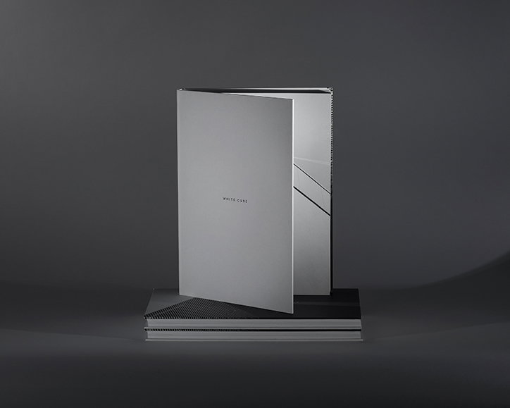
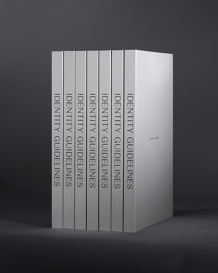
All of this design thinking was then filtered into a book format, acting as the identity guidelines for the White Cube. An incredibly clean, crisp, white hardback document, on asking David how this process was he jokes: “Have you ever had a wisdom tooth out?” Elaborating on how creating the identity guidelines “was a cathartic process,” he explains. “Collating all the work created over the 12-month process was hugely rewarding. It is worth saying that although this is a thorough set of guidelines, they are a foundation to be built upon.”
The document, in turn, demonstrates “the thinking behind the identity for the gallery,” adds Lee. It seems particularly relevant that B.A.M would accumulate its design process into a book acting “a functional manual to hand over to the internal White Cube design team.” Clarity of communication, after all, was the point in the first place.

B.A.M: White Cube
B.A.M: White Cube
B.A.M: White Cube
B.A.M: White Cube
B.A.M: White Cube
B.A.M: White Cube
B.A.M: White Cube
B.A.M: White Cube
B.A.M: White Cube
B.A.M: White Cube
B.A.M: White Cube
B.A.M: White Cube
B.A.M: White Cube
Share Article
Further Info
About the Author
—
Lucy (she/her) was part of the It’s Nice That team from 2016–2025, first joining as a staff writer after graduating from Chelsea College of Art with a degree in Graphic Design Communication, eventually becoming a senior editor on our editorial team, and most recently at Insights, a research-driven department with It’s Nice That.