




Some of Penguin's best new illustrated covers and a chat with their creator
The other week the good folks over at Penguin sent us a mammoth haul of brand new paperbacks covered in some of the best illustration we’ve seen on literary works for some time. The breadth of commissioning and the use of young and established talent was such that our interest was immediately piqued. So rather than just stacking them all up on our desks to show off what enquiring cultural minds we have, we got in touch with the art director responsible for them all to find out a little bit about his process and the talents he works with. Everyone, meet Richard Bravery, Richard, meet everyone…
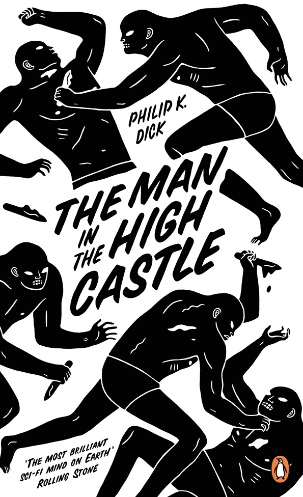
Cleon Peterson: The Man In The High Castle
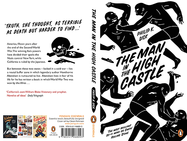
Cleon Peterson: The Man In The High Castle
Tell us who you are and what you do?
My name is Richard and I design book covers. Or a slightly longer explanation would be; I’m a cover designer for the publisher Penguin Books, where I work with artists, designers, editors and authors to produce books – which hopefully someone, somewhere will pick up and read.
How long have you been working for Penguin?
About six years. It’s a challenging place to work; they set the bar high and you are always aware of the history of Penguin and the designers who have gone before you. The reward is working for a company that is constantly evolving and encouraging you to do the same.
What was your background before then?
I studied illustration at art school but quickly realised that I was surrounded by people far more talented than I was. After that I took something of a tangent into carpentry for a few years, before finally moving into publishing by way of a masters in design. I have always loved books and knew I wanted to be involved in the industry somehow. It just took me a while to realise where I fitted in.
You’ve recently commissioned a lot of illustration on new Penguin covers at a time when it seems not to be in fashion, why is that?
I suppose, rightly or wrongly, I’ve never really paid much attention to trends in the market. If after reading a book, illustration seems like the best solution then it’s just a natural progression.
Tell us about some of the illustrators you’ve been working with and how you came across them?
I’ve been lucky enough to collaborate with some hugely talented people over the years, and most recently I’ve been working with Stanley Donwood, Cleon Peterson, Pete Fowler, Luke Pearson and Cat Johnston. Stanley I knew best because of Radiohead, but I was surprised just how broad and deep his body of work is.
I first came across Cleon a couple of years back, then was reminded of his insanely great work late last year when I was working on a street art series with ROA and DAIN. His work is so unique that I thought I’d struggle to find a project to work with him on, but Philip K Dick’s, The Man in the High Castle couldn’t be a better fit for Cleon.
I knew Pete’s work through the Super Furry Animals and was lucky enough to work with him and Gruff Rhys on American Interior. They were so focused and determined to produce something unique so it was great to be a part of that.
Luke I discovered when I bought his book, Everything We Miss, and instantly knew that he’d be great to work with – such a talented guy! And I saw Cat Johnston’s amazing work at an exhibition in Concrete Hermit, which was a bit of a mecca for graphic artists back in the day.
Generally I read magazines, follow blogs, go to exhibitions and degree shows, and if someone’s work is good it always filters through in the end.
You’ve worked with Luke Pearson on a series of crime thrillers. What about his work in particular felt right for this job?
I’m a huge fan of comic book art and graphic novels and – though America seems to be much better at celebrating the rich pool of talent they have over there – we have a group of equally talented young British artists, of whom Luke is one. What drew me visually to his work was his line style and fearless use of colour. But it was his wit and ability to capture life in all its absurdity that best suited this set of books.
What was the process of commissioning Luke?
We spent a while discussing the project – where it could go and what he could bring to it – then it was a matter of reading the books and coming up with some concepts that balanced the humour and violence of the stories. The first book was tricky as it set the tone for all the following covers, but Luke was always happy to explore other ways of communicating an idea and had the talent to make big ideas work.
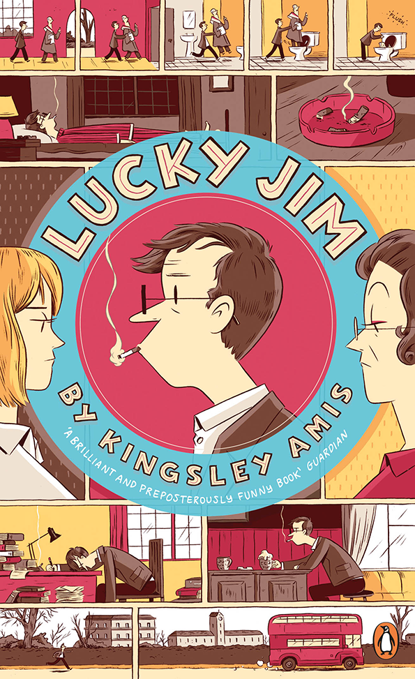
Luke Pearson: Lucky Jim
How closely do you work with an illustrator on this kind of commission?
I suppose both closely and not very closely; you want the artist to feel ownership of a project while still being close enough to guide it through. I’m a big advocate of explaining how something should feel, rather than telling an artist how it should look; so once the themes of a book and overall messages we would like to convey are agreed upon it’s up to the illustrator to visualise it in whichever way they feel is best.
"Good commissioning should be invisible; at the end of a project I don't want to see my fingerprints all over it."
Richard Bravery
Did you have a picture of how you wanted the series to link together?
I wouldn’t say I had a picture as such, and no matter how hard I tried to imagine a cover, Luke always came back with something infinitely better. We ultimately agreed that loosely linking it through colour palette, the central character – Charlie Mortdecai – and the utterly ridiculous situations he finds himself in, would be the best way to link the series. Luke’s distinctive style did the rest.
Does it concern you that book covers may one day become obsolete?
Not really. Everyone accepts that the way we read is changing, so the book as a printed object might well become redundant one day. But stories will always exist, however we consume them, and I can’t see a time when a product – whether digital or physical – won’t need a package.
What else is in the pipeline at the moment?
Another project with Stanley Donwood, and then it’s the big run up to Christmas.
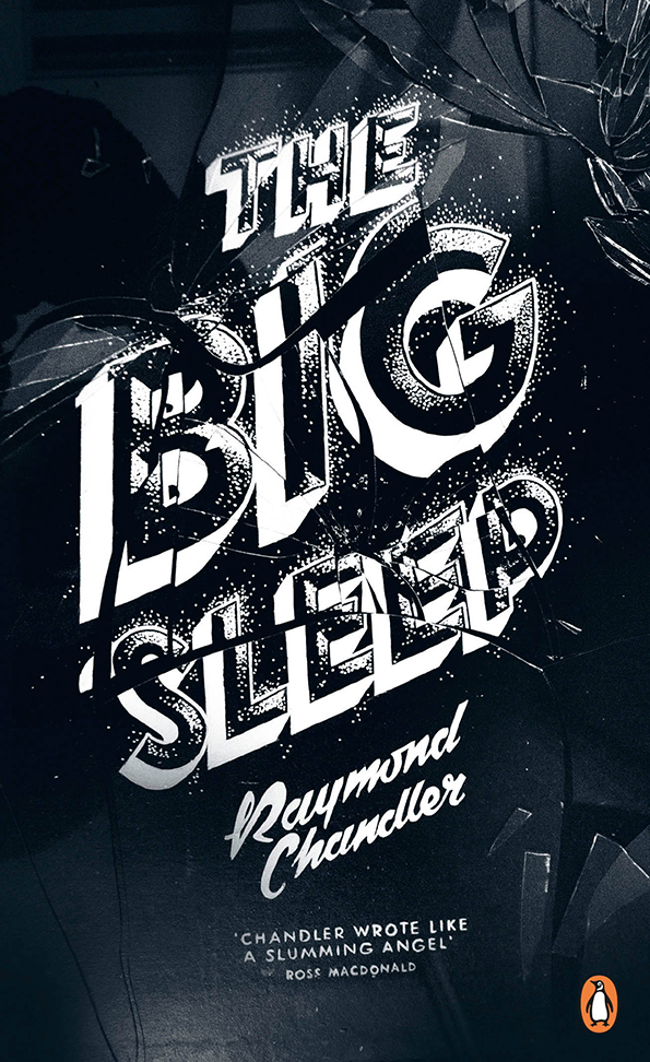
Georgia Hill: The Big Sleep
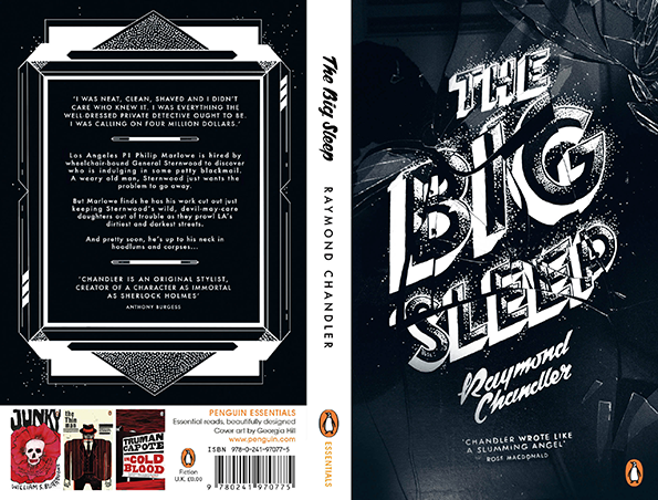
Georgia Hill: The Big Sleep
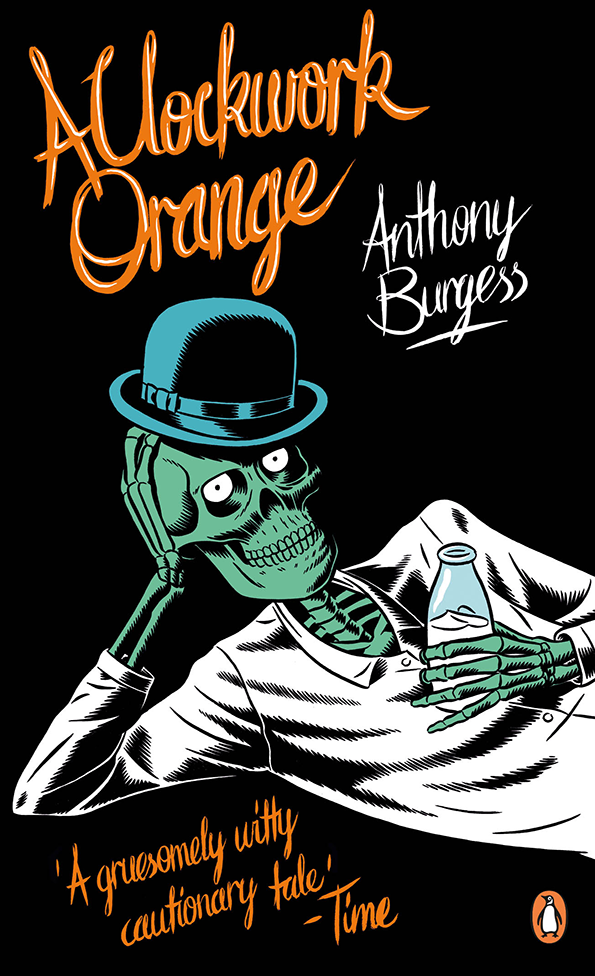
Kristian Hammerstad: A Clockwork Orange
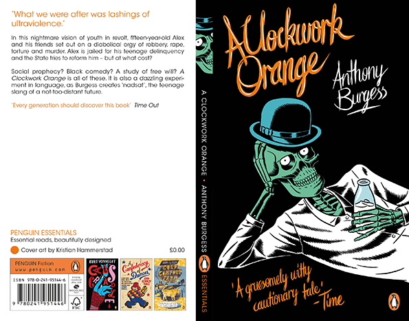
Kristian Hammerstad: A Clockwork Orange
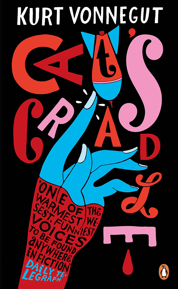
Parra: Cat’s Cradle
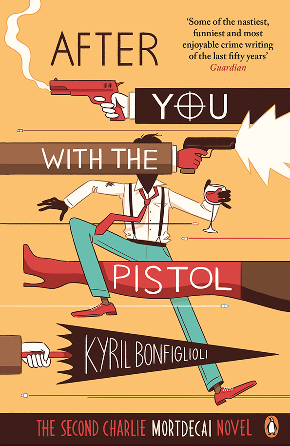
Luke Pearson: After You With The Pistol
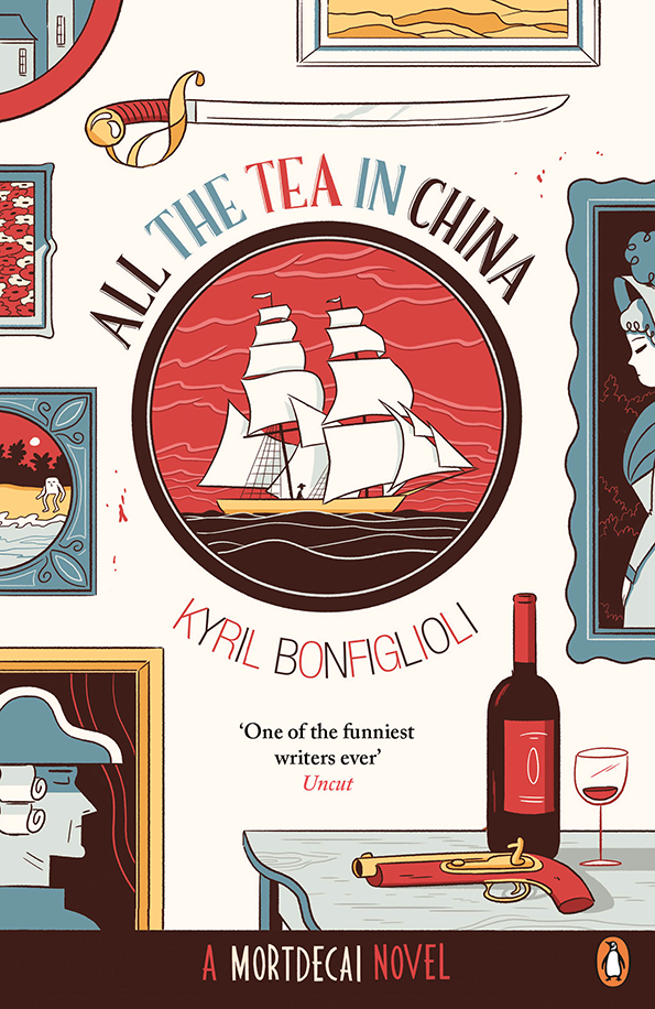
Luke Pearson: All The Tea In China
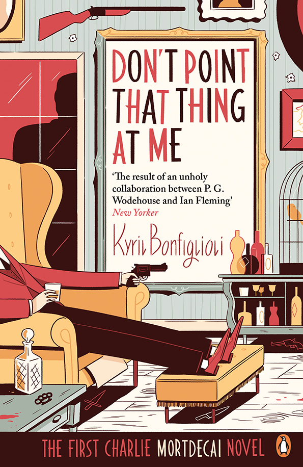
Luke Pearson: Don’t Point That Thing At Me
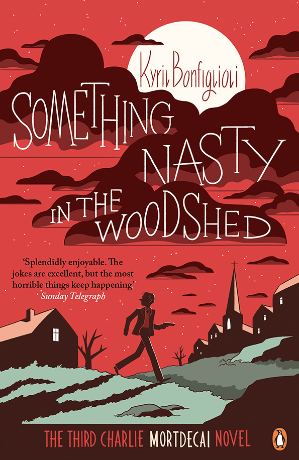
Luke Pearson: Sionething Nasty In The Woodshed
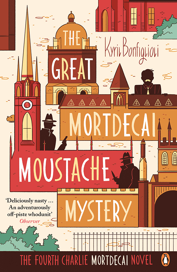
Luke Pearson: The Great Mortdecai Moustache Mystery
Share Article
Further Info
About the Author
—
James started out as an intern in 2011 and came back in summer of 2012 to work online and latterly as Print Editor, before leaving in May 2015.


