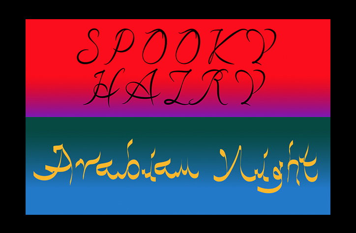
Typefaces for “bold graphic designers with a taste for risk and expressiveness”
The man behind some of our favourite experimental typefaces is back on It’s Nice That showcasing three new typefaces to the delight of type fans all over. In the past, Benoît Bodhuin has brought us the grid-based Pickle-Standard, the versatile Font Catalogue not to mention the jutting and jigsaw-like Standard. And now, less than one short year since his last article, the Belgian designer has returned with some pretty new (and amazing) designs to boot.
In our previous articles, we’ve explored Benoît’s geometry-inspired influences arising from his first degree in mathematics, not to mention his attempts to translate “noise into something harmonious” through typography. Continuing to combine these interests, he’s speedily created four new typefaces in the form of Elastik, Grotesk Remix and Side A. Three original designs that more-often-than-not, will be used by “bold graphic designers with a taste for risk and expressiveness.”
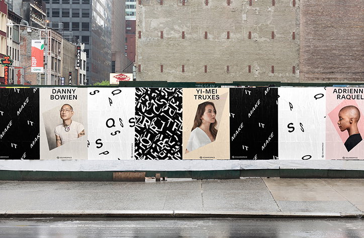
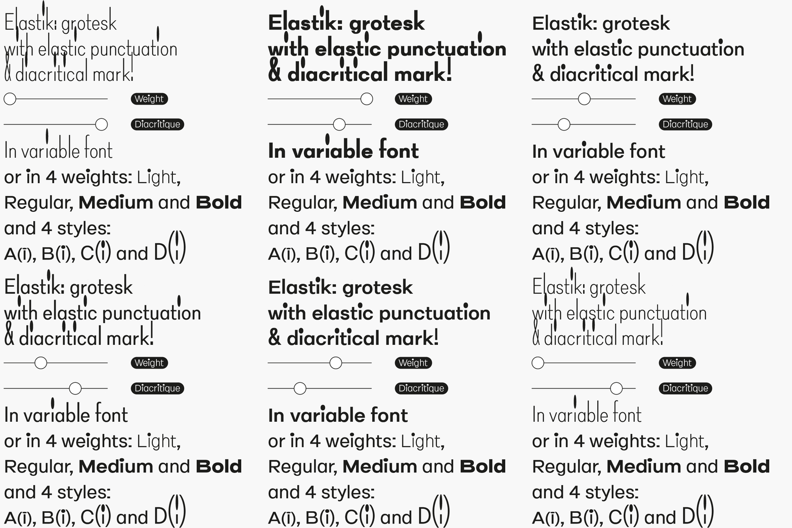
Elastik, designed in collaboration with Antonin Faurel, came about after a discussion around the diacritical mark (this is basically a glyph added to a letter to indicate a different pronunciation or sound). “The initial idea is to accentuate the size of the diacritical mark,” says the Nantes-based designer. “But very quickly, it transformed into a type with varying punctuation and diacritical marks to finally become what it is now." And what it is now is “a grotesk with elastic punctuation and diacritical marks in four weights (light, regular, medium and bold) and four styles (small diacritical, normal diacritical, hight diacritical and very hight diacritical).” It is also a variable font (of course).
Benoît Bodhuin: Side
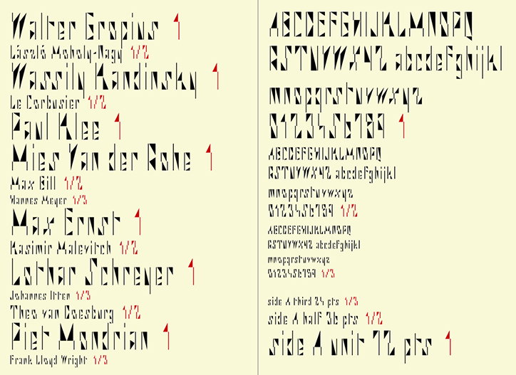
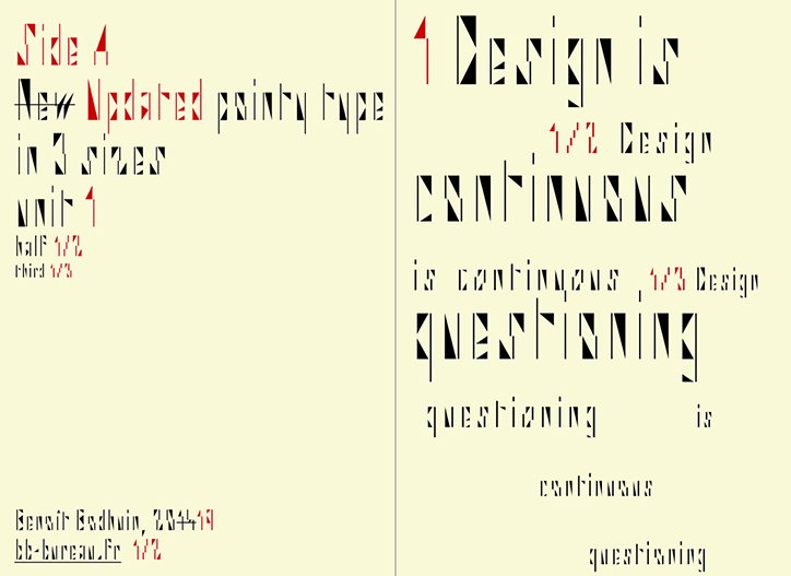
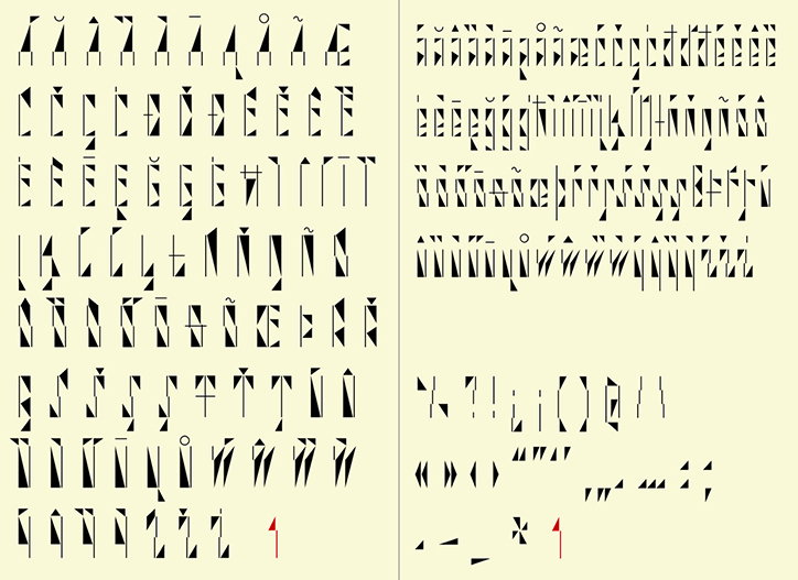
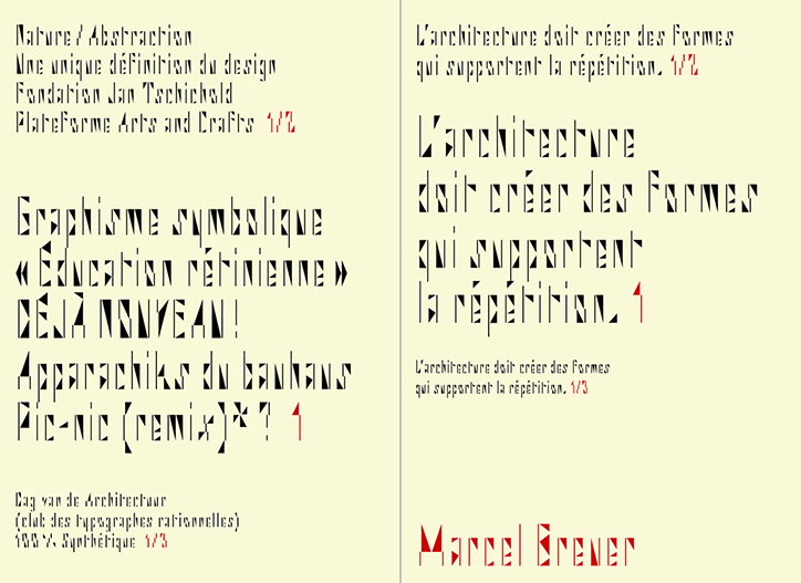
Side A, on the other hand, developed from the straightforward idea of creating a whole typeface purely from bars, triangles and spaces “judiciously calculated.” On his general rule of thumb for designing type, he tells It’s Nice That, “I try to start from a very simple idea.” Constructing letterforms from basic geometric shapes, he repeatedly draws and refines the letters until the whole alphabet works visually and collaboratively together. With Side A, all the bars and the spaces between each element are also equal, providing uniformity amidst the modular staccato. Available in three sizes, each one as a satisfyingly pointy as the next, Side A is originally designed for Krautrock records in mind. Krautrock, being a genre of experimental rock arising from West Germany in the late 1960s and early 70s.
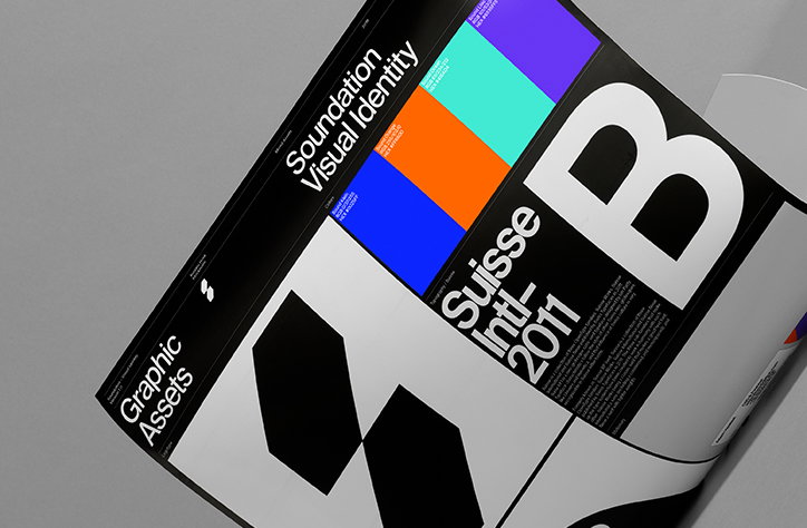
Finally, Benoît talks us through Grotesk Remix, a typeface originally designed as a bespoke design for his website, and now a fully formed variable font adapted to suit all graphic designer’s needs. Through six different weights, from thin all the way to black, the typeface is an actual remix of a grotesk. Stripping back the sans serif to a bare minimum, Grotesk Remix came out of simplified drawings and a need for a very big “b” for Benoît and Bodhuin. This big “b” is now also available in an Opentype alternate while its diversity of weights means any number of designers can utilise the typeface in any way they choose.
Benoît Bodhuin: Side A
Benoît Bodhuin: Side A
Benoît Bodhuin: Side A
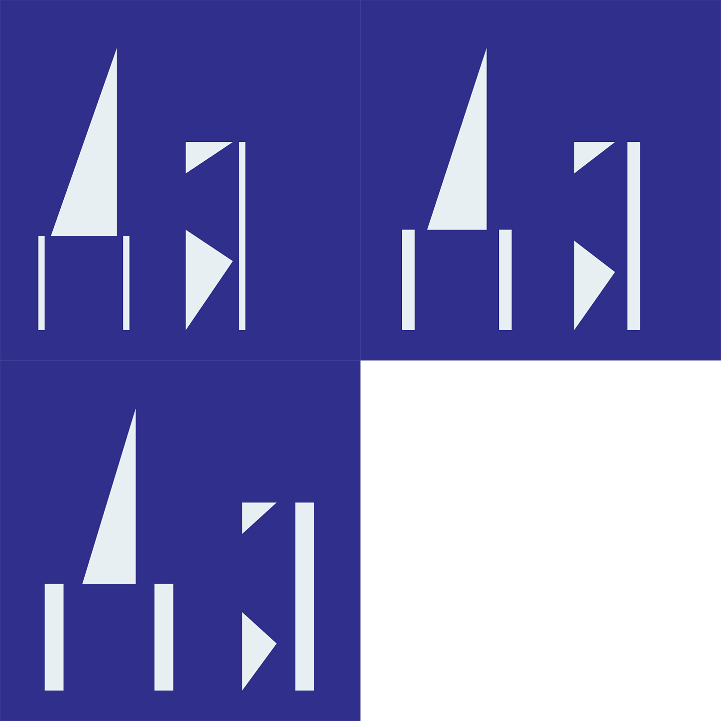
Benoît Bodhuin: Side A
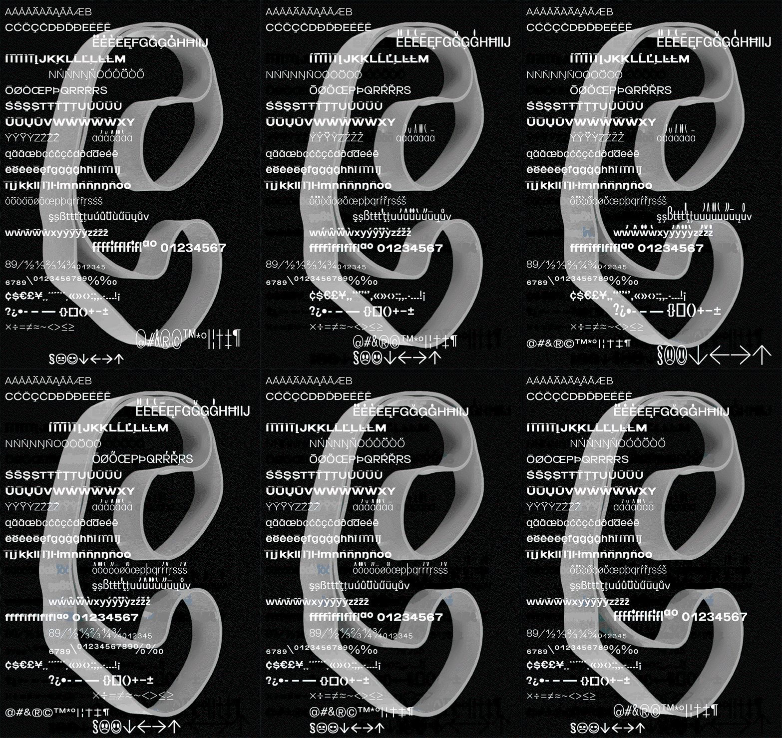
Benoît Bodhuin: Elastik
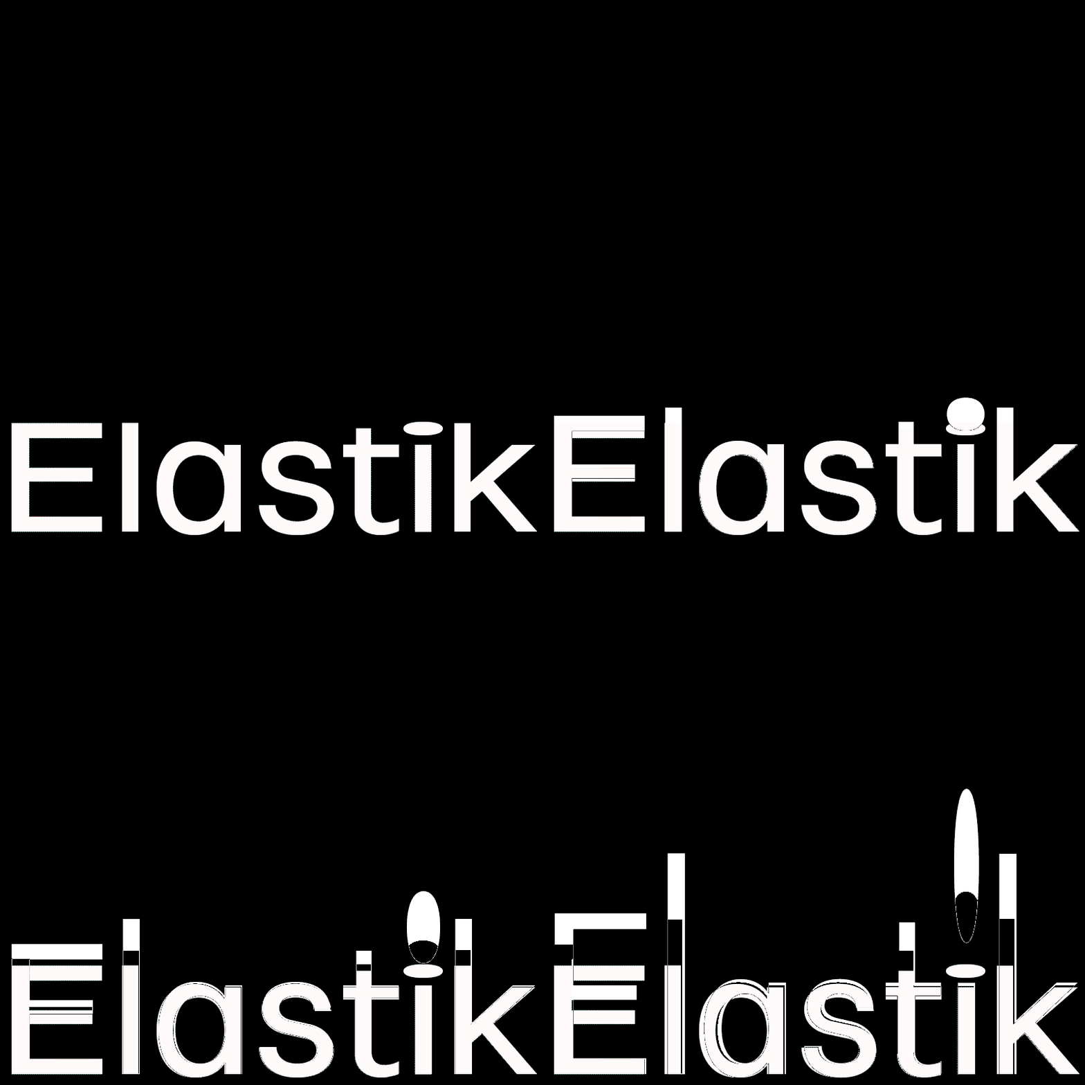
Benoît Bodhuin: Elastik
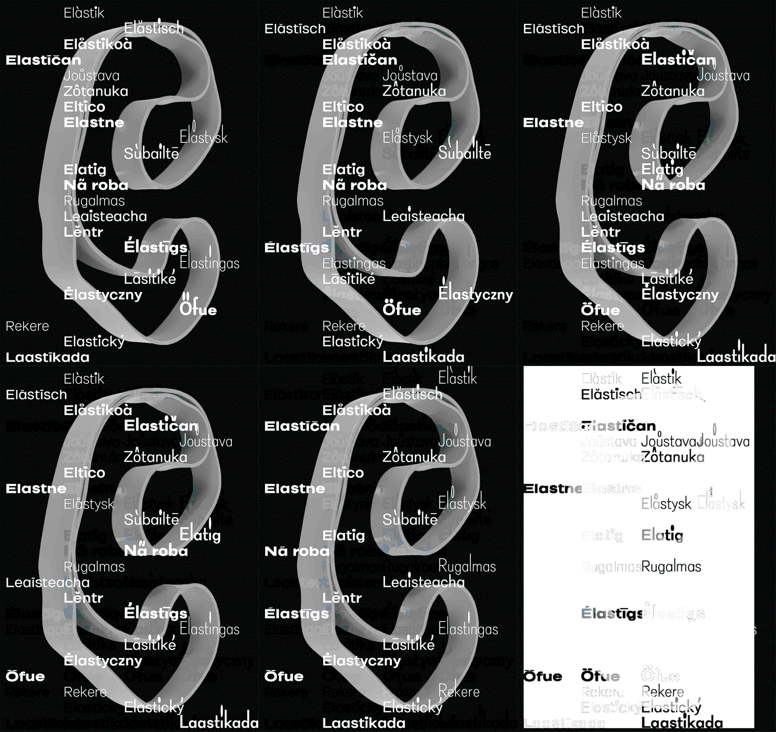
Benoît Bodhuin: Elastik
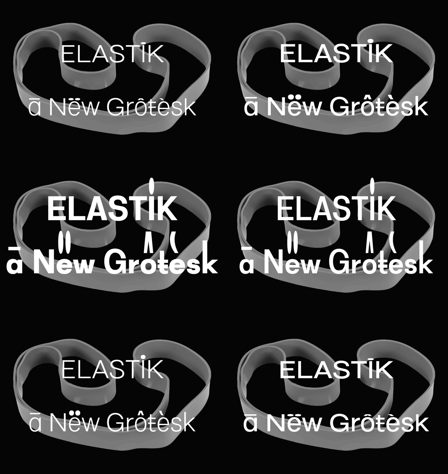
Benoît Bodhuin: Elastik
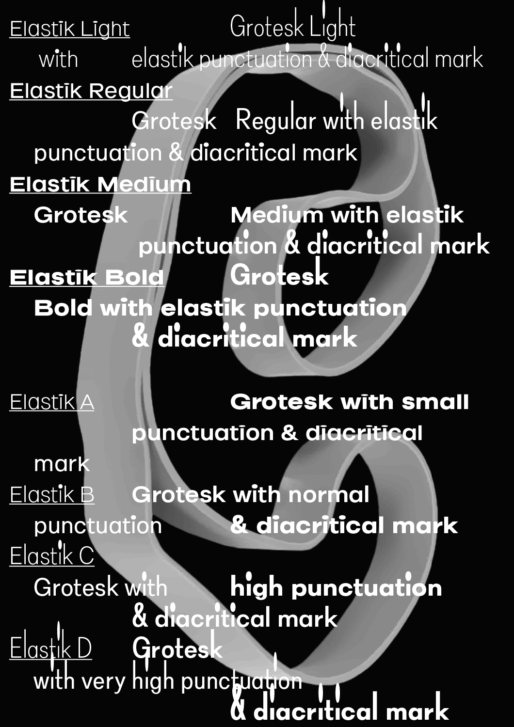
Benoît Bodhuin: Elastik
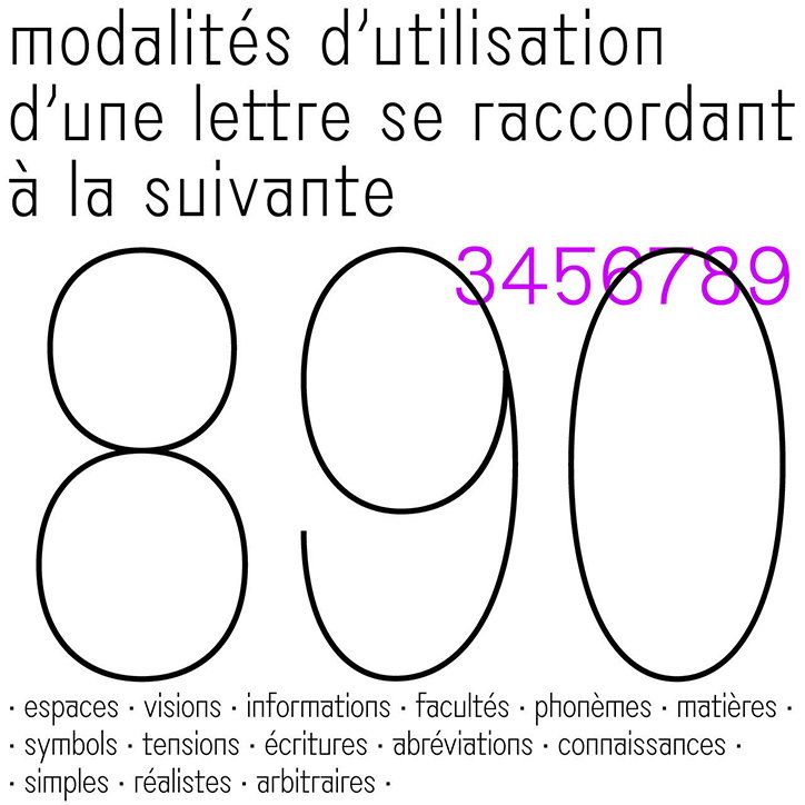
Benoît Bodhuin: Grotesk Remix
Benoît Bodhuin: Grotesk Remix
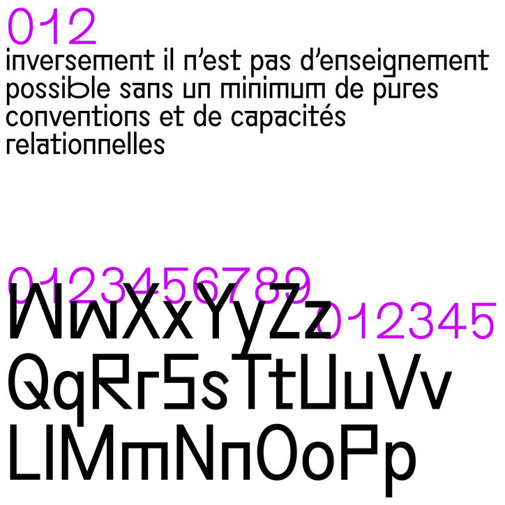
Benoît Bodhuin: Grotesk Remix
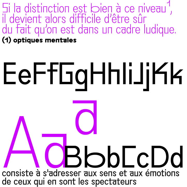
Benoît Bodhuin: Grotesk Remix
Benoît Bodhuin: Grotesk Remix
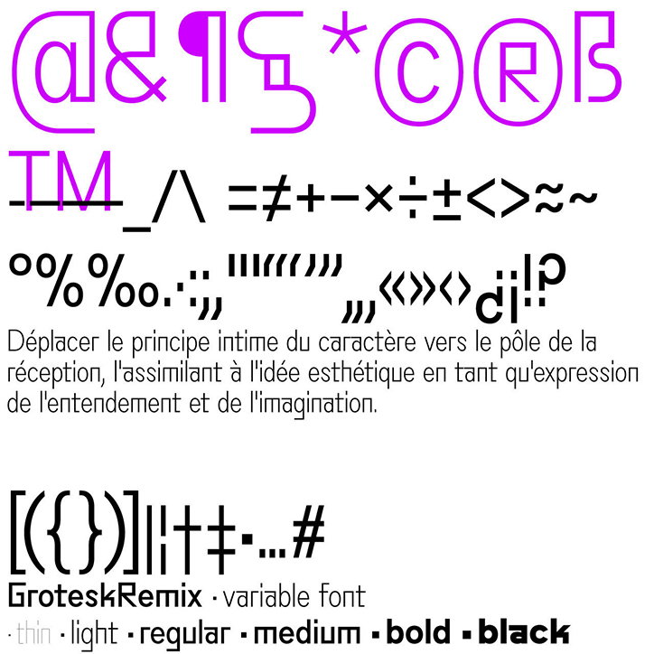
Benoît Bodhuin: Grotesk Remix
Share Article
Further Info
About the Author
—
Jynann joined It’s Nice That as an editorial assistant in August 2018 after graduating from The Glasgow School of Art’s Communication Design degree. In March 2019 she became a staff writer and in June 2021, she was made associate editor. She went freelance in 2022.