Claudia Van Eeden's work is one to be enjoyed, not analysed
With a joyful sense of humour, a love for the outdoors and lifelong knack for cheering people up with her drawings, Claudia's new book has us falling for Aus.
Share
Even when Australian artist Claudia Van Eeden was in primary school she had a reputation as a keen creative. Entwined in some kind of creative working as her “pa” owned a little artist supply store, she was lucky enough to always have some sort of artistic material within arms reach, known among her classmates as a fantastic turtle drawer with an impressive sticker collection to boot. But her creativity became something actively worth pursuing when she was a teenager, growing in confidence from the praise of teachers and peers, through to studying fine arts at university where “it became clear that my work had this smile inducing, witty language that was gaining recognition and shaping my identity as an illustrator,” she tells us.
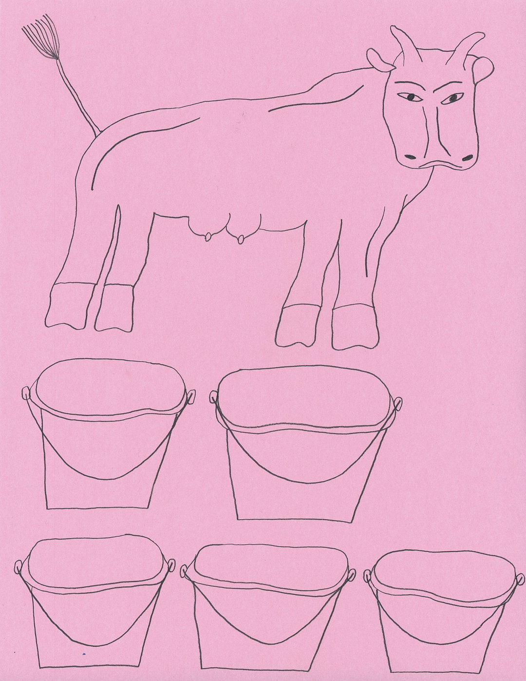
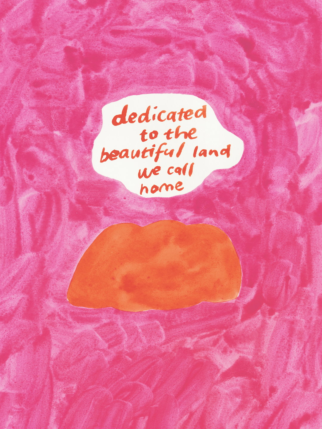
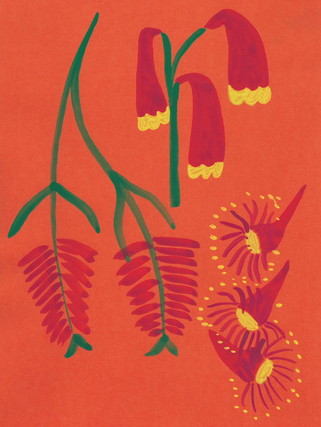
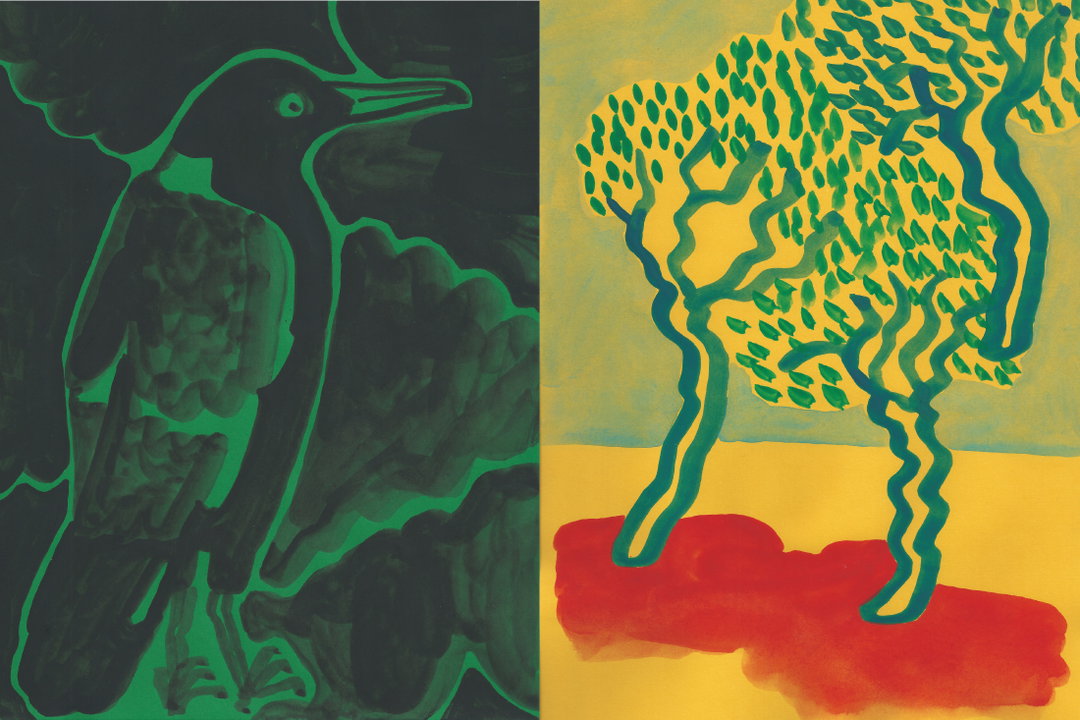
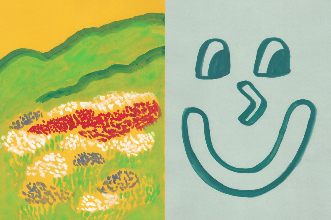
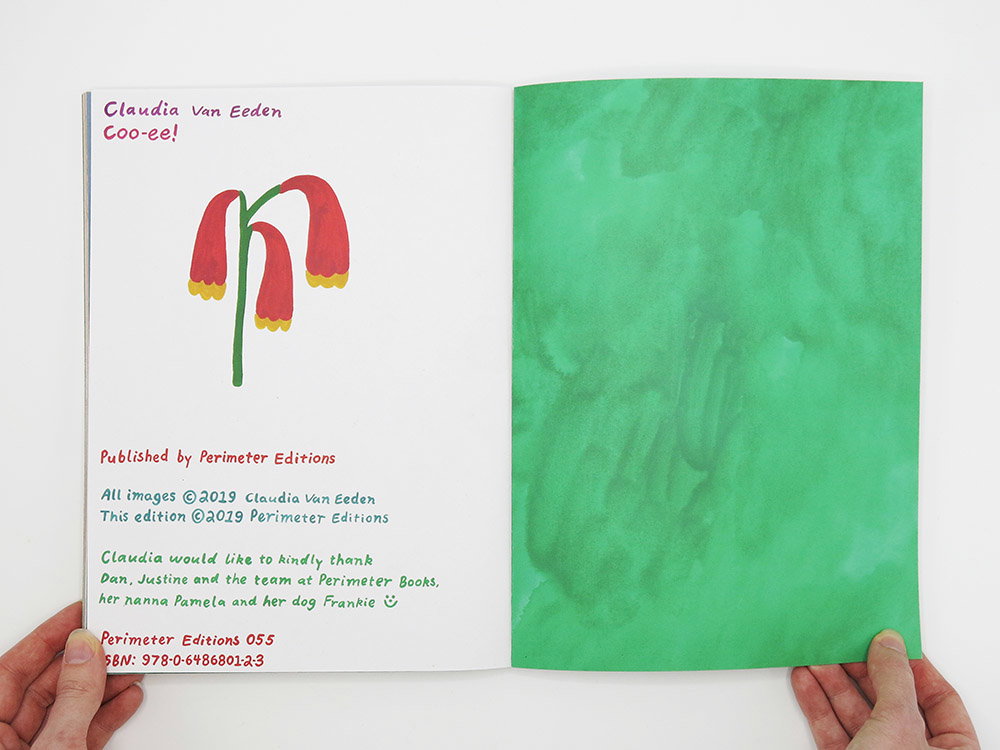
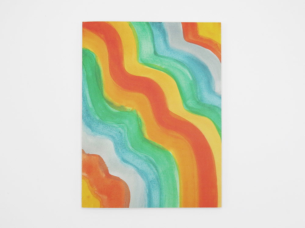
This hilarious character Claudia is able to channel into her works is best seen in Coo-ee, a new book published all about her home, Australia. A sort of visual love letter to the country, the book in particular displays a fondness for its wild environment, directly inspired by Claudia’s childhood again. “There is something about the countryside here that has found a really special place in my heart,” Claudia explains. “I had the best time growing up in the bush in rural Victoria, my family home was surrounded by hills, creeks and gumtrees and I spent my childhood days with my sisters and friends being cheeky bush kids.” This longterm love, coupled with an ever growing appreciation “of the flora and fauna” has come together within the publication, with the illustrator explaining how “the more I surround myself in this environment the more it becomes the content in my work.”
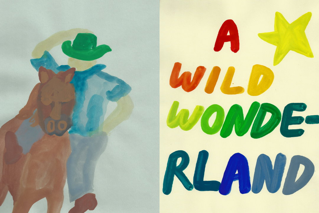
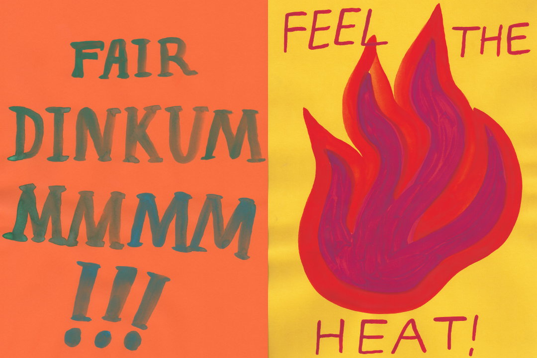
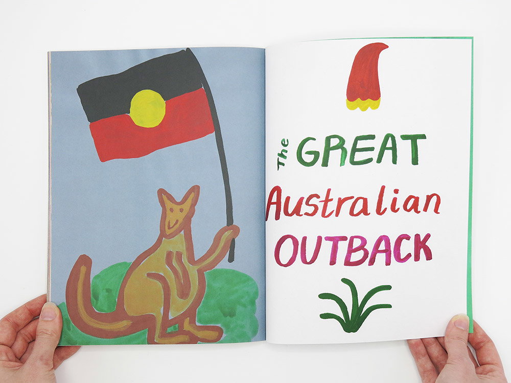
But aside from the beauty of the environment, as mentioned before, it's Claudia’s smart humour which is the real shining star in the book. “It is no secret that I like to make work that is witty,” she says on this note, “and a little bit cheeky.” But this too is linked back to her heritage and home, explaining how “there is a lot about this country that amuses me, in particular our slang,” she says. “My dad impressively uses terms like ‘fair dinkum’ and ‘bloody oath’ in almost any conversation and I catch myself using the slang more often than I’d like to admit. Sometimes I’m unsure if I’m being ironic or whether this nonsensical language has become second nature.” Therefore it was only natural that Coo-ee would “adopt this playful banter” additionally allowing the illustrator to present “my interpretation of Australiana without appearing to be overly patriotic” too. “I hope readers recognise the harmony of humour and sensitivity within Coo-ee as it exposes a lot about my identity as an illustrator.”
Claudia Van Eeden: Coo-ee
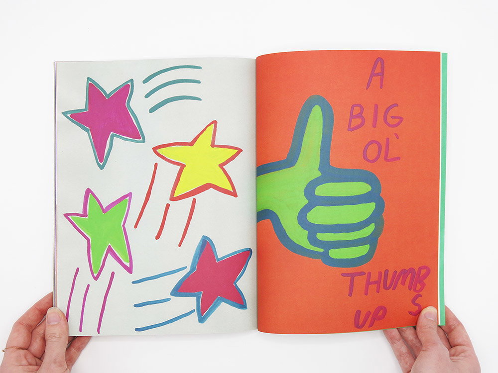
Within this identity is a measured approach to actually creating work too, somehow putting a hell of a lot of attention in her works but also keeping hold of a carefree air too. “The work that I make has always been cheerful and purely complicated in content” she says, describing her work in a refreshingly perfect way as “pictures to be enjoyed before analysed”. Again, harking back to her childhood when discussing this with us, Claudia continues that: “There was this honestness in the way that I made art when I was a kid that I find myself constantly drawn back to.” When it comes to details, Claudia admits she never seems to “tire of primary colours and always works with a joyful palette,” often adopting a speedy approach working “quickly and intuitively”. A material which lends itself well to this approach for the artist is oil pastels where colours can appear vibrant “and if you make a mistake you cannot correct it,” she explains. “Sometimes I will draw the same picture five times, and almost always the first attempt is my favourite, maybe because of its sincerity.”
The result, in the case of Coo-eee, is a book which is able to display a visual narrative within little writing at all. It has a scrappy approach and feel too (but in the best possible way) largely due to Claudia not setting any limits on herself or her approach while the book was in motion. For instance, size was never a consideration – “which eventually got me into trouble when I had to collate everything into one format” – meaning some teeter off the sides of pages too. “I painted anything and everything that reminded me of home and I painted on any paper I could get my hands on.”
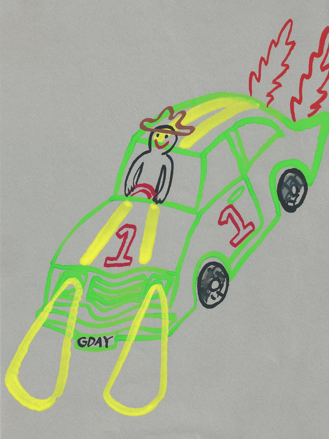
Overall it’s one particular painting of a character “wearing an Akubra driving a flaming race car with a license plate that reads GDAY” which sums up the determined the spirit of Coo-ee. A favourite of the illustrators, as well as ours, Claudia concludes that she hopes the works “will put a smile on your face, make you chuckle and maybe even trigger a special memory about your home,” she says. “But, most importantly, I wanted to bring the beauty of the environment and its wildlife to our attention so that we are more conscious to show it the love it deserves.”
GalleryClaudia Van Eeden: Coo-ee
Share Article
Further Info
About the Author
—
Lucy (she/her) was part of the It’s Nice That team from 2016–2025, first joining as a staff writer after graduating from Chelsea College of Art with a degree in Graphic Design Communication, eventually becoming a senior editor on our editorial team, and most recently at Insights, a research-driven department with It’s Nice That.