




CSTM Fonts is making up for lost time with Cyrillic typefaces
The pair is creating unique fonts used for everything from news to way finding.
Share
Yury Ostromentsky and Ilya Ruderman were in a unique position when creating their type foundry in Russia, and that was because they were pretty much the only people doing it.
“It was a rather neglected area of design back then in Russia, with just a couple of enthusiasts in the field,” Ilya tells It’s Nice That. “It was quite challenging to even find the information you needed, or a person who could help.”
Unlike the Latin alphabet, Russia wasn’t blessed with a plethora of type choices. “In the Soviet Union we had roughly 36 typefaces — with all the rest happily spent on our state’s military purposes,” says Yury. “Therefore we were left with nothing more than one typeface for newspapers, one for magazines etc. We all know too well that now and then a person needs something other than that: like some sex, once in while — and a bit of rock’n’roll, occasionally. All things nice, you know.”
The pair met whilst studying at Moscow State University of the Printing Arts, and were united by an interest in type that was ignited by their tutelage from Alexander Tarbeev – to whom they are both incredibly grateful to this day.
Apart from Tarbeev, there were very few people trained in creating Cyrillic typefaces, which led the pair to take on the burden themselves. “We finally had to admit the fact that there was literally no one but us that could create this CSTM Fonts foundry – so, yet again Ilya and me had to do everything by ourselves,” says Yury.
Having both gone on to do different things after university (Ilya in art direction and Yury in publishing), it was a return to what they loved, and was something they worked day and night to make happen.
CSTM Fonts
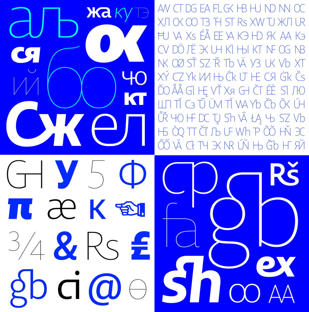
With so little having been done in the field before them, we ask where there are gaps to be filled. “They are literally everywhere,” replies Ilya. “In fact, whatever you do in Cyrillic will most likely be a new thing. While the Latin market is very rich and competitive, the Cyrillic market is new and scarce — thus enabling you to express yourself. The variety of fonts is a hundred times less, which means we all still have a lot of things to do!”
At the moment Ilya is based in Barcelona, whilst Yury is still in Moscow, however, they have not let this affect their creative process and continue to work collaboratively. “Each project is different but in most cases we work together, offering a bunch of independent options in a sketching stage,” says Ilya. “We then continue working together in production, helping and checking up on each other.”
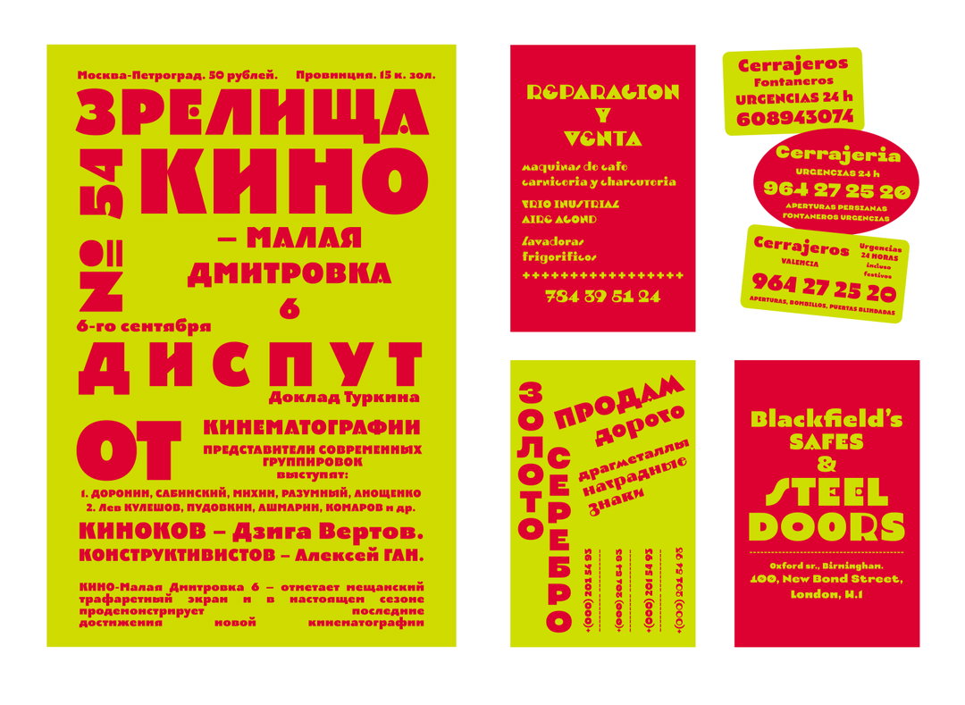
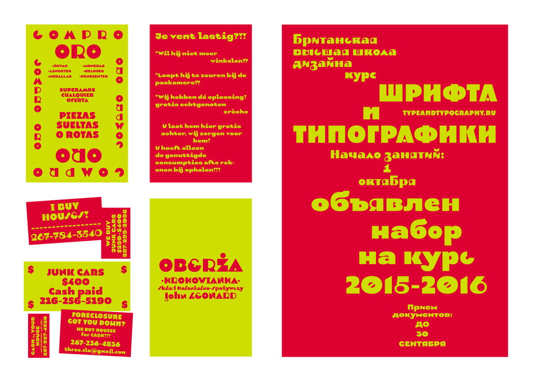
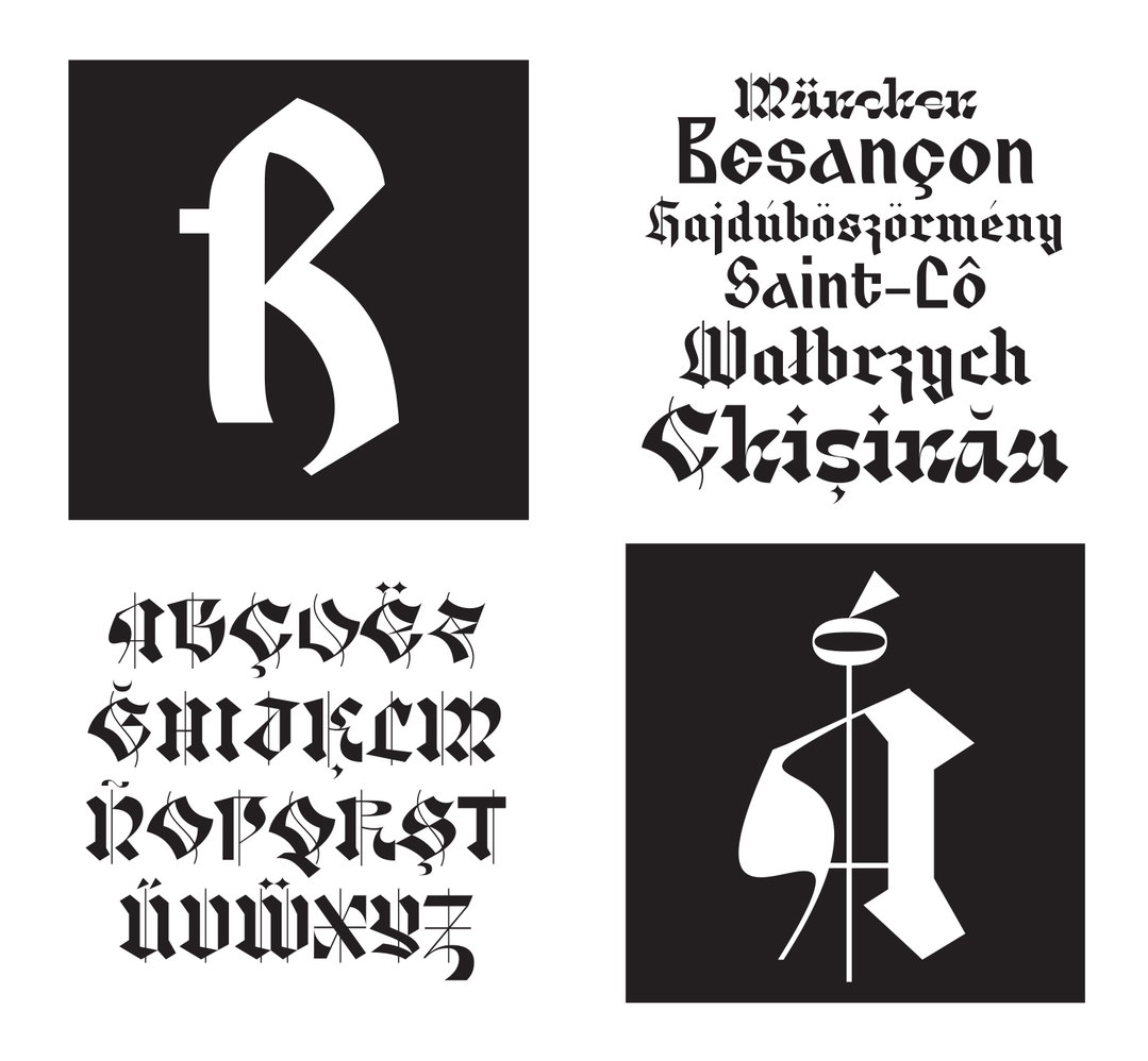
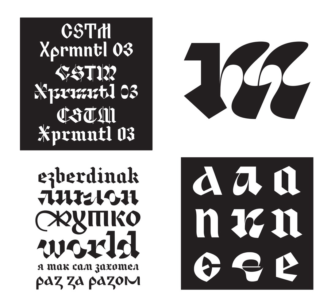
Their practice at the moment is admittedly varied, with most of their time spent on custom typefaces, as well as a small retail collection. The eclectic mix of fonts they have produced is demonstrated by the fact they both have completely different ideas as to which are their favourites. For instance one of Yury’s favourites is CSTM Xprmntl 01-03: “Those are experimental fonts. Yet, rather quirky ones. I intentionally assign a weird, seemingly unnecessary task to myself, that then leads the experiment to its final results all by itself.”
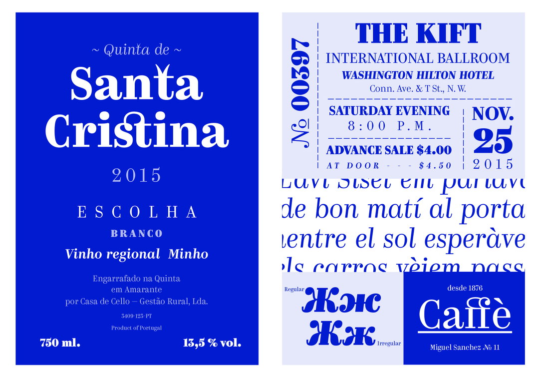
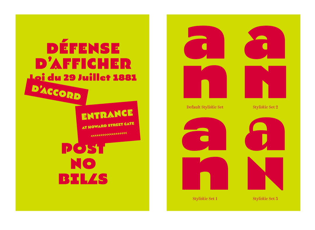
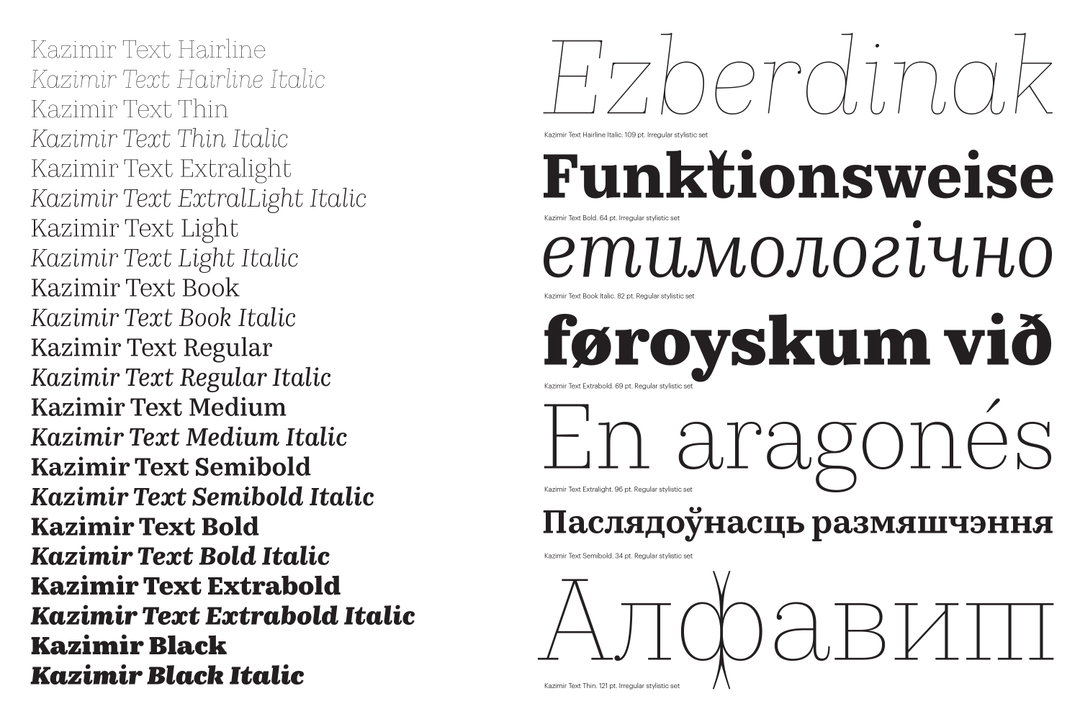
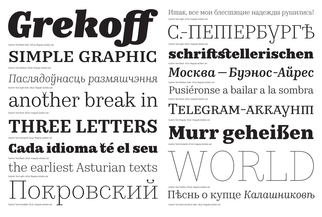
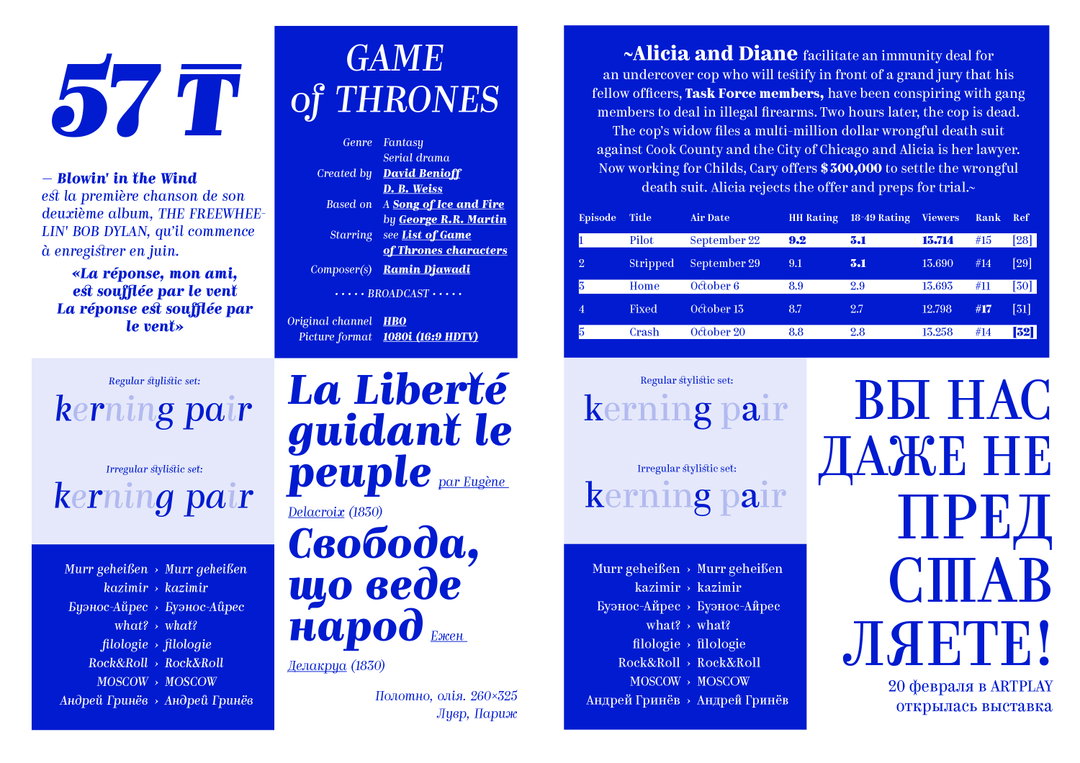
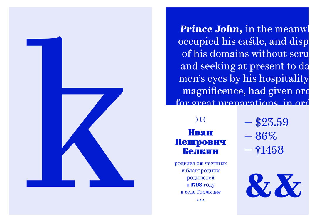
Ilya, on the other hand, speaks of one of their best-known typefaces, Kazimir: “It’s some sort of re-thinking of the Russian typography from the early 20th Century, with a stylistic collection of errors and flaws one can find in those materials.”
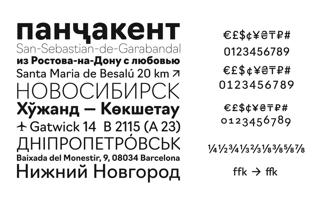
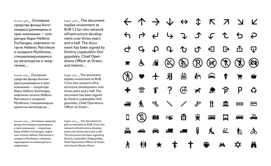
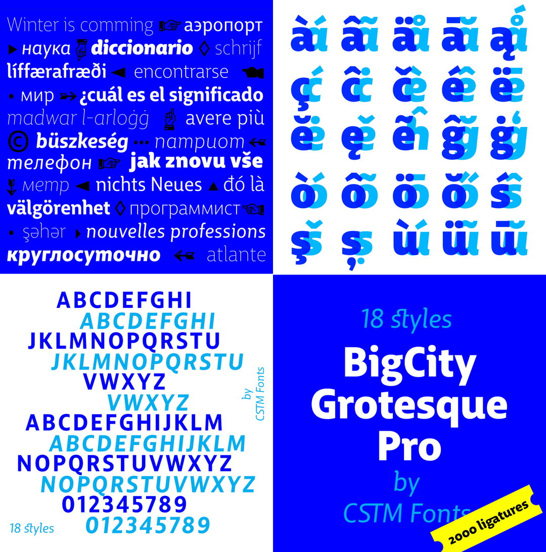
Their typefaces have found a variety of functions across many industries, creating customs for organisations as large as RIA Novosti (Russia’s former state news agency), as well as a custom wayfinding project for Moscow City District.
What was ultimately their passion as students has now been converted into a full-time job, and with their client list continuing to grow and their type selling platform in place, it is all going rather well. This is not by accident though, and just like in the past, they are still seemingly devoting their life to the craft:
“We design our fonts with pens on paper, with pencils on napkins, or using our computers,” says Yury. “We are doing type in the mornings and at nights, before breakfast and when the party’s over, on the road and on sick leave, at work and on the train...”
GalleryCSTM Fonts
Hero Header
CSTM Fonts
Share Article
About the Author
—
Charlie joined It’s Nice That as an editorial assistant in December 2019. He has previously worked at Monocle 24, and The Times following an MA in International Journalism at City University. If you have any ideas for stories and work to be featured then get in touch.


