Social geography, identity and elements of hauntology pervade graphic designer George Dutton’s portfolio
The Hong Kong-based designer recently graduated from the RCA and harbours a love for all things print.
Share
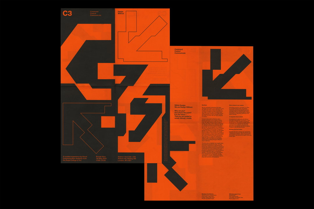
For recent RCA graphic design grad George Dutton, research and the concept that emerges from that research informs everything. “I have a strong belief that all projects should be grounded in strong in-depth research and exploring how that research manifests itself in the creative decision-making process,” he explains. “I believe that the concept should inform the aesthetics of the project, constantly questioning the intent behind those decisions.” This often manifests as printed matter but occasionally the designer strays into moving image or installations.
George’s love of design and the publishing world stems from a love of music, CD and record packaging, gig posters and music videos. Half English, half Chinese and born and raised in Hong Kong, where is he is now also based due to the pandemic, many of these were inaccessible to George growing up. He, therefore, consumed through the internet, coveting music blogs and outlets such as Boiler Room. “I particularly took a liking to the stylistics of record labels such as Mo’ Wax, Ninja Tune and Warp,” he recalls. His proclivity for all things printed can also be traced to his years collecting music and records, telling us, “I think it’s the tactility of the medium that particularly draws me towards it.”
An ongoing project of George’s which allows him to experiment within publishing is titled Value. It sees him recreating the same visual essay in “increasingly more valuable forms of publishing.” Issue one took the form of a leaflet, issue two Risograph posters, issue three a zine and the most recently released issue four was a more formal, professionally-published publication. At the project’s core, George is “questioning our perception of value, whether beauty and prices of production increase the perceived value of an object.”
In recent times, the audience’s perception of his work has become more important to his practice, he also tells us. “I have become engaged with how the nature of the communication of my work relates to its intended audience and also questions how this engagement with an audience enhances the project’s narratives and understanding.” Other themes which often arise include “the study of social geography, identity and elements of hauntology,” with George describing his practice as sitting somewhere between art, design and architecture.
GalleryGeorge Dutton: Value
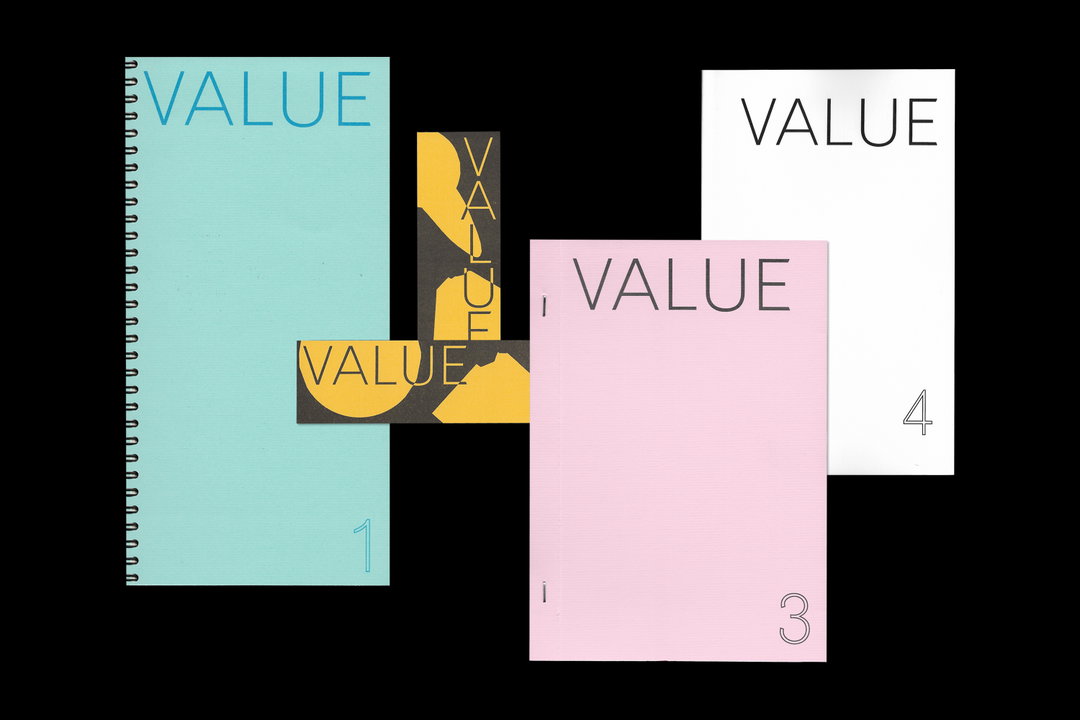
Issue #1—4 (Copyright © George Dutton, 2019)
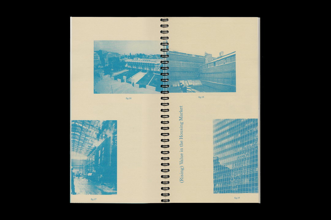
Issue #1 (Copyright © George Dutton, 2018)
Issue #2 (Copyright © George Dutton, 2019)
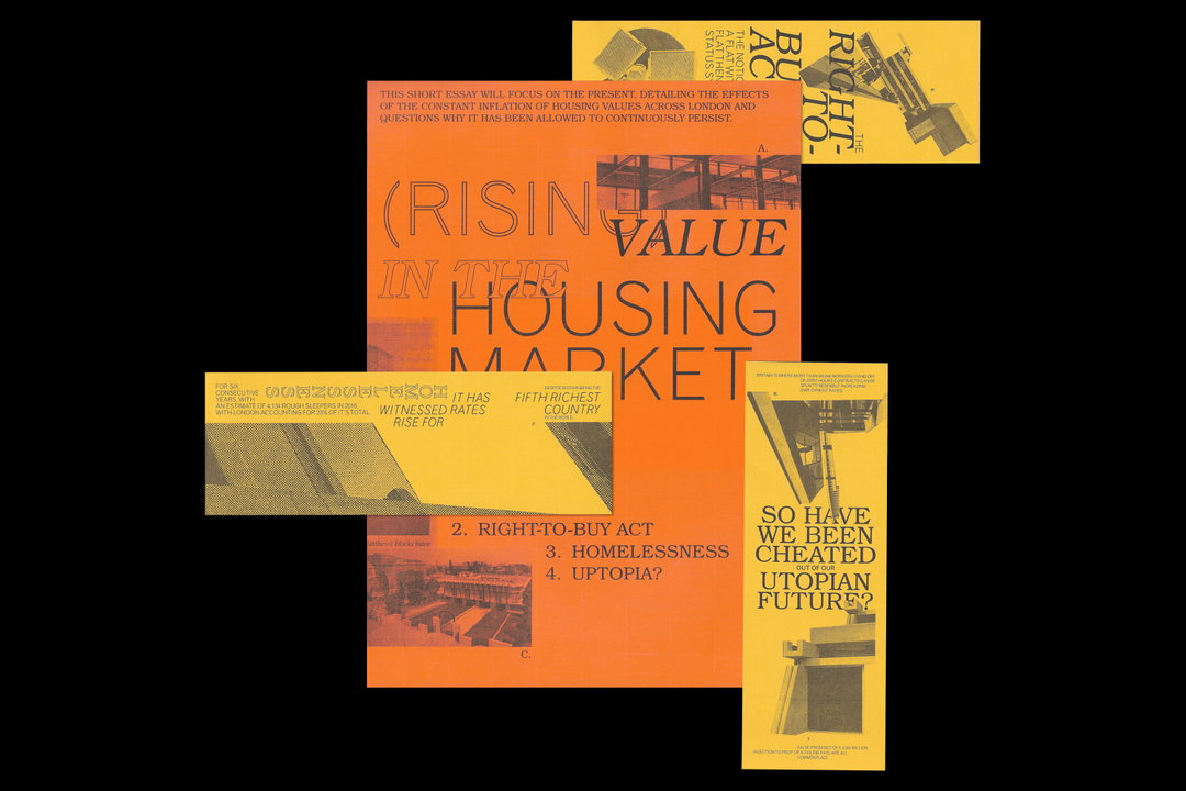
Issue #2 (Copyright © George Dutton, 2019)
Towards the end of his time at the Royal College of Art, George took on designing the visual identity and online platform for the 2020 degree show, in collaboration with two other students; Philip Veech and Sean Steed. “Our primary aim was to capture the diversity, creativity and hybridity of the RCA’s community in 2020,” George explains. “This was intended to be achieved by organising a series of cross-college workshops to create an identity that was inclusive and collaborative.”
The trio held workshops across February and March, where students were invited to draw a “2” or a “0”, generating an extensive catalogue of forms which would suffuse the final outcome. Instead of allowing free rein, participants were given a set of stencils containing a series of modular shapes. “This toolkit allowed for the outcomes to carry consistency in visual language, whilst showcasing a variation and individuality across the various departments and students,” George continues.
When the pandemic hit, as with countless projects, their initial intentions had to be altered as they could no longer host workshops. What did not change though, was the trio’s want to visually represent the diverse identity of the student body. Able to analyse many of the outcomes from the workshops they did hold, they extrapolated and expanded them “into typographic elements to create the four stylistically distinct type families.” Each of the styles “represents a school within the RCA – Architecture, Arts and Humanities, Communication and Design.” What George, Philip and Sean have created is a visually engaging identity which emerged from an interesting exercise in participatory design. It embodies all of the tenets of this facet of design in the fact that the visuals are a product of the very group involved in making them, conceptually and aesthetically. Without group engagement, the identity would not exist.
Reflecting on the project from his perspective, George has learned how to adapt to an increasingly digital creative landscape, a panorama which is sure to only extend further with the current state of the world. Despite this, he holds true his desire to work within the artistic sector of design, “be it to do with the visual arts or music, or with the realm of independent art publishing which particularly excites me.”
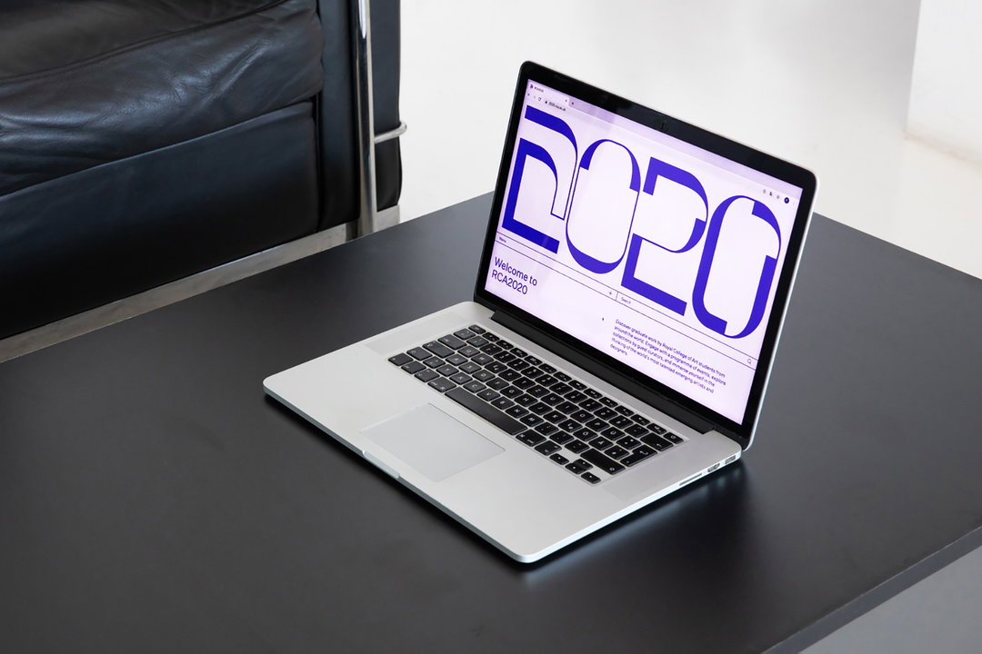
George Dutton, Philip Veech, Sean Steed: RCA2020 (Copyright © George Dutton, Philip Veech, Sean Steed 2020)
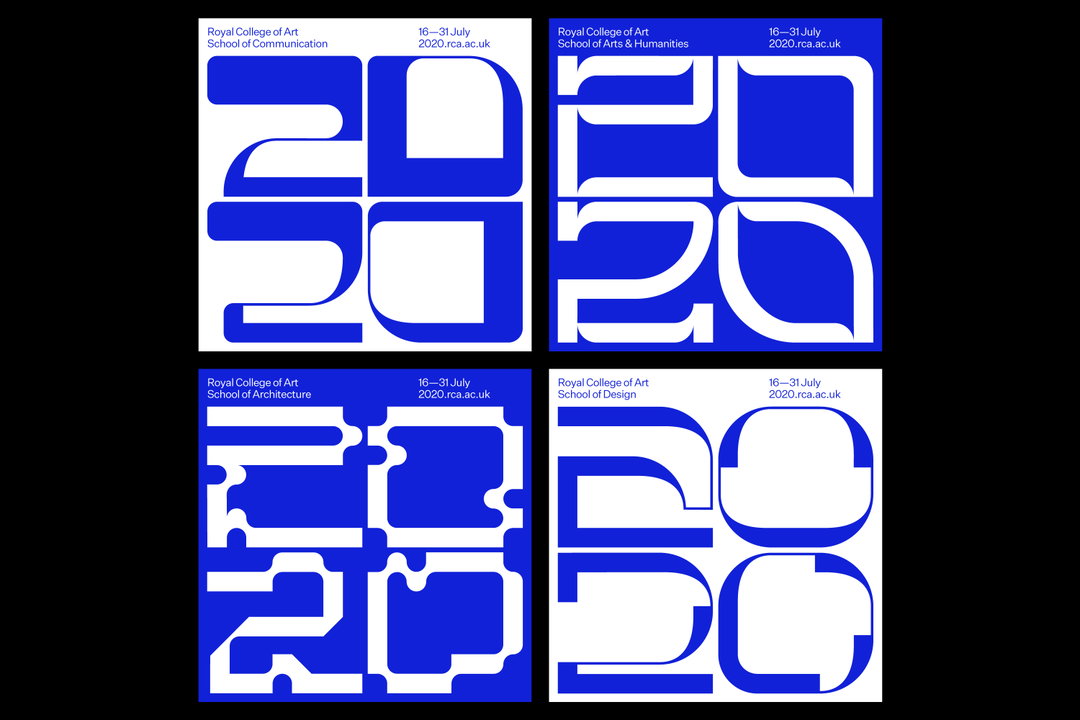
George Dutton, Philip Veech, Sean Steed: RCA2020 (Copyright © George Dutton, Philip Veech, Sean Steed 2020)

George Dutton, Philip Veech, Sean Steed: RCA2020 (Copyright © George Dutton, Philip Veech, Sean Steed 2020)
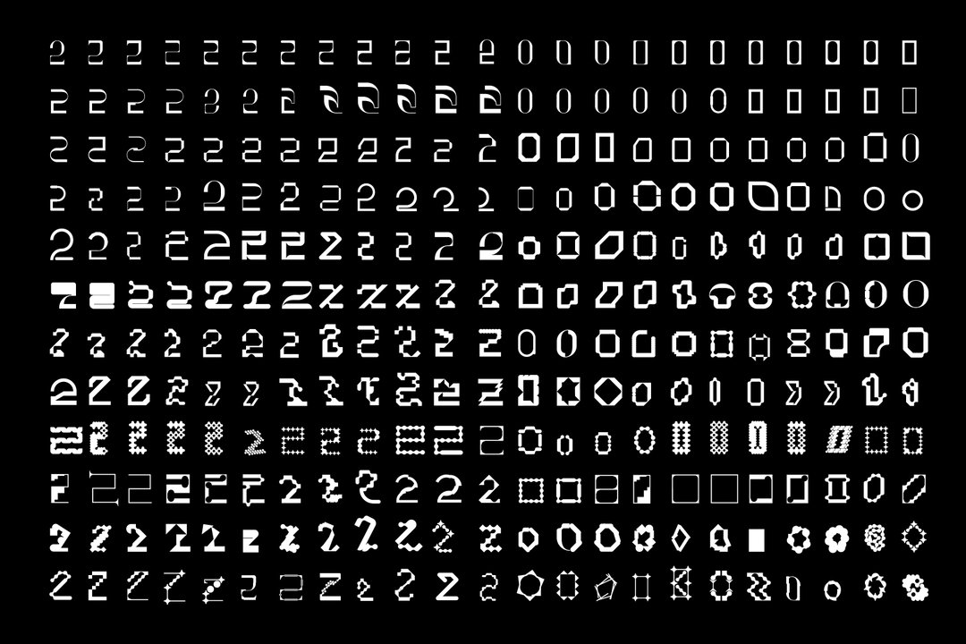
George Dutton, Philip Veech, Sean Steed: RCA2020 (Copyright © George Dutton, Philip Veech, Sean Steed 2020)
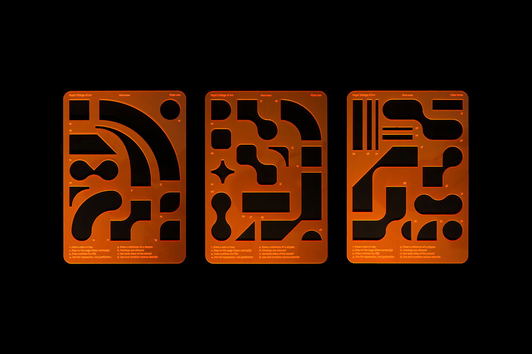
George Dutton, Philip Veech, Sean Steed: RCA2020 (Copyright © George Dutton, Philip Veech, Sean Steed 2020)
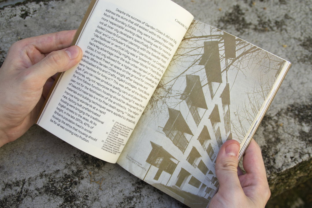
George Dutton: Concrete Gold (Copyright © George Dutton, 2020)
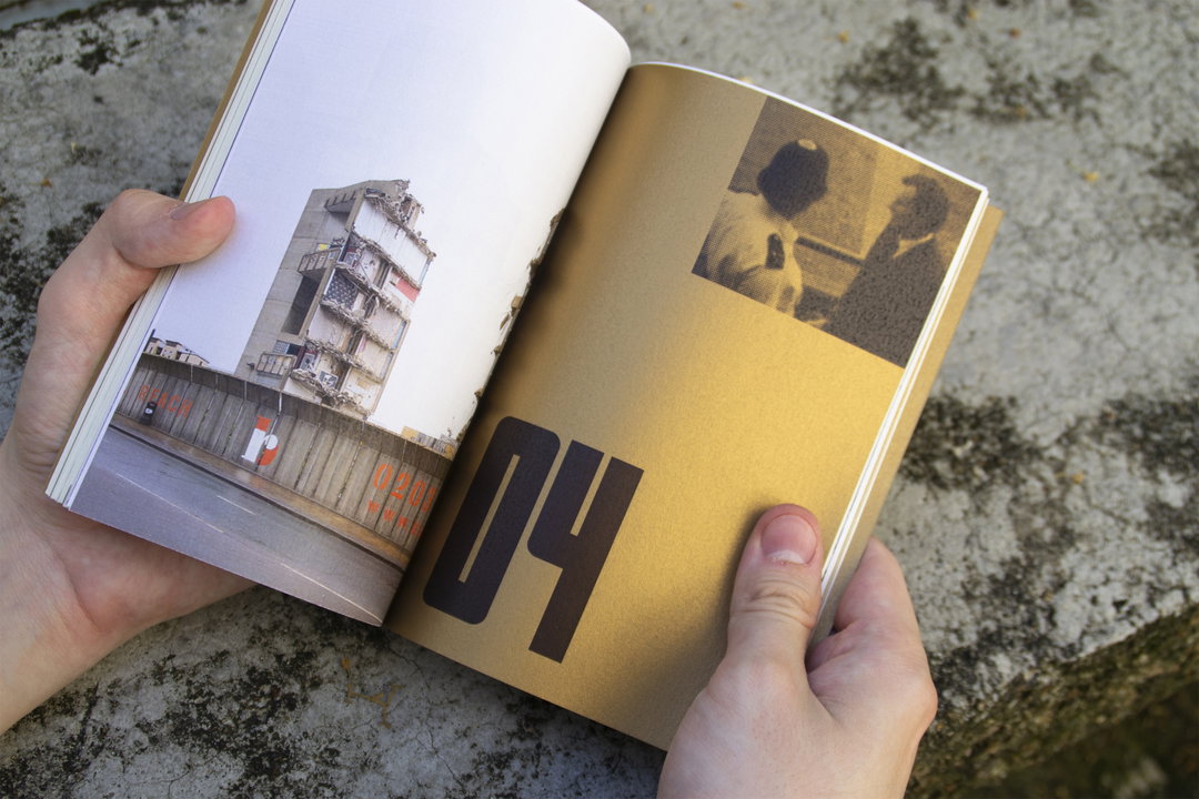
George Dutton: Concrete Gold (Copyright © George Dutton, 2020)
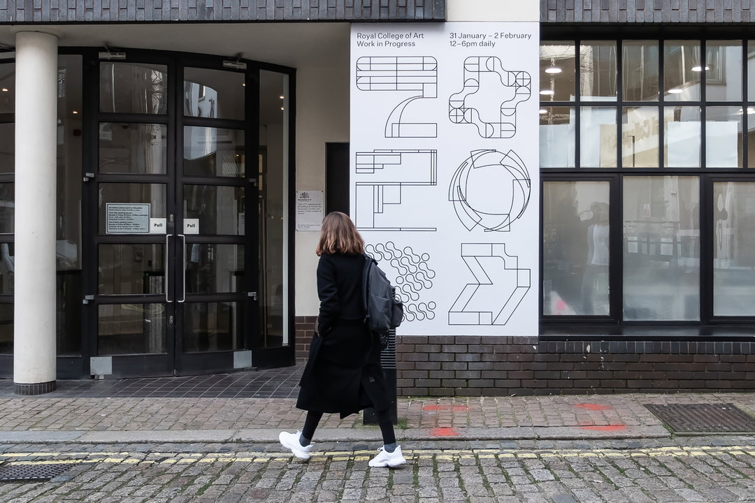
George Dutton, Philip Veech, Sean Steed: RCA2020 (Copyright © George Dutton, Philip Veech, Sean Steed 2020)
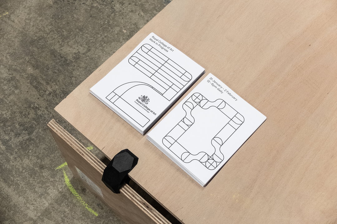
George Dutton, Philip Veech, Sean Steed: RCA2020 (Copyright © George Dutton, Philip Veech, Sean Steed 2020)
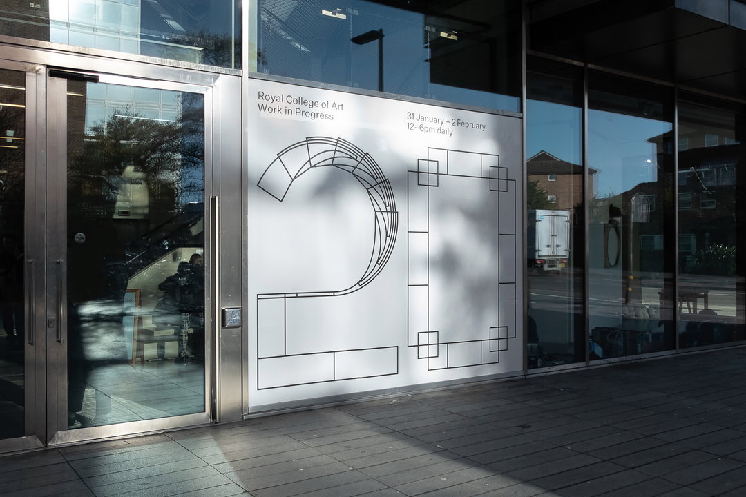
George Dutton, Philip Veech, Sean Steed: RCA2020 (Copyright © George Dutton, Philip Veech, Sean Steed 2020)
Share Article
Further Info
About the Author
—
Ruby is Senior Creative at It's Nice That, overseeing our visual output across platforms and projects. Before that, she was associate editor on the editorial team, after joining in September 2017 following graduation from Central Saint Martins.