Giliane Cachin’s complex designs are based on sets of data
From her Zürich-based studio, the designer gives us an insight into her thoroughly researched and carefully considered practice.
“I am always very attracted to visuals that exhibit a certain complexity”, begins graphic designer Giliane Cachin, “such as architecture plans, model construction manuals, passport security patterns, geographical maps, or the Rosetta Project time capsule.” This sourcing of inspiration from such a broad range of discipline and visual material, Giliane expands, is rooted in her desire to test and try the limits of her creativity: “The idea of having to arrange as much information as possible in a defined space appeals to me and I love when this kind of challenge is presented to me.”
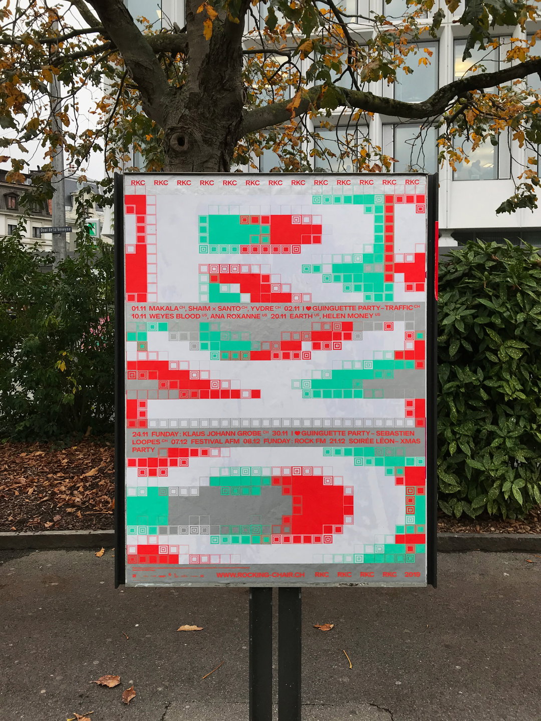
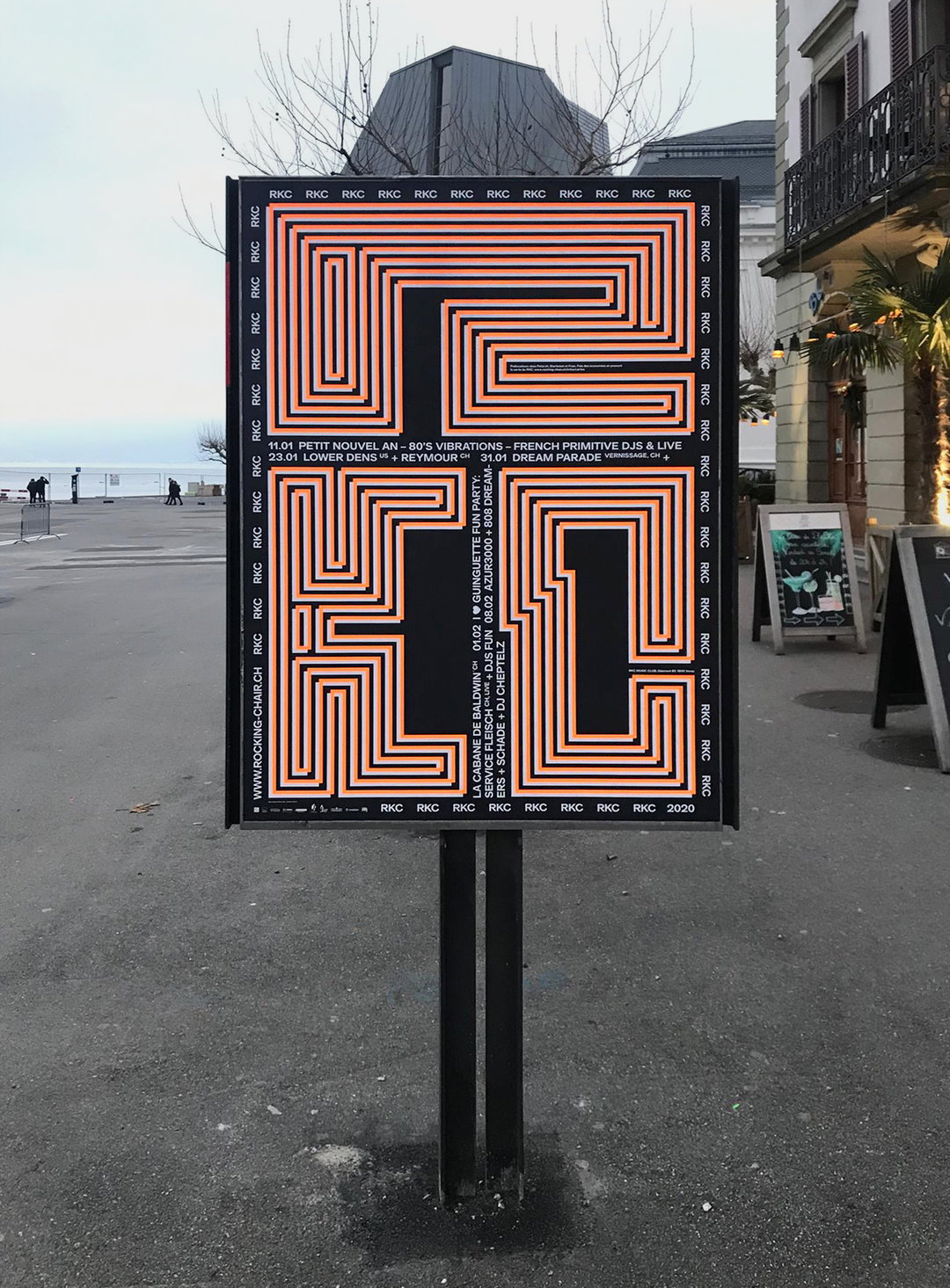
It is this focus on complexity that leads into one of the defining facets of Giliane’s work – her use of pattern. The vast majority of Giliane's projects are defined by their busy, overcrowded aesthetic, and the designer's real skill lies in her intuitive ways of making these pieces make sense. This approach is apparent in her posters for the RKC concert hall in Switzerland. Close up, the posters look like a pleasing, yet slightly incomprehensible set of dense patterns; it is only upon moving further away from the posters that you begin to see the outline of the letters 'R', 'C' and 'K' emerge. In creating work that changes in front of the viewers' eyes, Giliane crafts a truly multi-faceted visual experience.
Giliane Cachin: RKC–November 2019 (Copyright © Aurélien Haslebacher, 2019)
Perhaps the most stark visual comparison throughout Giliane’s body of work is how much it looks like sets of data. This, the designer explains, is very intentional, as she details that “basing an image or layout on specific data keeps me from wondering why I’m making this visual over another. The field of possibilities is reduced and I find that often the more the field is reduced and the stricter the parameters, the more creative I can be.” It is this approach that served Giliane well when designing a specimen for Maxitype. Beginning by comparing the designed typeface – titled Selecta – with other influential typefaces, Giliane tells us that she enjoyed the process of dissecting all the data she could find to generate several corresponding visuals. This project also aligns closely with Giliane’s thoughts behind type design: “I like the idea of type design in the sense of creating your own tool, but it's important to me to know why I’m designing a font and how exactly I want to use it.”
But, Giliane also isn't afraid to delve into designs outside of her complicated comfort zone. Her designs for the Photoworks Festival focused on creating a box containing the content that the festival would have presented if it had not been cancelled due to Covid. Working “very literally” the box was filled with proposals for scenography, cartels and explanations of the work. And, whilst still showing elements of Giliane’s style, with geometric shapes and angular edges, the more minimalist block colour and restrained use of pattern demonstrates the designer's ability to look outside of her typical creative approach and create work that effectively fits the brief, whilst still adding elements of her personal touch.
Seemingly always in pursuit of innovation, during one of the recent lockdowns Giliane began “creating sorts of graphic compositions in sewing”, as a result of a number of cancelled projects,. With this in mind, looking to the future, the designer tells us that, “I think the next step I’m trying to achieve is to find a certain harmony in my work rhythm that would allow me, alongside my studio projects, to have time to experiment with new techniques.”
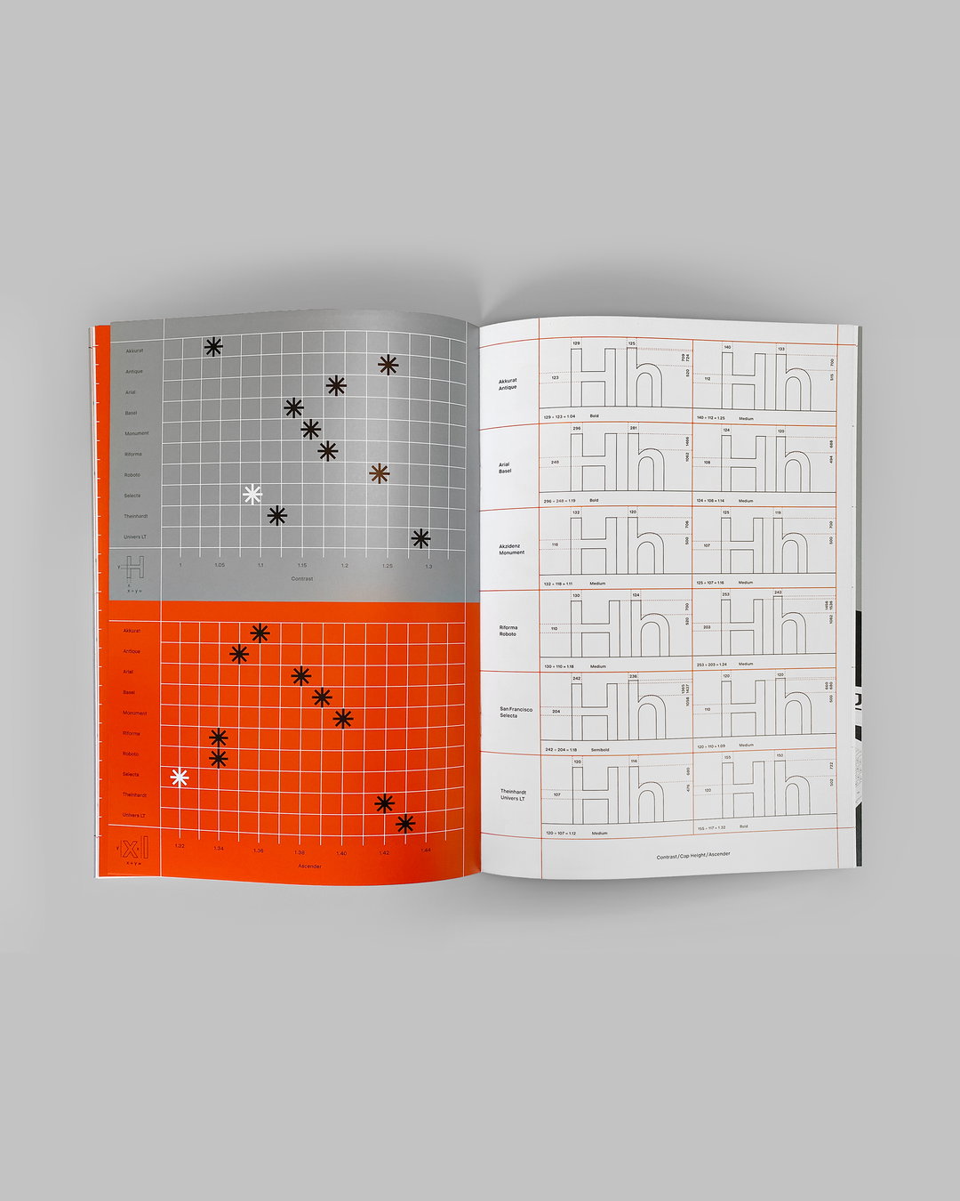
Giliane Cachin: Selecta Specimen–Maxitype (Copyright © Giliane Cachin, 2022)
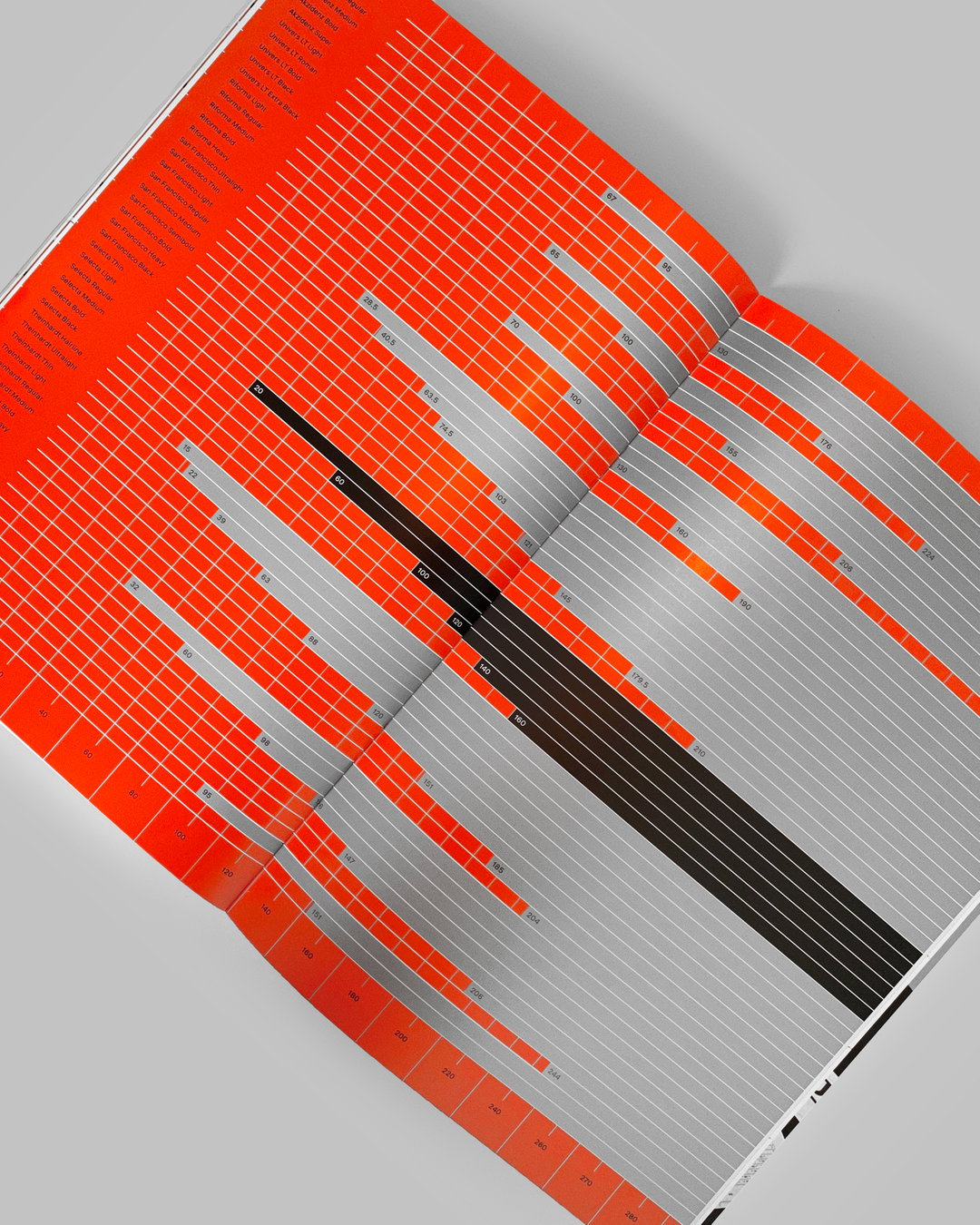
Giliane Cachin: Selecta Specimen–Maxitype (Copyright © Giliane Cachin, 2022)
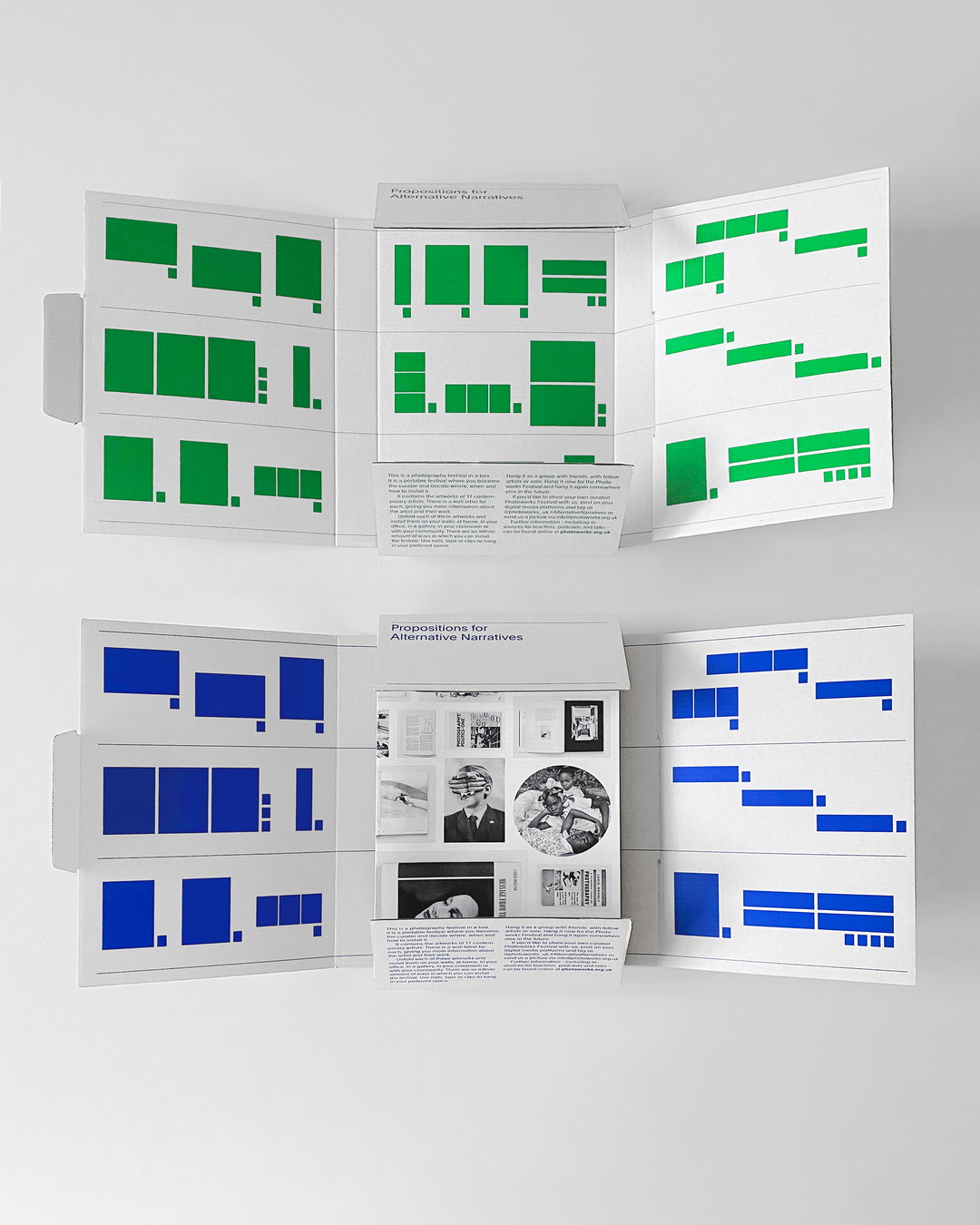
Giliane Cachin: Photoworks (Copyright © Giliane Cachin, 2020)
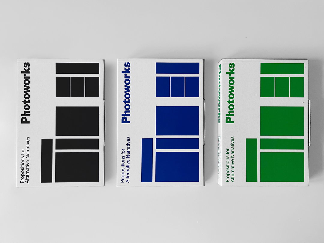
Giliane Cachin: Photoworks (Copyright © Giliane Cachin, 2020)
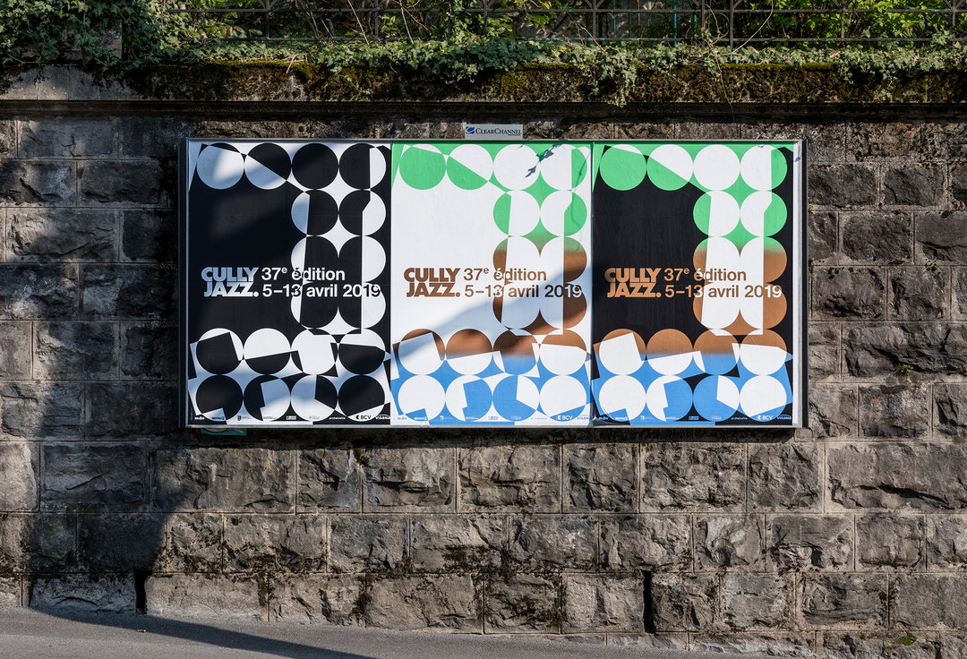
Giliane Cachin & Alice Franchetti: Cully Jazz Festival 2019 (Copyright © Étienne Malapert, 2019)
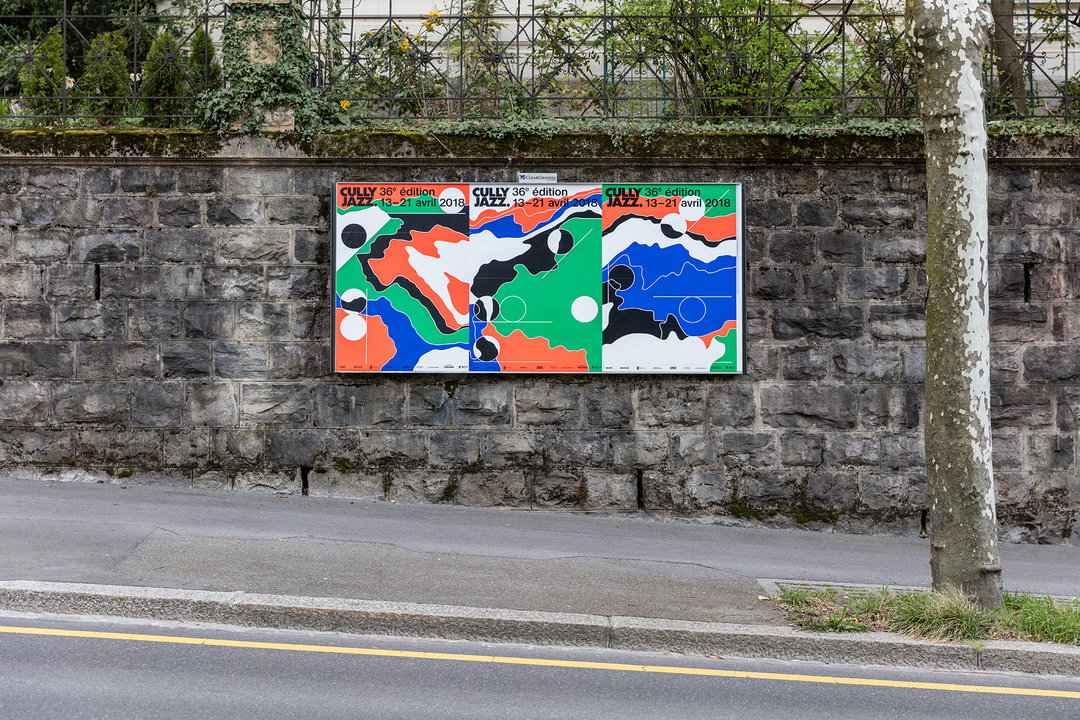
Giliane Cachin & Alice Franchetti: Cully Jazz Festival 2018 (Copyright © Étienne Malapert, 2018)
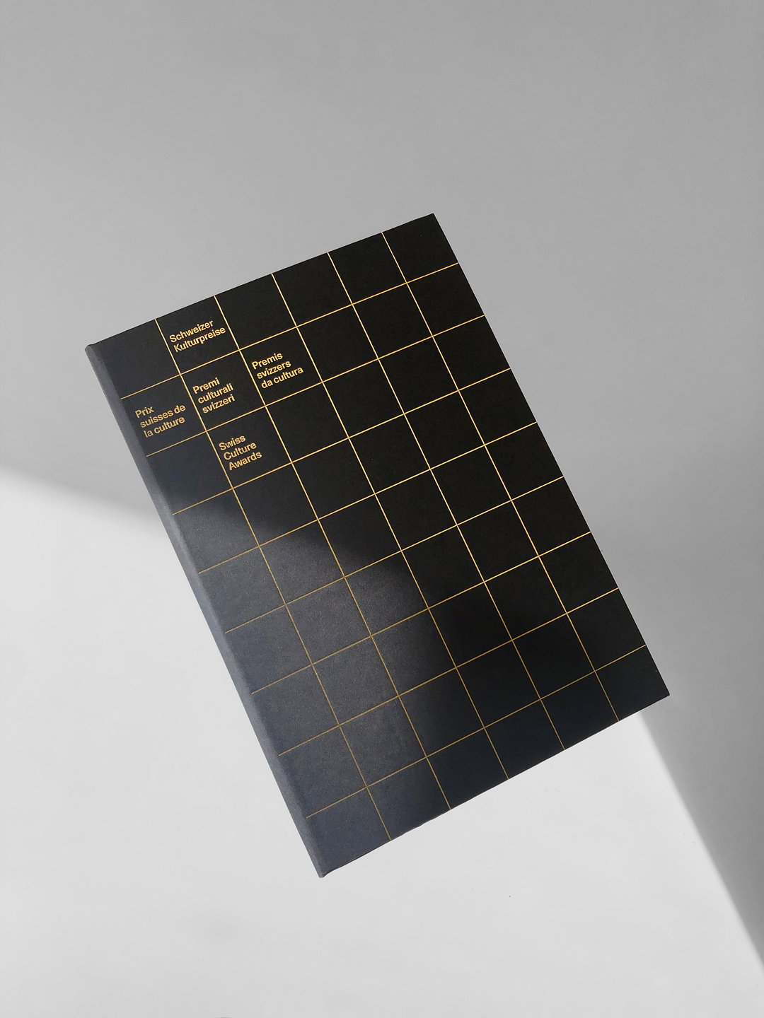
Giliane Cachin: Bundesamt für Kultur Diploma (Copyright © Giliane Cachin, 2020)
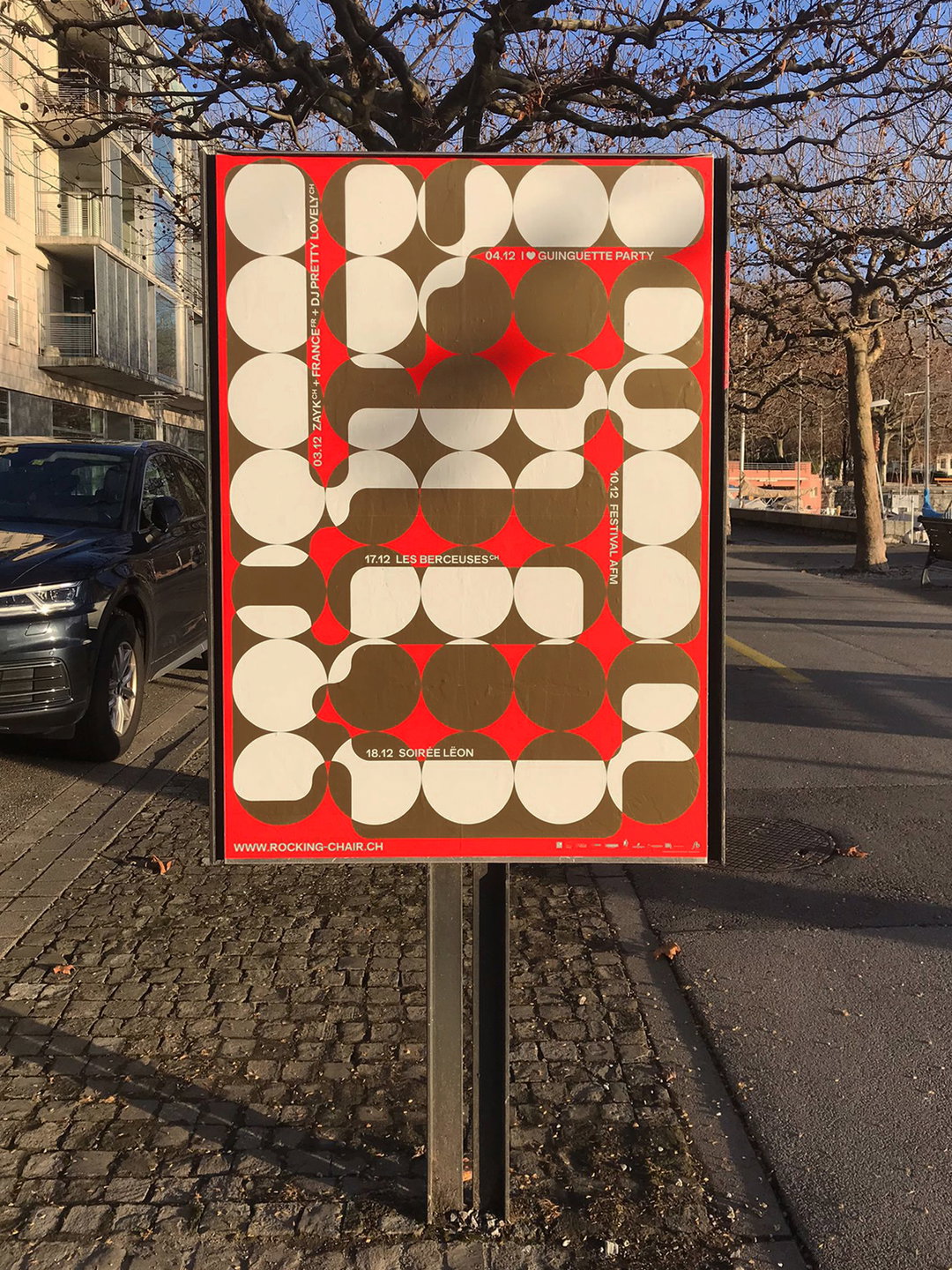
Giliane Cachin & Vilté Jurgutyté: RKC–November 2021 (Copyright © Maude Paley, 2021)
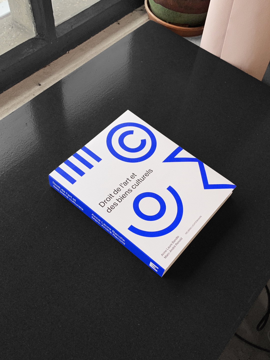
Giliane Cachin: Droit de l’art et des biens culturels (Copyright © Giliane Cachin, 2022)
Hero Header
Giliane Cachin: RKC–January 2020 (Copyright © Aurélien Haslebacher, 2020)
Share Article
Further Info
About the Author
—
Olivia (she/her) is associate editor of the website, overseeing the day-to-day editorial projects as well as Nicer Tuesdays events. She joined the It’s Nice That team in 2021. [email protected]
To submit your work to be featured on the site, see our Submissions Guide.