To design for musicians, Caleb Vanden Boom excavates “little gems of imagery” from their songs
Having created work for the likes of Clairo and Vampire Weekend, the designer shares why the work is never just about the musician, but the fanbase too.
Growing up, Caleb Vanden Boom loved nothing more than obsessing over the visual world of his favourite musicians – finding out who had designed the cover, who had led the shoots and directed their music videos. Now, years later, the designer has found himself engaging in very similar practices for the musical projects he works on, from tour visuals for indie pop darlings to an identity for a festival in a shipyard. In fact, Caleb goes so far as to say that to really get into the headspace he has to “live inside the artist’s world”.
We last caught up with Caleb last October, off the back of his Italian signage-inspired font, Valori. Since then, in just a matter of months, much has changed for the designer. Earlier this year he founded the independent perfume company Clue, with his best friend Laura. Beautifully designed, each bulbous bottle with a square cap features the bold wordmark and an illustration from a different illustrator, from Braulio Amado to Sophie Hollington. Due to the “incredible response” to Clue, Caleb left his studio job to further develop its visual world, which also left some space for what he describes as “soulful projects”, those for musicians, restaurants and artists.
Caleb tells us that briefs from musicians can “vary wildly”. He continues: “Some have a very specific vision they want brought to life and others are completely open to whatever ideas you may bring to the table.” In Caleb’s ideal world, he’s able to open a dialogue with the artist and their team, digging as deep as possible into references and material. One thing he always makes sure to do is return to the original source itself: the music. “Oftentimes I listen to the work while reading the lyrics and taking lots of notes,” Caleb says. “This helps identify both overarching themes and little gems of imagery to excavate and make use of.”
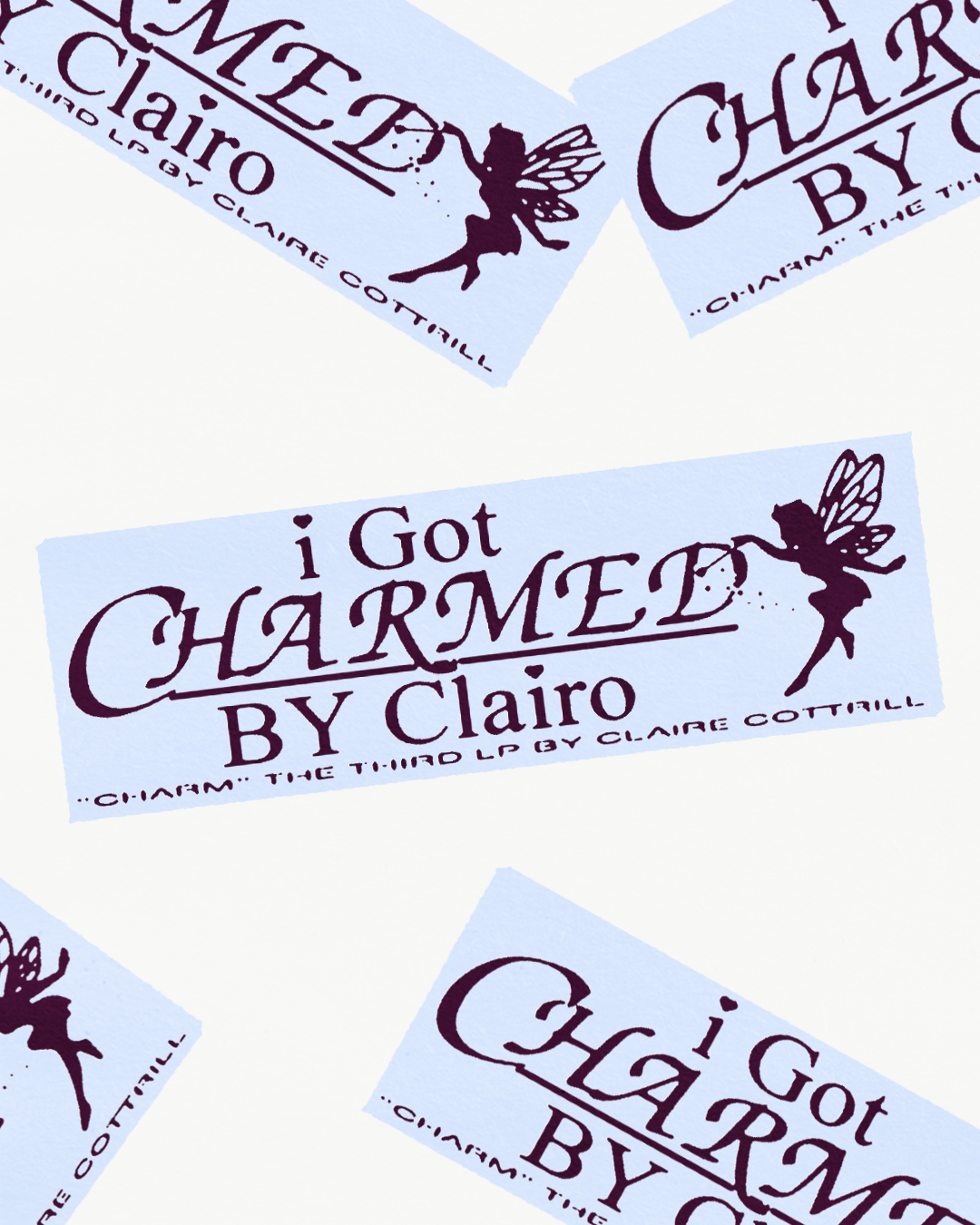
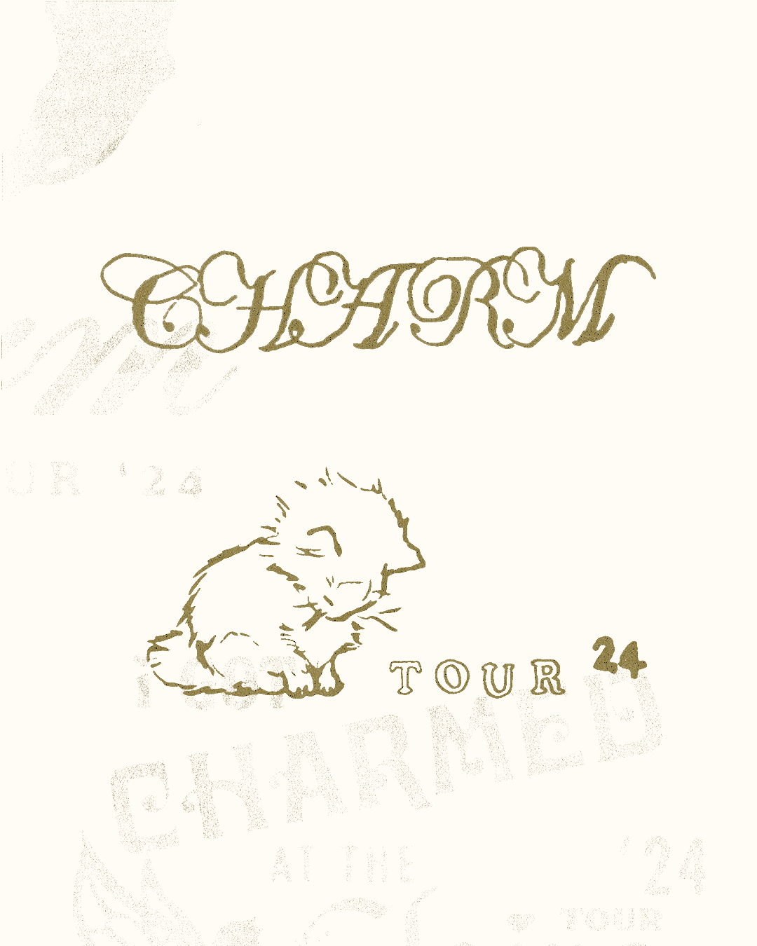
GalleryCaleb Vanden Boom: Clairo Charm (Copyright © Caleb Vanden Boom Studio, 2024)
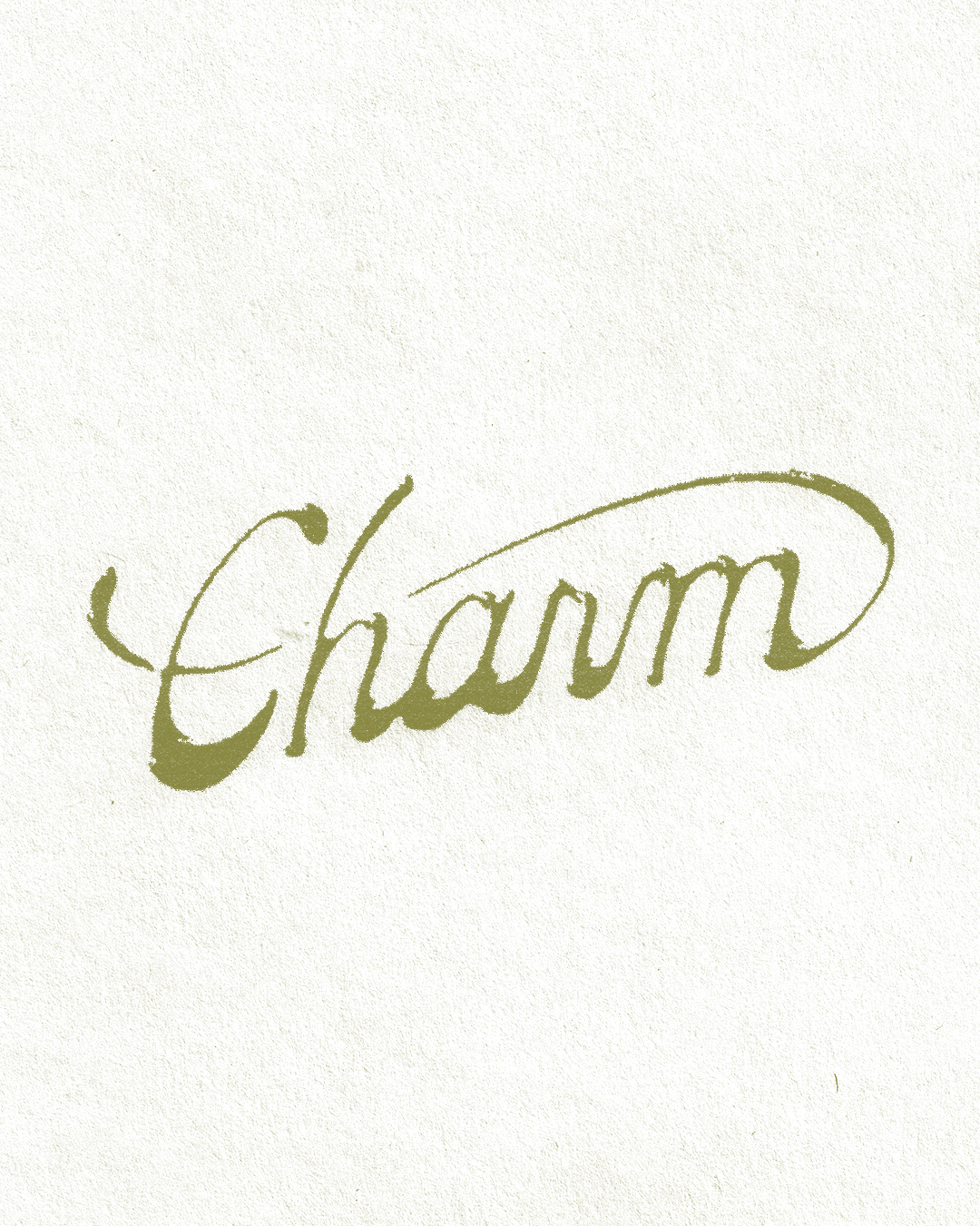
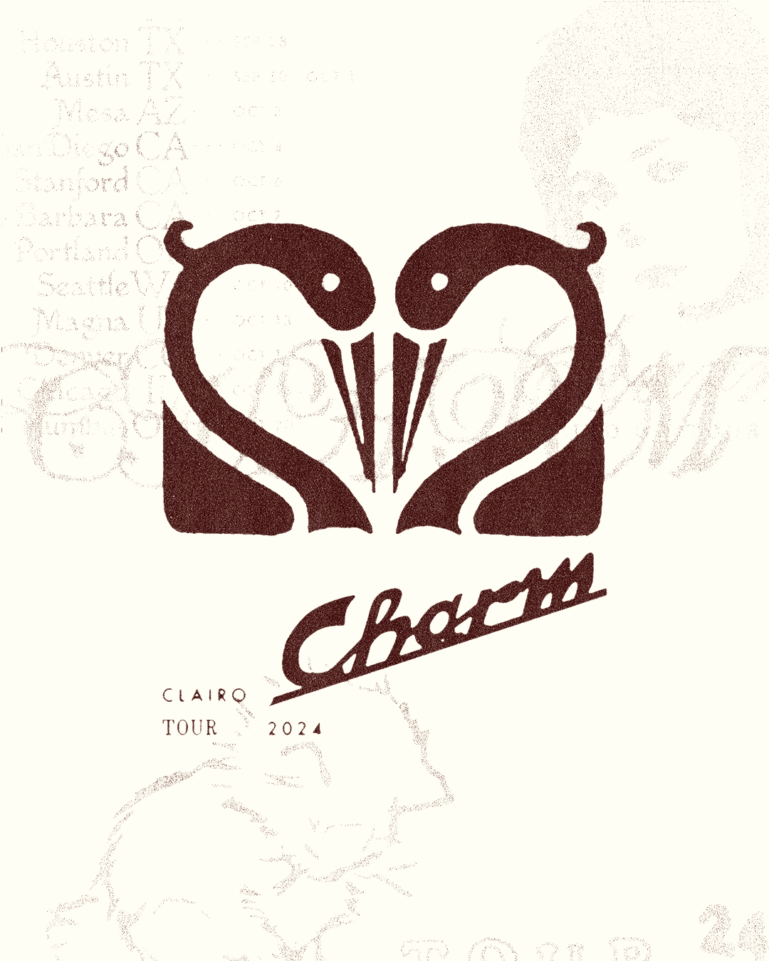
This close attention to the music is the core foundation of his work on Clario’s third album, Charm, a project Caleb outlines as a highlight of his year. Having been working with Clairo and her team since 2020, conversation around themes sparked easily, and soon Caleb noticed something new in Clairo’s sound. “The dialogue Claire [Cottrill] was using to engage with her audience had shifted into a more playful, cheeky tone,” something Caleb then tried to embody in the visuals. Elegant, textures and serif type is paired with silhouettes of fairies (a clever nod to the album name), swans and kittens, giving the impression that they could be drawings taken from a fan’s personal notebook. Caleb’s visuals went down a treat, especially, that is, his ‘I Got Charmed by Clairo’ tee, which has become a fan phrase in of itself.
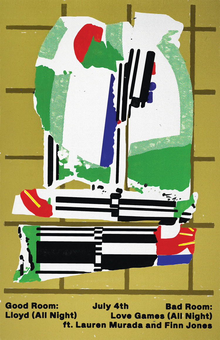
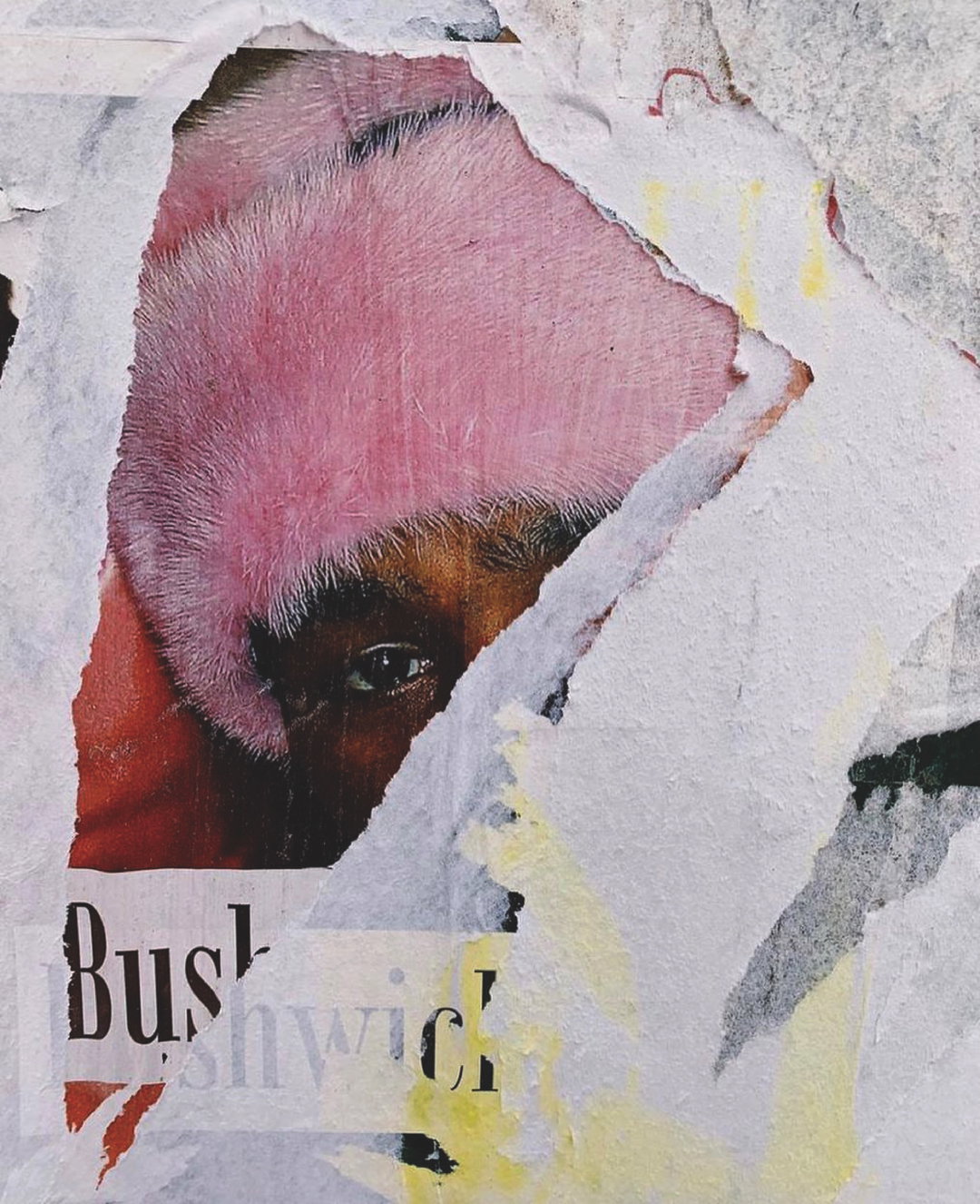
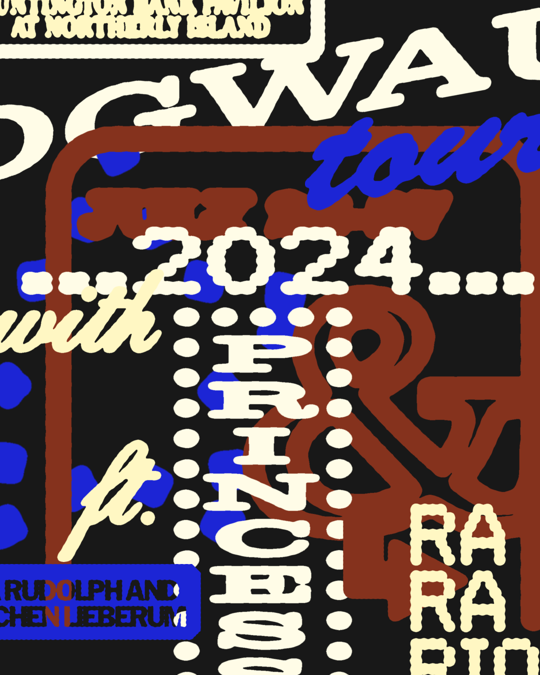
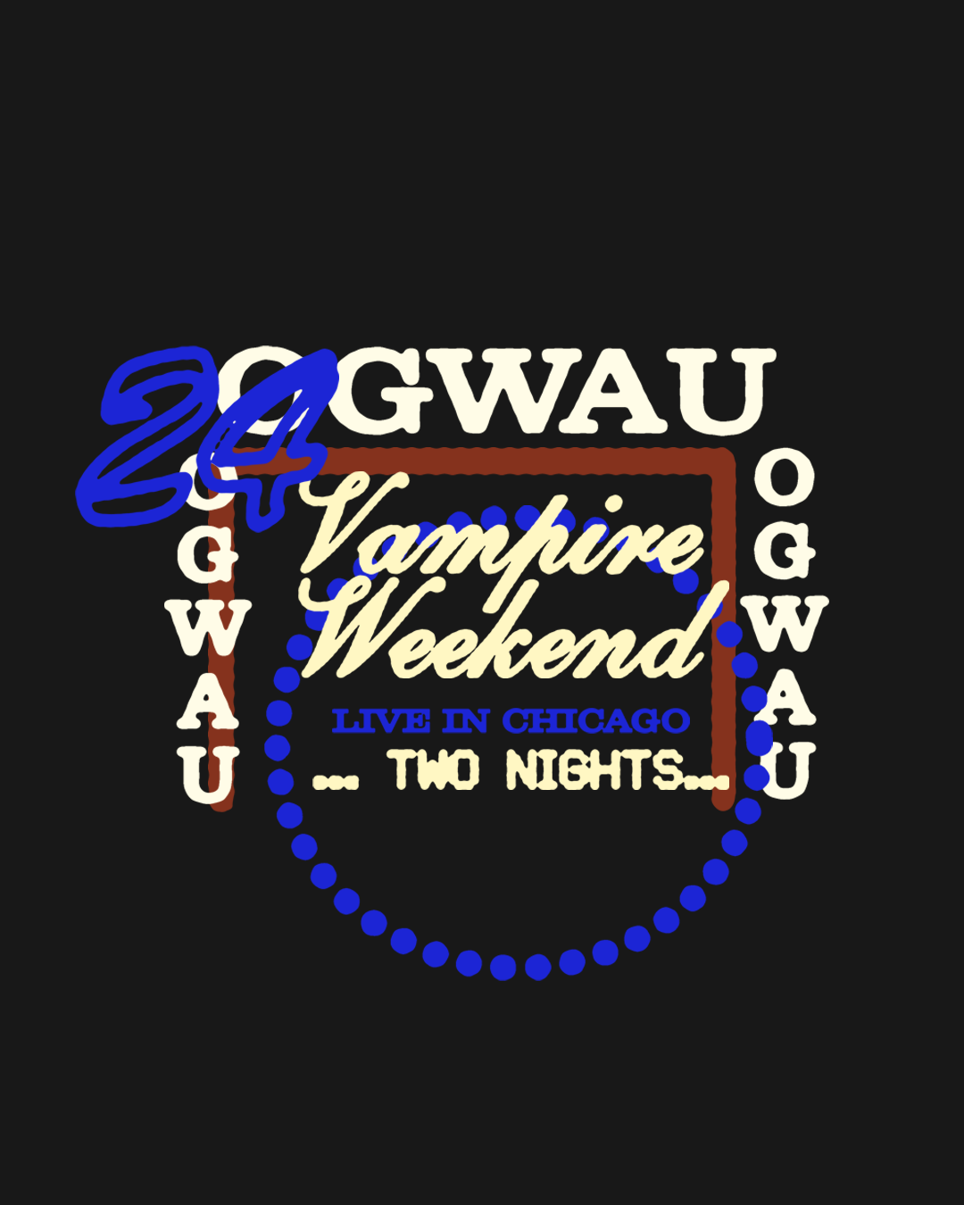
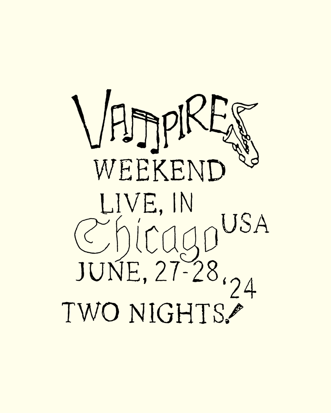
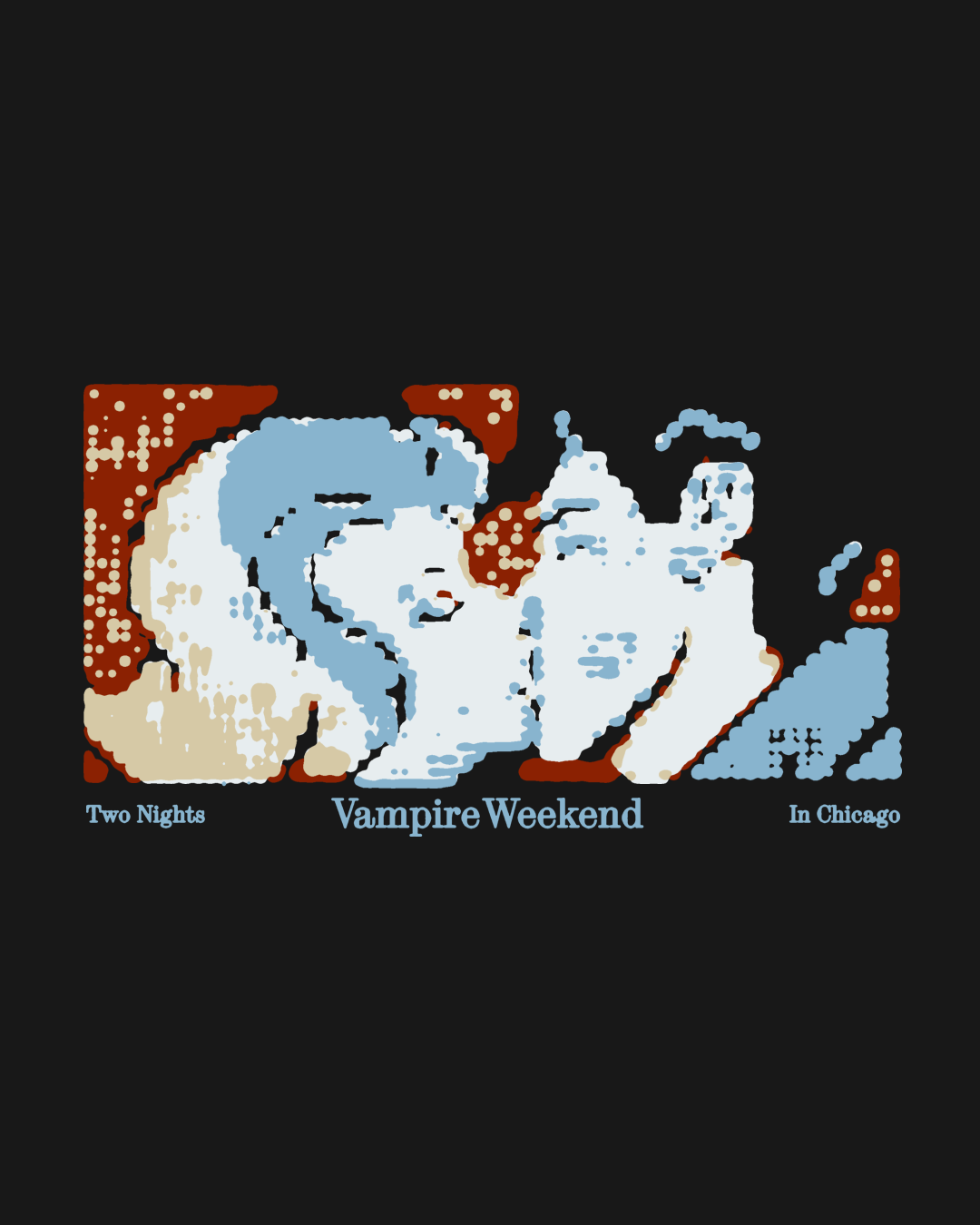
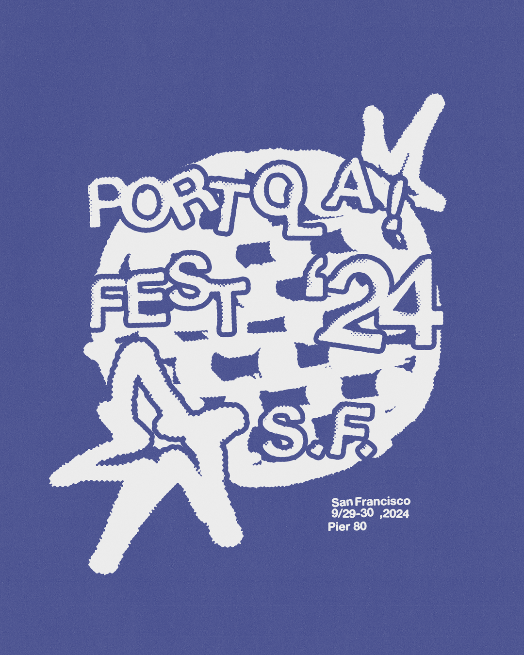
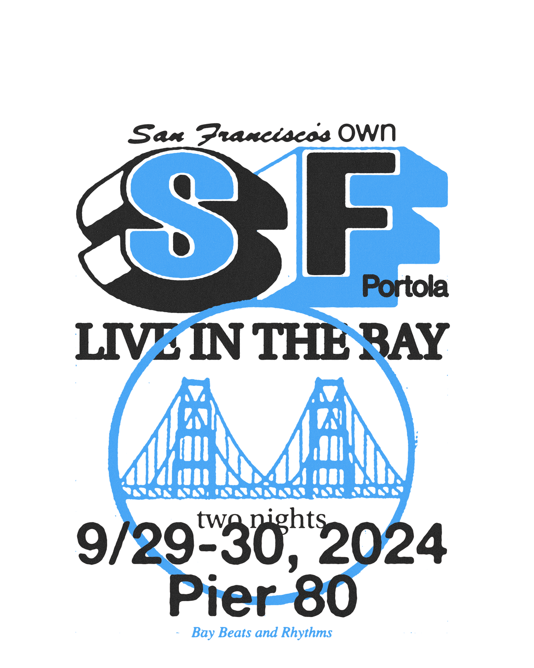
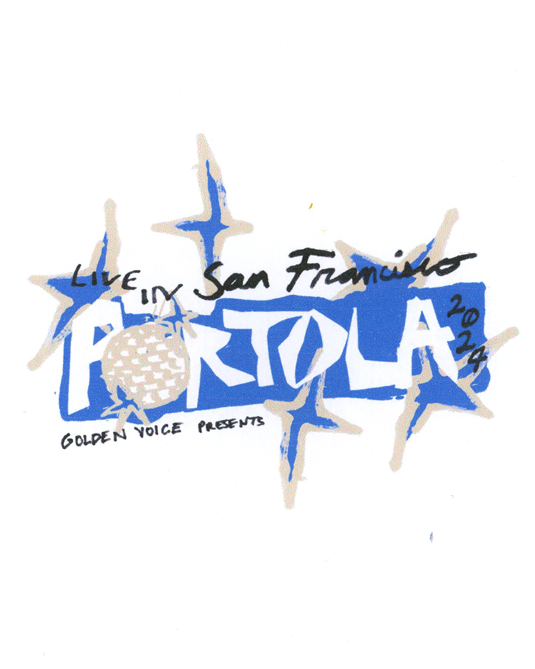
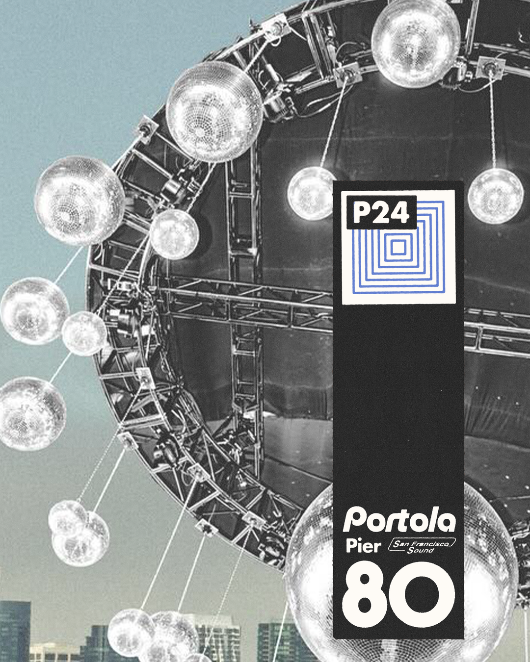
But Caleb also isn’t afraid of going off piste and looking outside of the music for inspiration. Take his work alongside creative directors Imogene Strauss and Isha Dipika Walia on the identity for Portoloa Festival, which saw Caleb turn to the event’s location, San Francisco’s Pier 8, a shipyard full of equipment, machinery, or in Caleb words, “industrial grit”. To reflect this environment, the team developed offbeat typography and distressed textures, resulting in a punky, DIY feel. What’s more, his recent Vampire Weekend graphics came after the visual world of the new album had already been developed – so he improvised. Caleb dug deep into the found footage that the band had used in their music videos, stumbling across “beautiful vignettes of light steep portraits and illuminated signs from downtown New York in the 80s”, which then formed the backbone of his bespoke drawings.
It’s not only the personal enjoyment that fuels Caleb’s work with musicians, but the impact he knows such visuals can have on fans, deepening their relationship with the musicians and providing an outlet. “Design can expand an artist’s world beyond their audio output. In many cases the visual component may be the first thing to pique someone’s interest, and therefore colour how they experience it, which I don’t take lightly,” he says. “I love that these kinds of projects really have an audience who deeply cares about the work.” It’s safe to say, Caleb’s creating work that his younger self would have spent hours obsessing over.
GalleryCaleb Vanden Boom: Clairo Charm (Copyright © Caleb Vanden Boom Studio, 2024)
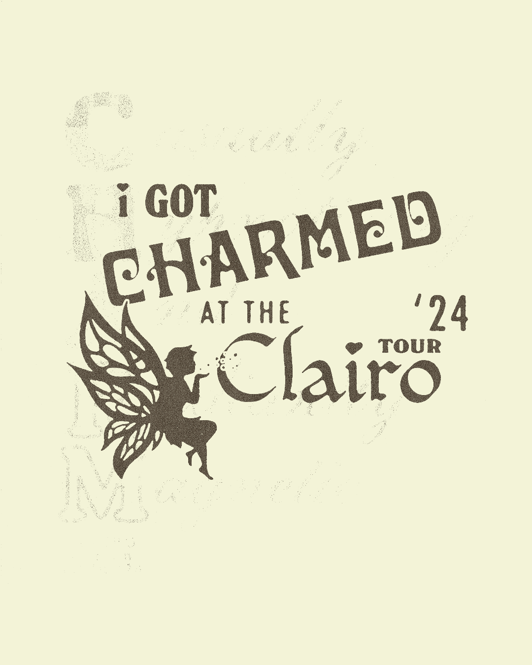
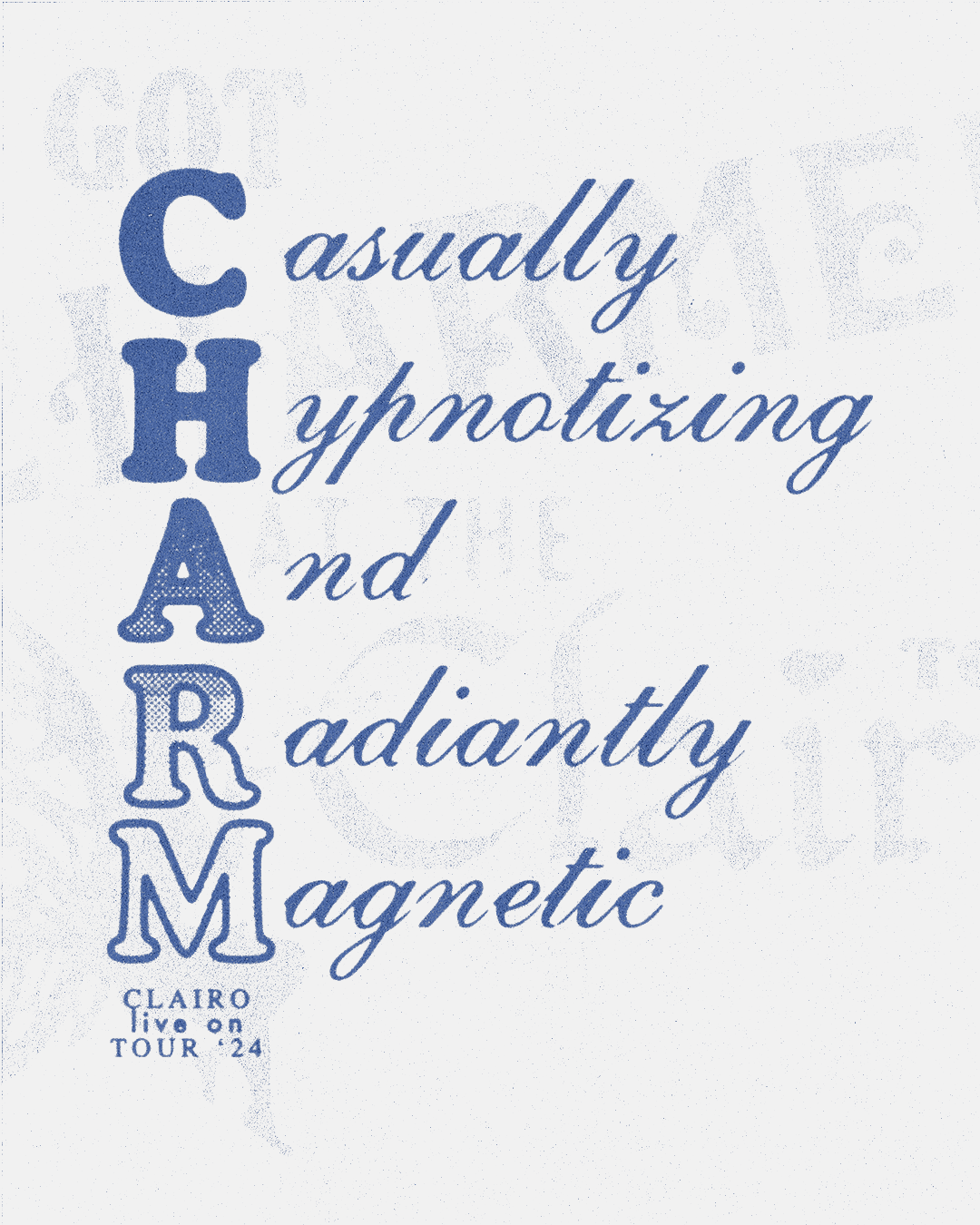
GalleryCaleb Vanden Boom: Vampire Weekend (Copyright © Caleb Vanden Boom Studio, 2024)
GalleryCaleb Vanden Boom: Portola Music Festival (Copyright © Caleb Vanden Boom Studio, 2024)
Share Article
About the Author
—
Olivia (she/her) is associate editor of the website, overseeing the day-to-day editorial projects as well as Nicer Tuesdays events. She joined the It’s Nice That team in 2021. ofh@itsnicethat.com
To submit your work to be featured on the site, see our Submissions Guide.