Launch Recite Me assistive technology
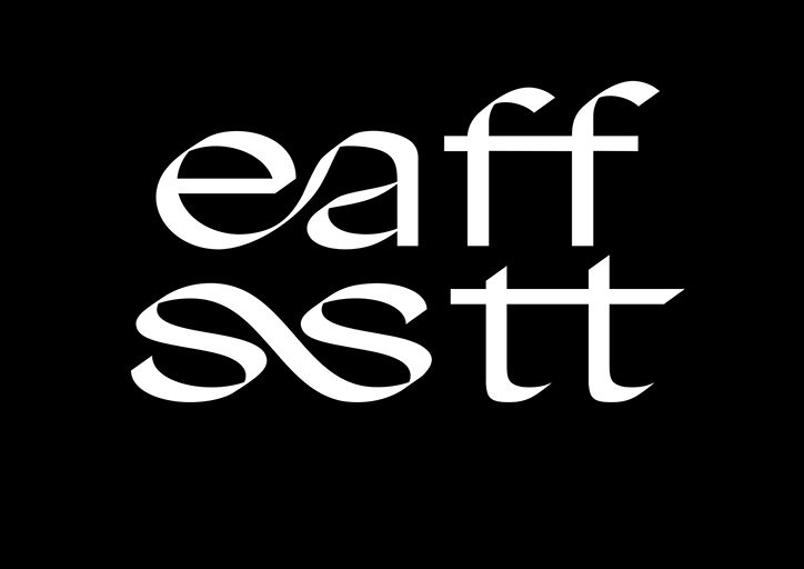
White typographic text on a black background reads “eaff” above “sstt”. The letters are rendered in a fluid, stylised serif font with sweeping curves.

Good Type: An Oslo-based foundry producing typefaces of a quality its name suggests

—
Date
31 August 2017

Each typeface by Oslo-based Good Type Foundry is developed from two considerations. A typeface is always “research driven” and includes a “conceptual approach” finished with a “high attention to detail” that gives each of its designs a certain edge.

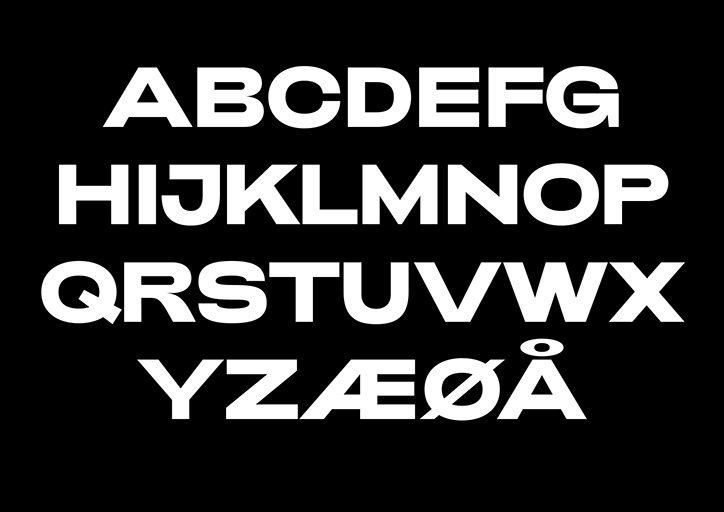
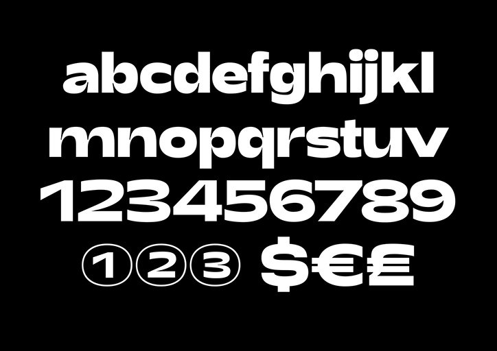
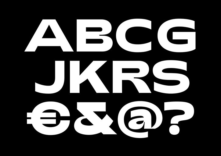
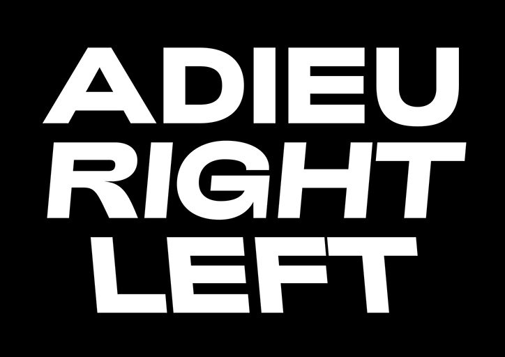
Only established in the spring of 2016 by Kenneth Knutsen, Good Type already has three available typefaces with poise, practicality and style. The first, Adieu “is a heavyweight sans-serif typeface inspired by typography found in racing and motor sport cultures,” the foundry explains. It is the curves used in the “backslant" option of the typeface which separate Adieu from its contemporary typeface siblings. The font plays with spacing and word alignment to add the aforementioned conceptual approach the foundry is built upon. It also gives off the impression that words typed using the font almost move, reflecting the speed of racing cars which inspired it.

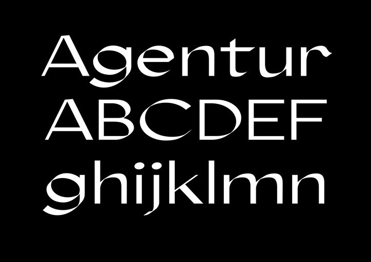
Agentur utilises an entirely different approach to typography, aligning more with calligraphy, but still remains just as pleasing on screen as it does on printed matter. Created as part of a fashion branding project, Agentur Regular was designed as a text font while Agentur Display is an extended version with more detail and character.

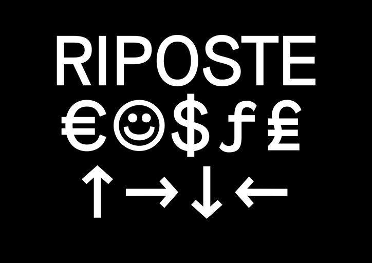
The last typeface in the foundry’s current library is Riposte a “neo grotesque typeface inspired by mid-century fonts, mixed with contemporary features”. Although originally released in 2016, Good Type has extended the font’s capabilities with an update this year, expanding its features, weights and styles.
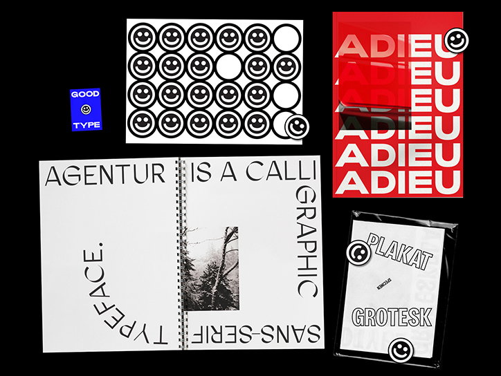
A collection of graphic design samples featuring bold typography and smiley face motifs. The works include a red poster reading “ADIEU”, a spiral-bound book with the words “AGENTUR IS A CALLIGRAPHIC SANS-SERIF TYPEFACE”, and a “PLAKAT GROTESK” specimen.
Above

Good Type

A bold, white sans-serif alphabet set against a black background. The letters are arranged in four rows, including the characters “Æ”, “Ø” and “Å”.
Above

Good Type: Adieu

A bold, rounded white typeface set against a black background. The image displays the lowercase alphabet, numbers one to nine, and currency symbols for the dollar, euro and pound.
Above

Good Type: Adieu

Bold white characters are set against a black background. The letters and symbols are arranged in three rows, including “ABCG”, “JKRS” and “€&@?”.
Above

Good Type: Adieu

A bold typographic image in white text on a black background. It reads “ADIEU RIGHT LEFT” across three lines.
Above

Good Type: Adieu

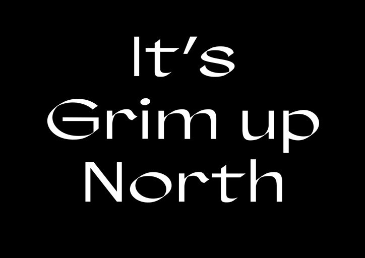
White serif text on a black background reads “It’s Grim up North”.
Above

Good Type: Agentur

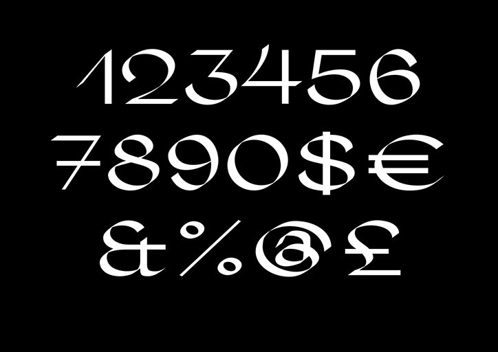
A set of white numbers and symbols displayed against a black background. The characters are rendered in a high-contrast, elegant serif typeface.
Above

Good Type: Agentur

White typography on a black background. The text reads “Agentur” above the uppercase letters “ABCDEF” and the lowercase letters “ghijklmn”.
Above

Good Type: Agentur

A graphic in white on a black background. The word “Riposte” sits above a row of symbols including the euro, dollar and pound signs, and a smiley face. Below these, four arrows point up, right, down and left.
Above

Good Type: Riposte

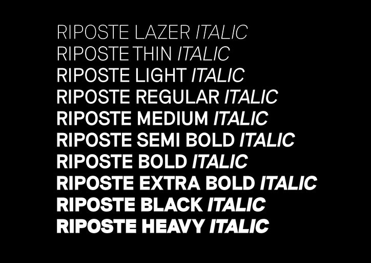
A specimen of the Riposte typeface in white text against a black background. The image shows ten different weights of the italic style, ranging from “Riposte Lazer Italic” to “Riposte Heavy Italic”.
Above

Good Type: Riposte

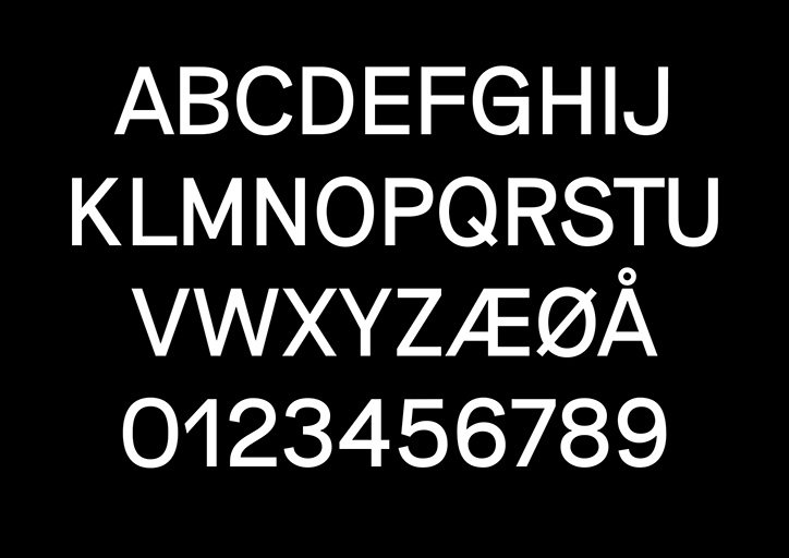
A white sans-serif alphabet and number set displayed against a black background. The characters are arranged in four rows, including the letters “A” to “Z”, Scandinavian characters and the numbers “0” to “9”.
Above

Good Type: Riposte

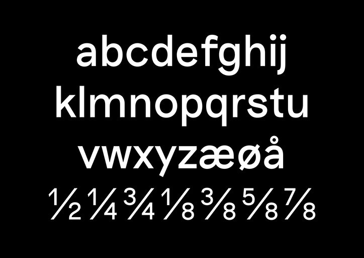
A white sans-serif typeface set against a black background. The image shows the lowercase alphabet, including the characters “æ”, “ø” and “å”, followed by a row of fractions from “1/2” to “7/8”.
Above

Good Type: Riposte

Share Article

About the Author

Lucy Bourton

—

Lucy (she/her) was part of the It’s Nice That team from 2016–2025, first joining as a staff writer after graduating from Chelsea College of Art with a degree in Graphic Design Communication, eventually becoming a senior editor on our editorial team, and most recently at Insights, a research-driven department with It’s Nice That.


It's Nice That Newsletters

Fancy a bit of It's Nice That in your inbox? Sign up to our newsletters and we'll keep you in the loop with everything good going on in the creative world.