Guang Yu on how everyday observations informs his design practice
A Black Cover Design is a creative studio based in Beijing, China, founded by Guang Yu and Nod Young in 2015. Guang and Nod’s award-winning practice works across branding, strategy and print design; most often with cultural institutions, universities, and art and design festivals. Recent work includes the identity for Shanghai’s first art book fair, Unfold; a poster campaign for AGI China; and printed matter and merchandise for Tokyo TDC Selected Artworks. We spoke to Guang about inspirations, problem-solving and why “suitable” is best.
It’s Nice That: How did you first get into graphic design?
Guang Yu: I’ve enjoyed drawing pictures since I was a child. I used to draw with stones, squatting on the ground; I’d draw characters in cartoons, from my imagination, or story books. Knowing that I like drawing, my family sent me to attend training courses from the age of five… Until I was 16, I wanted to be an artist. I liked music, too, and I realized that the feeling of music could also be expressed on paper through graphic expressions and fonts. It was then that I realised graphic design was the job for me.
I majored in graphic design at China Central Academy of Fine Arts for my BA, and after graduation, I set up a studio with two classmates. Then, in 2010 I set up a publishing house, Badger&, and started making books. In 2015, I set up A Black Cover Design with Nod.
INT: How would you define your creative process?
GY: I like to approach every project with a new approach to both thinking and design, no two projects are the same so for us, so it’s important to not approach them in the same way. Our work can be balanced, brutal, simple, rational, harmonious, complex, humorous, contradictory or provocative; if the outcome is “suitable”, I don’t reject any possibility. I like “suitable” best in fact.
For example, when I was in college, I always wanted to challenge why reading had to follow a linear logic. So in our project, Cat Book, which collects dozens of works about cats that we found online, we scrambled the order of pages in every edition. Each book is different, and encourages a happy rebellion for when the parents aren’t home… If every design project can provide such excitement, then that is the harvest of both interest and ideal.
Another example is “Olympic Beijing”, an invited poster creation project. In 2006, I received a call from the National Art Museum of China, which invited me to attend the International Design Artist Invitational Exhibition of National Art Museum of China. A total of 26 artists from different countries participated in the exhibition. In my view, non-commercial public design in China can be divided into two categories: “elite” design and “power” design. The facts are: on the one hand, good designers can win awards in the international competitions, and are known in other countries, but not known to the public in China. These designers have not done the design related to society, and are not serving society. On the other hand, in the publicity column of the streets and lanes, there are many posters, banners, and slogans that highlight the central theme of the times. They have a very fixed sense of form and expression. Such “power” aesthetics is the mainstream of public design in Chinese society. So, in this exhibition, I tried to bring “power” aesthetics into the exhibition hall. To be more objective, I didn’t do it myself. Instead, I found a roadside print shop and paid them to design a “Beijing Olympics” theme poster, based on experience and impression. When I submitted this work to organisers, I was removed from the exhibition. In this project, the behaviour itself was interesting, and I enjoyed the confusion after the provocation of authority.
INT: Do you have references or inspirations from outside the creative world?
GY: I believe there is always something interesting and inspiring around me. For example, some copycatting products on shopping websites are exceptional; another example is signage with graffiti at the door of a street store; and some interior décor can have very particular aesthetics. These things have a strong sense of form, and there is interesting logic and motivation behind them. In other words, whether it’s something in the design profession or not, I find the act of observing is always fun.
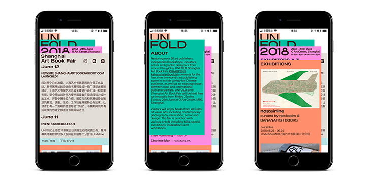
Unfold: A Black Cover Design
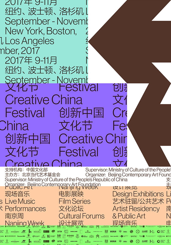
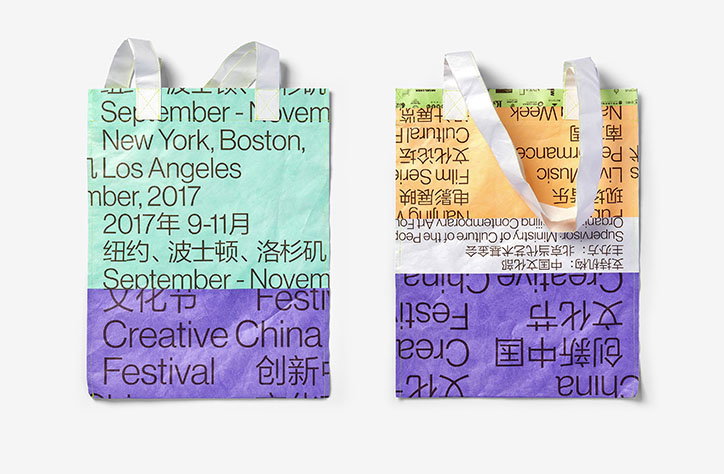
Creative China Festival: A Black Cover Design
Unfold: A Black Cover Design
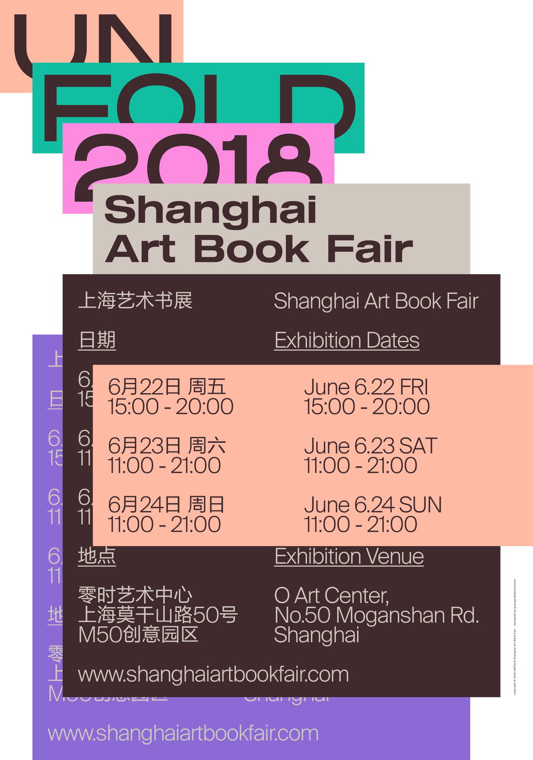
Unfold: A Black Cover Design
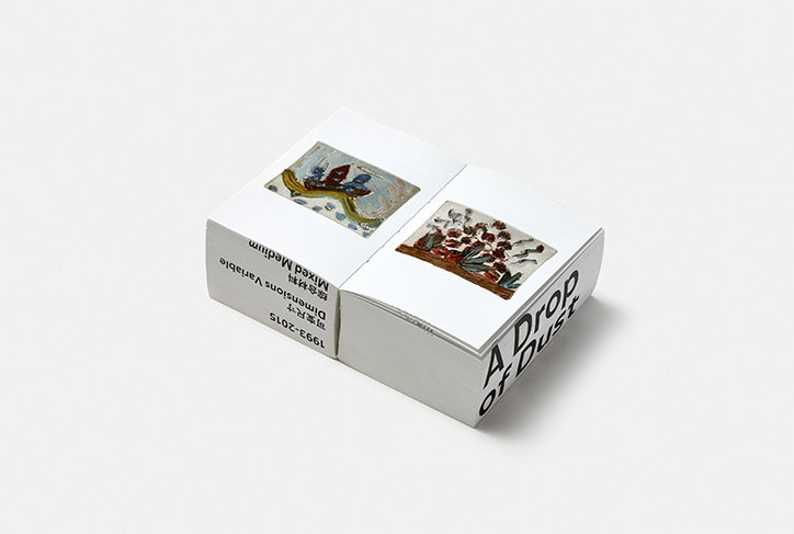
A Drop of Dust: A Black Cover Design
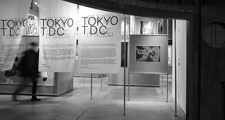
Tokyo TDC: A Black Cover Design

Tokyo TDC: A Black Cover Design
Tokyo TDC: A Black Cover Design
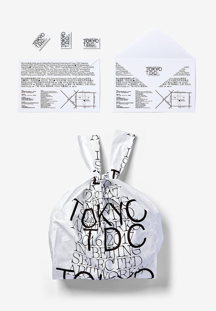
Tokyo TDC: A Black Cover Design
Share Article
Further Info
About the Author
—
Billie studied illustration at Camberwell College of Art before completing an MA in Visual Communication at the Royal College of Art. She joined It’s Nice That as a Freelance Editorial Assistant back in January 2015 and continues to work with us on a freelance basis.