Launch Recite Me assistive technology
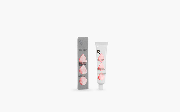
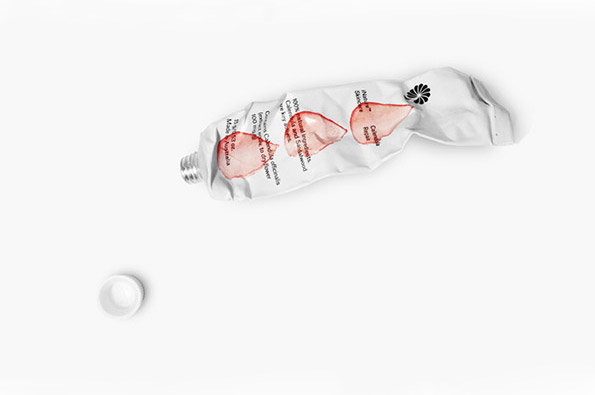
A crumpled white tube of cream lies on a plain white background, its cap resting nearby. Three red, organic shapes resembling petals or droplets are printed along the side of the tube.

Super-crisp skincare branding from Swedish studio Bedow

—
Date
21 February 2013

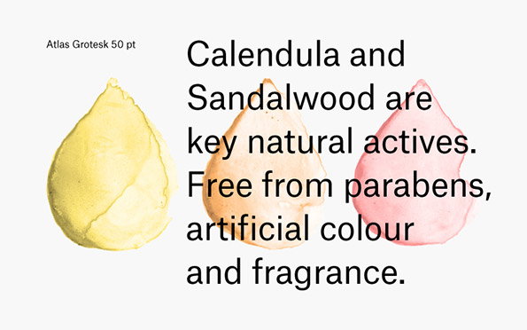
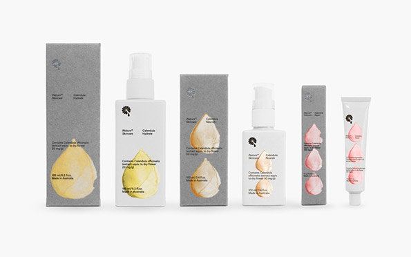
Stockhom design studio Bedow don’t have to do much to impress us these days, they’ve long since proved their skill with exceptional branding and packaging projects for some of Sweden’s most exciting industries. Their heat-sensitive beer bottles for Mikkeler were arguably one of our favourite pieces of packaging last year, and they’re still going strong in 2013 with their latest work for iNature Skincare. Simple watercolour marks differentiate between each product in a range otherwise defined by crisp typographic renderings of Atlas Grotesk. It’s a simple piece of branding for a simple, product. And where skincare’s concerned, simple always seems to be the goal.
A black logo on a white background featuring a stylised flower with a single droplet falling from one petal. Below the icon, the text reads “iNature™ Skincare”.
Above

Bedow: iNature Skincare

Three watercolour droplets in yellow, orange and pink sit behind black text. The text reads “Calendula and Sandalwood are key natural actives. Free from parabens, artificial colour and fragrance.”
Above

Bedow: iNature Skincare

A range of skincare products and their grey packaging boxes arranged in a line against a white background. The white bottles and tubes feature minimalist text and soft, watercolour-style illustrations of petals.
Above

Bedow: iNature Skincare

A white tube of skincare product stands next to its matching rectangular box against a plain white background. Both feature three pink, petal-like shapes arranged vertically.
Above

Bedow: iNature Skincare

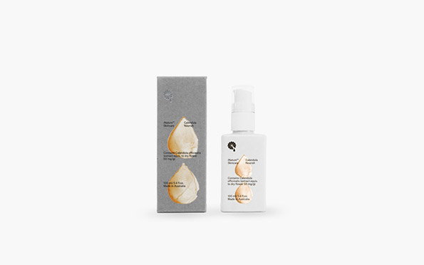
A white pump bottle and its grey cardboard packaging stand side by side against a plain white background. Both feature an image of a pale orange flower petal and the text “Calendula Nourish”.
Above

Bedow: iNature Skincare

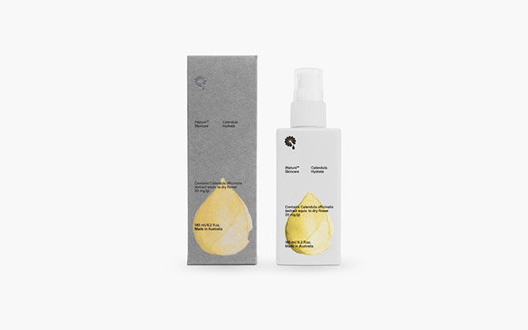
A white spray bottle and its grey cardboard packaging stand side by side against a plain white background. Both feature a yellow flower illustration and the text “Nature Skincare Calendula Hydrate”.
Above

Bedow: iNature Skincare

Share Article

Further Info

About the Author

James Cartwright

—

James started out as an intern in 2011 and came back in summer of 2012 to work online and latterly as Print Editor, before leaving in May 2015.


It's Nice That Newsletters

Fancy a bit of It's Nice That in your inbox? Sign up to our newsletters and we'll keep you in the loop with everything good going on in the creative world.