Jacob Wise on two new projects: a record sleeve which doubles as a hat, and a delicate serif typeface
Having left Bureau Borsche in Munich to move to Rotterdam and focus on his own stuff, Jacob has had a busy year.
A member of 2019’s Ones to Watch, Jacob Wise is a graphic designer whose practice places typography at the heart of every project. Having moved from Munich to Rotterdam, this year has seen him producing letterings for the relaunch of The Face and the redesign of Novembre, launching his own foundry Wise Type, as well as working on several commissions within the music industry. One of his more recent projects marks a diversion in Jacob’s output, however, focussing much more on a holistic design approach for the first release of new record label Klunk.
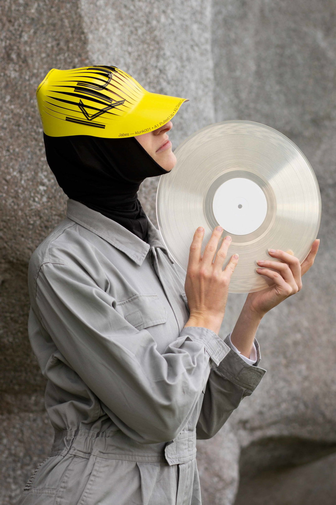
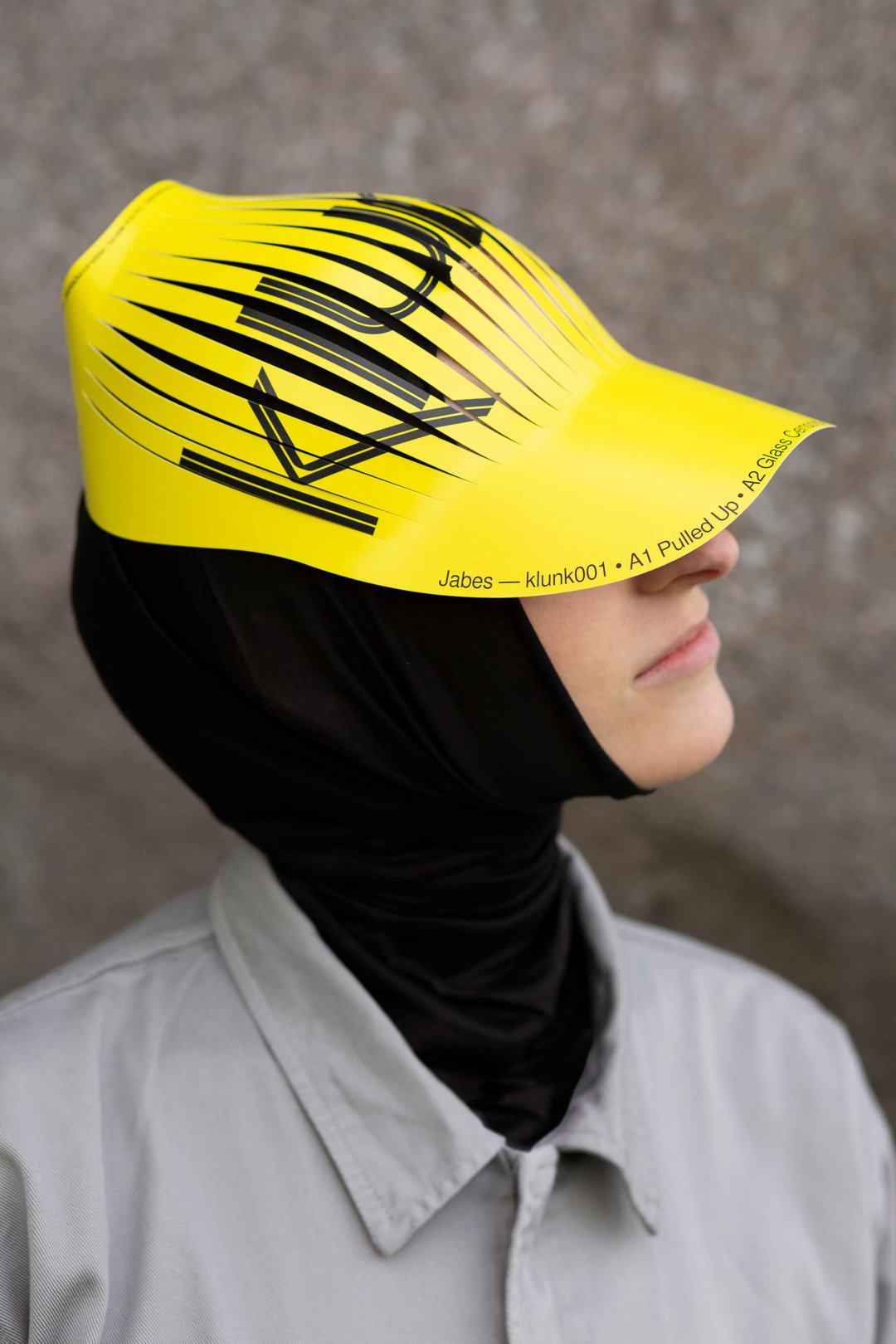
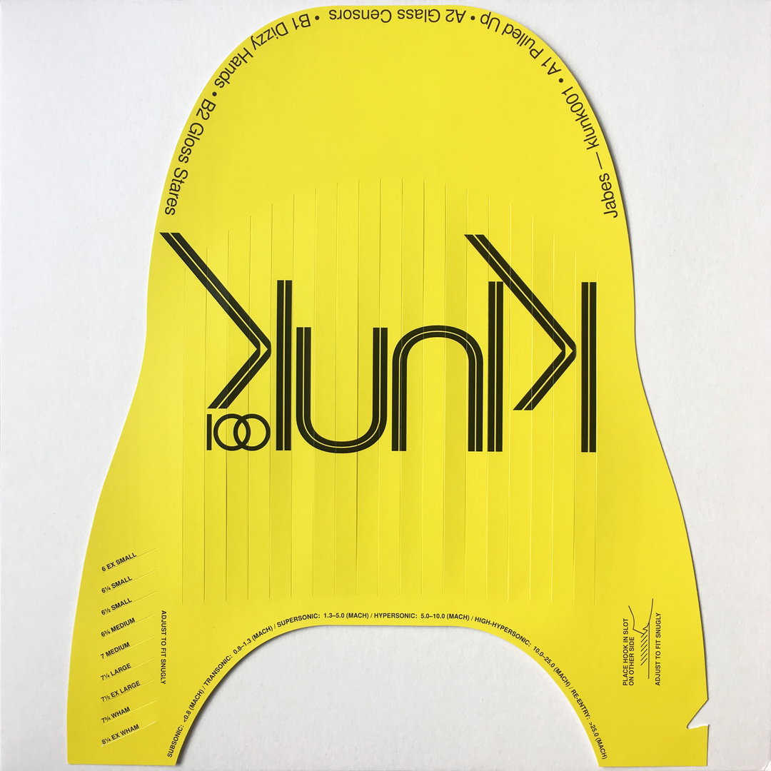
“I was contacted by Louie, the label manager, earlier this year about doing the design and direction for the label. At that point, the name hadn’t been decided so I put forward ‘klunk’. It had a clumsy ring to it when voiced which helped reflect the off-kilter nature of the label,” Jacob explains. From the outset, Jacob was granted full creative control which allowed him to explore new territory. This has culminated in a record sleeve which doubles as a flat packed hat design which can be assembled and worn.
The idea, he tells us, came from watching the 50th anniversary of the Apollo 11 launch. “The crowd were issued with cardboard caps which looked a little bizarre once assembled,” he continues. “Similarly, this was the launch of Klunk and although that may seem a tad flippant, the idea of being able to wear the record sleeve as a cap was just too good to miss.” In order to execute this idea to its fullest, Jacob opted to keep all other aspects of the traditional sleeve entirely blank. “This went through all layers down to the label stickers on a transparent vinyl. Keeping everything else blank put complete emphasis on the cap being the sole design artefact,” Jacob explains. The record was then shot by Bo Bannink, and modelled by Maike Postma. “The regal gestures, styling and location were all essential in creating a wider world around the design.”
GalleryJacob Wise: Klunk
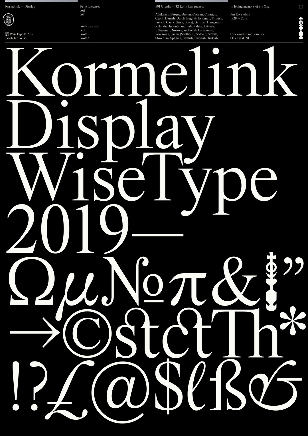
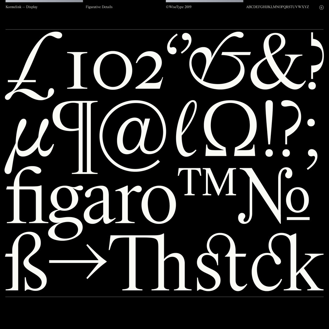
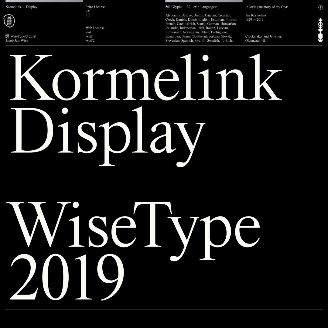
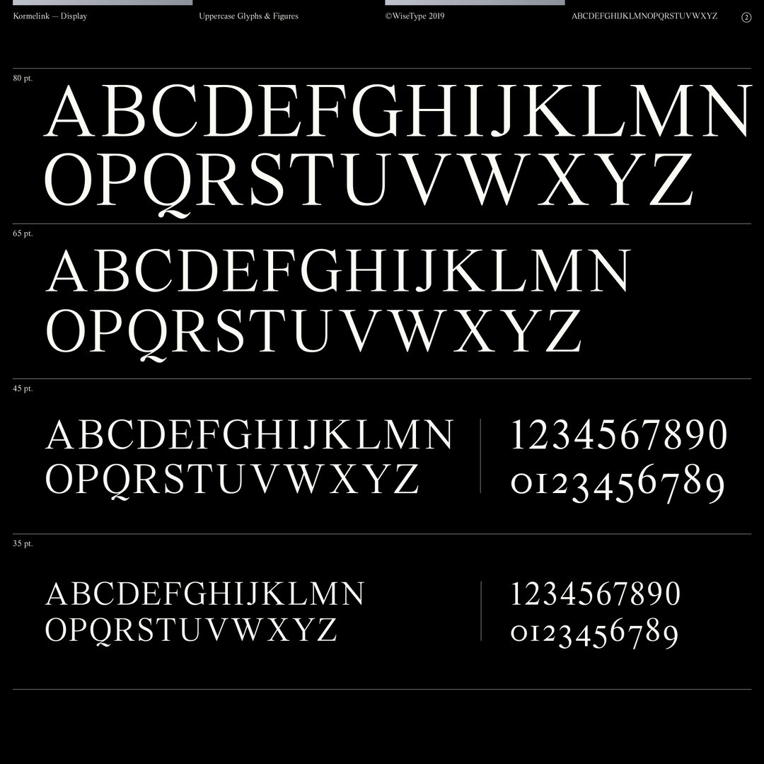
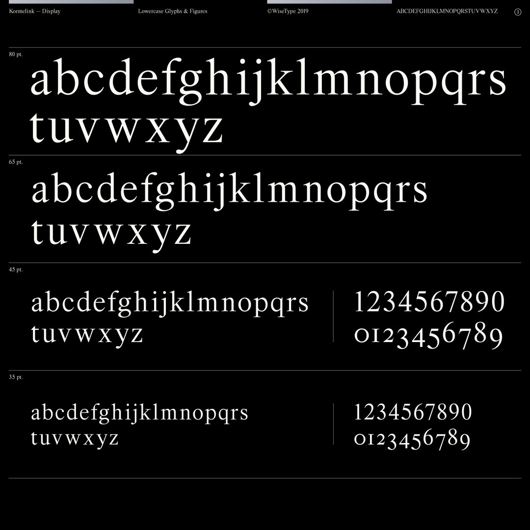
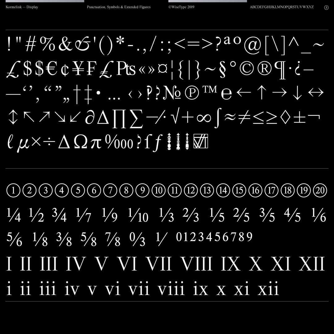
When we featured Jacob as part of Ones to Watch back in February 2019, he mentioned wanting to create a classic serif, something slightly different to the experimental typefaces he had been working on until that point. Released by his foundry, that serif, titled Kormelink, is now available to the world, having taken two years to produce. With over 500 glyphs, it’s a mammoth project and one that Jacob describes as “an exercise in precision and subtlety.”
It started as a “delicate revival of Times New Roman” but the initial display cut takes cues from other classic serifs including Sabon and Caslon, he explains. “I was hoping to achieve something more timeless and sober which played down contemporary trend nuance. I also wanted this to be my most complete project to date.” While this was the starting point, the project quickly grew into something more personal: a tribute to Jacob’s late Dutch grandfather Jan Kormelink. “He was an incredibly skilled clockmaker and jeweller – the last owner of the Kormelink family business which stood for over 100 years in Oldenzaal,” the designer tells us. “Precision and detail were paramount within his craft and I’d like to think the same within my own. So as a little tribute to his fine work I dedicated the project to him.”
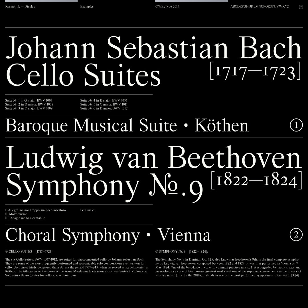
With the serif out in world for anyone to use, Jacob hints at how best the typeface might work: “The current cut is great for anything sophisticated or delicate in application. Since the current version only includes a display cut, it’s optimised for headlines due to the increased contrast in weight. However a lot of work still went into ensuring it still functions as copy.” And as for what’s next for Jacob, the current display cut is just the first step. “Ideally, I’d like to finish the italics in 2020 and then expand the family to multiple weights,” he concludes. “I’ve also got a beefy slab serif typeface in the works which should be available in the new year.”
GalleryJacob Wise: Kormelink Display, released by WiseType
Hero Header
Jacob Wise: Klunk
Share Article
Further Info
About the Author
—
Ruby is Senior Creative at It's Nice That, overseeing our visual output across platforms and projects. Before that, she was associate editor on the editorial team, after joining in September 2017 following graduation from Central Saint Martins.