Jaeha Kim channels different discplines of art through his graphic design practice
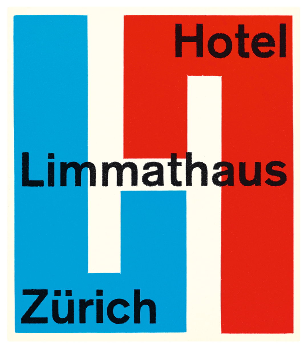
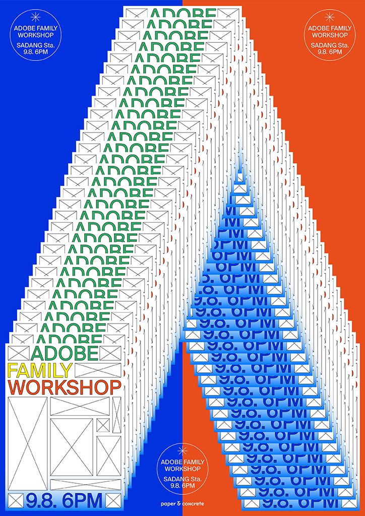
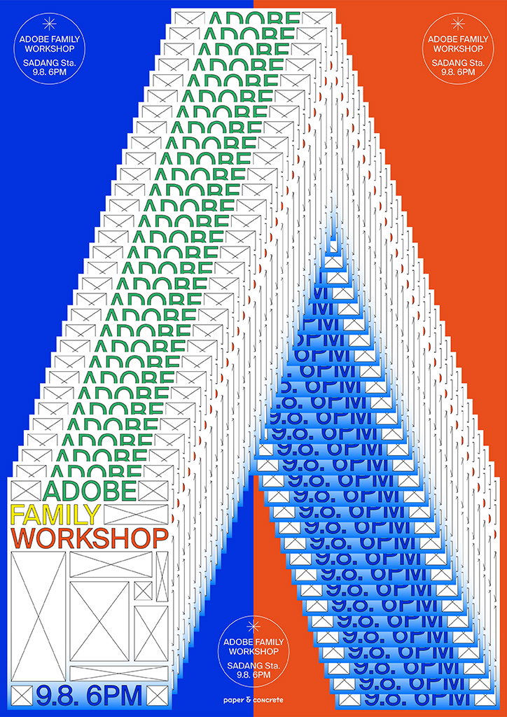
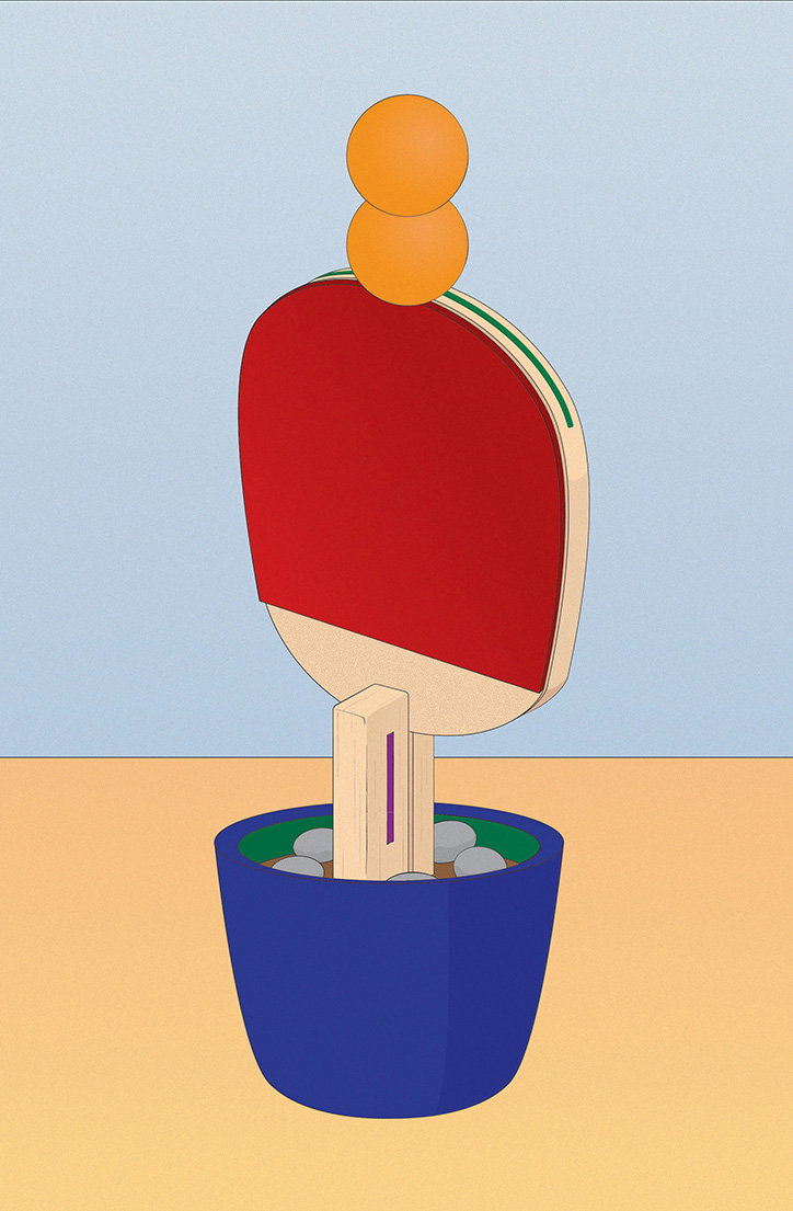
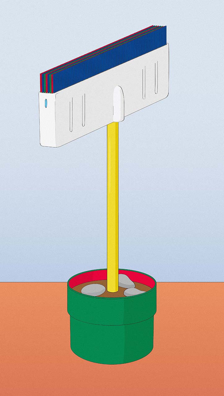
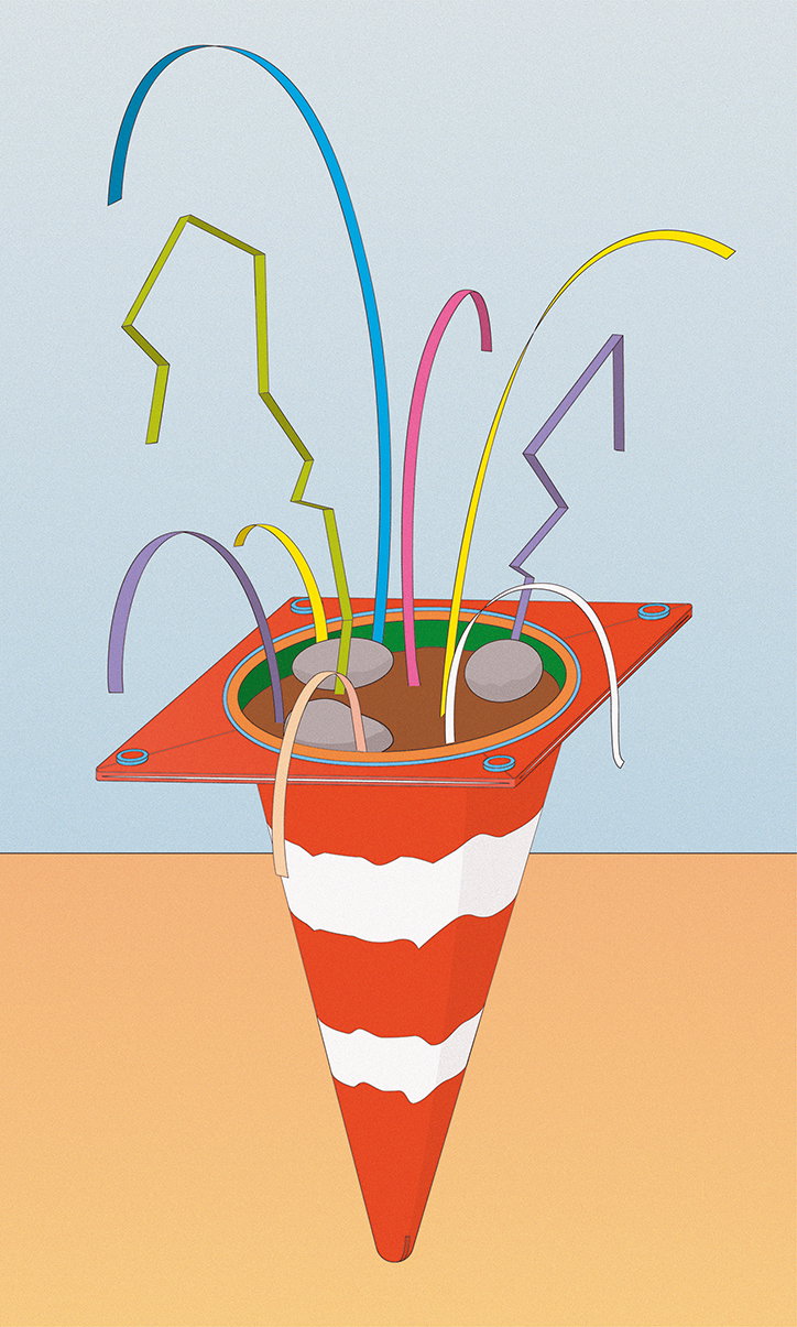
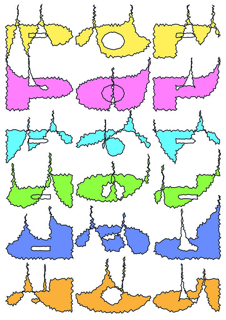
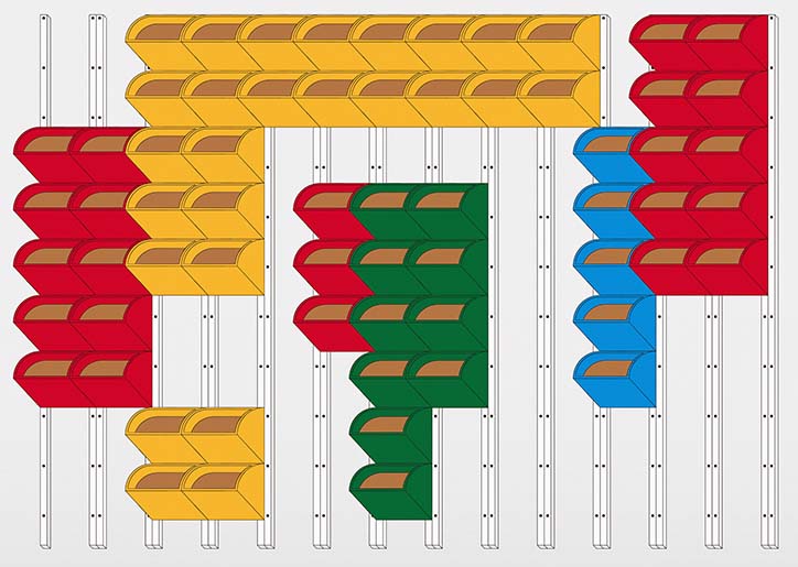
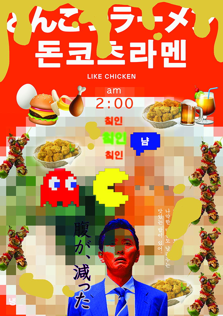
“I love making posters,” says Seoul-based graphic designer Jaeha Kim. “It is the one medium that can contain all the elements of graphic design.” Jaeha’s posters, not to mention all his other outputs, draw on many aspects of the visual arts, which he then refines using his graphic design knowledge. Elements such as illustration, photography and fine art are drawn out in Jaeha’s designs. He tells It’s Nice That on this subject, “I like the idea that I can bring any other forms of art into this genre and make it a part of the visual system.”
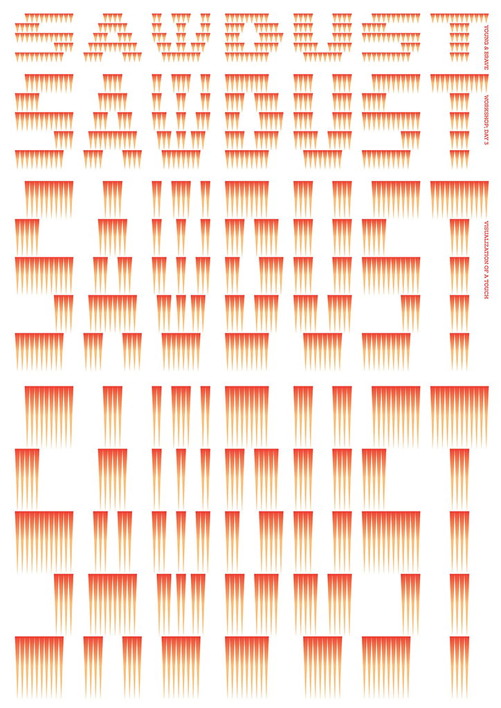
Jaeha’s path into graphic design began rather unexpectedly when he was serving in the Korean Air Force. In his spare time, he started experimenting with shapes and forms that he would print out and visualise into different compositions. “It was a shock that I could get any kind of result from printing out my designs that quickly,” he says on this process. As a result, Jaeha’s body of work feels alive with experimentation. He often uses repeated shapes or abstract textures to create a print design that feels unique to Jaeha. And having studied textiles surface design, it comes as no surprise that Jaeha knows how to create a nice pattern, even if it’s on paper rather than fabric.
In the last year, Jaeha and his friend Hyunglun Shim have also started their own studio. Planatarium is a self-described “plant-like” studio focusing on both graphic design and textiles, working with artists, publishers, curators and so on to deliver designed outcomes with ideas that “sprout and grow widely”. Though the design-duo have created some fantastic work, Jaeha remarks that they are yet to receive the brief they really, really want. That being said, they put the same amount of effort and ambition into every project they receive.
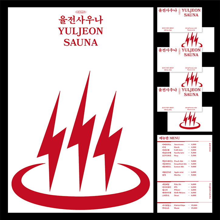
In the future, he hopes to work on more offline materials like a series of books, or to design an identity for a cafe or a line of products. Continuing to work with a variety of disciplines that inform his graphic design process, Jaeha hopes to further expand his network of interconnected skills under an umbrella of graphic design. “To challenge other forms of art is also a challenge in understanding the materials of graphic design.” The designer then goes on to conclude, “at the same time, these challenges are also a personal test to identify and understand my own capabilities”.
Jaeha Kim
Jaeha Kim
Jaeha Kim
Jaeha Kim
Jaeha Kim
Jaeha Kim
Jaeha Kim
Jaeha Kim
Share Article
Further Info
About the Author
—
Jynann joined It’s Nice That as an editorial assistant in August 2018 after graduating from The Glasgow School of Art’s Communication Design degree. In March 2019 she became a staff writer and in June 2021, she was made associate editor. She went freelance in 2022.