




Jakub Samek talks us through the evolution of his typeface Rhymes
The Prague-based designer, who has created multiple bespoke versions of the typeface in recent years, describes how he has adapted it to a variety of contexts.
Share
Jakub Samek’s creative career started – he admits today, displaying refreshing candour – with a minor act of fraud. While studying at an arts high school in Prague, he became a fan of the city’s famous nightlife, which meant he “was always late and sleepy during classes”. One day, as he was running behind with an assignment for a typography class, Jakub decided to trace some letterforms using a lightbox. “The result looked precise and my tutor fell in love with me,” he recalls. “In order not to break his heart, I started faking all the type drawings I could get my hands on for the next few years.”
While it started simply as a way to save time and get out of doing the work, this “cheating era”, as Jakub calls it, fostered in him a deep understanding and appreciation of typography. “I realised that I was capable of drawing those shapes by myself already quite well,” he explains. “The guilt inside me grew into a hint of that skill, which then drove my interest in typography.” From here, he went on to study type design at Prague’s Academy of Arts, Architecture, and Design (AAAD).
While at university, Jakub started work on a typeface called Rhymes, as part of a project called “Evolution” that saw students redesign selected classics. “I finished the first static styles of Rhymes for the final exhibition, which we curated together with Štěpán Marko, and also designed and co-edited a book about the project,” he says. Since then, Rhymes – in its original and in some newly designed forms – has found its way into a variety of projects.
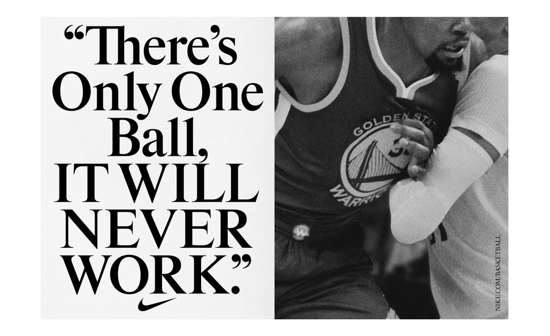
Back in 2018, for instance, Hort Berlin used the typeface in a Nike NBA campaign produced together with Tim+Tim, after which an unreleased version of the same font appeared in several other Nike outputs. More recently, new bespoke versions of Rhymes have been used by the Jan van Eyck Academy in Maastricht, in The Netherlands, and by one of the art world’s leading publications, Frieze Magazine.
There’s a symmetry to how these projects came about. Last year, new director Hicham Khalidi joined the Jan van Eyck Academy and decided to update the graphic identity. “The beautiful new visual style, designed by Nana Esi and Sophie Keij (of Atelier Brenda), deals with urgent questions of ecology, efficiency and time,” Jakub explains. “They came up with significant new type components for the logo and typeface. I incorporated it in the font and designed a proportionally different, more space-saving version of Rhymes for them.”
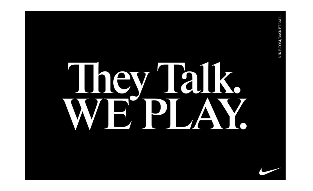
Jakub Samek: Rhymes typeface in use – Nike Basketball NBA Finals campaign designed by Hort and Tim+Tim (2018)
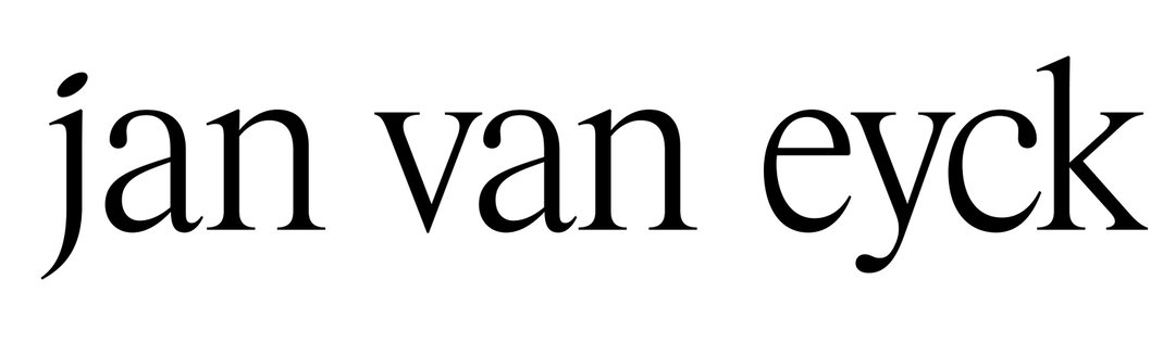
Jakub Samek: Rhymes Van Eyck typeface — Redesign of the Jan Van Eyck Academy visual identity designed by Atelier Brenda (2020)
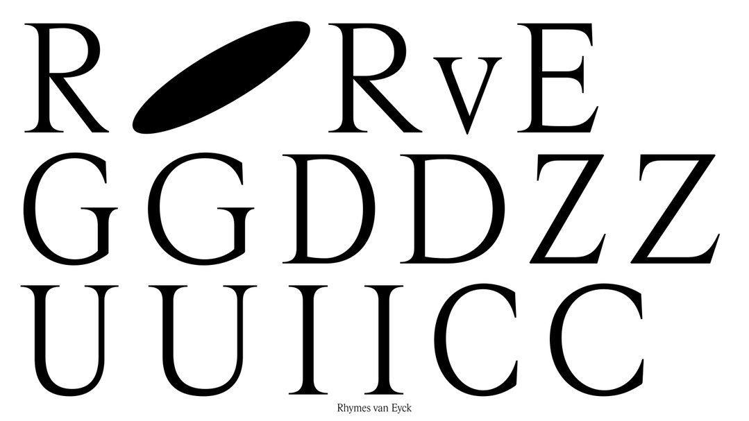
Jakub Samek: Rhymes Van Eyck typeface — Redesign of the Jan Van Eyck Academy visual identity designed by Atelier Brenda (2020)
A similar thing happened with Frieze, when new editor-in-chief Andrew Durbin came onboard and a fresh redesign was kicked off. “David Lane with Lorenz Klingebiel came up with great new layouts set in Rhymes,” says Jakub. “I designed a bespoke bold compressed/narrow style, especially for the magazine columns. It’s a bit chewy and retro, so that it works with the secondary typeface Swiss721 and also brings a bit of the imperfection, soft comfort of the past.”
Outside of Rhymes, Jakub has lent his type-design skills to a variety of different projects, including a visual identity for Ingredients, a niche perfume store in Prague; the design of Pramen, a book documenting 10 years of the Studio of Photography at AAAD (designed in collaboration with Parallel Practice); and Reformulate, a typeface distributed by Briefcase Type Foundry in Prague.
Rhymes is soon going to be released by Maxitype, a new Swiss type foundry founded by David Keshavjee and Jullien Tavelli from studio Maximage. And there is more exciting news on the horizon for Jakub. He’s working on a couple of books alongside fellow designer and “kindred spirit” Martin Groch – one is called Temples of Money and is about “the intriguing Czech architecture of banking socialism in the 90s”; the other is a new novel by Persis Bekkering called Exces, for which he is doing the cover lettering.
He’s also currently enjoying his time as a designer in residence at the Jan van Eyck Academy and is keen to start a new typeface (“Not sure what it will be,” he says). In the meantime, though, he’s simply enjoying the space and time to experiment and discuss with his peers in Maastricht. “Simply being with the community of participants could already fill one’s mind and schedule,” he says. “The dialogue is why we are actually here. There is space for research, try-outs, or just reading and thinking, and I’m OK with any of those now.”
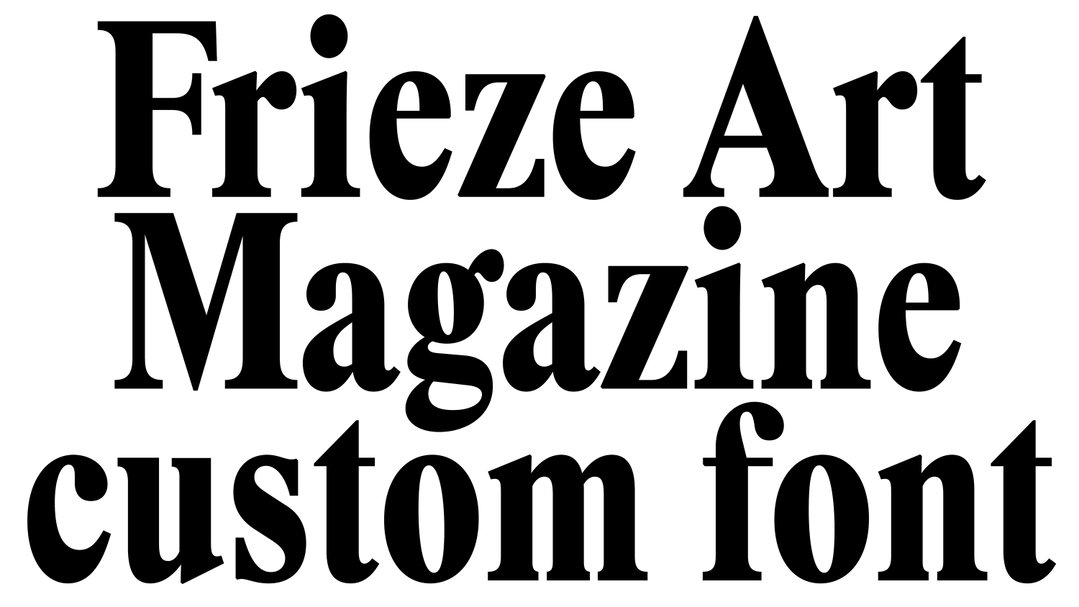
Jakub Samek: Frieze Magazine redesign by David Lane & Lorenz Klingebiel; set in Rhymes font with a new bespoke Rhymes Headline style (2020)
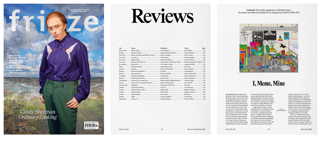
Jakub Samek: Frieze Magazine redesign by David Lane & Lorenz Klingebiel; set in Rhymes font with a new bespoke Rhymes Headline style (2020)
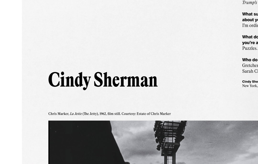
Jakub Samek: Frieze Magazine redesign by David Lane & Lorenz Klingebiel; set in Rhymes font with a new bespoke Rhymes Headline style (2020)
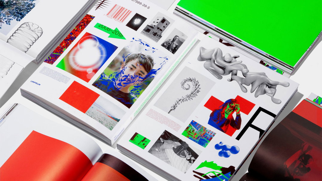
Jakub Samek: Pramen book – Designed in collaboration with Parallel Practice (2018; Photo of the book by Radek Brousil; Colours by colorlibrary.ch)
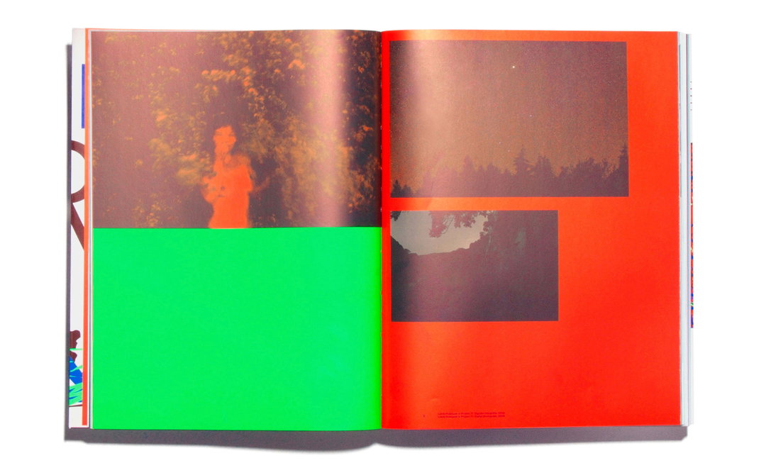
Jakub Samek: Pramen book – Designed in collaboration with Parallel Practice (2018; Photo of the book by Radek Brousil; Colours by colorlibrary.ch)
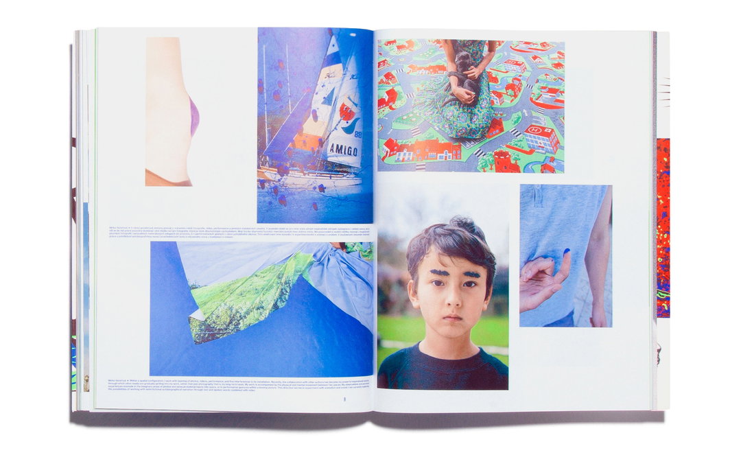
Jakub Samek: Pramen book – Designed in collaboration with Parallel Practice (2018; Photo of the book by Radek Brousil; Colors by colorlibrary.ch)
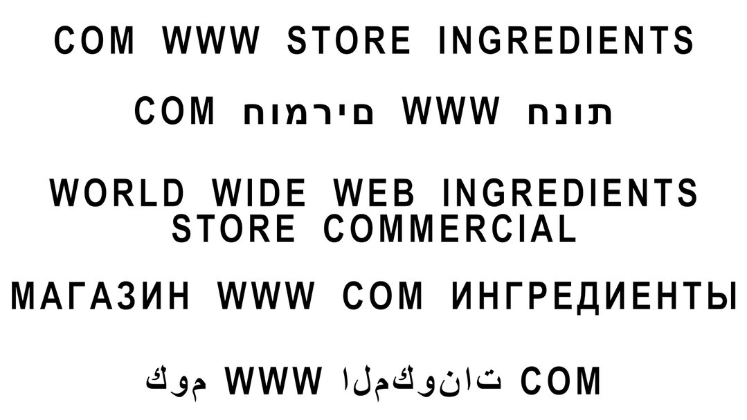
Jakub Samek: Fragments of Ingredients Store visual identity (2019)
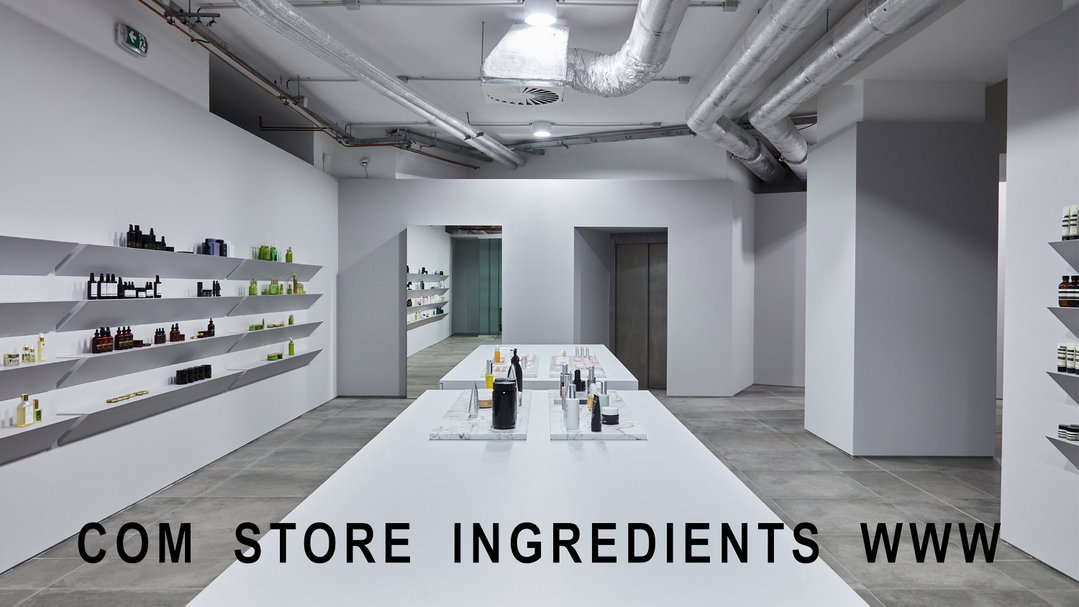
Jakub Samek: Fragments of Ingredients Store visual identity (2019)
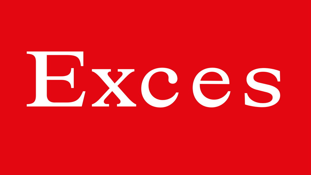
Jakub Samek: Sketch of the cover lettering for Exces, a novel by Persis Bekkering. Designed in collaboration with Martin Groch (to be released in 2021)
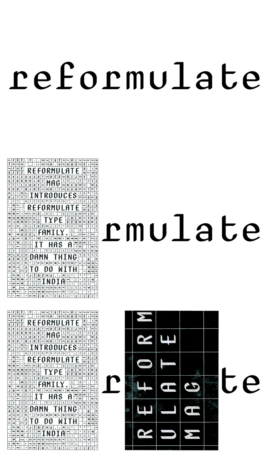
Jakub Samek: Reformulate typeface (overlaying images are fragments of Reformulate Mag, designed by Michal Landa), typeface is distributed by Briefcase Type Foundry (2011)
Hero Header
Jakub Samek: Rhymes typeface in use – Nike Basketball NBA Finals campaign designed by Hort and Tim+Tim (2018)
Share Article
Further Info
About the Author
—
Matt joined It’s Nice That as editor in October 2018 and was editor-in-chief in September 2020–2024. He was previously executive editor at Monocle magazine. He is now a freelance writer and editor.


