




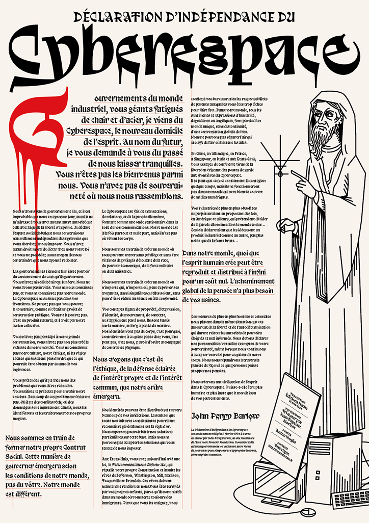
Velvetyne's new font Trickster is cool, weird, maybe ugly, "but at least it’s not your usual Helv"
“When the Velvetyne crew and I published the typeface, I called it ‘a smooth blend of Merovingian writing, blackletter influences and contemporary shapes,’” designer Jean Baptiste Morizot says of his typeface, Trickster. “It’s a smart way to say I don’t know how to label it properly.”
Released via playful French type foundry Velvetyne, Trickster as Jean Baptiste says, is quite difficult to describe. It’s not a typeface you would automatically turn to use, but one to be applied for an edge, for fun, or even to evoke some kind of medieval mood. The design itself is fairly unusual, loopy and thick, slightly calligraphic but bold at the same time, “call it weird or ugly if you want,” says the designer, “but at least it’s not your usual Helv”.
Initially developed from “frenetic pen and paper doodling periods,” as iterations of Trickster were drawn out repeatedly there was one letter Jean Baptiste kept returning to, “this radical and unusual ‘a’. I liked it so much I drew it again and again until I switched to the computer and designers the glyph directly with Bezier curves.”
Partly returning to it because the letter was a challenge, this first letter of the alphabet posed many questions for Trickster as a whole. Queries such as “how to derive a typeface for this atypical letterform? Is it even possible?” began to crop up. Referencing medieval calligraphy as an influence, the typeface took on a unique perspective stemming from Luxeuil writing, also described as Merovingian writing. “Merovingian writing is quite illegible now because of the many ligatures, forgotten letter constructions, and the use of a writing tool that allows you to go back from bottom to top and cause very black stems (you don’t do that usually in calligraphy).”
Noticing how influenced he was by the Luxeil approach to letterforms, Jean Baptiste ran with the idea, loosely using its shape and amalgamating with his initial “a” design. From there, other letters quickly followed suit, the “g” and “o” for instance follows a Merovingian construction, “while the square-like ‘m’ and ‘n’ are influenced by the ‘a’,” says the designer. Tiny details from the writings Jean Baptiste was inspired by filter through the typefaces final design, “it’s a calligraphic feature with a reason,” he says.
Once developed “the typeface had a Blackletter feeling, so quickly I moved to a bolder weight,” Jean Baptiste describes. “The letter space followed the movement and I redesigned the ‘m’ and ‘n’ in a more classical way. Yes, the dot on the ‘i’ is a mess, and curves are generally wrong.” However, the quirks in Trickster build its charm and give it a personality to mould. From this stage the designer began to dig deeper, making the weight even bolder before making the remaining lowercase and the capitals.
Trickster’s influences also reference the contemporary too, as Jean Baptiste “works in a neighbourhood where tags bloom on corner shop,” and the stylistics of graffiti writing can be particularly seen within the typeface’s featured “f”. While other challenges cropped up when the designer was working out the numerals and other details, now implemented Trickster’s strengths are evident. To celebrate its release Velvetyne worked with a bunch or brilliant designers to showcase its use displaying how despite it’s medieval roots, it can be applied in an array of graphic styles.
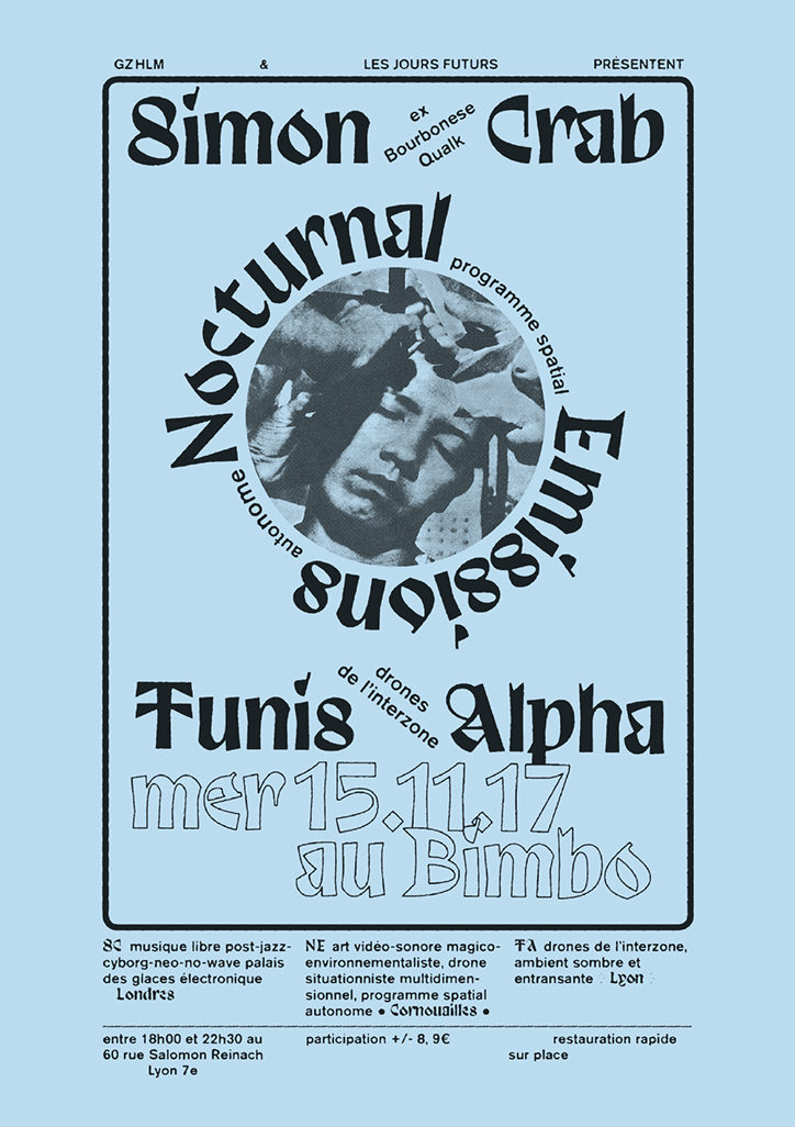
Velvetyne and Jean Baptiste Morizot: Trickster, poster by Félcité Landivon
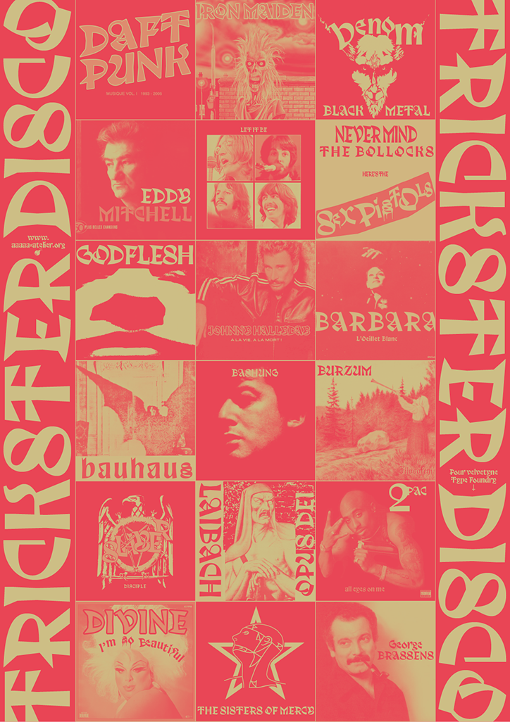
Velvetyne and Jean Baptiste Morizot: Trickster, poster by AAAA Atelier
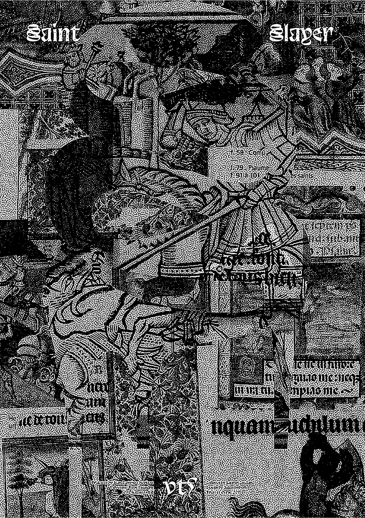
Velvetyne and Jean Baptiste Morizot: Trickster, poster by Lauren Coullard
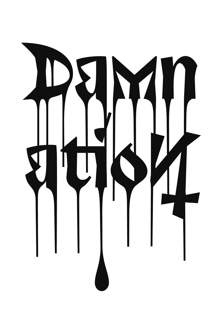
Velvetyne and Jean Baptiste Morizot: Trickster, poster by Jean Baptiste Morizot
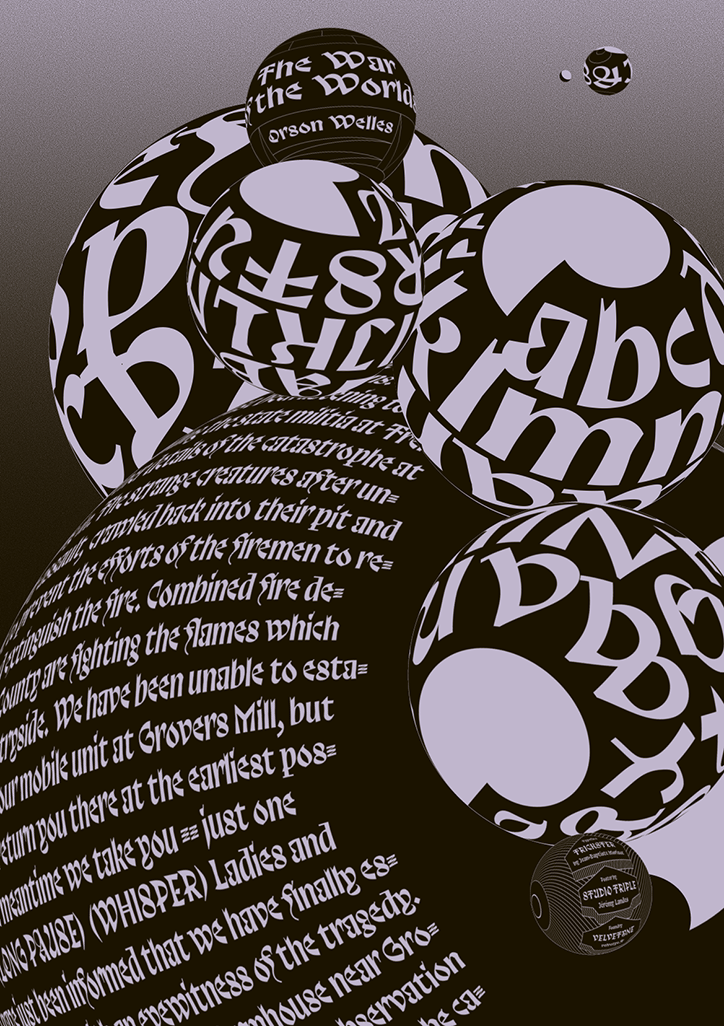
Velvetyne and Jean Baptiste Morizot: Trickster, poster by Jérémy Landes
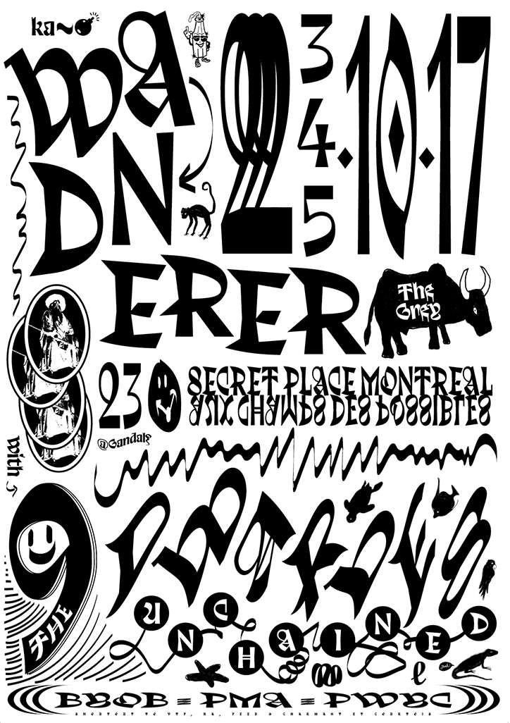
Velvetyne and Jean Baptiste Morizot: Trickster, poster by Lionel Michée
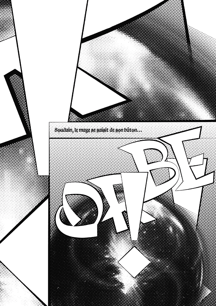
Velvetyne and Jean Baptiste Morizot: Trickster, poster by Lucas Le Bihan
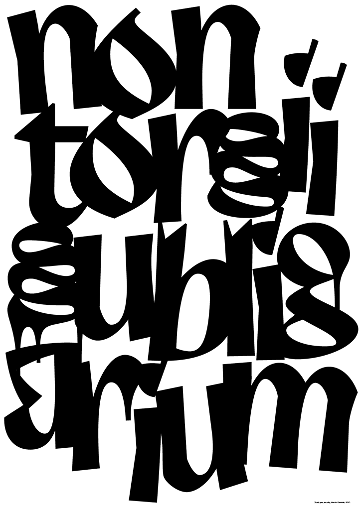
Velvetyne and Jean Baptiste Morizot: Trickster, poster by Martin Desinde
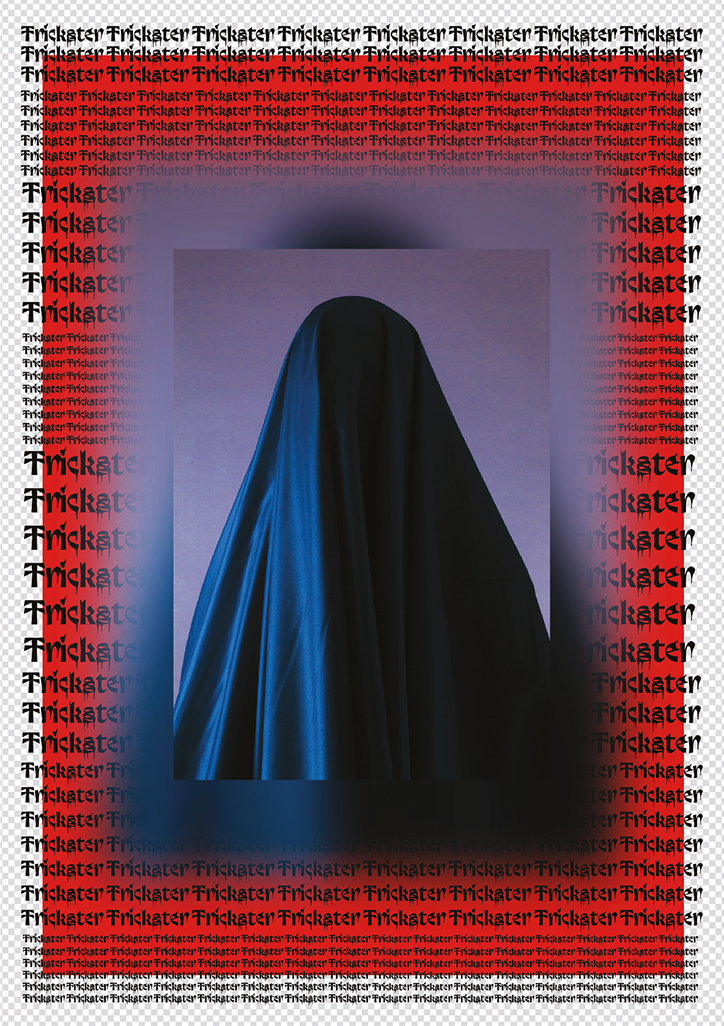
Velvetyne and Jean Baptiste Morizot: Trickster, poster by Murmure
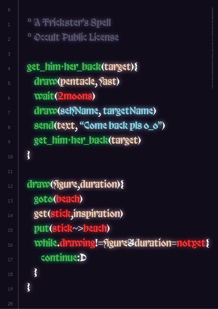
Velvetyne and Jean Baptiste Morizot: Trickster, poster by Raphael Bastide
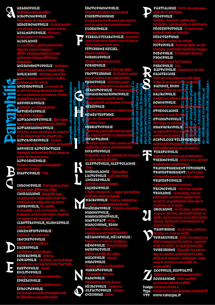
Velvetyne and Jean Baptiste Morizot: Trickster, poster by Sébastien Hayez
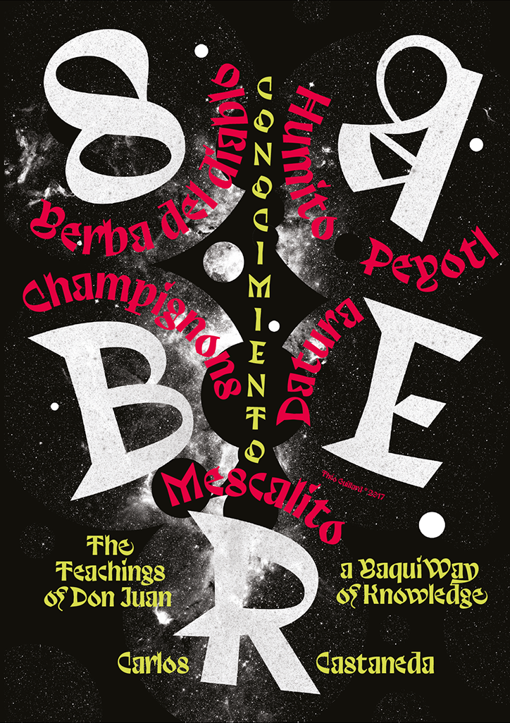
Velvetyne and Jean Baptiste Morizot: Trickster, poster by Théo Guillard
Share Article
Further Info
About the Author
—
Lucy (she/her) was part of the It’s Nice That team from 2016–2025, first joining as a staff writer after graduating from Chelsea College of Art with a degree in Graphic Design Communication, eventually becoming a senior editor on our editorial team, and most recently at Insights, a research-driven department with It’s Nice That.
