




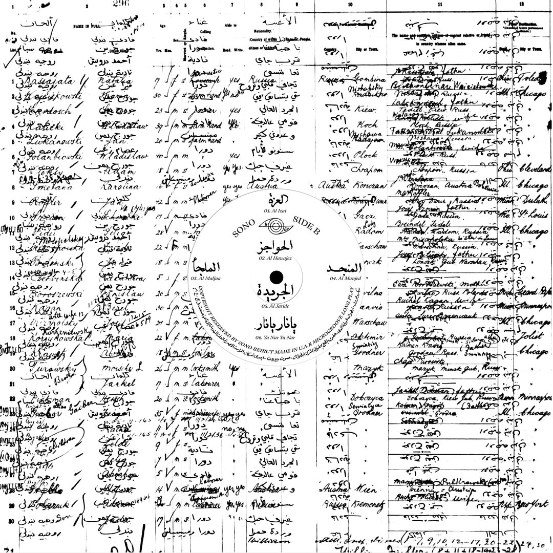
Graphic designer Lana Soufeh goes back to her roots in a creative exploration of Arabic type-led design
The Jordan-based designer draws on her rich cultural background to explore not only her creative practice but also a multifaceted identity.
For Lana Soufeh, being a good graphic designer isn’t just about technical skills or interesting concepts. It also means being a good reader and a good listener. In this way, she takes mental notes on a range of experiences and eventually, these make their way into her creative thinking and design processes.
Having grown up in Saudi Arabia, studied in Lebanon and now living in Jordan, the designer pulls from a wide gamut of cultural references to inform her buzzing design practice. A recent graduate of the American University of Beirut, Lana is just a couple of years out of uni, so doesn’t think she’s landed on her signature aesthetic just yet. That being said, she notes how she is “always captivated” by organised chaos.
When Lana first started exploring her creative side, she barely understood the role of the graphic designer. While studying in Beirut, she remembers observing the architecture and marvelling at the student posters hanging on the walls as she entered the buildings. “It was honestly a breathtaking moment for me,” she says, “because every poster felt like a deep breath.” It was here that she first appreciated the individual character and charm of poster design, experiencing its unique combination of message and creativity that set her on her path.
Though Lana grew up in the multicultural hubbub of Saudi Arabia where she met many different people from a variety of cultures and backgrounds, she admits, in her eyes, the city “was kind of bland.” In contrast, the colourful posters she saw covering the streets of Beirut opened a new avenue of creative potential. “It was freeing,” Lana explains of the pivotal turning point, “it was something I never got to experience before becoming a designer. Without a second, I enrolled in the graphic design program, and now at 24, there is nothing else I want to do more than this and I can’t picture myself in any other field of practice.”
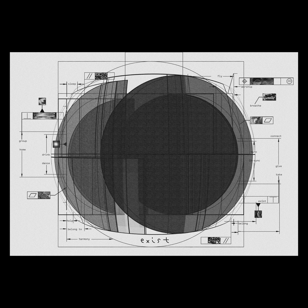
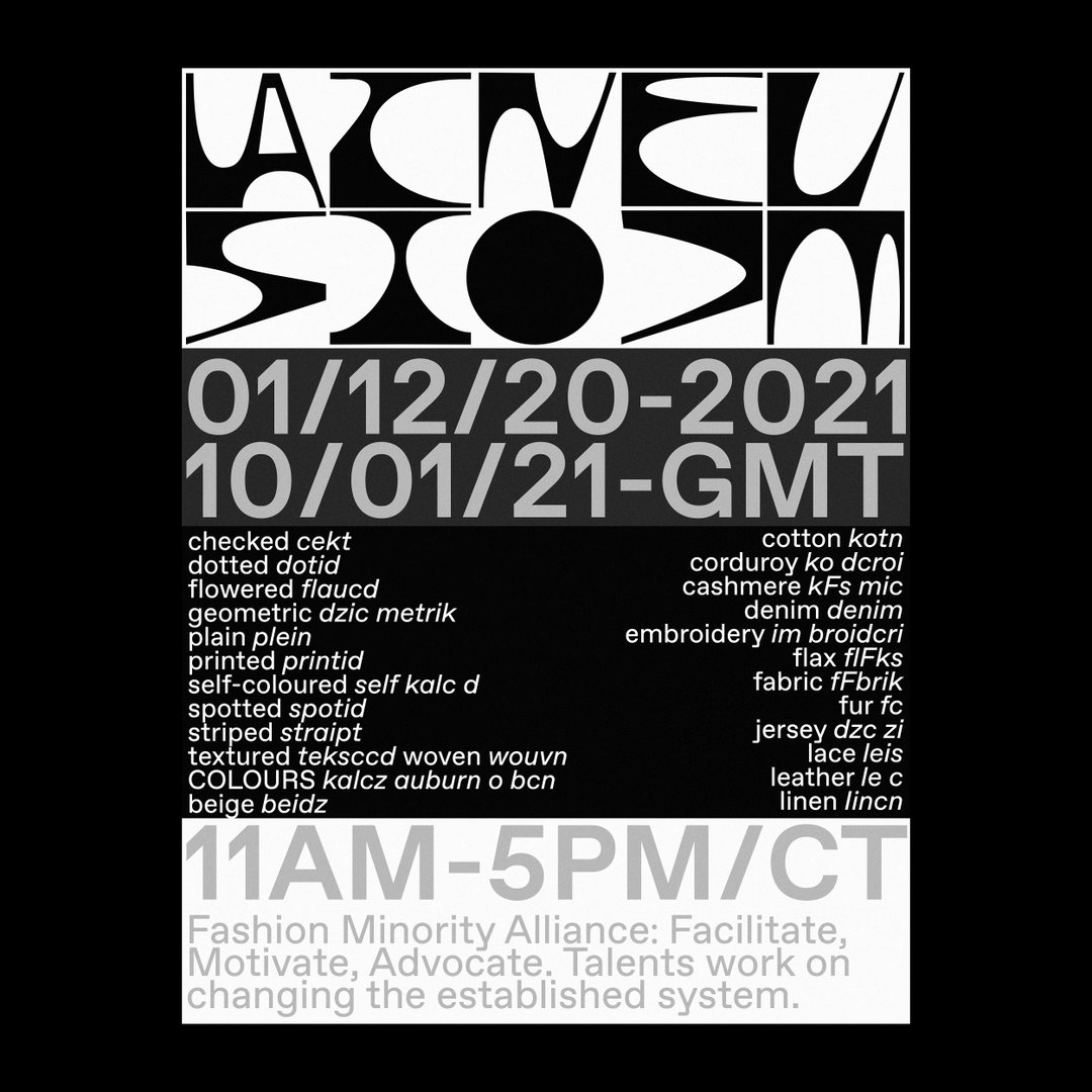
Her designs are highly decorated with an amalgamation of graphic symbols and typography seen on the surface of her print and editorial work. But when you take a closer look, there is an order to all of Lana’s output. “Designing layouts is a sort of therapy for me,” she explains. Soon after graduating, the pandemic quickly unravelled and the designer found herself back in Jordan where she realised “how difficult it is for a woman designer to grown and expand.” As a way of coping, she immersed herself in research, trying new things and reading. Finding a solution was no mean feat but Lana knew one thing for sure: “I wanted to keep moving forward." And by “blindly trusting myself,” she found the answers she was looking for.
Copyright © Lana Soufeh, 2021
For example, she’s found creative inspiration and solace in talking to fellow young, ambitious designers (especially female ones) which help develop the narrative surrounding Lana’s work. “Coming from the Middle East,” she continues, “has already set me apart from other people in the industry because of our background.” She cites the particularly difficult last year for the region in driving her practice, and herself, forwards. From the devastating blast in Beirut to the current situation in Palestine, Lana’s recent motivations come from the fact that “we all have our battles here and this is what truly moves me.” The designer goes on to say, “Yes, what’s around me is not ideal or close to perfect politically, culturally, socially, you name it. I battled this idea for a long time but eventually it is what makes me who I am today, and I can say that for many other people who are also in my shoes, and for the generations before me.”
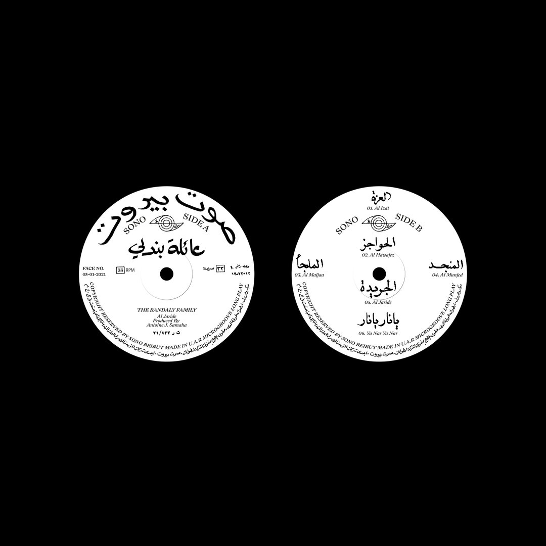
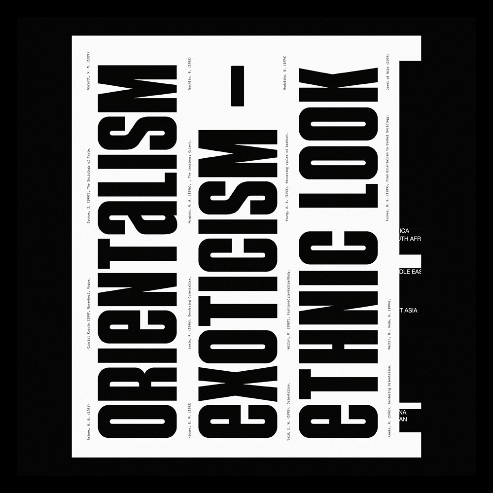
In attempting to grapple with this duality, Lana has found her source of inspiration. She not only finds creative release in her expressive designs, but also explores the sociopolitical nuances that come with her Arabic identity. She talks us through two projects which do exactly this, both of them noted for “bringing me back to my roots.” First off, the Bandaly Project is significant to Lana, as it marks the first project incorporating Arabic type and design after almost a year of distance “due to an ongoing conflict with my culture.” Fusing Latin and Arabic typography together, and thus exploring an intersection of East and West, Lana slowly began to revisit her heritage in this typographic collaboration with Andrea Biggio. By pouring both their cultures into the project, they hoped to create a linguistic hybrid as seen through the experimental redesign of the Al Jaride vinyl.
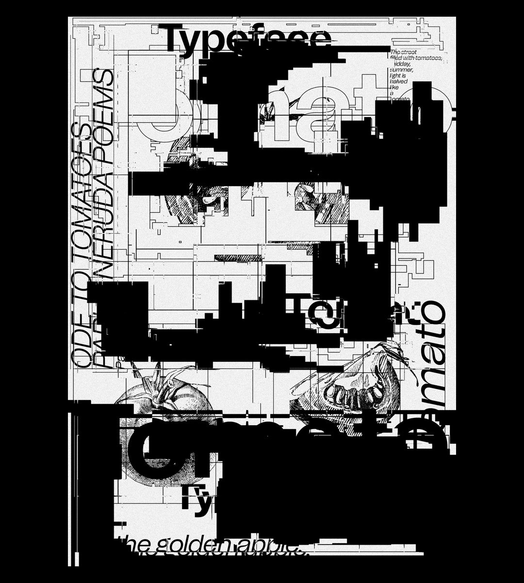
Elsewhere, Lana has designed the opening title for the experimental short Out of her father’s house, which is based on the traditional Arabic wedding procession (zaffah) song that narrates the story of a woman before she goes through the stages of a traditional marriage. The designer continues, “this pre-engagement tradition acts as a barrier for the woman’s freedom of expression and decision of her marriage.” As a result, the title tries to visualise this femininity through the typography choices of the title sequence but at the same time, Lana’s treatment is also bold and powerful, adding an edge to the tradition of the topic at hand.
As for the future, Lana still has a lot to see, learn and explore. Not just in the creative industry and through education, but also in life; she’s also been accepted on ÉCAL’s Type Design Master’s where she hopes to embark on a new chapter of learning. While the future is bright, she ends our interview on a nod to the present and what she’s doing in the now: “I hope to look back to this article one day, and know that I was able to contribute back to my culture in some way or the other.”
GalleryCopyright © Lana Soufeh, 2021
Become an Extra Nice Supporter
Unlock an inspiring new way to explore It’s Nice That, get your hands on exclusive perks, and help bring meaningful creative projects to life.
Hero Header
Copyright © Lana Soufeh, 2021
Share Article
Further Info
About the Author
—
Jynann joined It’s Nice That as an editorial assistant in August 2018 after graduating from The Glasgow School of Art’s Communication Design degree. In March 2019 she became a staff writer and in June 2021, she was made associate editor. She went freelance in 2022.