Lorena Manhães is using flexible visual systems to tell stories with a sense of rhythm
The independent art director and graphic designer is taking her editorial background into branding to structure her expansive and expressive identities.
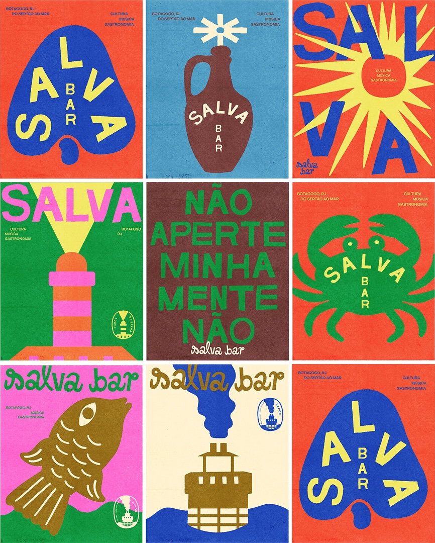
When it comes to branding, rather than thinking of identities as fixed or static systems, Lorena Manhães likes to see them as “something that can be expanded and expressed in many ways”. Coming from an editorial background, her approach to building visual narratives across design systems for print or web, art direction and campaigns is thoughtful, capturing each project’s core with a heavy dose of editing: “I focus on creating tension between elements to produce simple, impactful design pieces,” Lorena shares.
With over a decade of experience in the creative industry, Lorena now works from her base in Barcelona across the fields of art direction and graphic design. The Brazilian-born designer splits her time between working for big agencies on briefs for clients across the globe like Microsoft, and contributing to smaller design-driven companies and cultural institutions in Barcelona, tapping into her narrative-driven approach to branding. She also makes sure to carve out some creative time to collaborate with artists in her home of Brazil, diving into self-initiated projects as a way to “bring my own perspective to curation, product design and creative direction and explore ways to broaden the spectrum of Brazilian culture”, she says.
Lorena sources inspiration for her clean and colourful visual work from bookshelves — often finding herself absorbed by “the rhythmic balance of layouts, photography, and narratives” in photobooks and magazines. “More than any standalone artworks, I’m drawn to systems that are flexible and tell dynamic stories with a sense of rhythm”, she says. Something that’s always drawn the designer to the art of branding is its ability to be “endlessly collaborative”, with the joy of creating visual languages often extending far beyond just the design work itself.
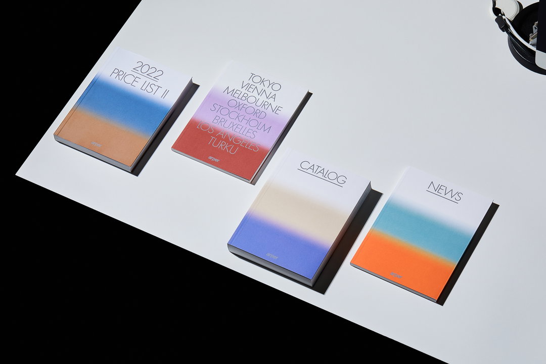
Lorena Manhães: Arper cover and communication system, creative direction and graphic design by Clasebcn & Lorena Manhães. Image courtesy of Clasebcn (Copyright © Clasebcn & Lorena Manhães, 2022)
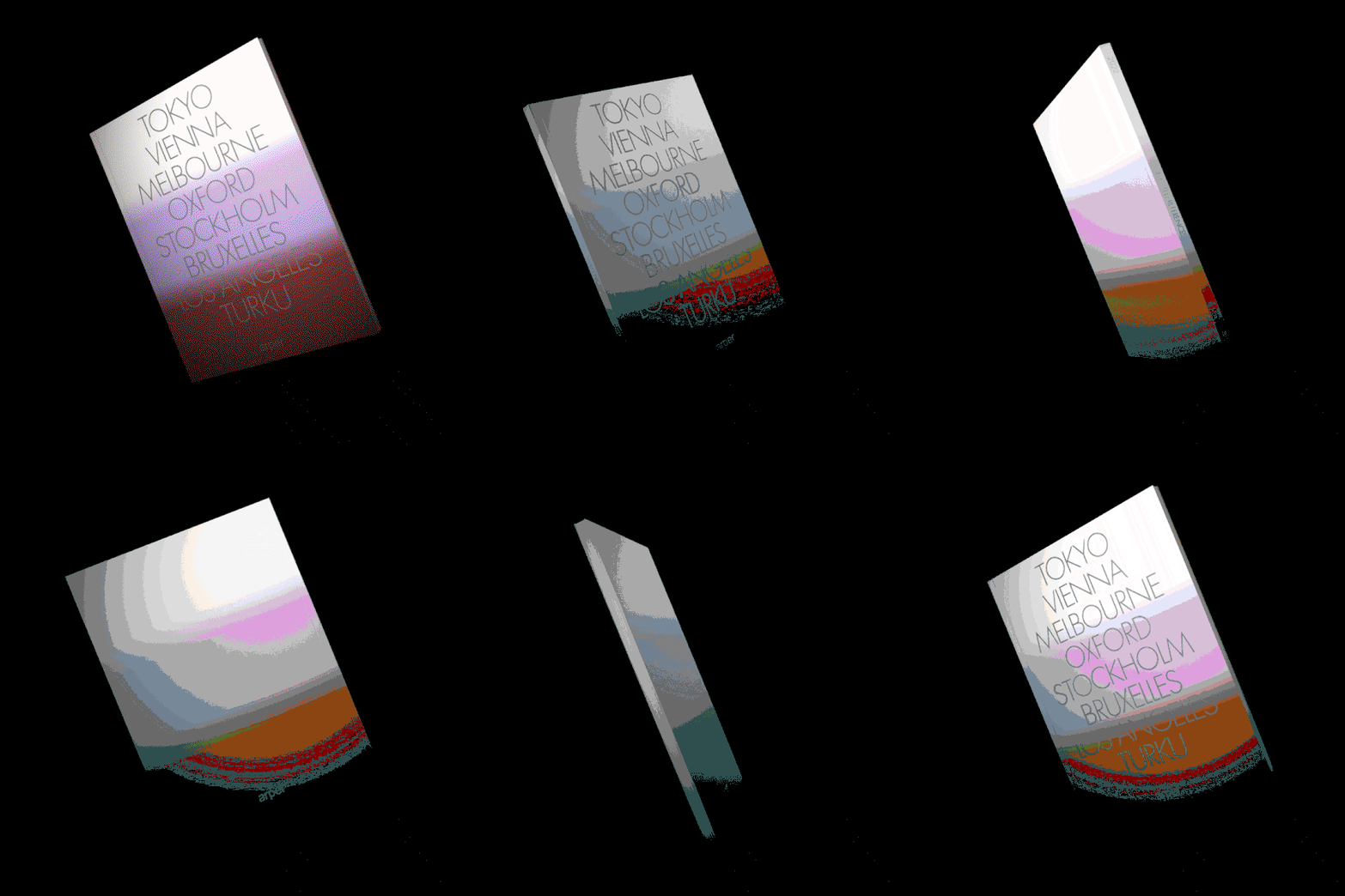
Lorena Manhães: Arper cover and communication system, creative direction and graphic design by Clasebcn & Lorena Manhães. Image courtesy of Clasebcn (Copyright © Clasebcn & Lorena Manhães, 2022)
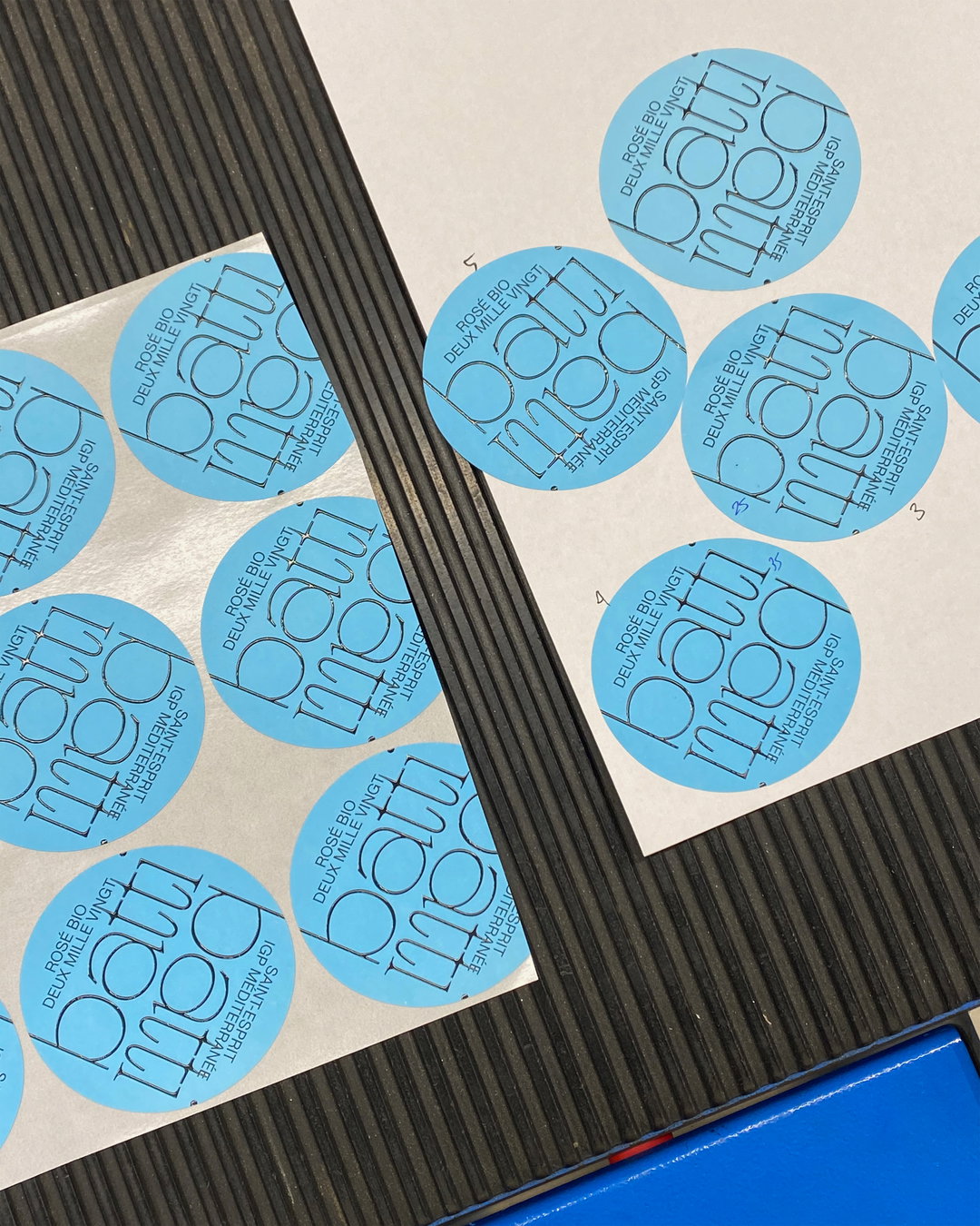
Lorena Manhães, Atipus: Batti Batti wine label and visual identity, Image courtesy of Atipus (Copyright © Atipus & Lorena Manhães, 2020)
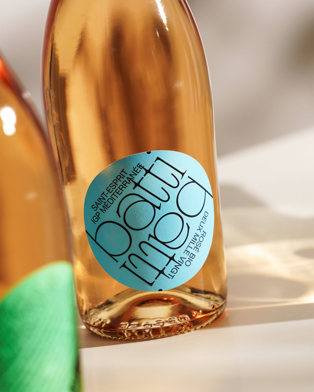
Lorena Manhães, Atipus: Batti Batti wine label and visual identity, Image courtesy of Atipus (Copyright © Atipus & Lorena Manhães, 2020)
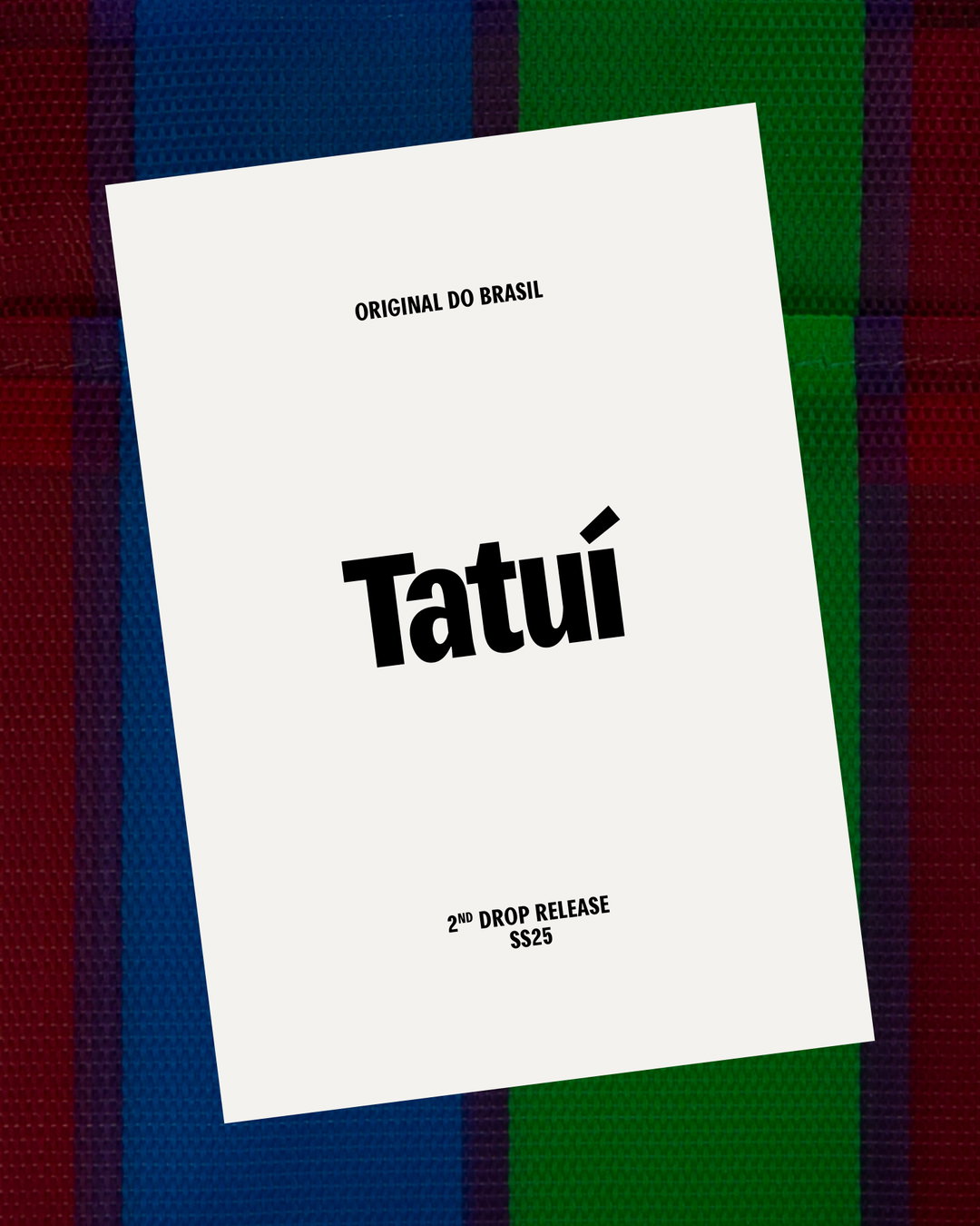
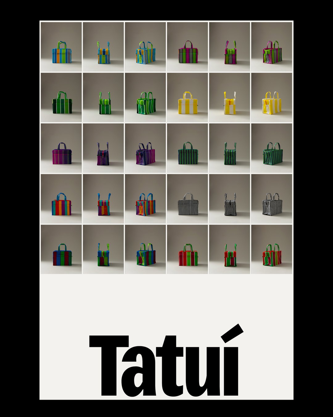
Lorena Manhães: Tatuí, self-initiated project (Copyright © Lorena Manhães, 2024)
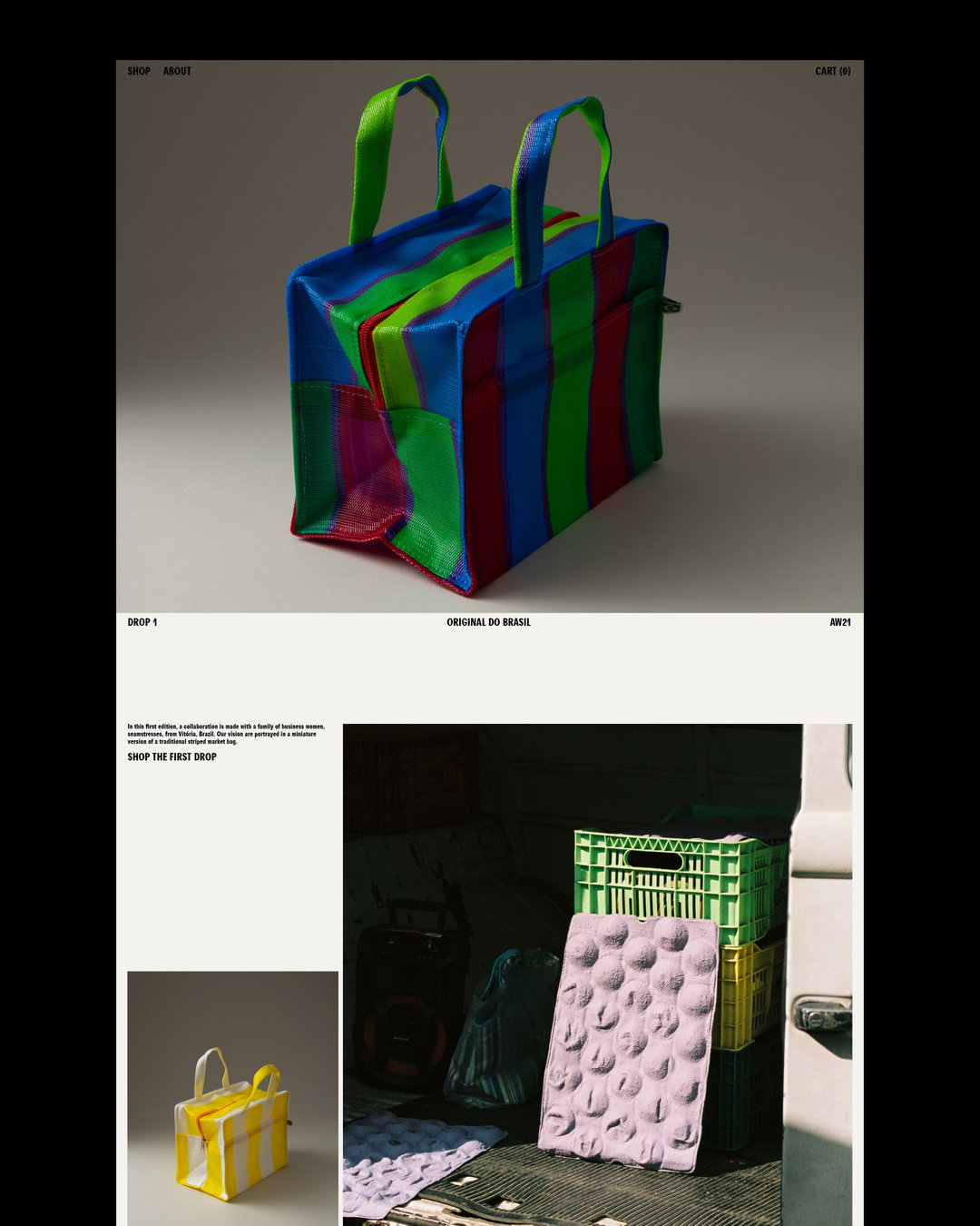
Lorena Manhães: Tatuí, self-initiated project (Copyright © Lorena Manhães, 2024)
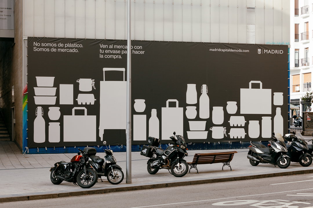
Lorena Manhães, Atipus: Madrid city campaign to reduce single use plastic, Image courtesy of Atipus (Copyright © Atipus & Lorena Manhães, 2020)
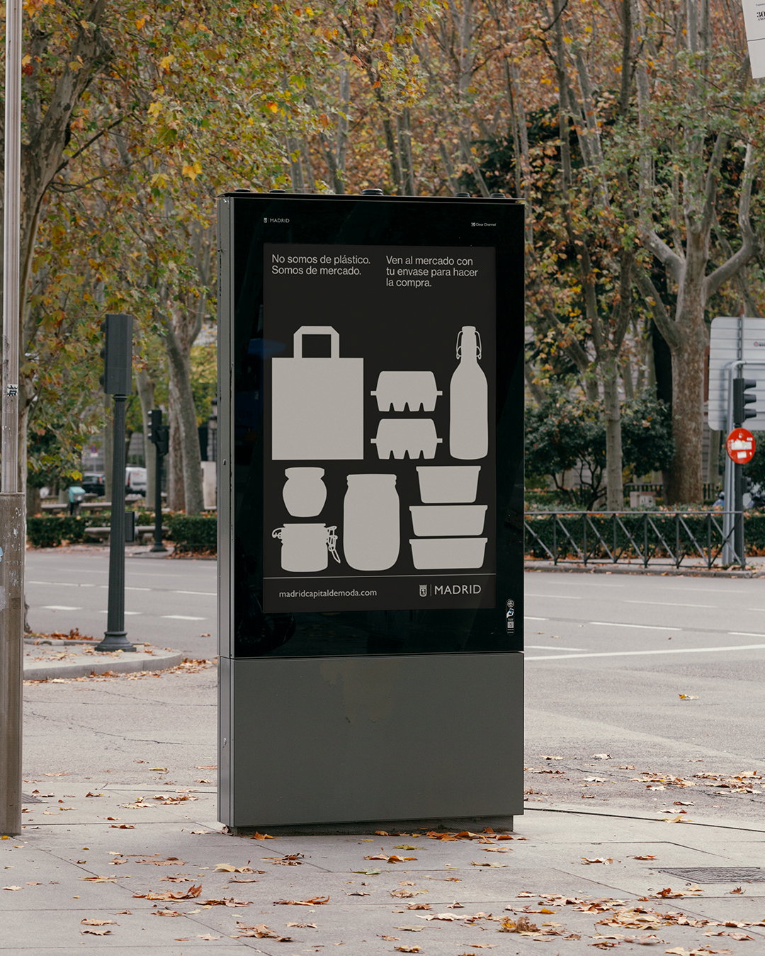
Lorena Manhães, Atipus: Madrid city campaign to reduce single use plastic, Image courtesy of Atipus (Copyright © Atipus & Lorena Manhães, 2020)
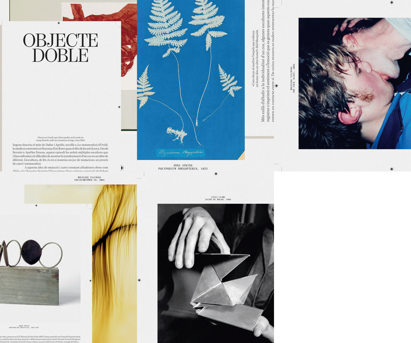
Lorena Manhães, Clasebcn: The Point of Sculpture book (Copyright © Clasebcn & Lorena Manhães, 2022)
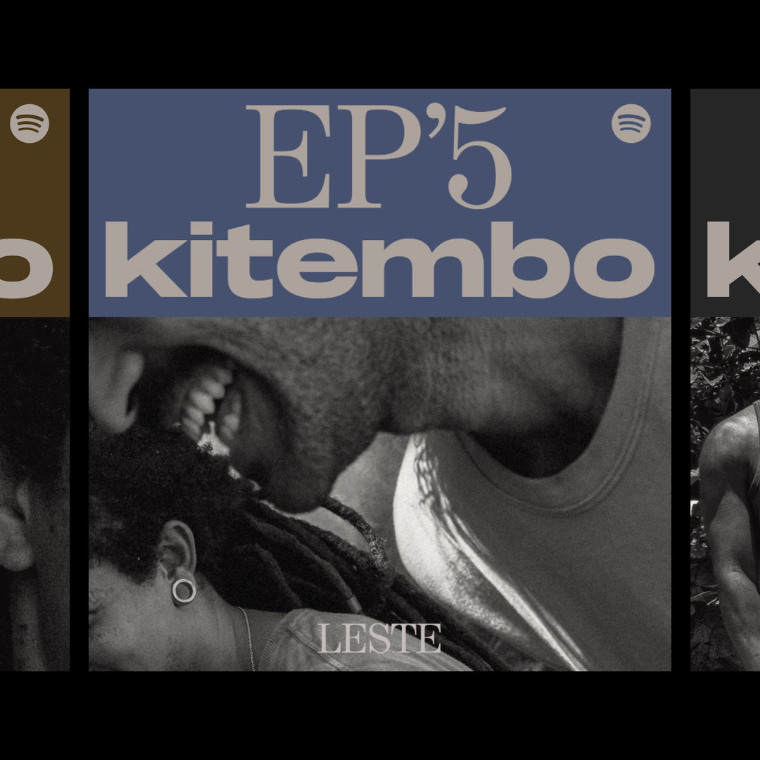
Lorena Manhães: Kitembo podcast, Quintal Bantu (Copyright © Lorena Manhães, 2021)
Hero Header
Lorena Manhães: Tatuí, self-initiated project (Copyright © Lorena Manhães, 2024)
Share Article
Further Info
About the Author
—
Ellis Tree (she/her) is a staff writer at It’s Nice That. She joined as a junior writer in April 2024 after graduating from Kingston School of Art with a degree in Graphic Design. Across her research, writing and visual work she has a particular interest in printmaking, self-publishing and expanded approaches to photography. [email protected]
To submit your work to be featured on the site, see our Submissions Guide.