Loveday Vickers’ vibrant graphic design work turns to tactile elements and interactive experiences
The designer is playing with paper, packaging, publishing and stop-motion to reimagine our design interactions into playful and immersive new forms.
Loveday Vickers’ creative process “thrives on hands-on experimentation and bringing ideas to life through dynamic forms”. Taking a playful approach to materials and traditional formats, the designer’s greatest interests lie in experiential graphic design. “I am particularly interested in how people interact with design in physical spaces,” she tells It’s Nice That, and the “rich opportunities for innovation and deeper audience engagement it presents.”
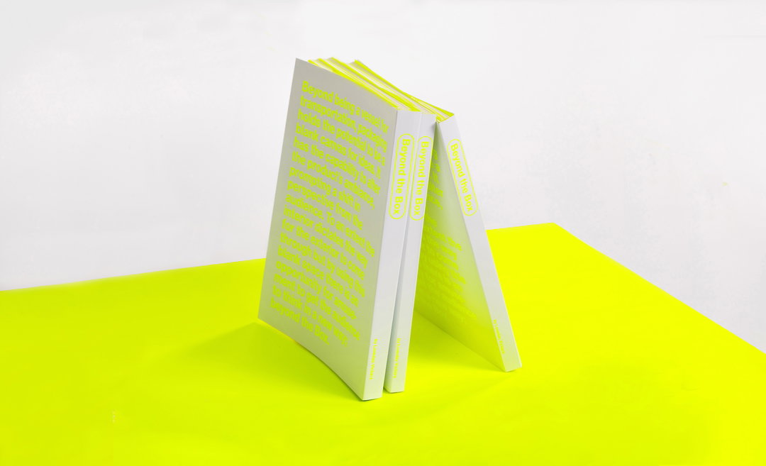
Breaking away from the flat page (quite literally) in her exhibition Rethinking Conventions where she challenges the traditional view of posters as static uniform prints, Loveday is interested in breaking free from traditional graphic constraints and entering into a world of tactile 3D joy in her design projects. On this occasion, she’s doing so through some wonderful coloured corners. This attention to the tactile details of our designed environments is celebrated in her captivating claymation Muted Symphony and the designer’s editorial project on what packaging means, Beyond the Box. The latter is a carefully considered documentation of the designer’s extended research on “humour in package design through metaphor, personification, and synecdoche” and its engagement and interaction from different product audiences.
A recent graduate from Kingston School of Art, the designer has taken inspiration from the work of design collectives and contemporary artists who “challenge conventional boundaries”, during her time studying, a common point of reference being Barbara Solomon. Besides the clean graphic forms of the American landscape architect and designer, Loveday takes creative fuel from all those she works alongside for her many collaborative endeavours.
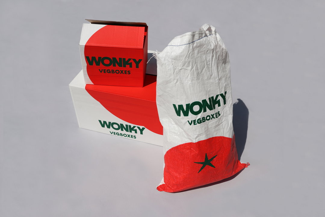
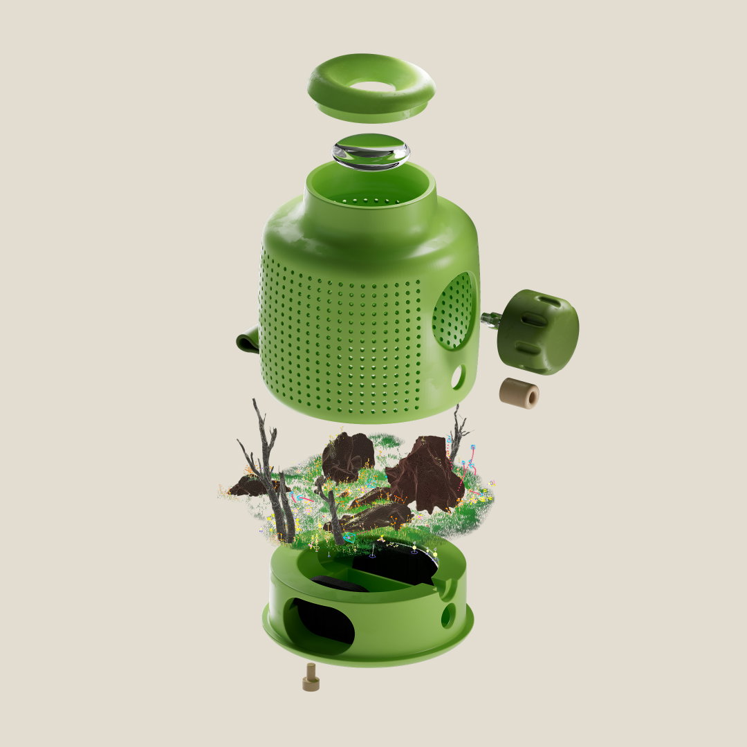
Loveday Vickers: Wonky Vegboxes (Copyright © Loveday Vickers, 2024)

Loveday Vickers: Wonky Vegboxes (Copyright © Loveday Vickers, 2024)
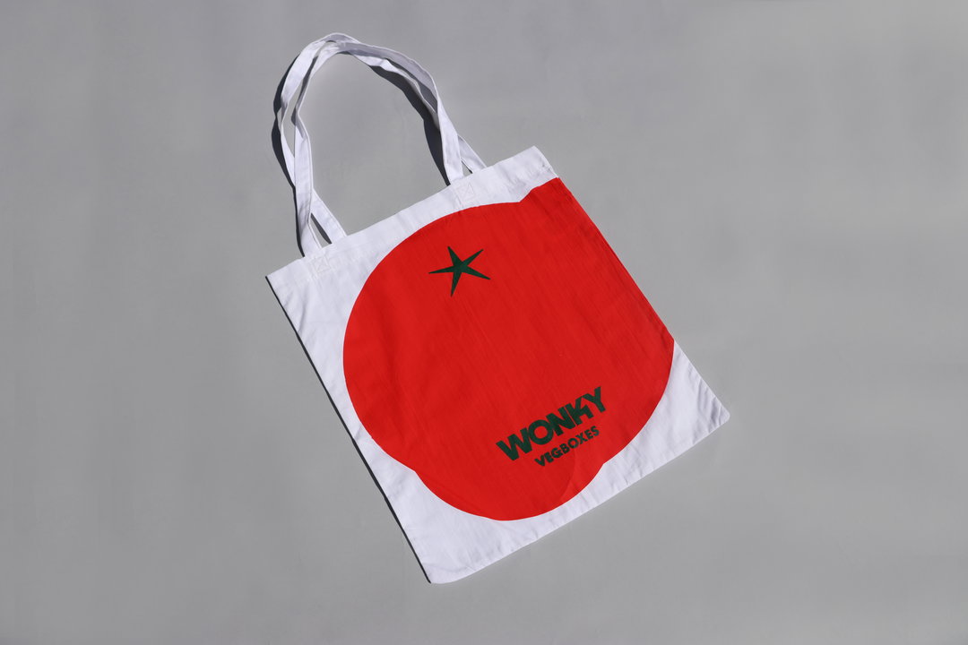
Loveday Vickers: Wonky Vegboxes (Copyright © Loveday Vickers, 2024)
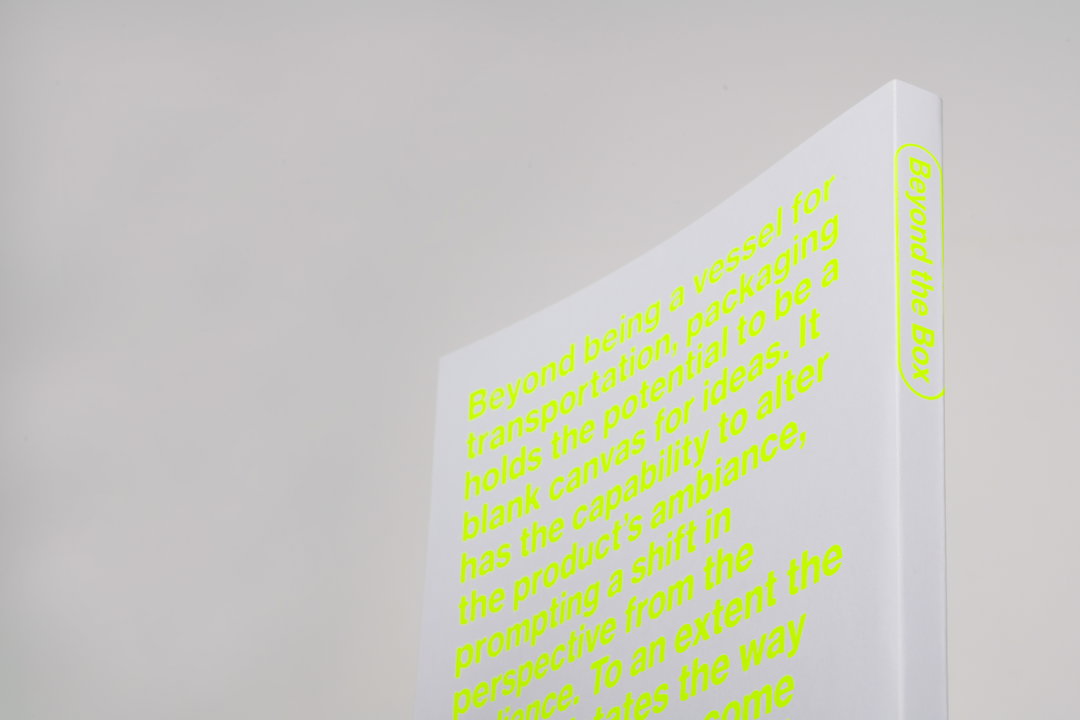
Loveday Vickers: Beyond the Box (Copyright © Loveday Vickers, 2024)
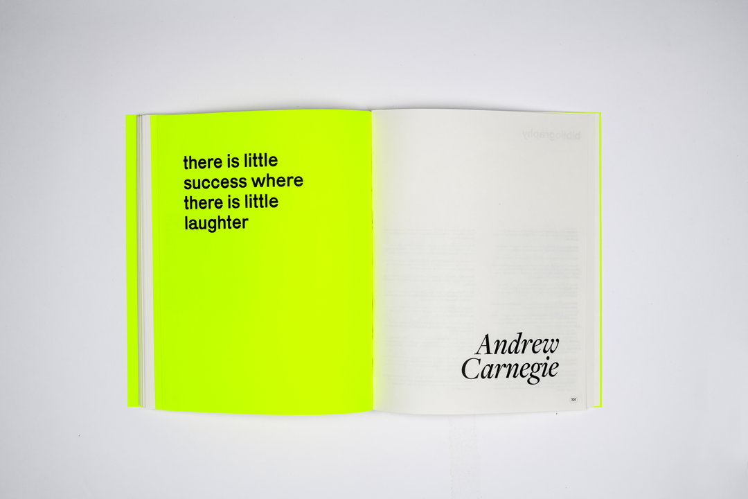
Loveday Vickers: Beyond the Box (Copyright © Loveday Vickers, 2024)
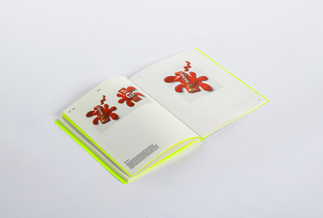
Loveday Vickers: Beyond the Box (Copyright © Loveday Vickers, 2024)
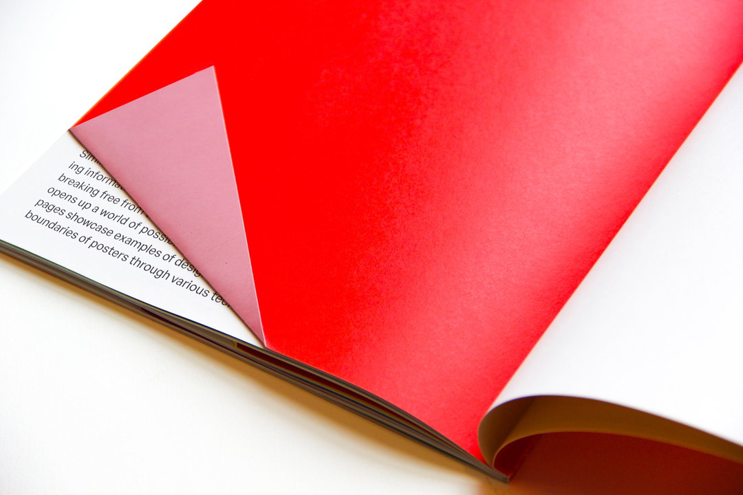
Loveday Vickers: Rethinking conventions (Copyright © Loveday Vickers, 2024)
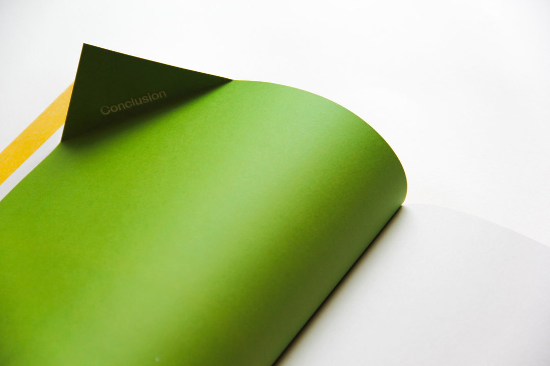
Loveday Vickers: Rethinking conventions (Copyright © Loveday Vickers, 2024)
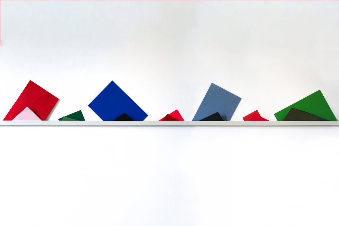
Loveday Vickers: Rethinking conventions (Copyright © Loveday Vickers, 2024)
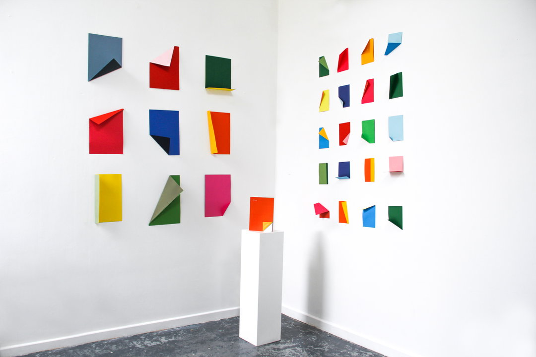
Loveday Vickers: Rethinking conventions (Copyright © Loveday Vickers, 2024)
Hero Header
Loveday Vickers: Beyond the Box (Copyright © Loveday Vickers, 2024)
Share Article
Further Info
About the Author
—
Ellis Tree (she/her) is a staff writer at It’s Nice That. She joined as a junior writer in April 2024 after graduating from Kingston School of Art with a degree in Graphic Design. Across her research, writing and visual work she has a particular interest in printmaking, self-publishing and expanded approaches to photography. [email protected]
To submit your work to be featured on the site, see our Submissions Guide.