Marina Lewandowska’s graduation project shows graphic design flair and function
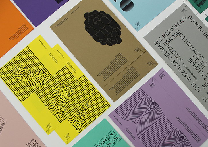
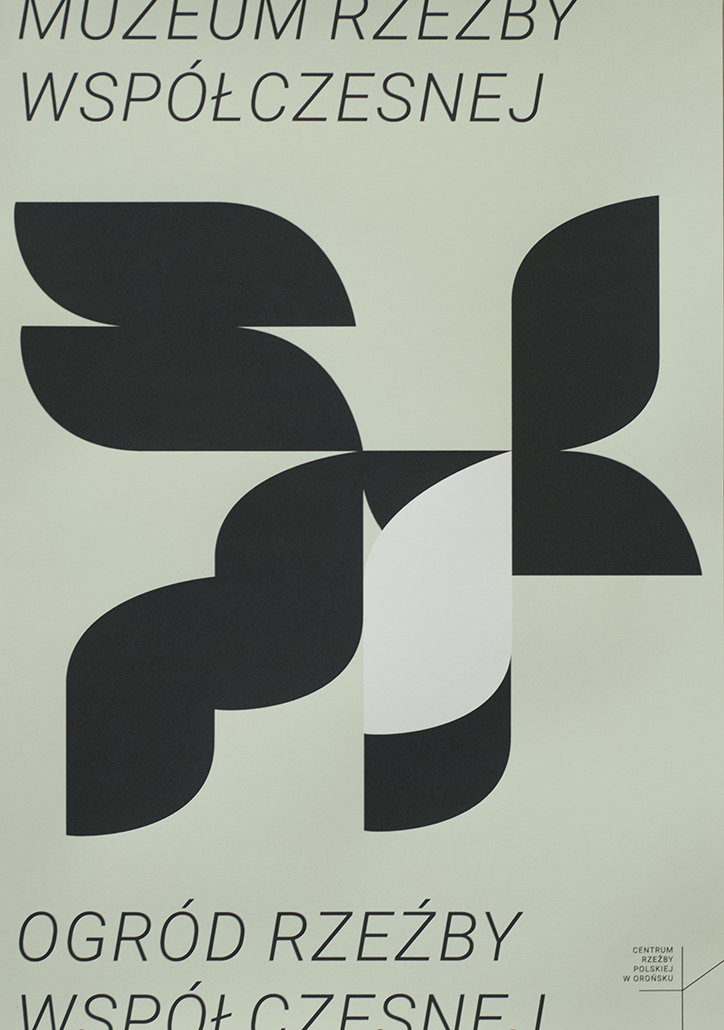
For Marina Lewandowska’s graduation project the graphic designer decided to represent and combine her artistic academic journey, creating a identity for the Centre of Polish Sculpture in Orońsko.
An interest in the arts runs within the designer’s family, her father had a passion for painting and there has “always been plenty of art books and paintings in my family home,” she tells It’s Nice That. Unsurprisingly, the designer became “fascinated by drawing and sculpture myself,” an interest which encouraged Marina to enrol at the Wroclaw Academy of Art in Poland, studying sculpture for two years. “During that time I was drawing and sketching a lot and my interest in printmaking techniques started to develop, as well as the desire to change the direction of my studies.”
Marina took the punt of changing subject, switching to the graphic design faculty at the same art school. “In the beginning I attended both graphic art elements and graphic design classes, but as time passed and my knowledge and skills developed, I started to devote more time and effort to graphic design,” she tells It’s Nice That.
The designer’s approach to the graphic practice stems from a long-standing interest “in creating abstract shapes and a relation between them,” she explains. Her graduation project articulates this fondness for shapes visually, applying her style and knowledge of graphic design to “an artistic centre with a pretty poor graphic style”.
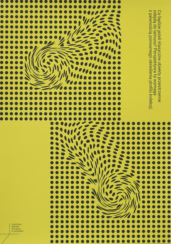
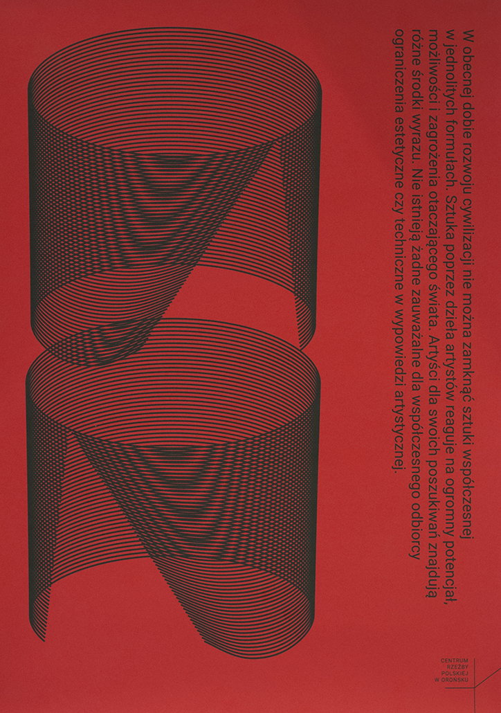
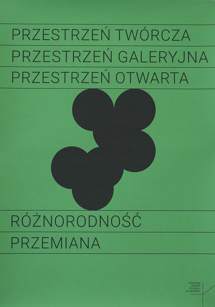
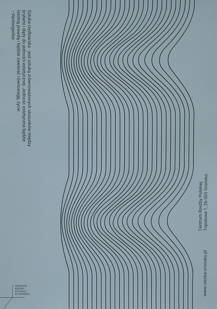
Inspired by “abstract art and modernism,” Marina’s initial aim was to “design a clear frame of identity and to secure more freedom for graphic materials for exhibitions and events,” creating a “neutral logo which symbolises the diversity of the Centre’s activities,” she says. The basis of the identity’s logo is “a simple sign which consists of three lines setting three main directions: horizontal, vertical and diagonal,” Marina explains. “My intention was to have clear reference to spaciousness (a main characteristic of sculpture) and to inform and attract a potential reader about the variety of Centre’s activities.”
By building a simplified framework for the identity, the designer was then able to add flair to it stylistically. Personality is developed by using the font Roboto “due it’s crude character,” and then developing a rainbow of coloured posters sporting individual shapes to represent different events. Each poster design uses official descriptions of sculpture works, basing her design around them, “the examples have their own character, colours and abstract shapes which were adjusted to the content”.
Currently an intern at Portuguese studio Eduardo Aires, working in the industry has “revealed various new perspectives,” for the designer after also working for Zieta Prozessdesign studio, an industrial design company. Just at the beginning of her design career, we look forward to seeing where Marina’s plethora of artistic interests and determination will take her next.
Marina Lewandowska: Centre of Polish Sculpture
Marina Lewandowska: Centre of Polish Sculpture
Marina Lewandowska: Centre of Polish Sculpture
Marina Lewandowska: Centre of Polish Sculpture
Marina Lewandowska: Centre of Polish Sculpture
Marina Lewandowska: Centre of Polish Sculpture
Marina Lewandowska: Centre of Polish Sculpture
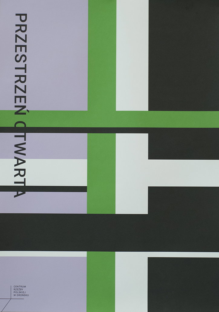
Marina Lewandowska: Centre of Polish Sculpture
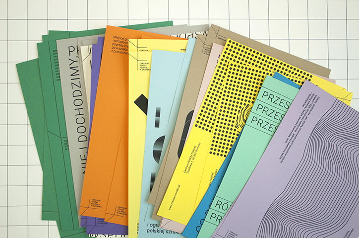
Marina Lewandowska: Centre of Polish Sculpture
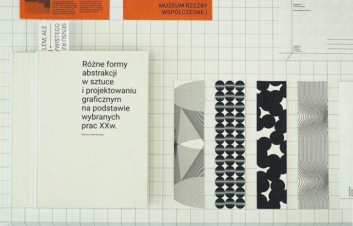
Marina Lewandowska: Centre of Polish Sculpture
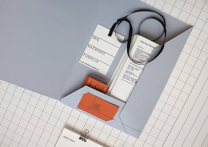
Marina Lewandowska: Centre of Polish Sculpture
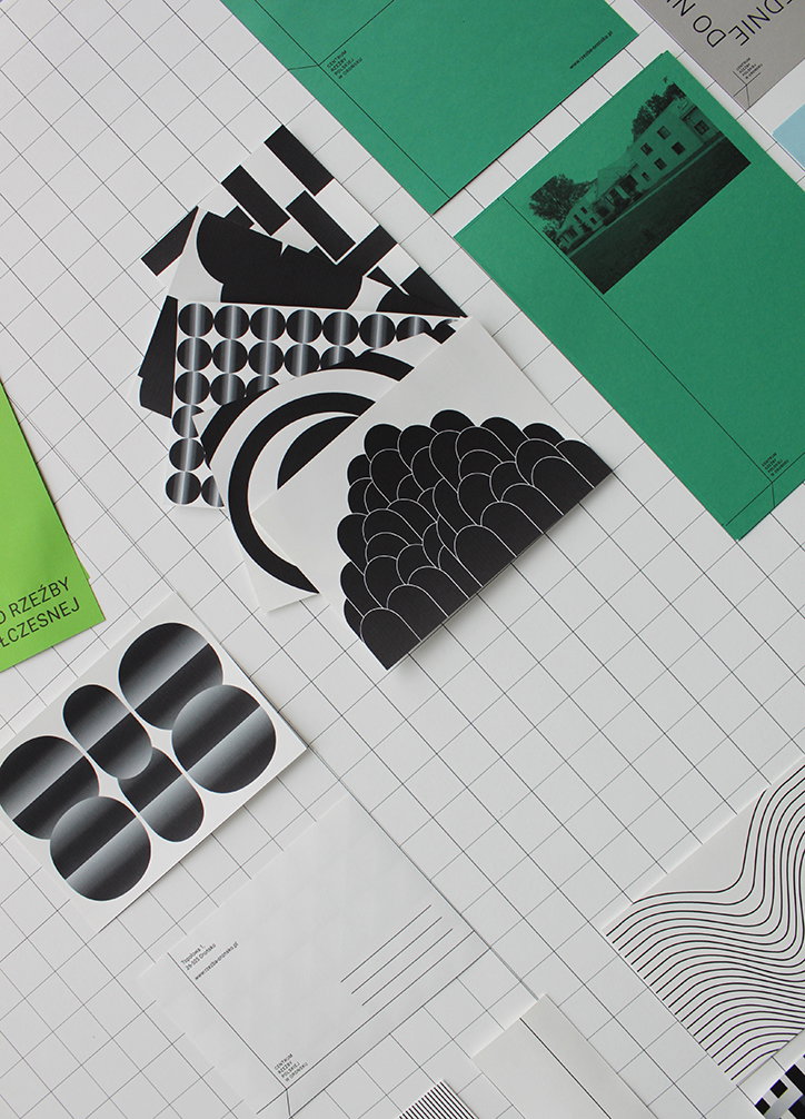
Marina Lewandowska: Centre of Polish Sculpture
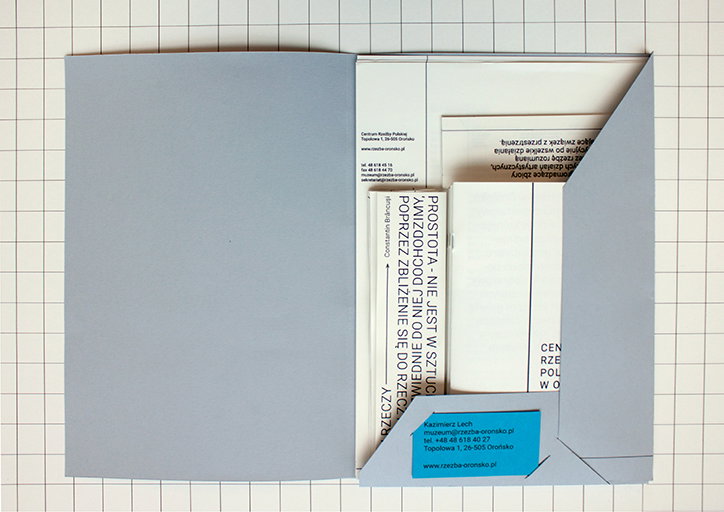
Marina Lewandowska: Centre of Polish Sculpture
Share Article
Further Info
About the Author
—
Lucy (she/her) was part of the It’s Nice That team from 2016–2025, first joining as a staff writer after graduating from Chelsea College of Art with a degree in Graphic Design Communication, eventually becoming a senior editor on our editorial team, and most recently at Insights, a research-driven department with It’s Nice That.