Matthieu Becker considers “the graphic designer as a middle-man between content and audience”
“I’m very fond of visual contemporary culture but always try to avoid trend,” explains graphic designer Matthieu Becker. With a particular interest in book design, the Paris-based graphic designer works mainly with artists, publishers and cultural institutions. After graduating from the Graphic Research School in Brussels under Renaud Huberland, Matthieu recalls how he not only learned about typography, he also “learned how to read forms and then how to add context to them”. In turn, this allows him to create a design language that is relevant and appropriate to the cause.
After graduating nearly ten years ago, the designer has predominantly worked with artists, publishers and cultural institutions, designing beautiful publications that elevate an artist’s work through coherent graphic design. “Surrounded by talented artists,” Matthieu tells It’s Nice That, “I soon realised that I was much more efficient in helping these artists show off their work in the best way possible (whether that be book design or exhibition design) rather than adding my own voice to the crowd.”
Consequently, Matthieu and his friends have founded a community-based publishing house LeMégot éditions, a platform for showcasing their zines, books, posters and so on. With an impressive array of design styles arising from Matthieu’s skillset, the designer adds, “as far as I can remember, I wanted to make books.” He likens a piece of design to three-dimensional space: “I really like the idea that with one piece of paper with ink on it, you can create a space. This space can fit in a backpack, or on a shelf”.
In a similar vein, the designer goes on to say, “a page spread can, in turn, be considered like a room where you can arrange content for the reader.” If an empty spread is like an empty room, you can add pieces of furniture like a chair, and this ensures that the reader will sit on it, just like how the reader will interact with a design element on a spread. “You could have a window, so the reader will be able to see outside, or alternatively, you could saturate the space to let the reader find all the details for themselves.” Using this analogy, Matthieu points out how creating a design is similar to creating a relationship with people. He draws on this theory to produce dynamic graphic designs for each and every project he undertakes. In a sense, his designs act more like a dialogue between the reader and the work of an artist, in his own words, he emphasises, “I consider the graphic designer as a middle-man between content and audience.”
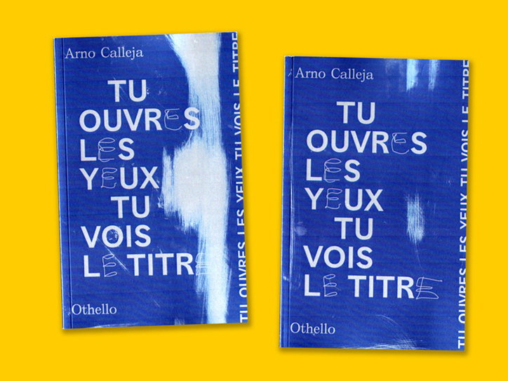
Matthieu Becker: Tu ouvres les yeux tu vois le titre
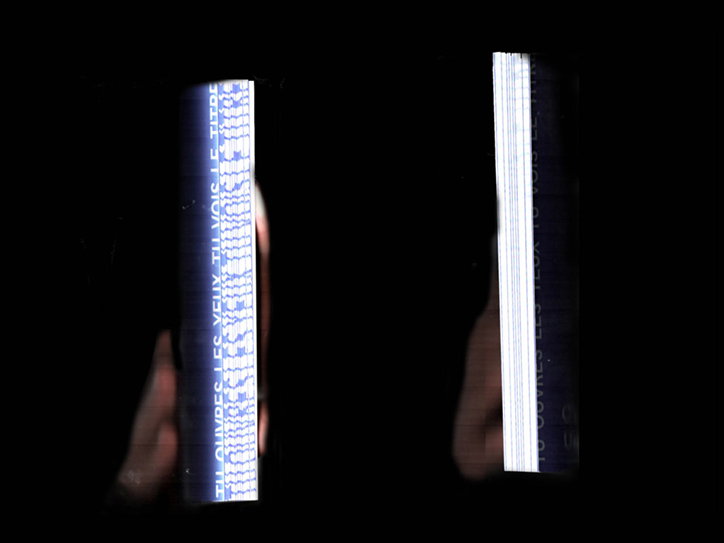
Matthieu Becker: Tu ouvres les yeux tu vois le titre
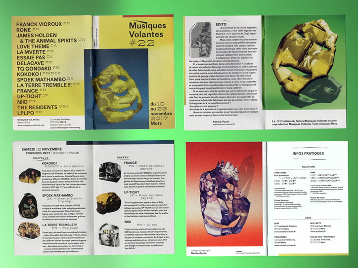
Matthieu Becker: Musique Volantes #22
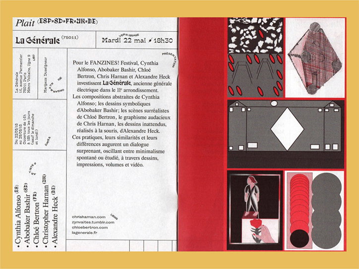
Matthieu Becker: 8e Fanzines! festival 2018
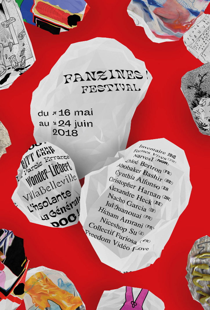
Matthieu Becker: 8e Fanzines! festival 2018
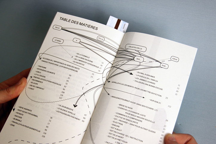
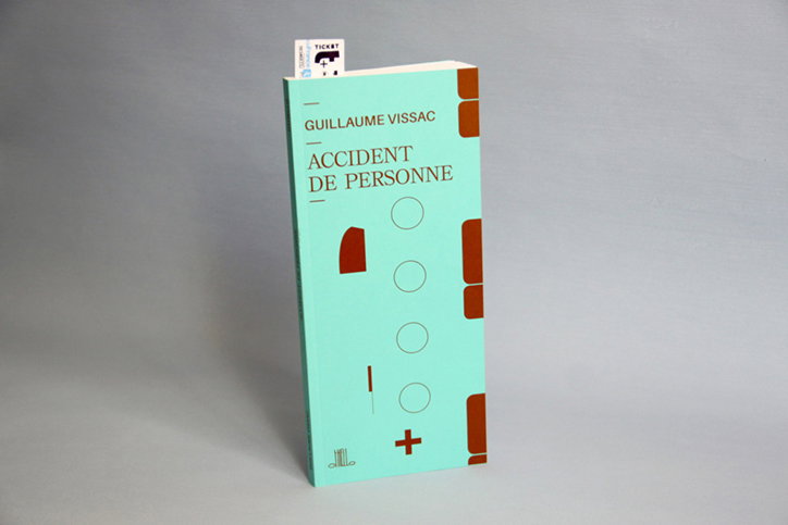
Matthieu Becker: Accident de Personne
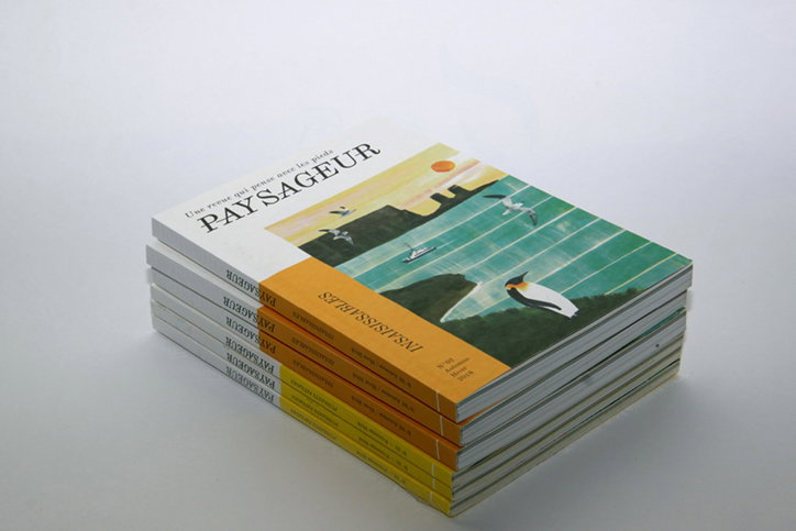
Matthieu Becker: Paysageur N°01 & N°02
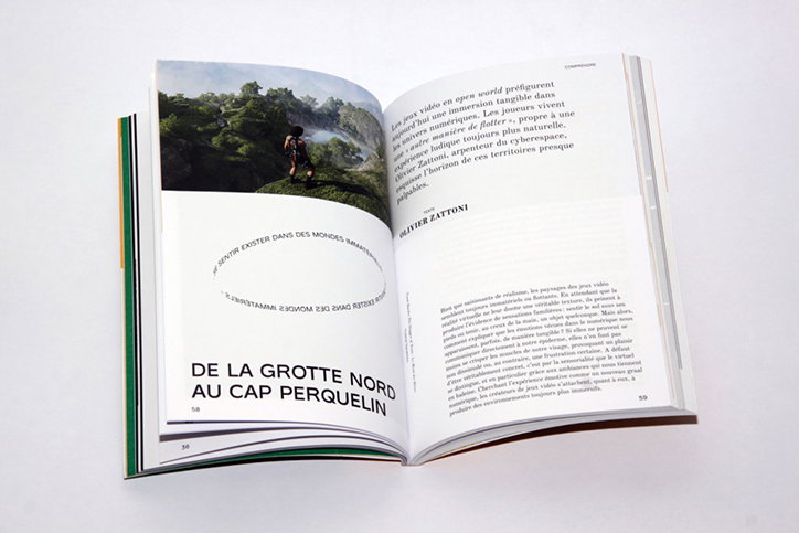
Matthieu Becker: Paysageur N°01 & N°02
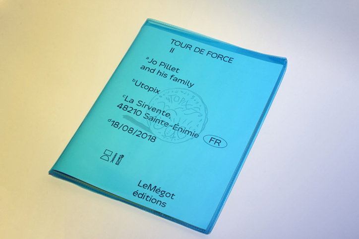
Matthieu Becker: Tour de Force #1 & #2
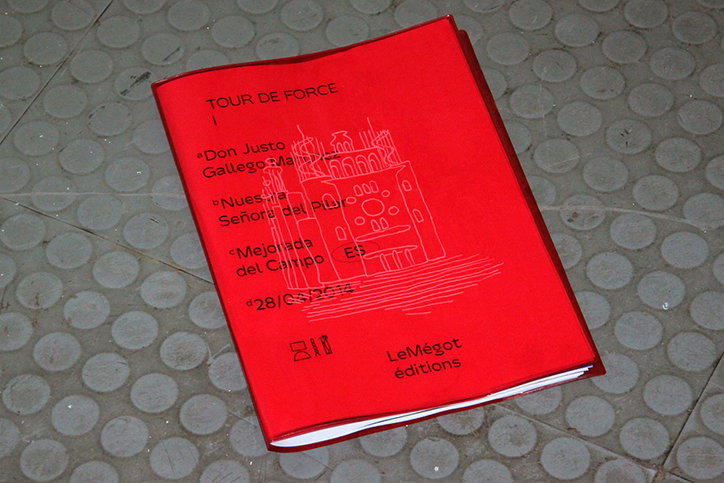
Matthieu Becker: Tour de Force #1 & #2
Share Article
Further Info
About the Author
—
Jynann joined It’s Nice That as an editorial assistant in August 2018 after graduating from The Glasgow School of Art’s Communication Design degree. In March 2019 she became a staff writer and in June 2021, she was made associate editor. She went freelance in 2022.