First custom brand font for TJ Maxx built by McCann Design
McCann, along with MCKL type and design studio, revolt against retail’s overreliance on Helvetica and turn the TJ Maxx logo into a font.
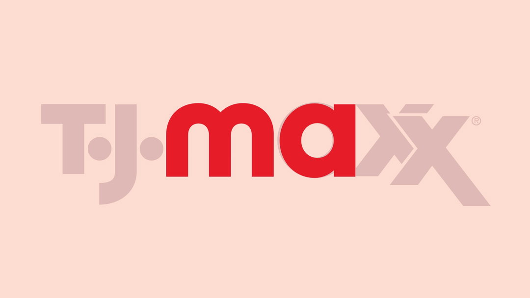
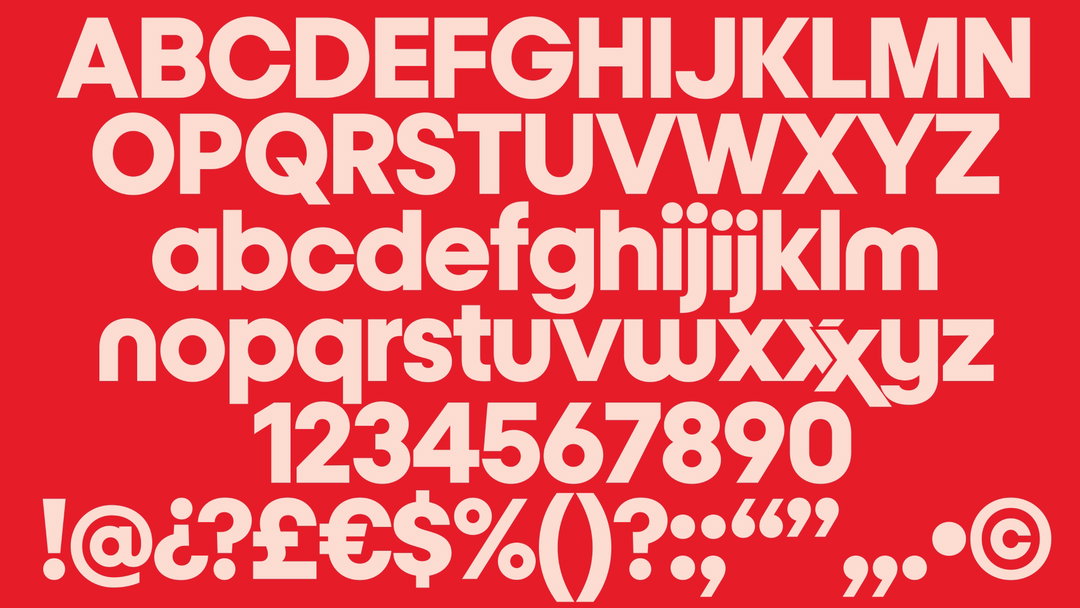
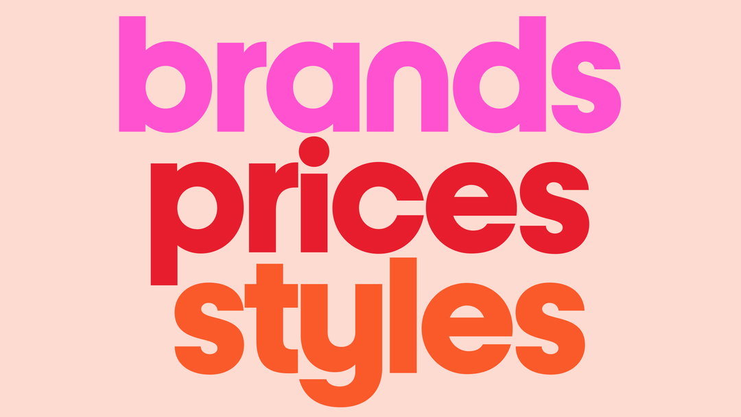
TJ Maxx, or TK Maxx as it’s known in the UK, has traditionally used Helvetica for its brand typeface. It was in good company in the US, where Helvetica “still dominates” in retail marketing, says Matt van Leeuwen, head of design at McCann in New York. Now, McCann has worked with Jeremy Mickel of MCKL Type and Design to turn the letter shapes of the TJ Maxx logo into a font.
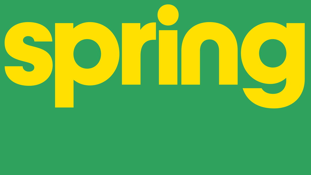
The idea came as McCann was mid-delivery for the advertising campaign, Maxx What Makes You, You. “Anything we tried in Helvetica reminded us of other brands,” says Matt. At the same time, the team had great admiration for the retailer’s original logo; “It is so full of character and lovely idiosyncrasies, and as we started to apply that in big and bold ways in the design system we are developing, we simply had the bright idea to turn the letter shapes of the logo into a font.”
McCann hopes the new font will step into a “long history of strong modernist typography”. Matt says the blend of rounded forms and straight stems particularly brings to mind Herbert Bayer’s Universal Type, which began as an experiment in creating an all-lowercase typeface that could be drawn with a ruler and compass.
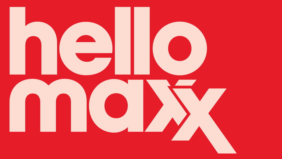
McCann Design: Maxx for TJ Maxx (Copyright © McCann Design, 2024)
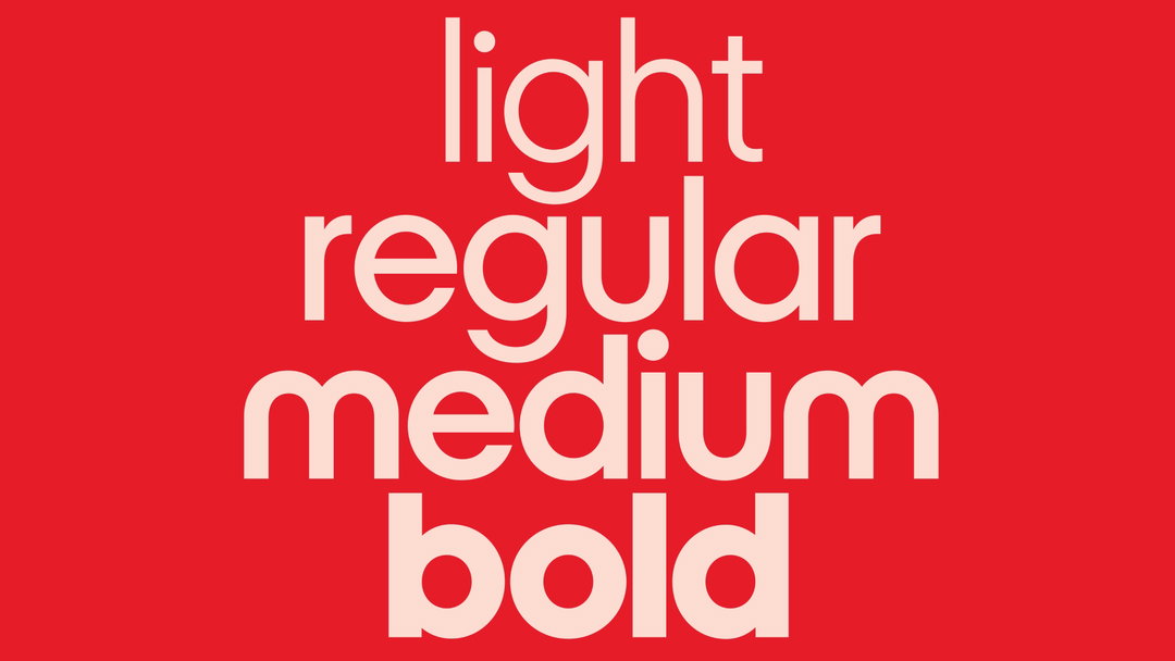
The Maxx typeface has a family of four weights and is apparently “chock-full of little gems in the Open Type features”. Typing out two X’s will bring up the option of the famous XX ligature that appears in the logo. There are also alternative shorter glyphs for the I and J, “to close the leading more naturally in tight typesetting”.
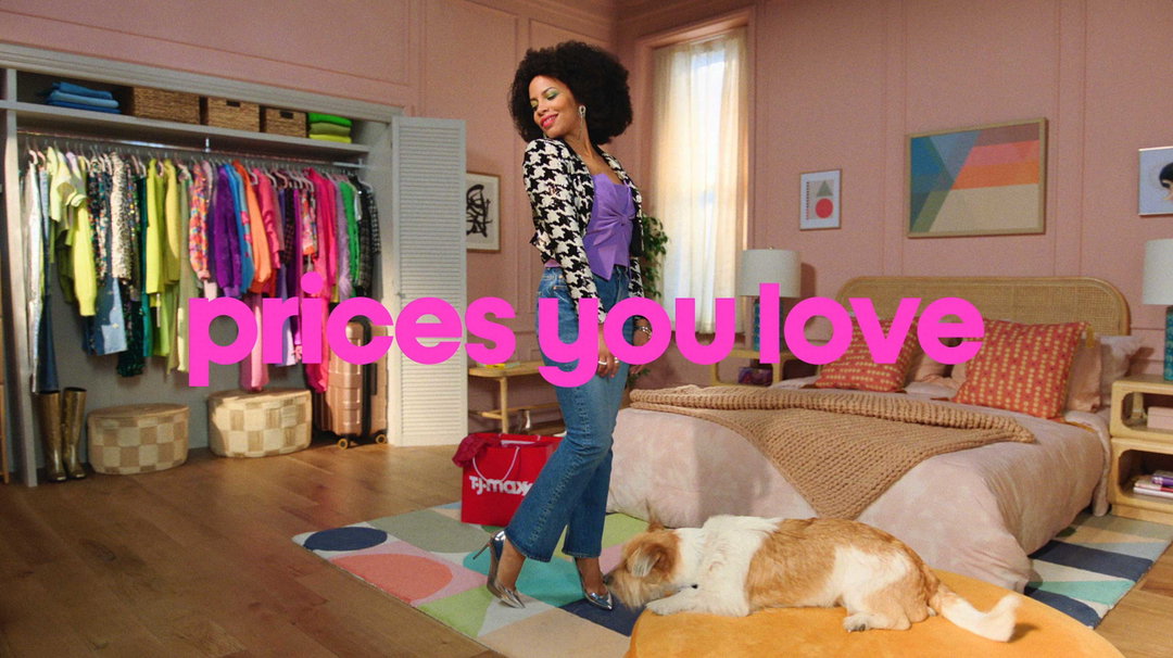
The typeface Maxx is currently being used in the US market and will gradually roll out beyond the campaign into wider brand assets. “We set out, at the beginning of the project, to bring iconicity to the brand,” says Matt. “The store experience of TJ Maxx can feel like a discovery, an array of so much apparel and home fashion, and we wanted to cut straight through the noise and get to the core of their identity, with radical simplicity.”
McCann Design was established in 2022 as the advertising agency’s design arm. A slew of other agencies have followed suit, including Not W+K and Wonderhood.
GalleryMcCann Design: Maxx for TJ Maxx (Copyright © McCann Design, 2024)

Hero Header
McCann Design: Maxx for TJ Maxx (Copyright © McCann Design, 2024)
Share Article
About the Author
—
Liz (she/they) is the senior editor at Insights, a research-driven department within It’s Nice That. They previously ran the news section of the website. Get in contact with them for potential Insights collaborations or to discuss Insights’ public-facing reports.