A traditional Chinese dessert brand inspired by plastic collectible toys
Meat Studio counters the subtle flavour profile of many long-established Chinese desserts with high-fructose visuals.
In Beijing, the noodle brand Pangmei has amassed a bit of a cult status – it’s “consistently ranking #1 in the ‘Noodles’ category on food recommendation apps, with long queues constantly outside all day,” says Ronald Tau, founder and CD of Meat Studio. Hoping to build up the same prestige for its new dessert offshoot, Pangmei has called in Meat to create an identity that will “bring traditional, ancient Chinese dessert products to a new generation of young consumers”.
Pangmei told Meat that up until now, traditional Chinese desserts have taken “a major backseat” to western desserts like cakes and tarts; the hope here is to get a new audience to relate to these products. Meat has some history appealing to this market – in 2022, it created a video game-inspired identity for a convenience store, using the idea of gaming ‘buffs’ to sell sandwiches and the like. The references for Pangmei are no less compelling.
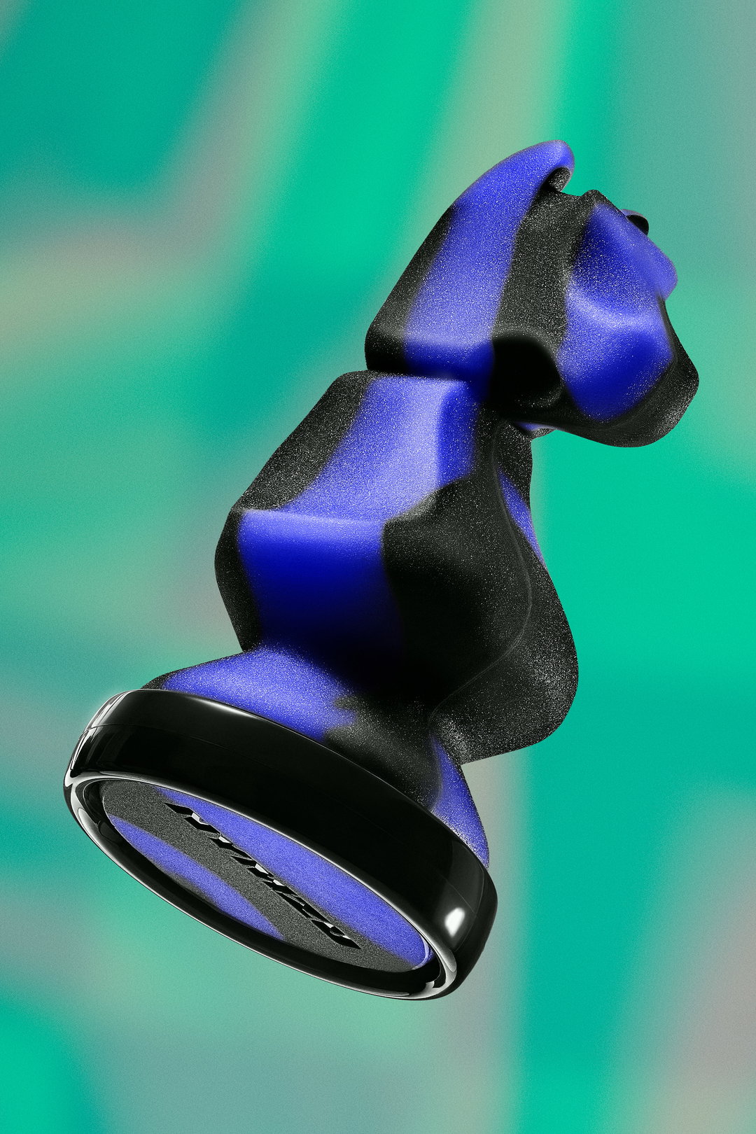
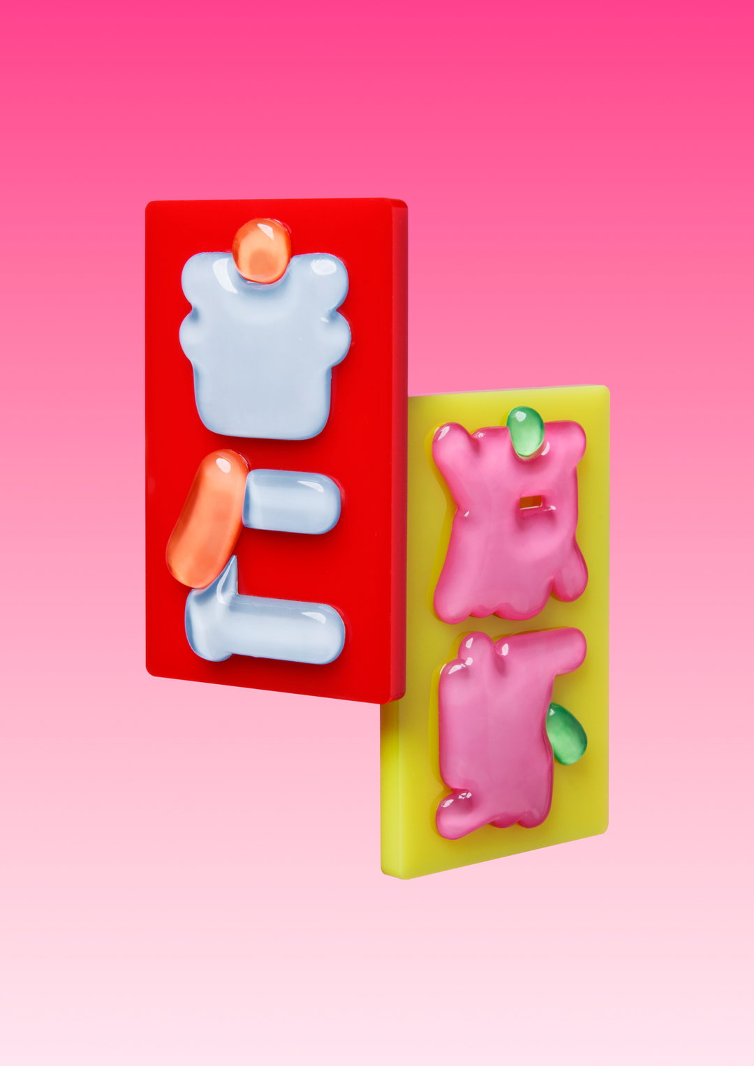
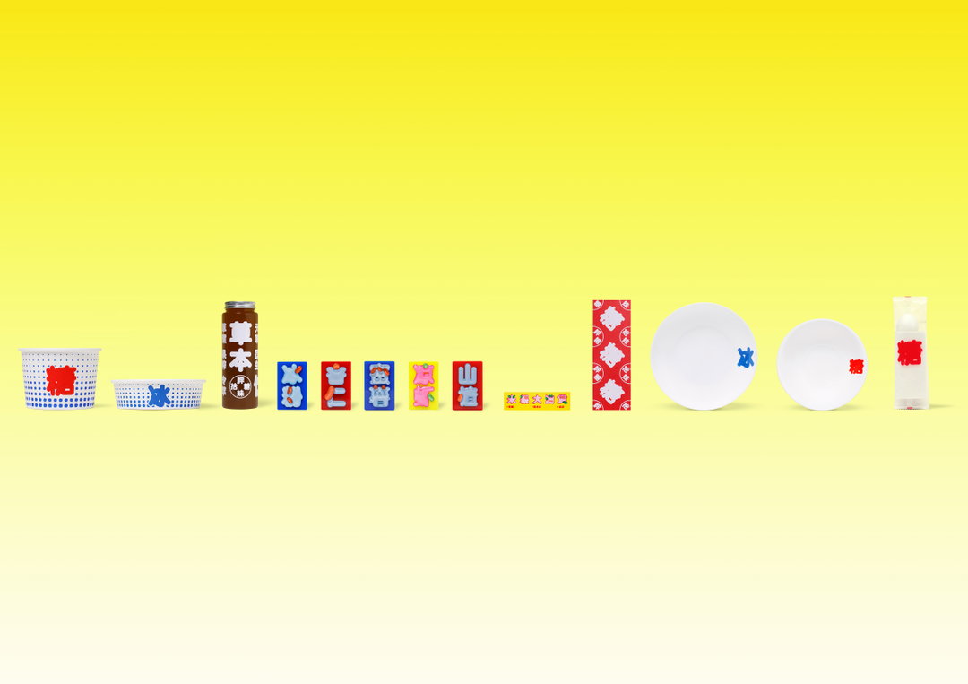
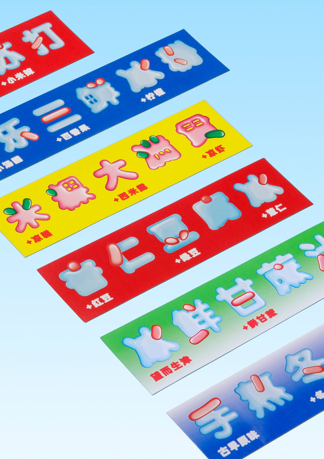
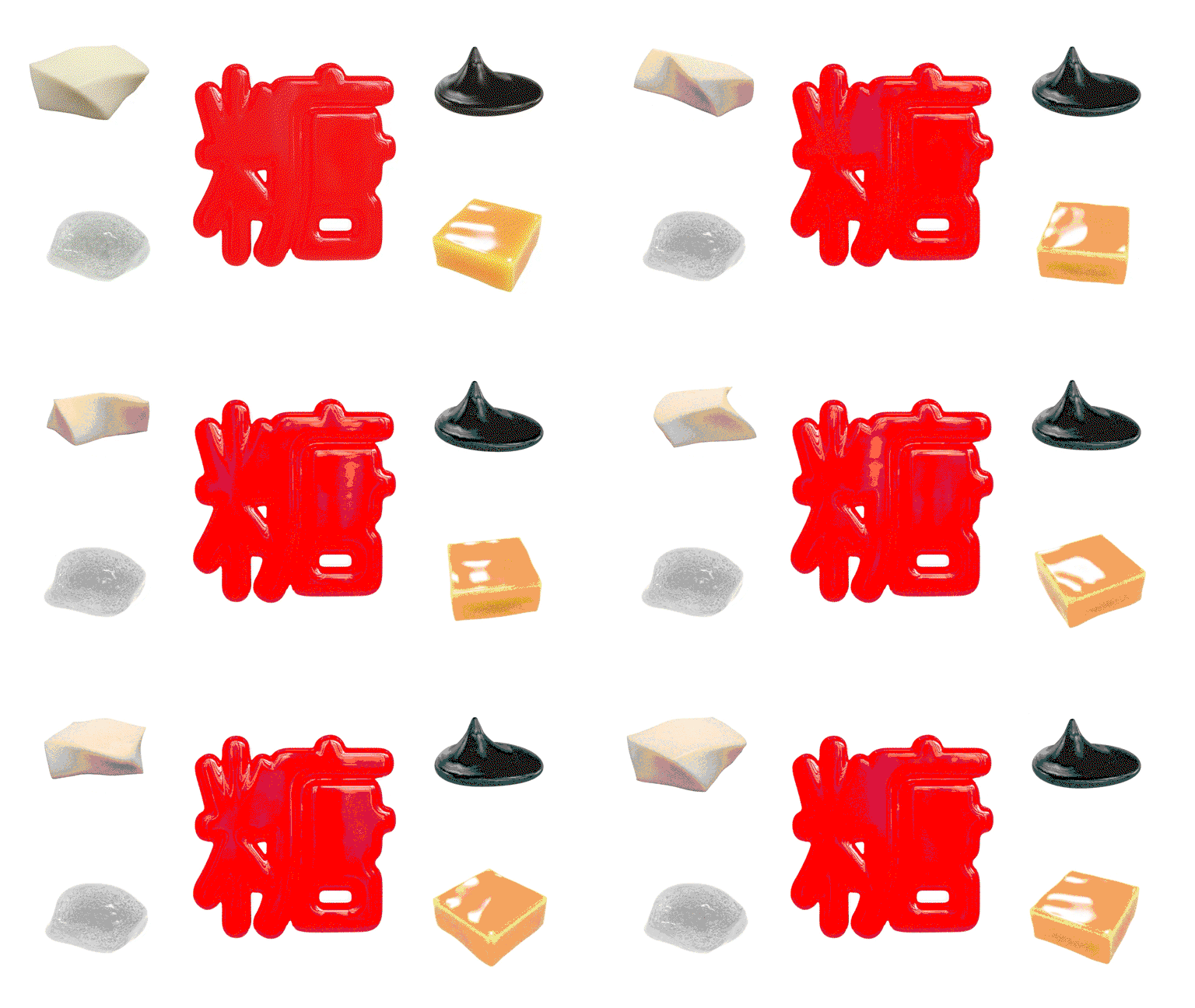
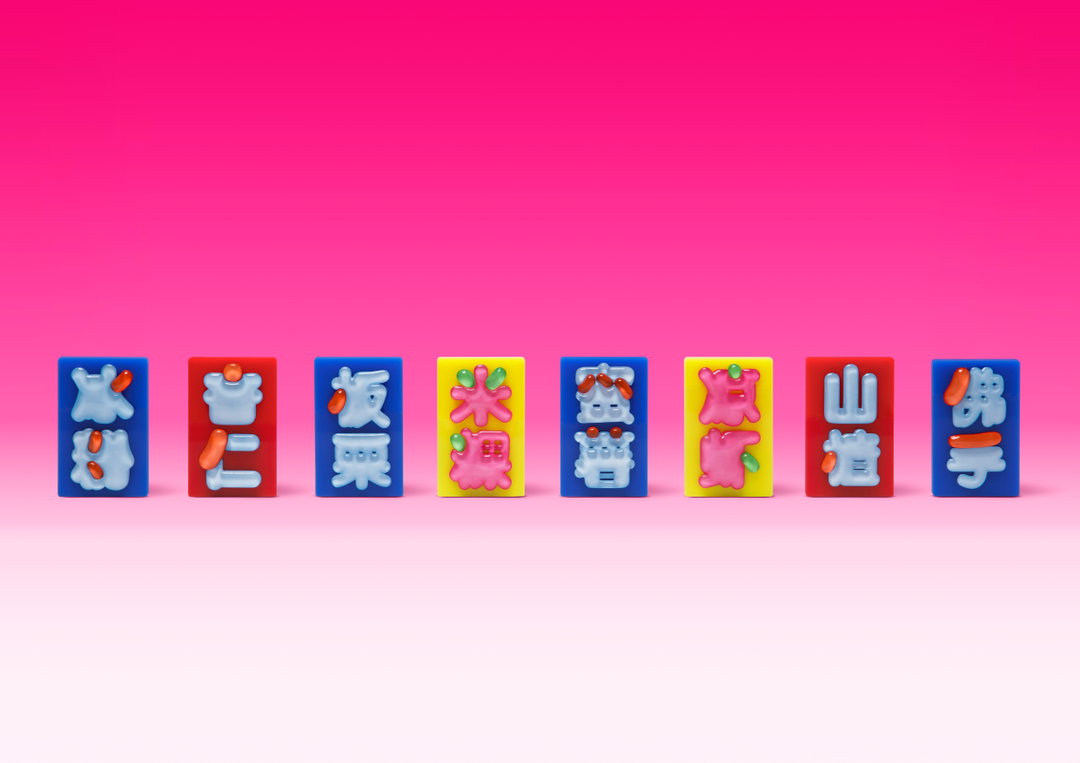
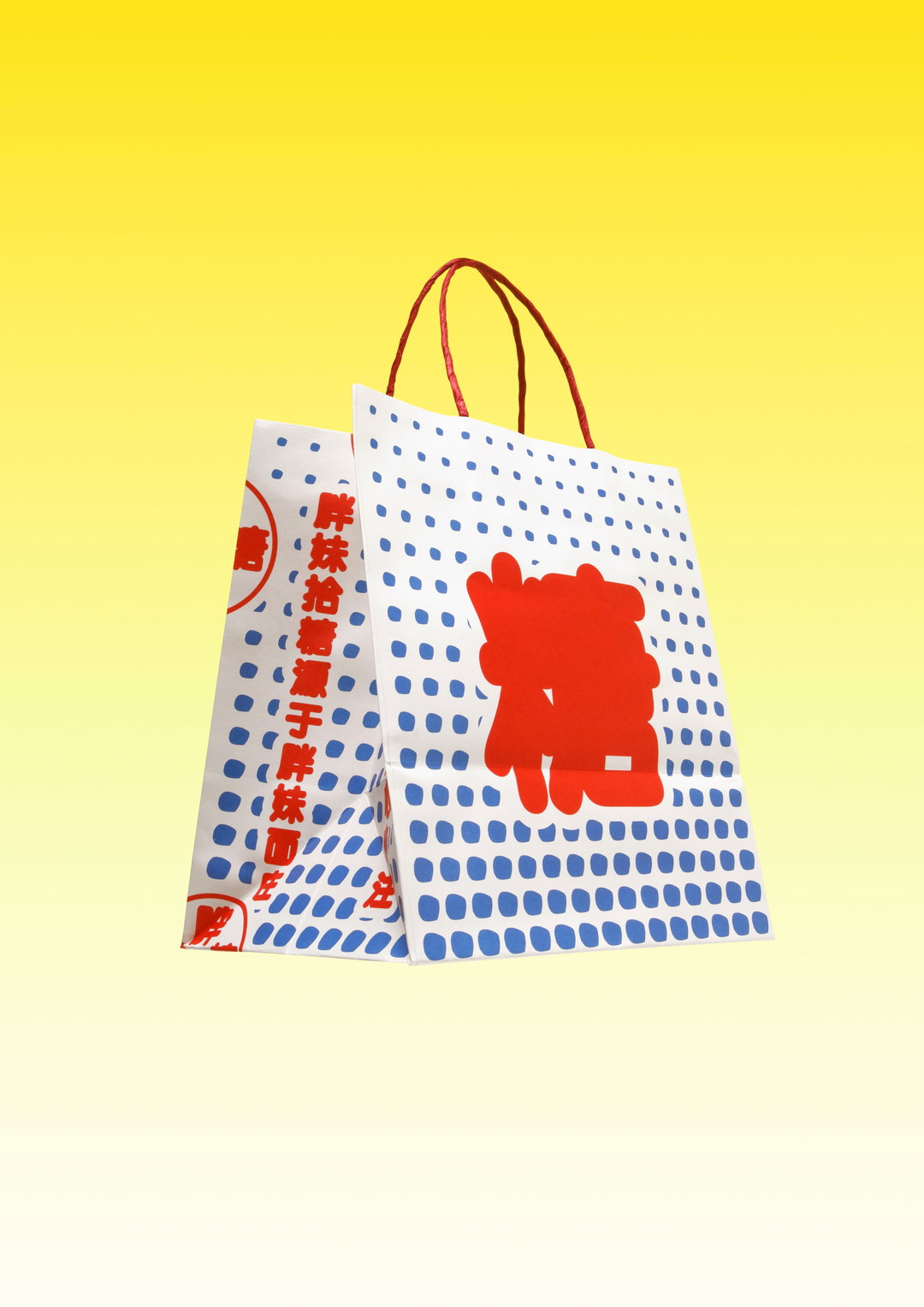
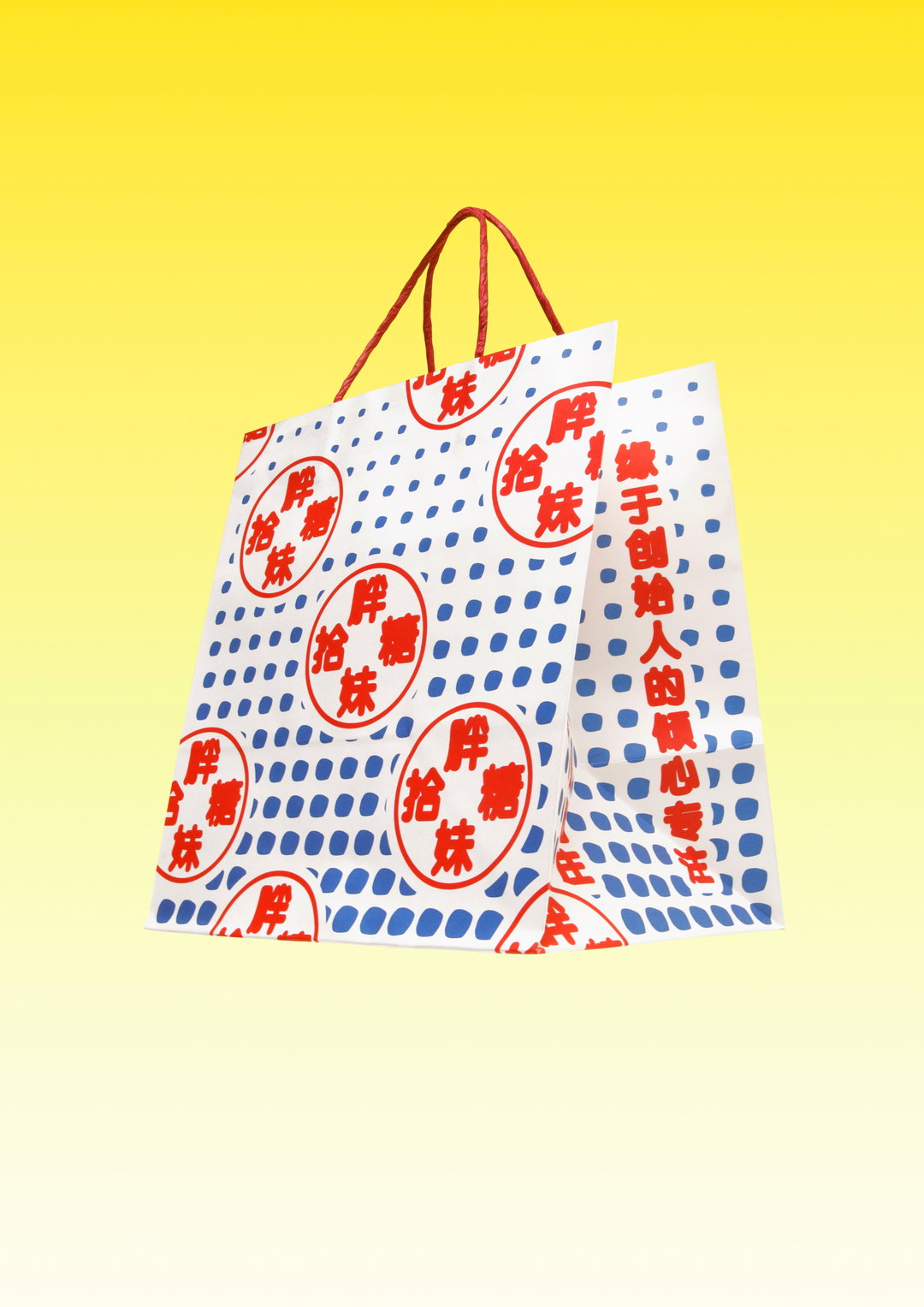
Here Meat is playing with concepts like collectible toy dispensers (gachapon machines) and pachinko arcades. The structured compartments toys are kept in, for example, can be seen in the organisation of layouts, while the “squidgy-ness” of the 3D elements reference “east Asian jellies” like mochi, grass jelly, sago and boba.
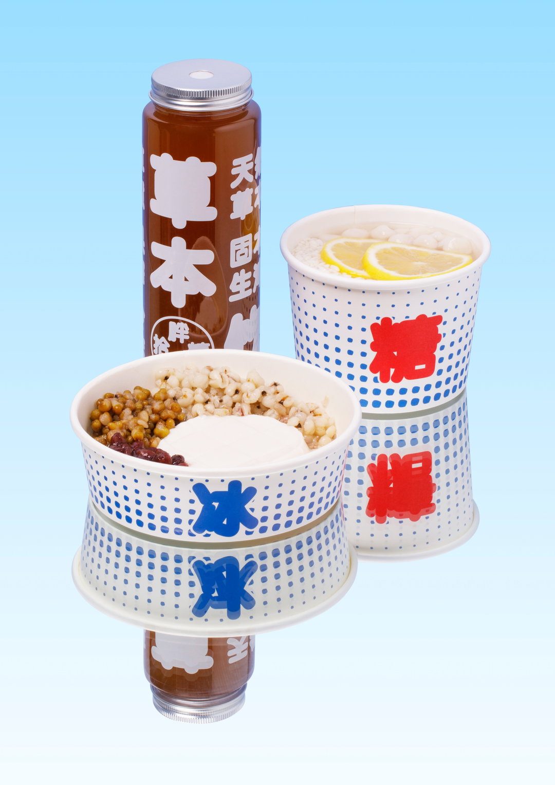
Meat Studio: Pangmei Shitang (Copyright © Meat Studio, 2024)
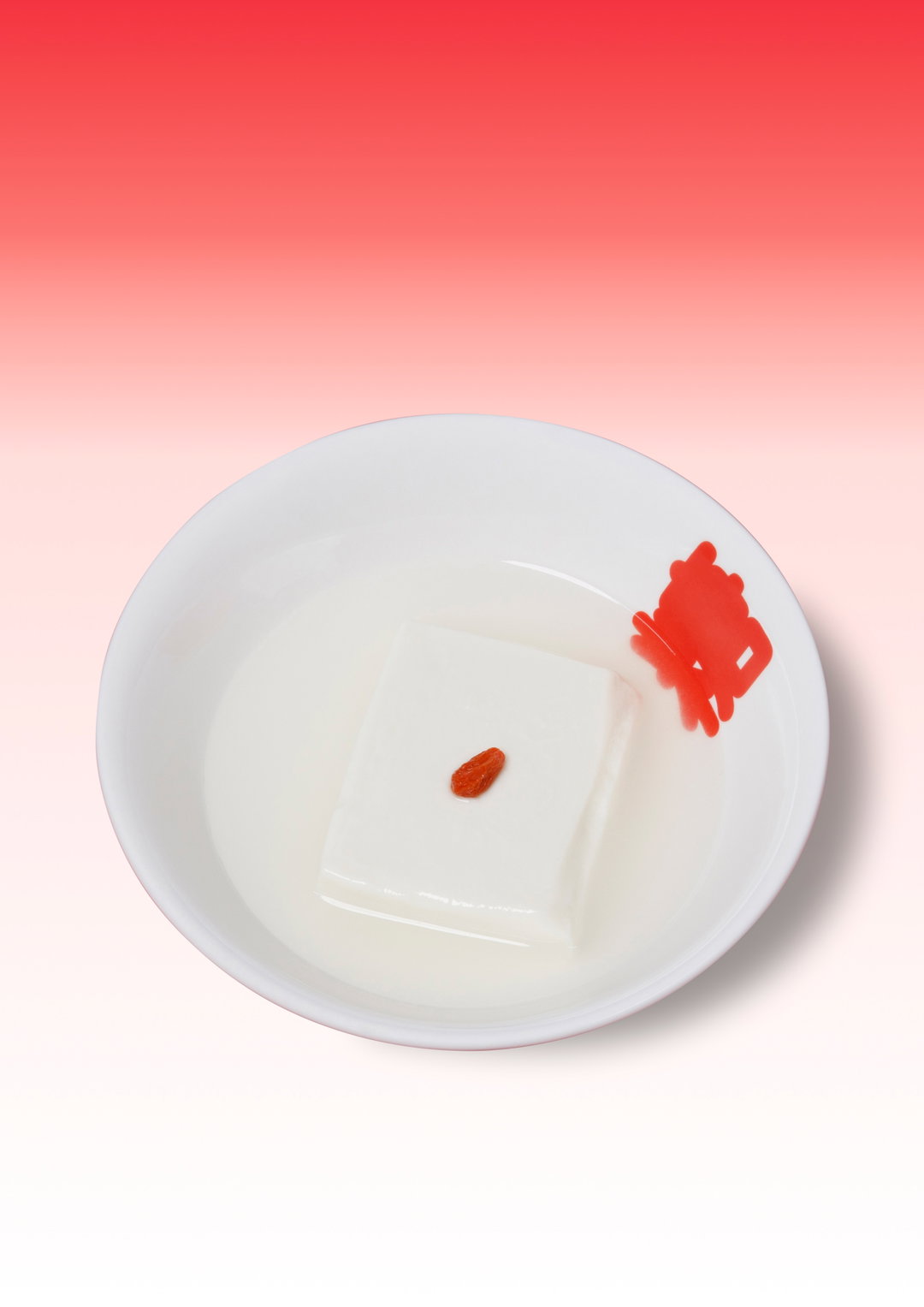
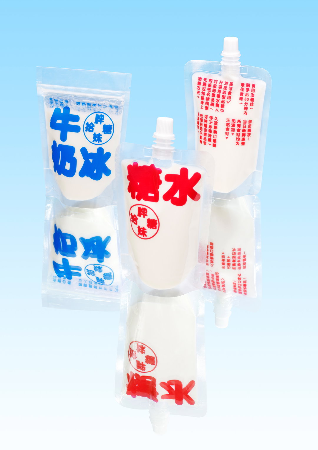
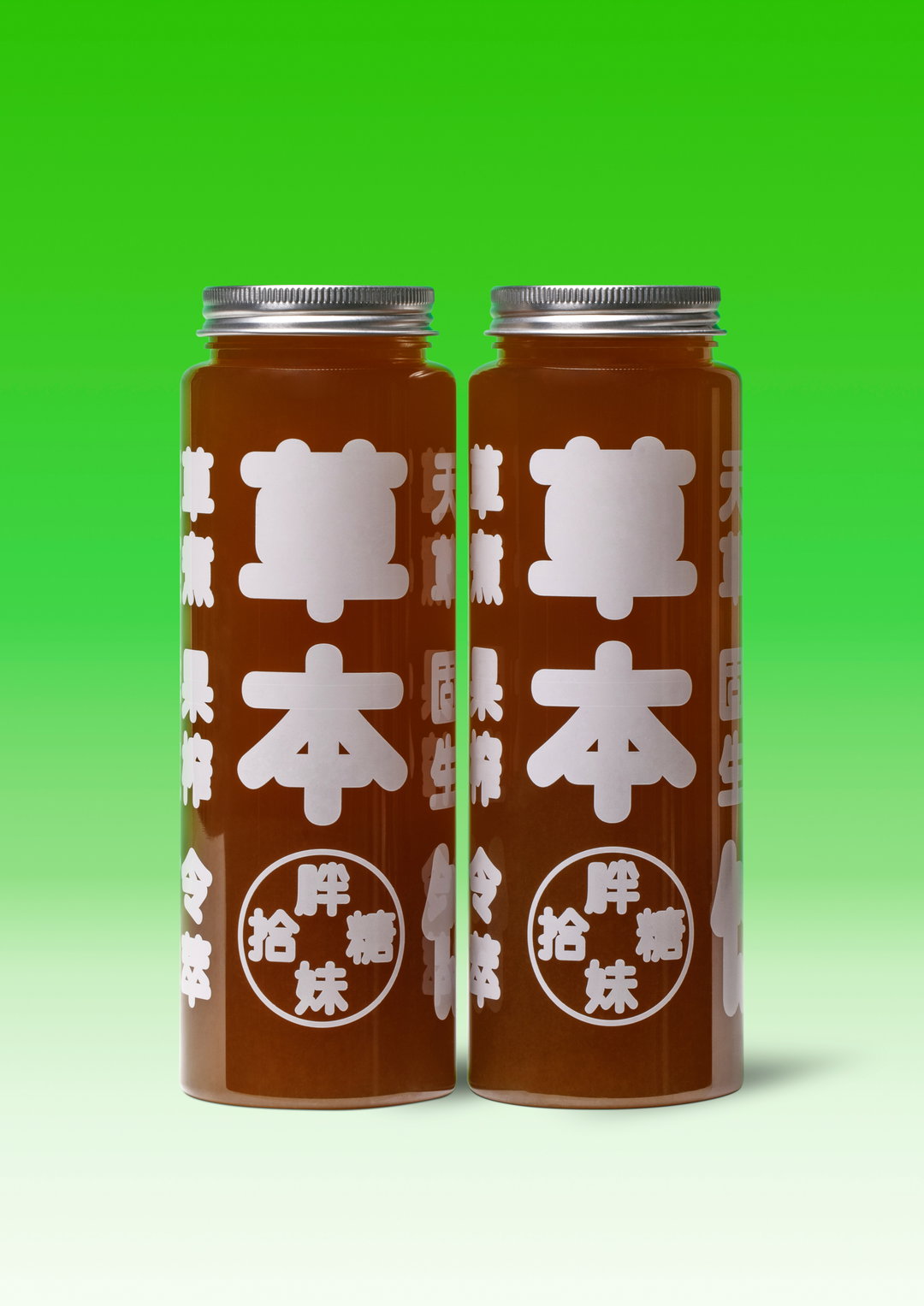
Inspiration is also drawn from Hong Kong and Taiwanese night markets in the late 80s and 90s. Typography, for example, is based on a standard rounded Heiti, “stylistically equivalent to a sans serif in Latin,” says Ron, which was often used on signage in this by market sellers, “perhaps for its friendliness and cuteness”. The strokes of the glyphs have been inflated so that positive and negative space disappear, and appear as a single tasty-looking morsel instead. The results have been 3D-printed for in-store applications and signage, so that gelatinous texture carries over to the in-person experience.
“We wanted it to be jovial and warm,” says Ron. “The overall design stands out from the wider market because all the visual cues come decidedly from a specific reference point in the collective memory of east Asian street food culture, it gives off a sense of warmth that’s very authentic and nostalgic.”
GalleryMeat Studio: Pangmei Shitang (Copyright © Meat Studio, 2024)
Hero Header
Meat Studio: Pangmei Shitang (Copyright © Meat Studio)
Share Article
Further Info
About the Author
—
Liz (she/they) is the senior editor at Insights, a research-driven department within It’s Nice That. They previously ran the news section of the website. Get in contact with them for potential Insights collaborations or to discuss Insights’ public-facing reports.