Monkee gives music’s best known names a quirky illustrative refresh
The Chengdu-based illustrator expresses creative happiness in her unique 60s rock 'n' roll depictions.
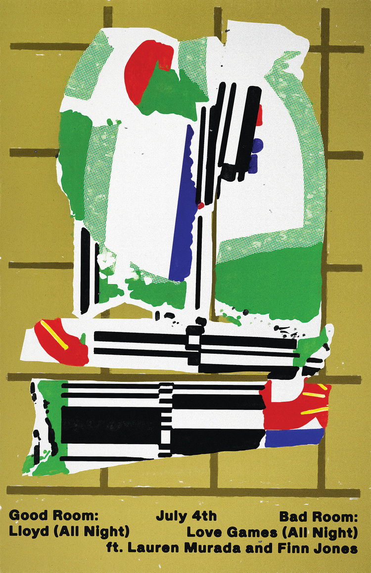
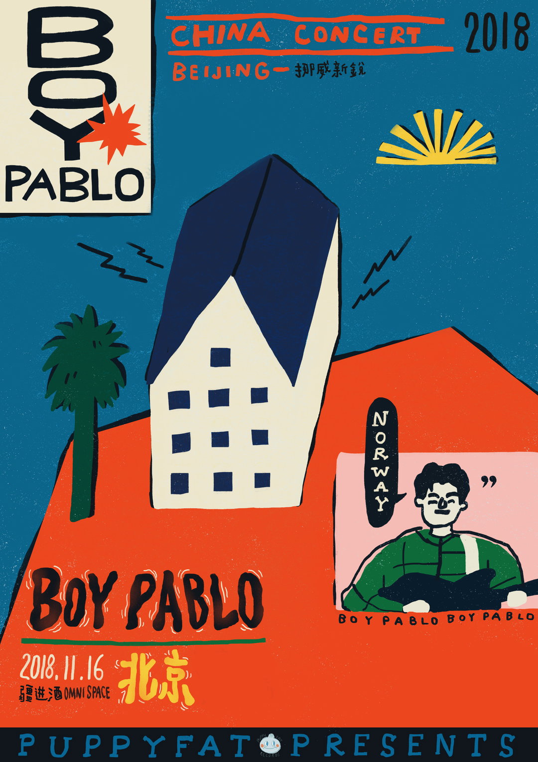
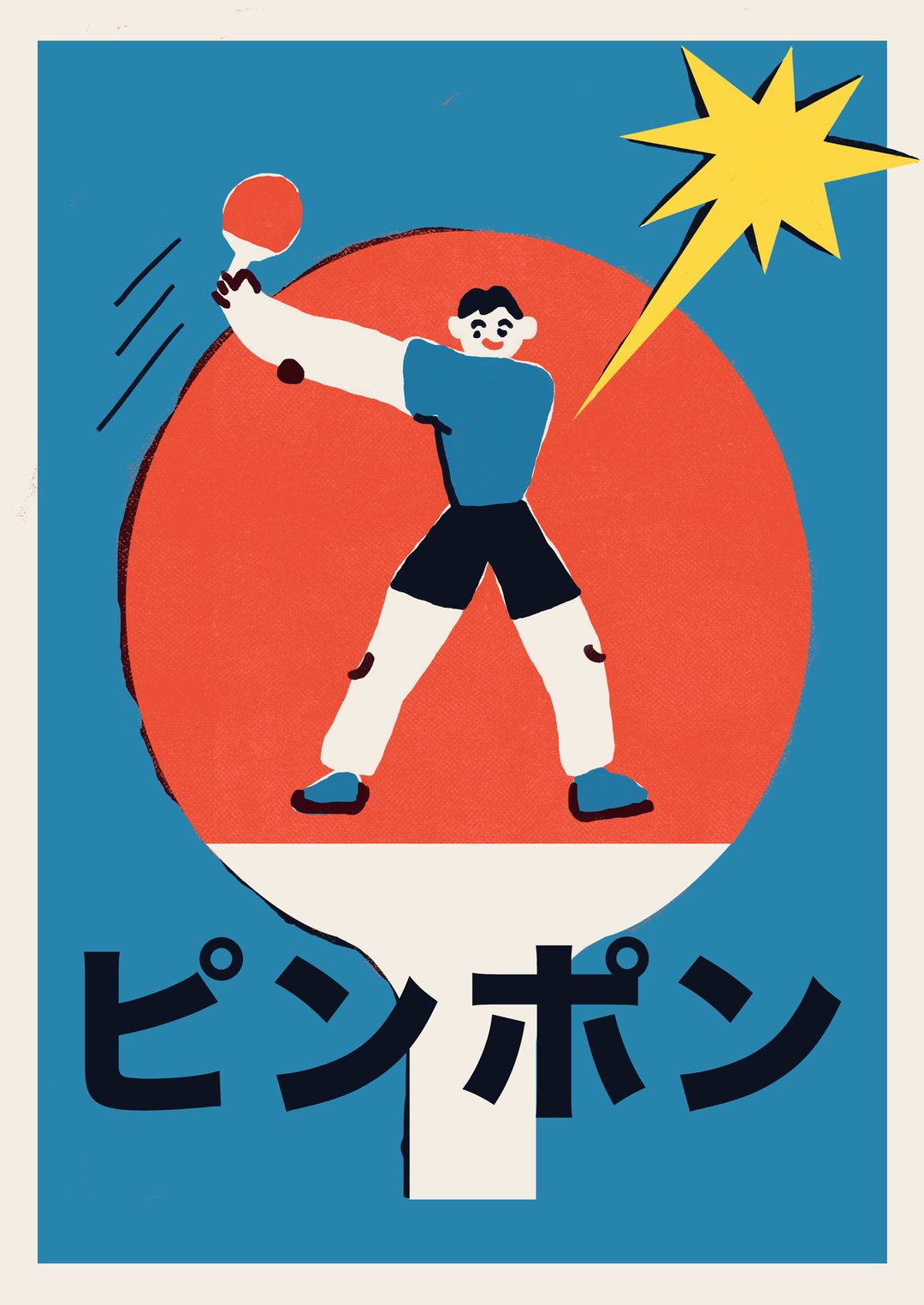
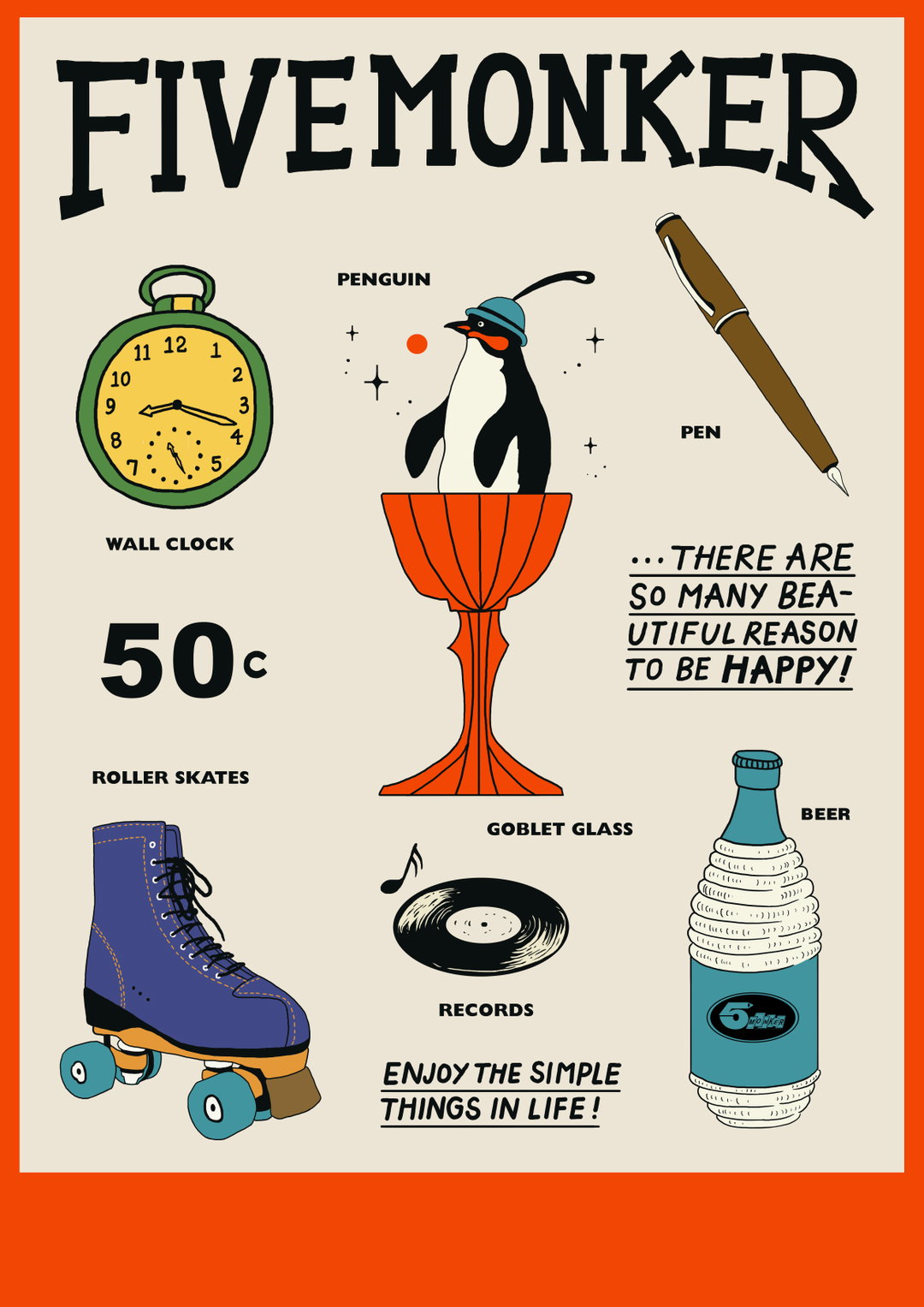
Meet Monkee, a Chengdu-based illustrator bringing us some much-needed colour on this grey Monday morning. Have a scroll through Monkee’s instagram and you’ll find a ton of uplifting visuals (both illustrative and typographic) to get our juices flowing for the rest of the week. There’s a bunch of commercial posters and artworks for a range of clients, from the Shanghai Coffee Festival to music venues, as well as a kaleidoscopic dose of works from Monkee’s latest exhibitions and personal works.
“I think the vibe of my work changes due to different moods,” she tells It’s Nice That of her eclectic yet distinctive illustrative style. On first glances, her work varies in technique, but when you dig a little deeper, sure enough, there are certain characteristics that makes Monkee’s work, Monkee-like. You can always see splashes of colour, weird lines, a sense of childhood euphoria, not to mention a curiosity with objects throughout her illustrations. “Mostly,” Monkee continues, “my intention is to express happiness in an artistic way and I hope people can find my work pleasant.”
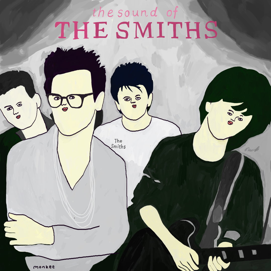
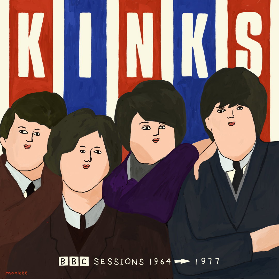
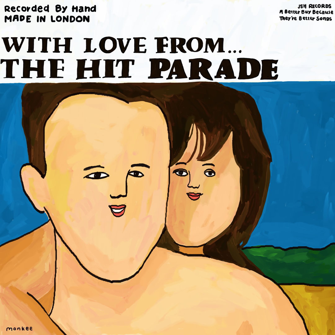
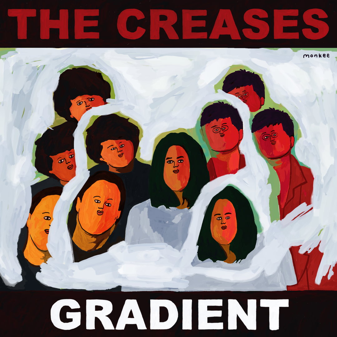
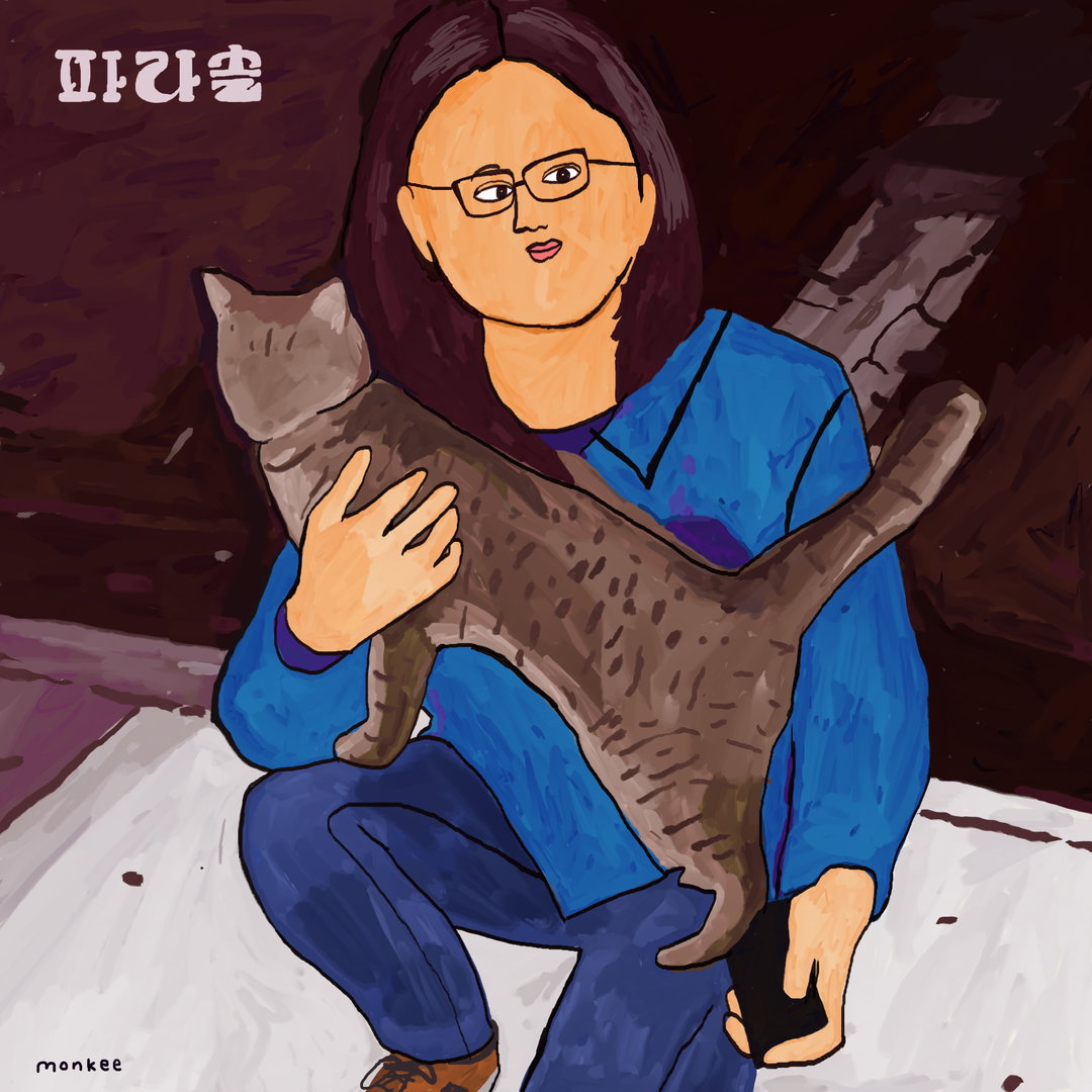
She finds much of her inspiration in music. Rock 'n' roll music from the 60s to be precise. It’s not just the riffing sounds that spark the squiggles on the pages however, it’s also the outfits, the lifestyle and of course, the record covers that set her imagination off too. In this way, Monkee has applied her unique penmanship to the past covers of The Kinks, The Smiths and The Crease’s albums, just to name a few. Reinterpreting some of the best known faces in the history of music with a sprinkling of Monkee magic, the illustrator extends some chins out and zhooshes quite a few quiffs. “I have collaborated with some musicians and bands in the past too,” Monkee continues, “and hopefully will have the opportunity to do it more with some of my favourites in the future.”
Monkee
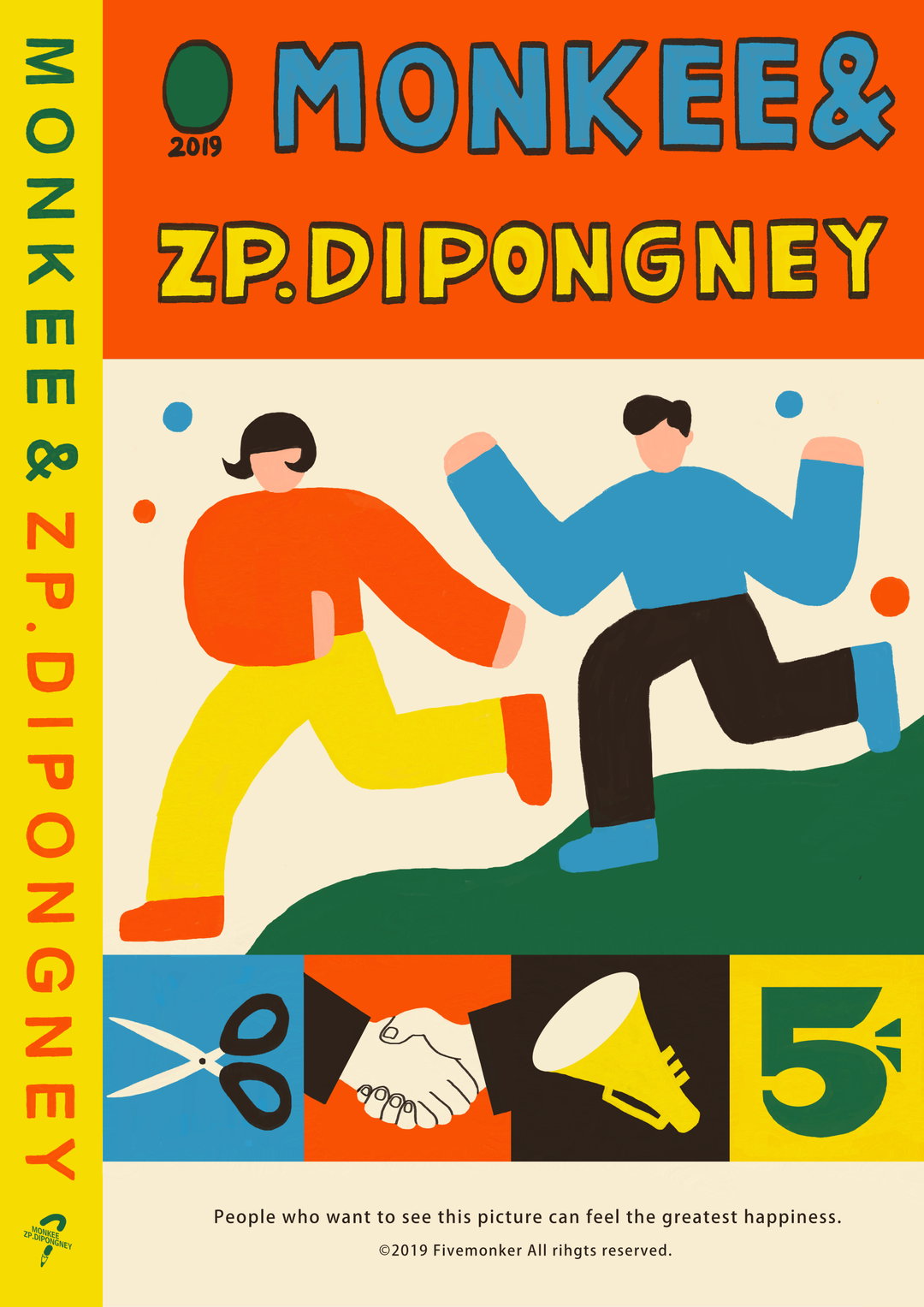
In other news, Monkee is working on a bowling project. Yep you heard right, bowling. It’s not a common sport in China, so you can imagine the illustrator’s inquisitiveness when she first passed a bowling alley. As she heard the rumbling sounds of skittles scattering, Monkee asked herself, “why don’t we express curiosity in our own way.” And just like that, she got started on a new series of works with her creative partner, Zp.Dipongney, imagining a bunch of bowling-themed adventures. Together, the two artists form the duo known as Fivemonker, collaborating on a number of projects inspired by the city of Chengdu which is, in Monkee’s words, “a city full of styles.”
Elsewhere, Monkee cites the artist Yoshitomo Nara as another great influence – recalling a time in high school when she bought countless catalogues by the Japanese painter. Poring over the artist’s works, which are both sweet and sinister at the same time, Monkee indulged in his evident passion for creating. In turn, she started illustrating, finding more comfort in the medium than in the subject she eventually chose to study at university, animation. “Now, I’m trying to give this energy to others in my work,” she says of this pay-it-forward attitude. Now, she hopes other budding illustrators can look to her for inspiration and feel the energy flowing throughout her vibrant compositions. All the while continuously challenging herself further, too.
GalleryMonkee
Hero Header
Monkee
Share Article
Further Info
About the Author
—
Jynann joined It’s Nice That as an editorial assistant in August 2018 after graduating from The Glasgow School of Art’s Communication Design degree. In March 2019 she became a staff writer and in June 2021, she was made associate editor. She went freelance in 2022.