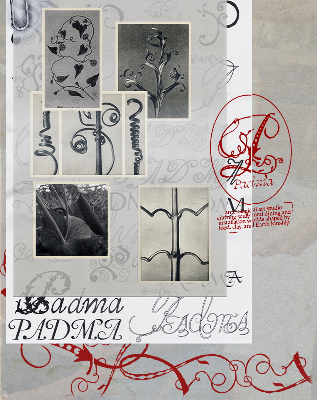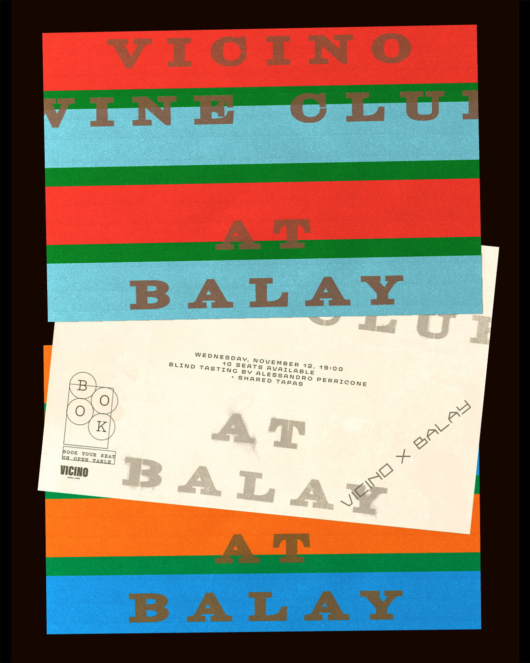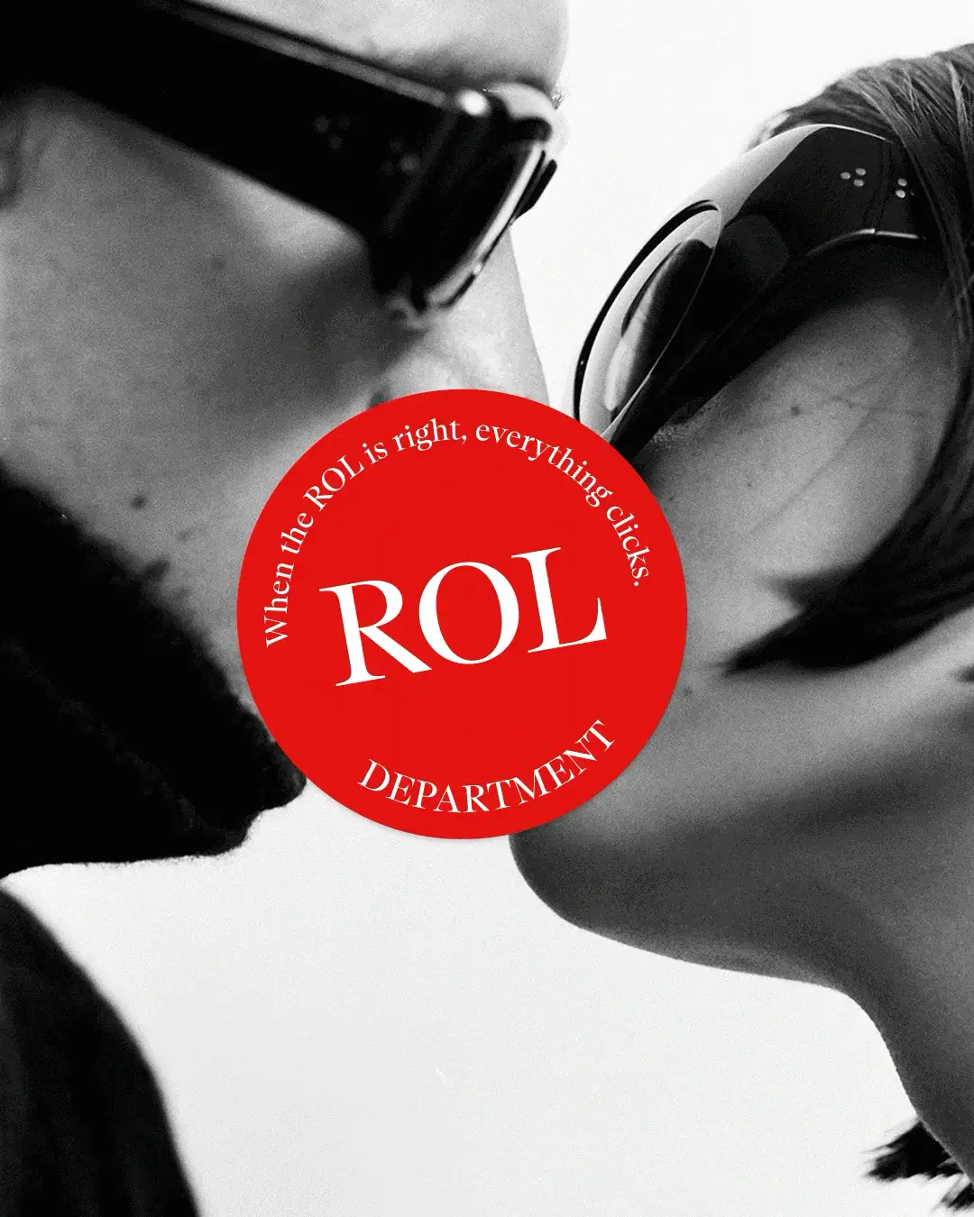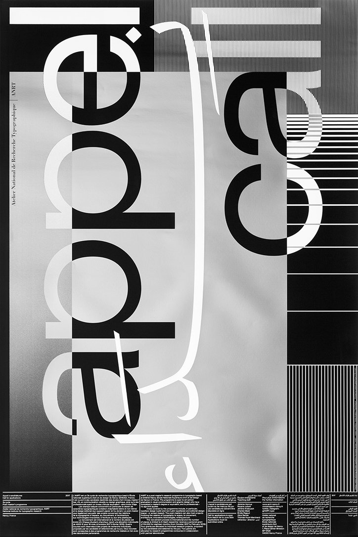
Arabic and Latin typography don’t have to mimic each other to be harmonious says Montasser Drissi
Typography not only informs our fundamental modes of written communication, but it is also the glue that binds disparate elements of graphic design. For Moroccan freelance designer Montasser Drissi, “typography has become the tool through which everything comes together.”
After relocating from Marrakech to France, Montasser settled in Nancy for a few years to work with Atelier National de Recherche Typographique, an institution dedicated to developing typographical solutions for academic research. During his time there, Montasser’s area of research focused on Arabic and Latin typography and, as a result, his design practice still centres on the two.
“When working on projects involving Arabic, I avoid typefaces that are trying too hard to look modern and am more attracted to ones that tap into the rich heritage of Arabic calligraphy,” Montasser tells It’s Nice That. Amazed by historic Arabic manuscripts, the graphic designer was surprised by the letterforms’ boldness. “The way calligraphers constructed their compositions by using heavy text blocks reminded me of Swiss modernist design that has also inspired my work,” he says on the matter.
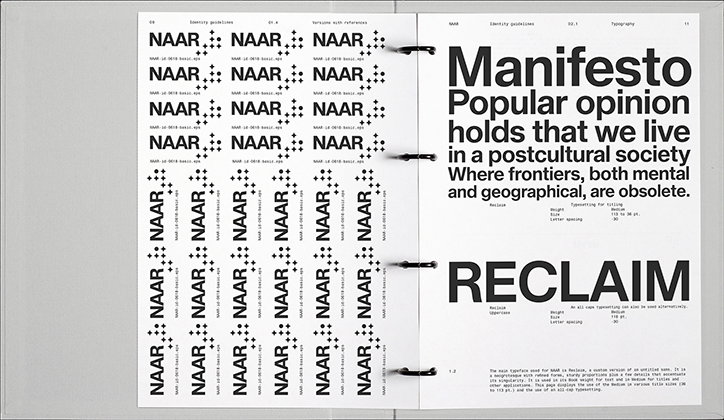
Montasser Drissi: NAAR
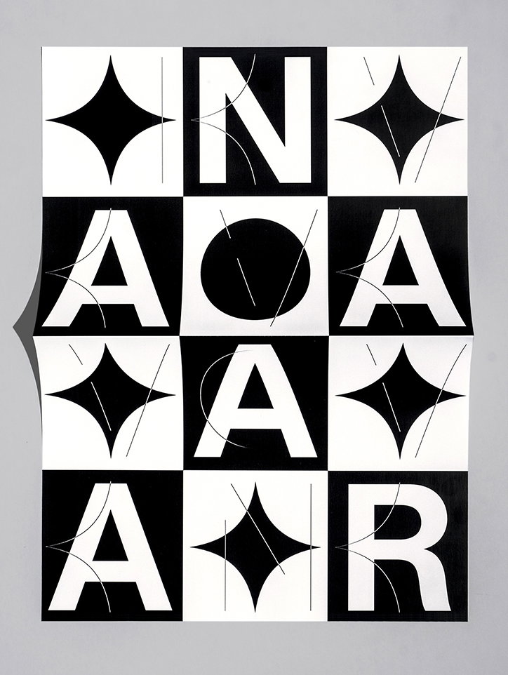
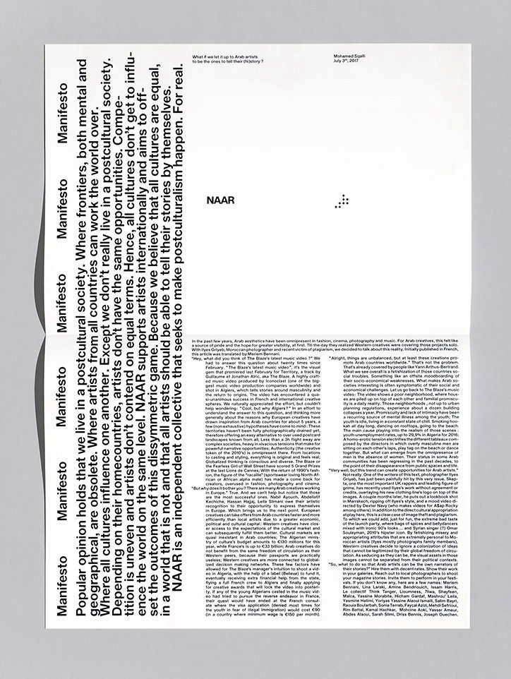
As a result, Montasser has developed a unique graphic style between the calligraphic Naskh style and the Latin grotesque. In his time in Nancy, the designer delved into the relationship between the two typefaces. “It was a way for me to challenge the use of typefaces with matching contrast, weight and overall feel,” he explains. “Arabic and Latin typography shouldn’t have to mimic each other to create harmony in a given space.”
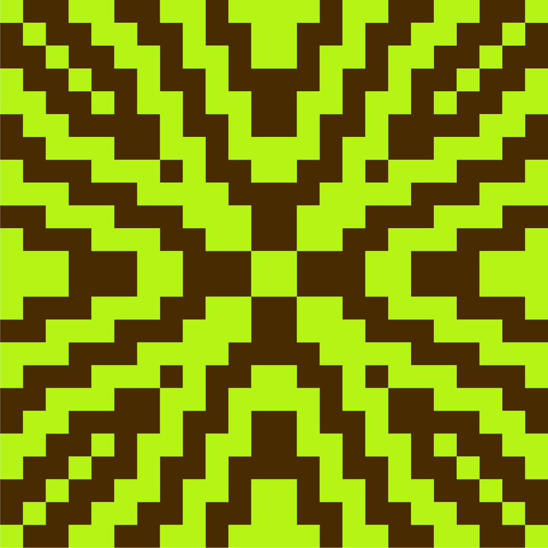
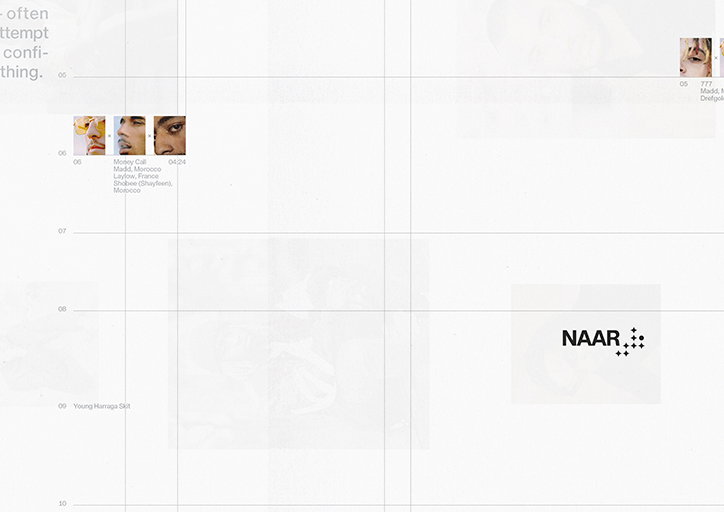
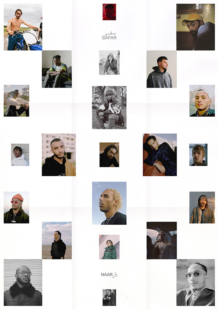
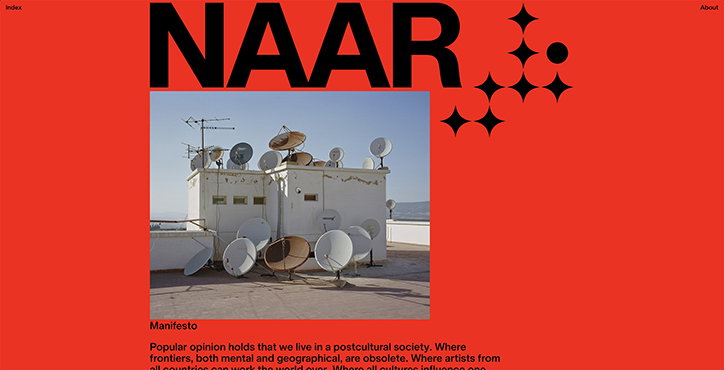
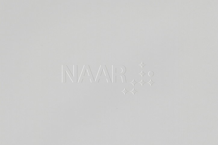
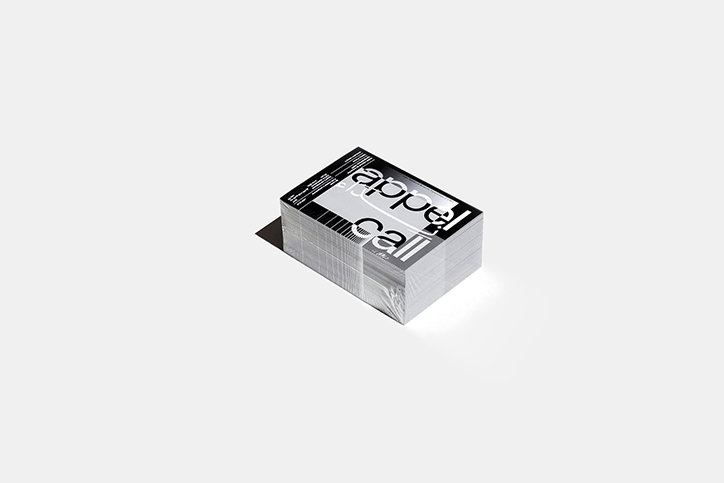
In the last couple of years, Montasser has regularly collaborated with the artist collective Naar. As well as designing the website and various printed matter, Montasser’s design for the visual identity features an abstracted version of the word for “naar” in Arabic, نار, which translates to “fire” in English. On the creative collective’s identity, Montasser adds, “as it’s an international project that is tightly related to Morocco and involves many local artists, it seemed obvious to go for an Arabic lettering as its main symbol.”
But, Montasser continues, because the content is predominantly in English and involved not only Arab artists, “building the visual identity using an Arabic logo seemed incoherent.” Not wanting to demote the Arabic script to something ornamental, Montasser’s deconstructed identity based on نار doesn’t look like a word but behaves like one. It stands on the baseline alongside its Latin counterpart and from that, the identity organically grew into a unique form of multilingual communication.
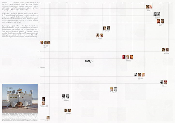
Montasser Drissi: NAAR
Montasser Drissi: NAAR
Montasser Drissi: NAAR
Montasser Drissi: NAAR
Montasser Drissi: NAAR
Montasser Drissi: NAAR
Montasser Drissi: NAAR
Montasser Drissi: NAAR
Montasser Drissi: NAAR
Montasser Drissi: NAAR
Montasser Drissi
Share Article
Further Info
About the Author
—
Jynann joined It’s Nice That as an editorial assistant in August 2018 after graduating from The Glasgow School of Art’s Communication Design degree. In March 2019 she became a staff writer and in June 2021, she was made associate editor. She went freelance in 2022.