Mouthwash Studio’s identity and site for furniture brand Waka Waka is playful yet luxurious
The LA-based studio embodied the “minimal design and conscious proportion” of the brand through the unusual e-commerce platform.
Share
When it comes to e-commerce sites, you generally know what kind of experience you’re in for. Which is why, when we came across the site for Waka Waka, a Los Angeles-based studio focusing on wood furniture and functional objects designed and handcrafted by Shin Okuda, we were intrigued to find out which creative studio was behind it as it took us totally by surprise.
Turns out it was Mouthwash Studio in collaboration with Ben Mingo, also based in Los Angeles, a small creative collective started by a group of friends who met through the internet and decided to go into business together. Before officially starting the studio, the group initiated a magazine and a podcast series. “It’s what really brought us all together and led to the studio being created,” Mouthwash explains. Today, its work varies but there’s a constant focus on “intentional digital experiences through web design, that requires quite a lot of strategy and art direction to bring to life.”
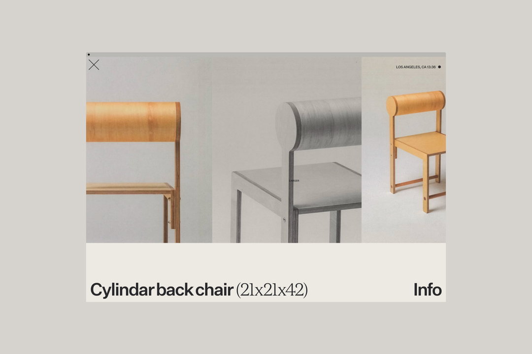
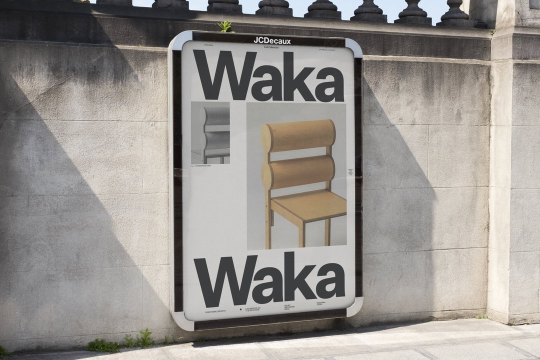
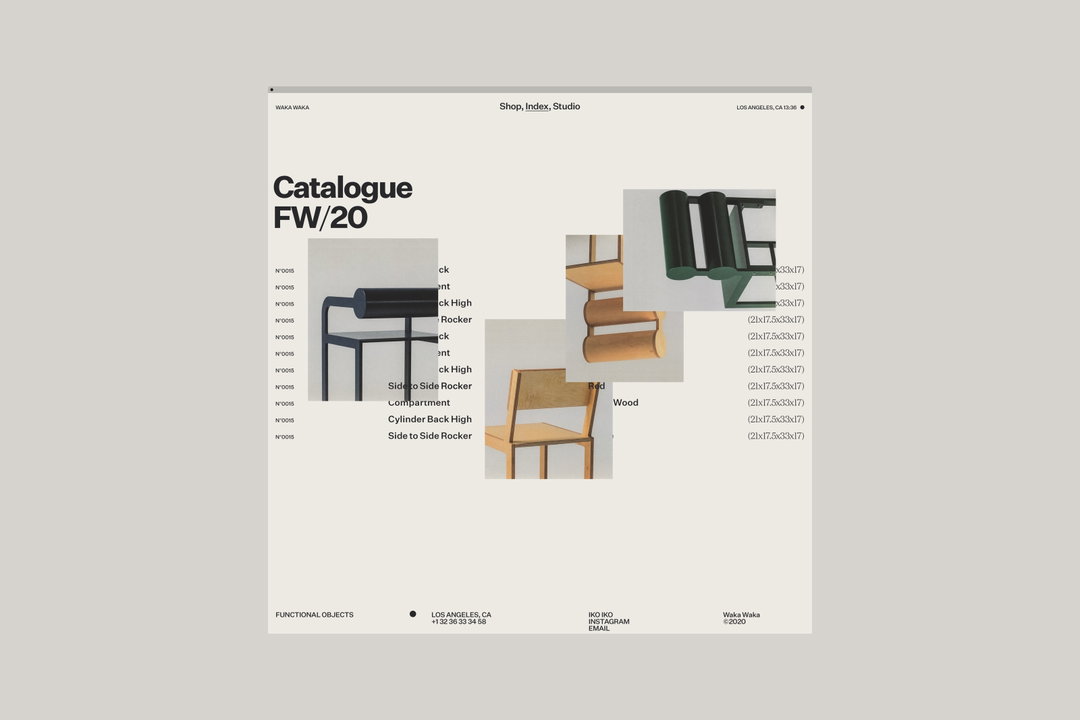
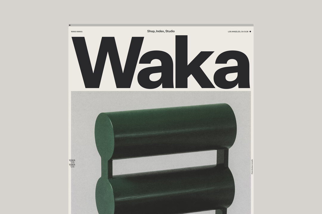
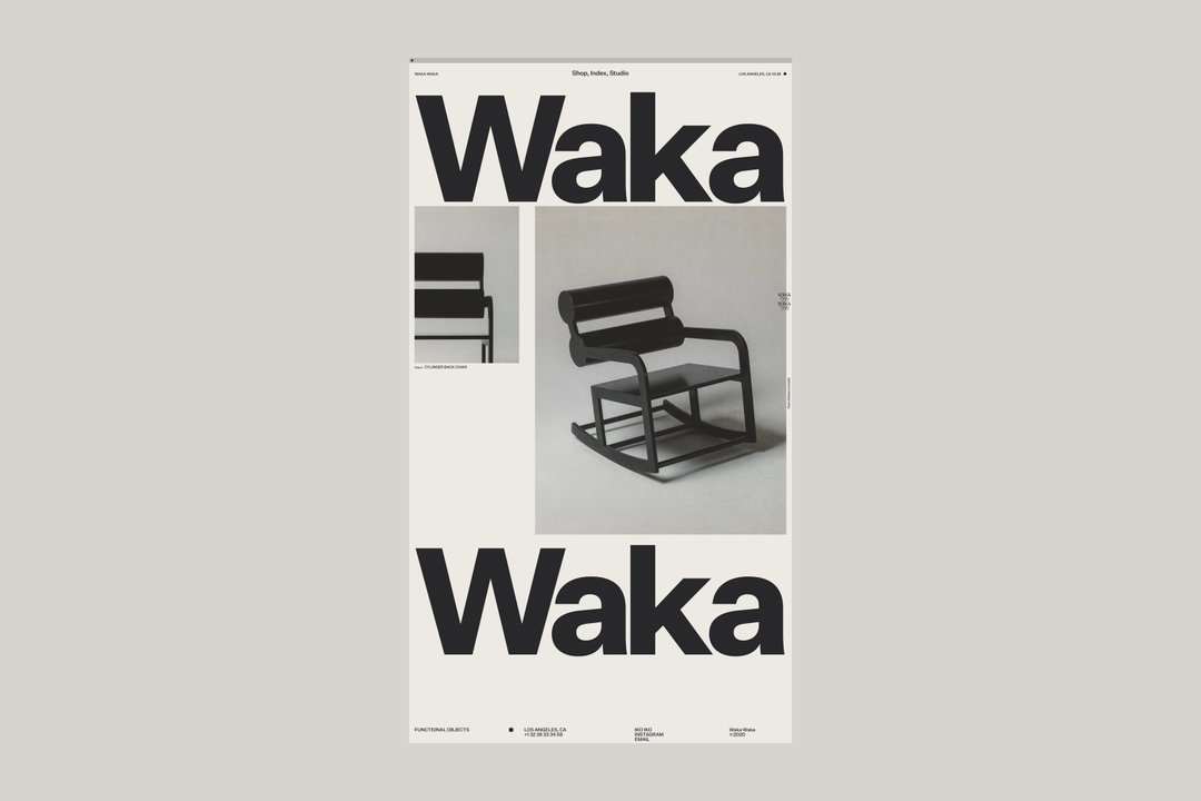
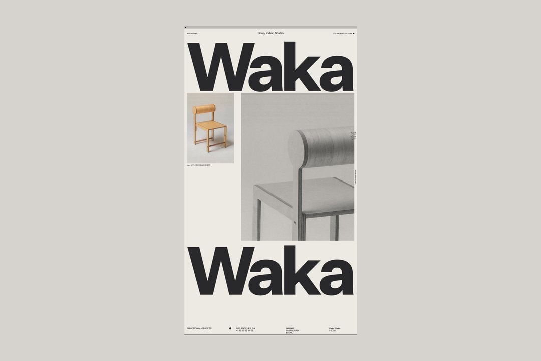
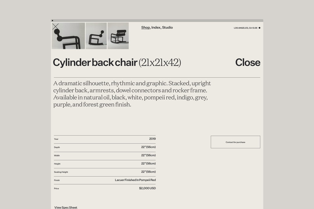
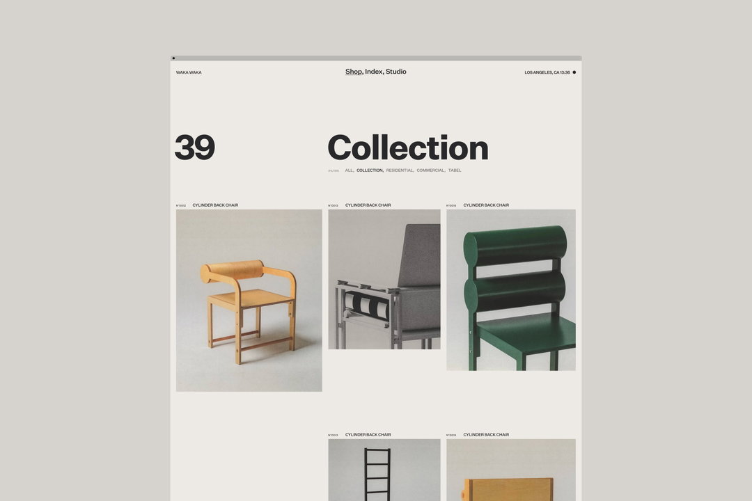
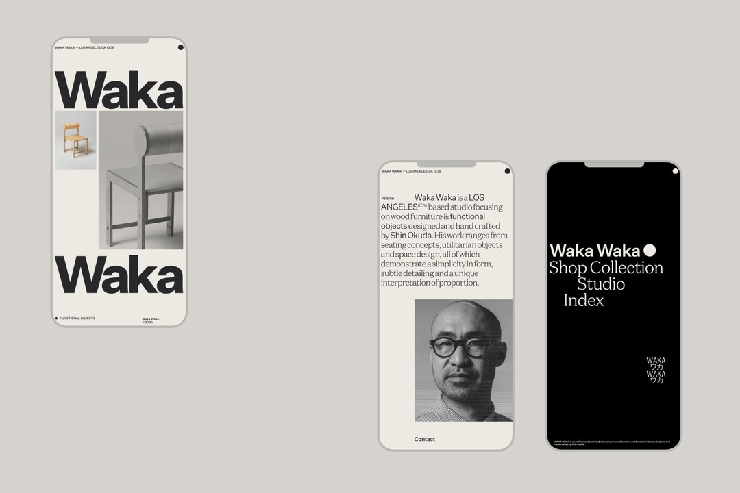
The site (which was built with help from Ben and Timothée Roussilhe) and identity which the studio has created for Waka Waka are sophisticated and luxurious, riffing off of the utmost attention to detail and craft that goes into Waka Waka’s collections. This is expressed through beautiful photographs which fill the screen, considered typography and a user journey which feels more like flipping through a magazine than shopping for furniture.
Mouthwash has been working with Waka Waka and crafting its visuals for three collections now: Collection 01, Collection 02, and the most recent titled the Full Collection. It’s a been a process of iteration and building upon previous work, Mouthwash explains: “The first two collections, which came to life mid-2019 to early-2020, were made from an appreciation of the work Shin was making. He had just hit a decade of his studio-practice, so it made sense to us to create a digital experience that documented his work up until now. For the Full Collection, we were tasked with creating a functional yet playful e-commerce experience to house the complete range of his products.”
To do so, Mouthwash leaned into Shin’s “minimal design and conscious proportion”, displaying this through “the creation of a uniquely structured grid system that allows for discovery through these organic and random moments of interaction.” The studio also explains that it pulled heavily from both digital and printed mediums to inform how the site would look and feel, which is clear when you travel around the site, particularly when you interrogate the texture of the photography.
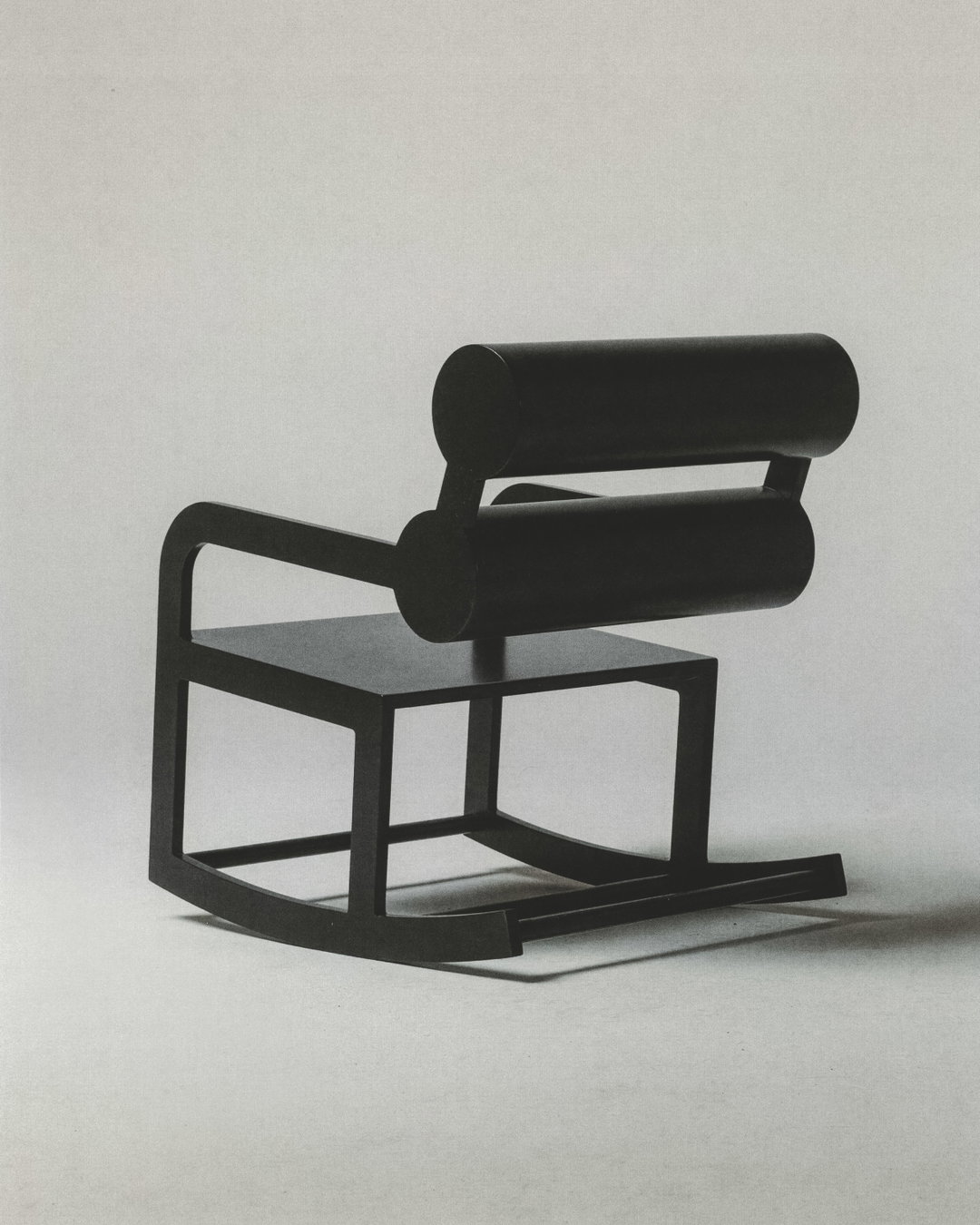
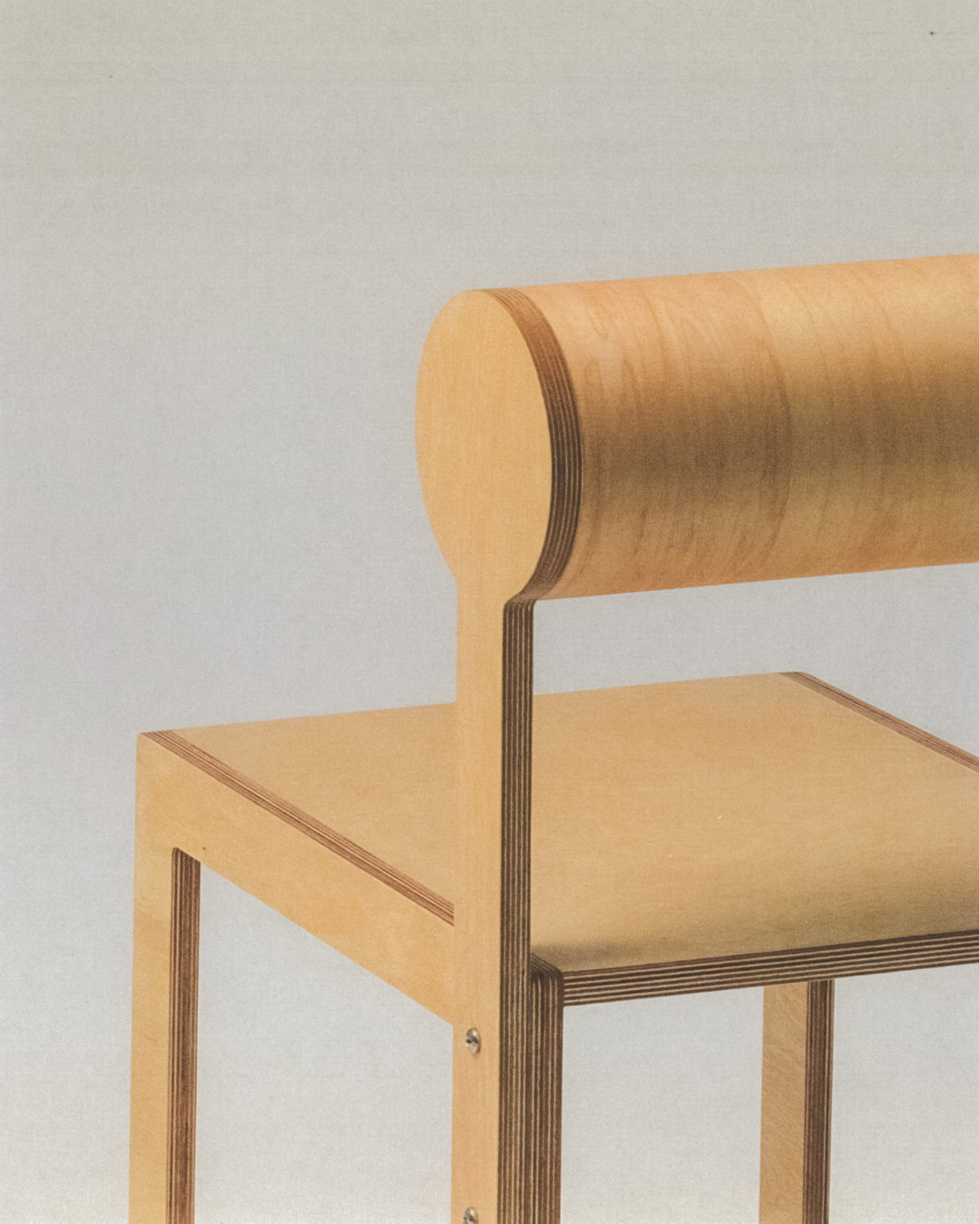
It’s the imagery on the Waka Waka site which really makes it stand out and, when asked about the importance of it to the experience, Mouthwash tells us that it was because it needed to accurately capture Shin’s work. “Choice of material is essential in his craft,” the studio says. “Paying attention to those details, accentuating the shape of the chairs, and highlighting textures found in the material were all small decisions that led to a singular feeling.” It was also to ensure that the imagery would age well, much like Shin’s work has, “So referencing print styles from artists like Enzo Mari was essential to us,” Mouthwash continues. To achieve such perfectly imperfect results, the studio ended up scanning every image to achieve the right visual style.
On what it feels makes the site so unique, Mouthwash explains “We just really find the site a joy to explore, which is rarely a feeling you get through an e-commerce website.” There’s a playful balance to everything that forms arounds Shin’s work though the interactions and hover states, for example. “This site’s quite special to us because it’s a great example of successfully merging multiple disciplines. The organic collaboration between photography, visual design, motion design, and development work together to form an interactive solution. But at the end of the day, the site shines because it’s highlighting beautiful work. The container is only as good as what it’s holding.”
GalleryMouthwash Studio: Waka Waka (Copyright © Mouthwash Studio, 2020)
Hero Header
Mouthwash Studio: Waka Waka (Copyright © Mouthwash Studio, 2020)
Share Article
Further Info
About the Author
—
Ruby is Senior Creative at It's Nice That, overseeing our visual output across platforms and projects. Before that, she was associate editor on the editorial team, after joining in September 2017 following graduation from Central Saint Martins.