




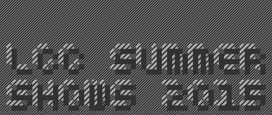
Muir McNeil's typography-led LCC Summer Shows identity
It’s Summer Shows-time again, and so we’re bracing ourselves for another slew of smart identity projects to go with them. Today, we present to you the work of MuirMcNeil, which has created the identity for the show at London College of Communication, where the duo teach. MuirMcNeil is comprised of Hamish Muir, lead tutor of BA Graphic and Media Design and Paul McNeil, course leader for MA Contemporary Typographic Media. Naturally, it’s a very typographic identity, and “confronts traditional letterform” according to LCC.
“As graphic designers who often employ a typographic approach, information hierarchy mediated in carefully structured ways has always been central in our design work,” says MuirMcNeil. “There are no mysteries in the systems we use – no traditional skills, trade secrets or black arts are employed. We are not type designers in this sense but graphic designers interested in developing processes, generating forms and systems to work with.”

Muir McNeil: LCC Summer Shows identity 2015
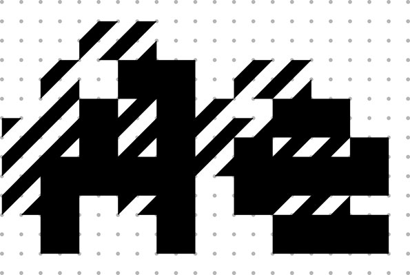
Muir McNeil: LCC Summer Shows identity 2015
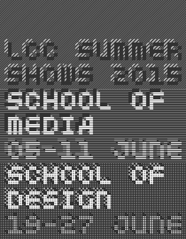
Muir McNeil: LCC Summer Shows identity 2015
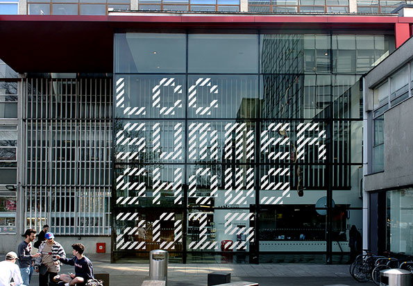
Muir McNeil: LCC Summer Shows identity 2015

Muir McNeil: LCC Summer Shows identity 2015
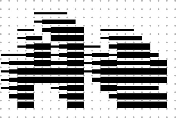
Muir McNeil: LCC Summer Shows identity 2015
Share Article
Further Info
About the Author
—
Emily joined It’s Nice That as Online Editor in the summer of 2014 after four years at Design Week. She is particularly interested in graphic design, branding and music. After working It's Nice That as both Online Editor and Deputy Editor, Emily left the company in 2016.



