




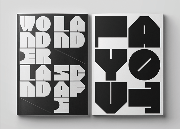
Turnover is both a typeface and a series of shapes that can be choreographed together
As self-described “type designers that work with commercial projects”, the Paris-based studio My Name is Wendy divides its time between commercial work and self-directed typography projects. Notably redesigning the NBA players’ practice t-shirts two years ago for Nike, the studio predominantly focuses on typographic explorations at the heart of both its commercial and personal work. Previously designing a bold type-based article for the philosophy magazine Hohe Luft as well as creating two custom typefaces – Newfabrik and Burlesk – for the Ministry of Science and Higher Education in Poland, the design studio values innovative type at the core of its designs.
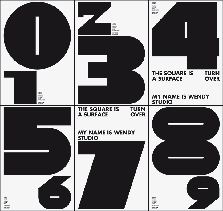
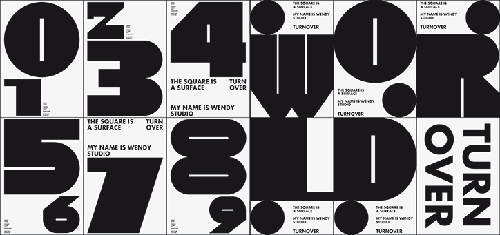
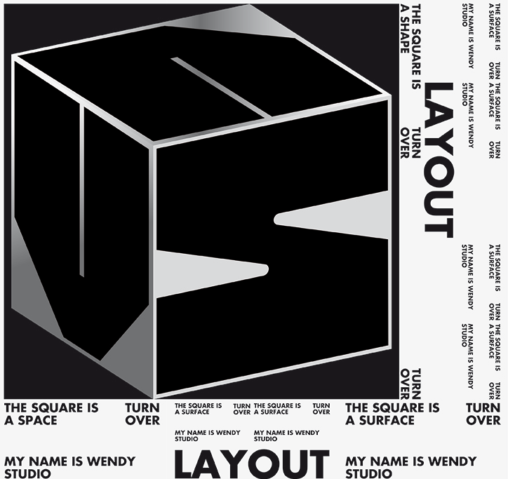
Carole Gautier and Eugénie Favre, founding designers of My Name is Wendy appreciate the importance of self-directed projects, such as their most recent output Turnover as they “enrich our other work”, the designers tell It’s Nice That. Designed in the last few months, Turnover acts as both a typeface and a series of shapes and signs. Each letterform is formed from a square and in turn, the typeface is a fixed width typeface that satisfyingly slots together. Geometric and chunky, Turnover started as a way for Carole and Eugénie to work with black and white shapes and now makes up a dynamic visual language that can be used in a number of different ways.
“The typeface was built from black rectangular shapes” explain the designers, “and we then used some white shapes to dig into the black areas to create the letters.” The designers’ often begin their projects by questioning the issues faced by the plastician; a plastician being an artist involved in the plastic arts. Influenced by the methods used by sculptors, each letter resembles a chiseled block of dense black marble that has been chipped down by craftsmen.
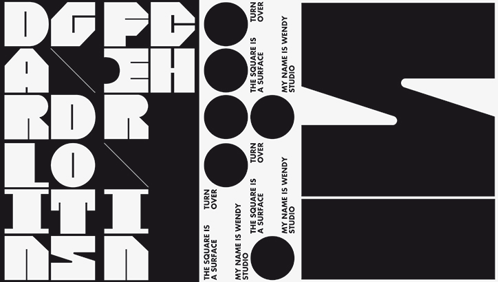
My Name is Wendy: Turnover
Kicking off the design process by designing a series of numbers, Carole and Eugénie’s process lay in “hiding as little as possible in the basic black shape.” Aiming to create a typeface which embodies both “rough forms and bold layouts,” Turnover’s blocky stability allows its users to compose a variety of layout like choreographed movements that melodically flow from one another.
Aptly named Turnover as a hint to its model-like poses, each letterform hints at anthropomorphism while adhering to the graphic designers’ grid methodology. As exemplified by its designers in the type specimen publication, the letters satisfyingly stack against one another and consequently, its compositions are both aesthetically pleasing and straightforward to use.
On this simplicity, the founding designers add, “if the principle of creating is simple in its sense of efficiency, the designed result will be more bold and timeless.” By creating a series of design rules which involves “finding a good basic idea, then deploying a project around these rules which is playful,” Carole and Eugénie respond to the plastician’s issues; creating something that is both communicative and sculptural.
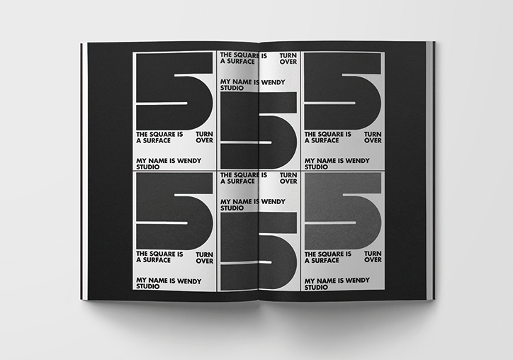
My Name is Wendy: Turnover
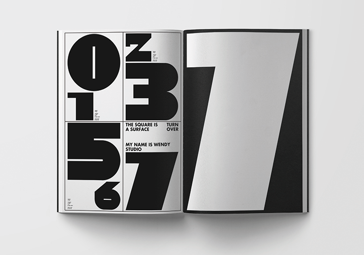
My Name is Wendy: Turnover
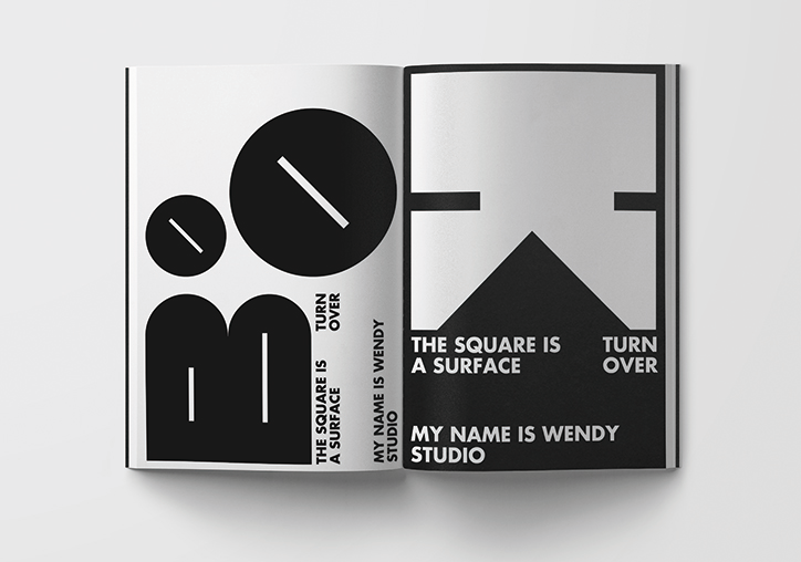
My Name is Wendy: Turnover
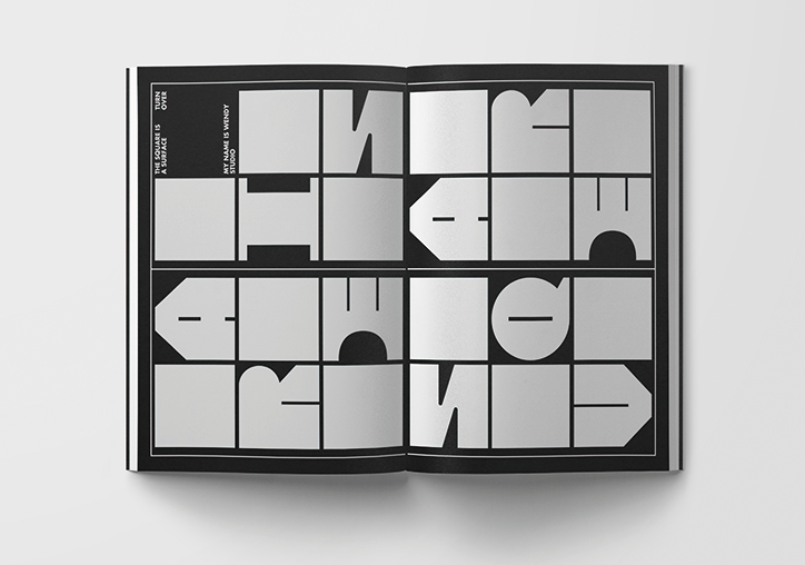
My Name is Wendy: Turnover
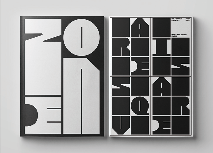
My Name is Wendy: Turnover
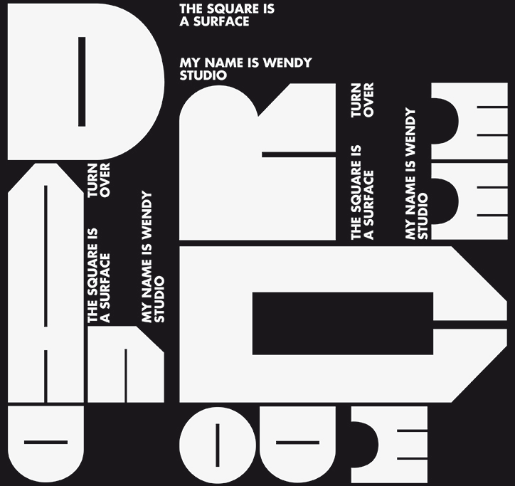
My Name is Wendy: Turnover
My Name is Wendy: Turnover
My Name is Wendy: Turnover
My Name is Wendy: Turnover
Share Article
Further Info
About the Author
—
Jynann joined It’s Nice That as an editorial assistant in August 2018 after graduating from The Glasgow School of Art’s Communication Design degree. In March 2019 she became a staff writer and in June 2021, she was made associate editor. She went freelance in 2022.

