Launch Recite Me assistive technology
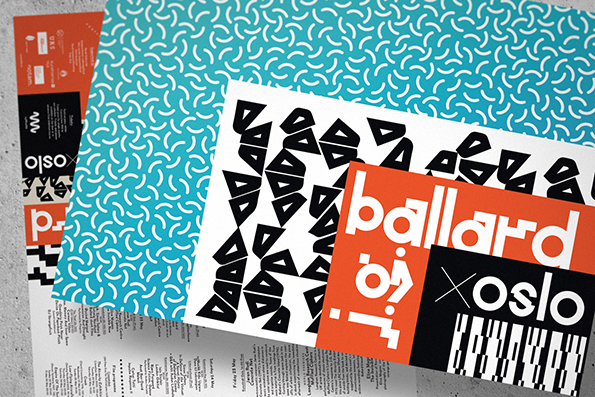
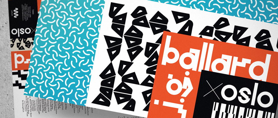
A collection of graphic prints and posters are layered over one another. One orange poster features the word “ballard” in bold white typography, while another black print reads “oslo”.

Graphic Design: Non-Format take on the late, great J.G Ballard for their latest festival identity

—
Date
5 June 2014

Last time we bigged up Norwegian/American studio Non-Format it was for an anthropomorphic animal head serving as the identity for Only Connect Festival of Sound in Oslo; so it seems only right that the following feature also explores the visuals for that same Nordic gathering. This time the festival has been dedicated to the late, great J.G Ballard – a man for whom much graphic design and illustration has already been produced, both for his books and film adaptations, as well as in his cult magazine, Ambit. But the Non-Format team have steered clear of any Ballardian visual clichés and adopted a retro-futuristic, geometric approach to the branding, utilising a glitchy typeface for the logo mark and a variety of pixellated patterns to tie the programme’s contents together. And not a smashed-up car or crash-test dummy in sight!
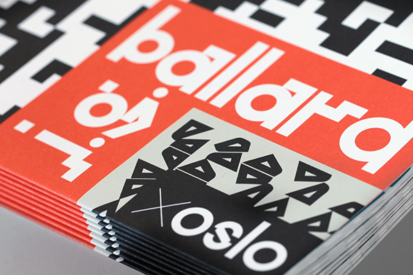
A stack of red and white booklets features bold, white typography that reads “ballard”. A smaller black and white graphic below includes the word “oslo” and a pattern of geometric shapes.
Above

Non-Format: J.G. Ballard x Oslo

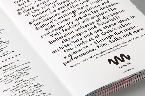
A close-up of an open booklet featuring a block of black text on a white page. The text describes a festival exploring the “Ballardian universe of dystopian cityscapes” in the context of Oslo.
Above

Non-Format: J.G. Ballard x Oslo

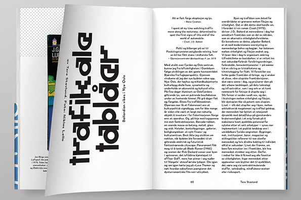
An open magazine showing a layout with a large, vertical typographic title that reads “trafiktablår”. The right-hand page contains several columns of dense text in Norwegian.
Above

Non-Format: J.G. Ballard x Oslo

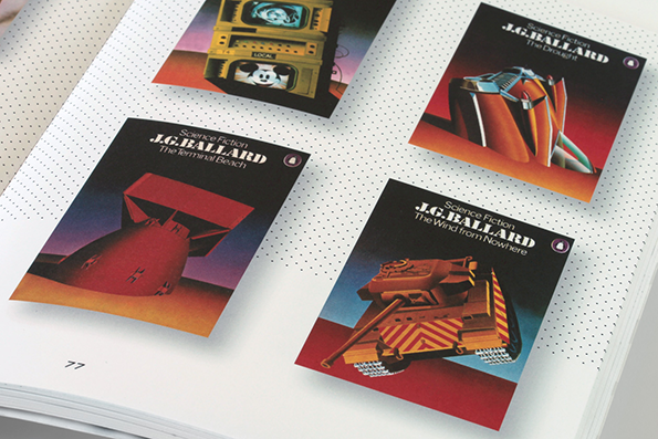
Four small cards for J.G. Ballard science fiction stories are laid across a dotted notebook page. Each card features a surreal illustration and the author’s name above titles including “The Terminal Beach” and “The Wind from Nowhere”.
Above

Non-Format: J.G. Ballard x Oslo

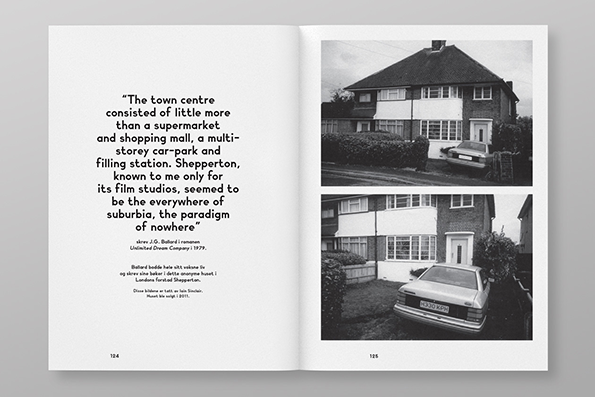
An open book shows a page of text opposite two black and white photographs of a suburban house. The text reads “The town centre consisted of little more than a supermarket and shopping mall, a multi-storey car-park and filling station. Shepperton, known to me only for its film studios, seemed to be the everywhere of suburbia, the paradigm of nowhere”.
Above

Non-Format: J.G. Ballard x Oslo

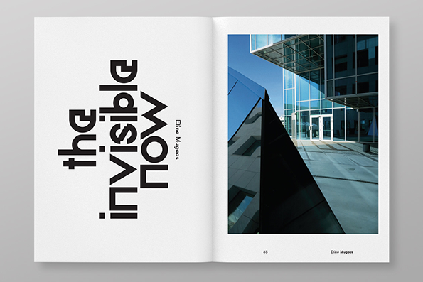
An open book shows a bold typographic layout on the left and a photograph on the right. The text reads “the invisible now” and “Eline Mugoas”. The photo shows the sharp angles of a modern glass building under a clear blue sky.
Above

Non-Format: J.G. Ballard x Oslo

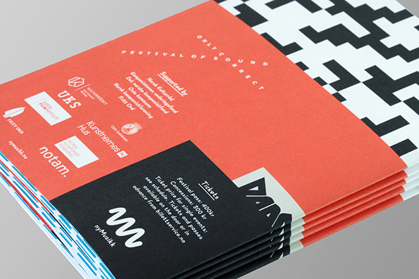
A stack of red and black brochures. The top cover features a list of sponsors and a “Tickets” section with pricing and booking information.
Above

Non-Format: J.G. Ballard x Oslo

A collection of graphic prints and posters with bold geometric patterns and typography. One orange poster reads “ballard” in white lowercase letters, while a black one reads “oslo”.
Above

Non-Format: J.G. Ballard x Oslo

Share Article

Further Info

About the Author

James Cartwright

—

James started out as an intern in 2011 and came back in summer of 2012 to work online and latterly as Print Editor, before leaving in May 2015.


It's Nice That Newsletters

Fancy a bit of It's Nice That in your inbox? Sign up to our newsletters and we'll keep you in the loop with everything good going on in the creative world.