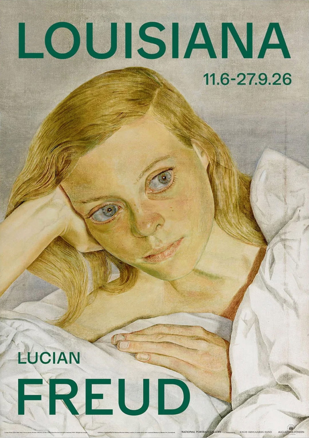
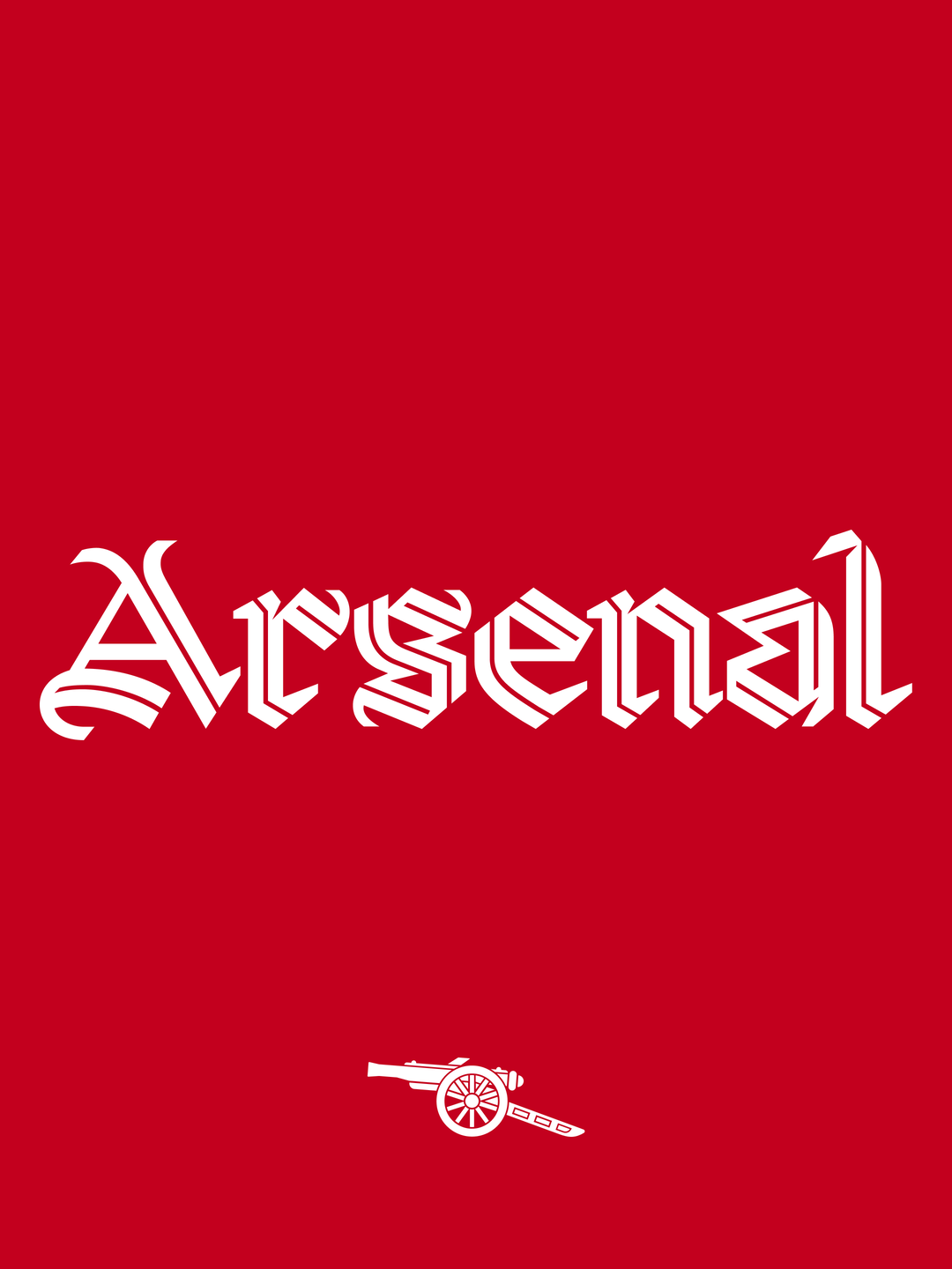
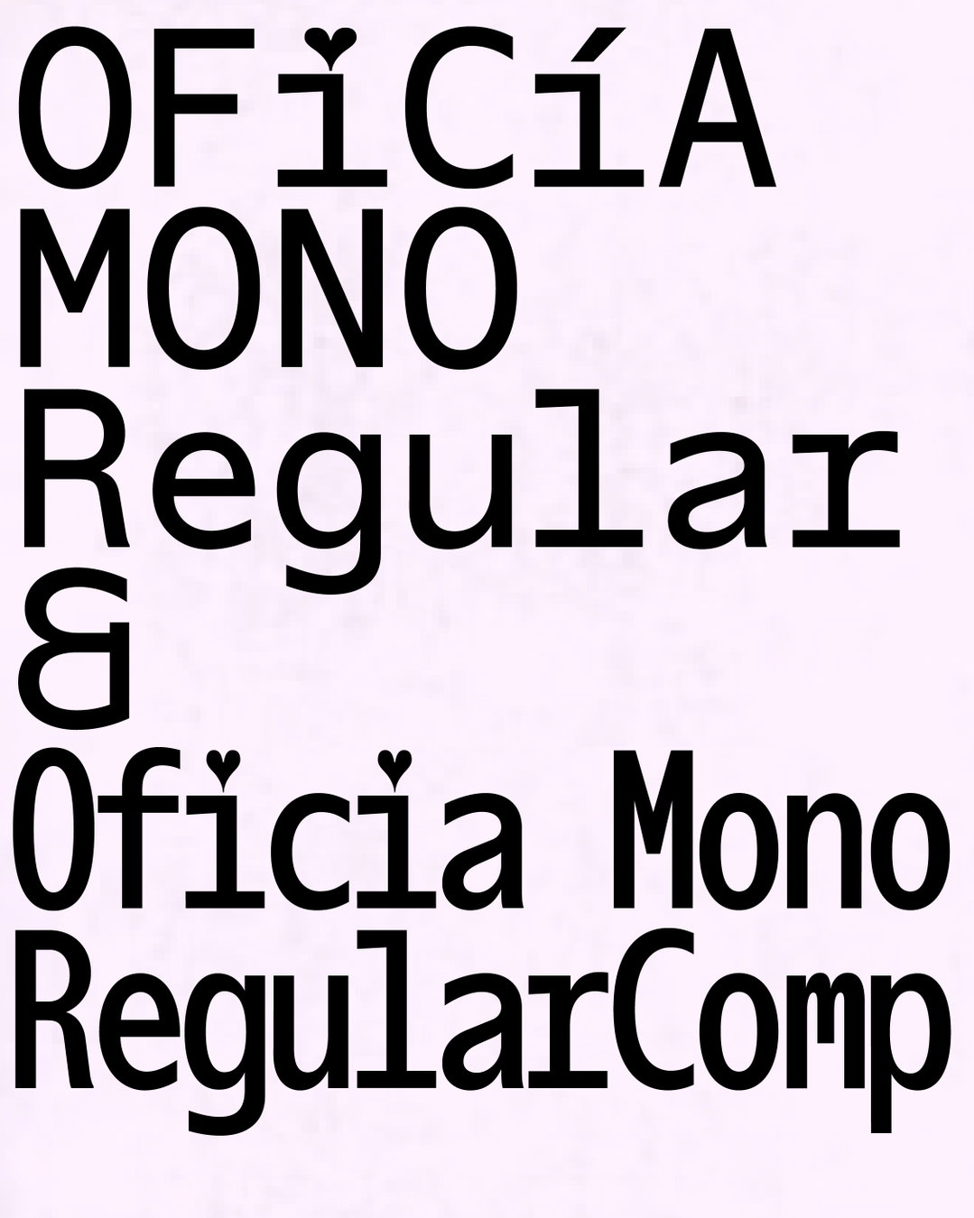
Or Type on the new weights of typeface Boogie School Sans
Having successfully made its way into the contemporary design canon, Or Type’s Boogie School Sans has been adopted by countless publications and identities including Cao Fei at MoMA PS1. Dating back to a quick sketch drawn during a residency in 2011, the Boogie School Sans family has recently expanded to include 18 different styles. Its new weights provide a language for all kinds of functions while maintaining the character of the original typeface which was published back in 2016.
Mads Freund Brunse, the founding designer of the Icelandic and Danish type foundry alongside Guðmundur Úlfarsson tells It’s Nice That on the typeface’s enlarged family: “The initial sketch for Boogie School Sans was based on the idea of developing a typeface with a reversed contrast, something that would seem quite obvious today but at the time, there weren’t many fonts that took on this approach; apart from in some historic typefaces.”
With the aim to create a reverse contrast typeface with a distinctly soulful personality, Boogie School Sans emerged as a published typeface five years after its first rudimentary drawings. Within this time, Mads had also been organising a series of parties in Christiania, Copenhagen called The Boogie at the Opera. As the typeface complimented the style and music of the parties, Boogie School Sans’ first iterations were seen on promotional posters advertising the events and as a consequence, the typeface also evolved with each poster, getting better with every party.
“We later thought it would be useful to have other versions with more contrast, making the stems even thinner,” says Mads. “This quickly evolved into the idea of a future variable font which could have different versions of both thicks and thins.” And in the typeface’s most recent update, such contrasts are exemplified as the letterforms combine several ways of functioning as a reverse contrast and even go into a “somewhat normal contrast model” too.
For the Brussels-based designers, a successful type design starts off with a simple idea, whether it’s formal or conceptual. “Some ideas often come out of sketching” adds Mads, “but we usually work digitally very early on in the process, often from the very start. The essence of our sketches and concepts are then applied to the rest of the alphabet.” It can take a few months or several years for the designers to prepare a typeface ready for general release. As meticulously thorough designers (like most type designers) once scrutiny kicks in, the design process can lengthen quite a bit. Once the whole character set is drawn, and spacing and kerning is finalised, the typeface is ready for an initial release.
While Or Type’s most recent release Or Lemmen, encapsulated a revival of Georges Lemmen’s Antiqua at the end of 2018, the studio is currently focusing on updating and extending many of its released fonts, while a few brand new releases are also bubbling away in the pipeline. And with the newly extended versions of Boogie School Sans, designers can now combine its different styles within the same project. Mads goes on to say, “This could work well for people who want to use a unique typeface with a varied visual output. We think the public will discover a new style of the typeface which is very unusual in its construction. Maybe it will even make people think about how letters constructed and why the letters look different that what we usually see?”
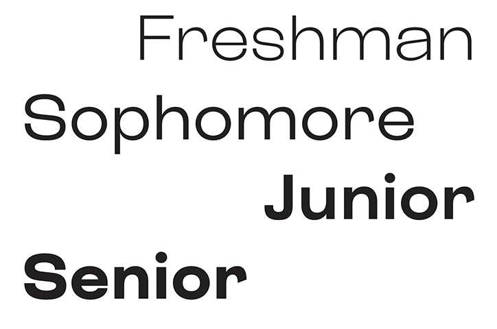
Or Type: Boogie School Sans
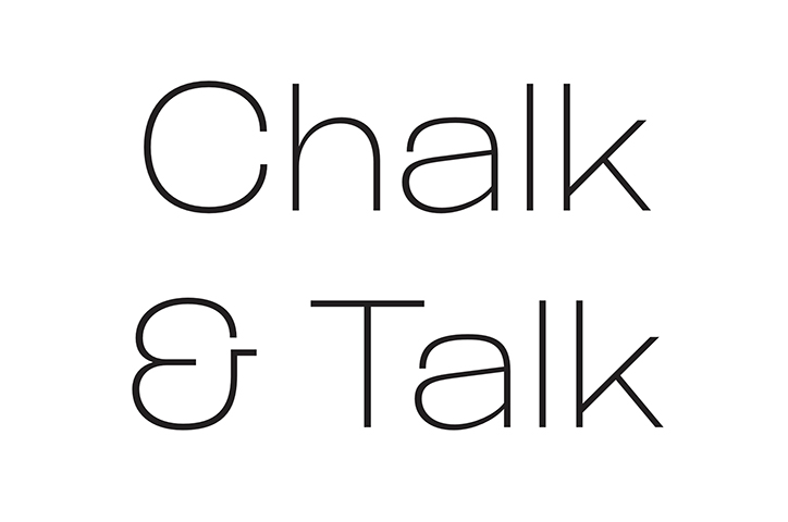
Or Type: Boogie School Sans
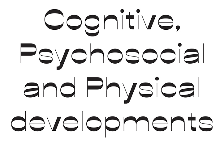
Or Type: Boogie School Sans
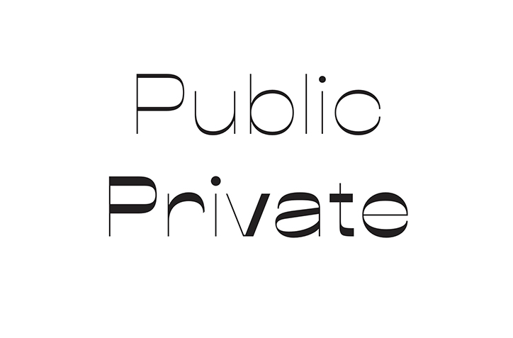
Or Type: Boogie School Sans
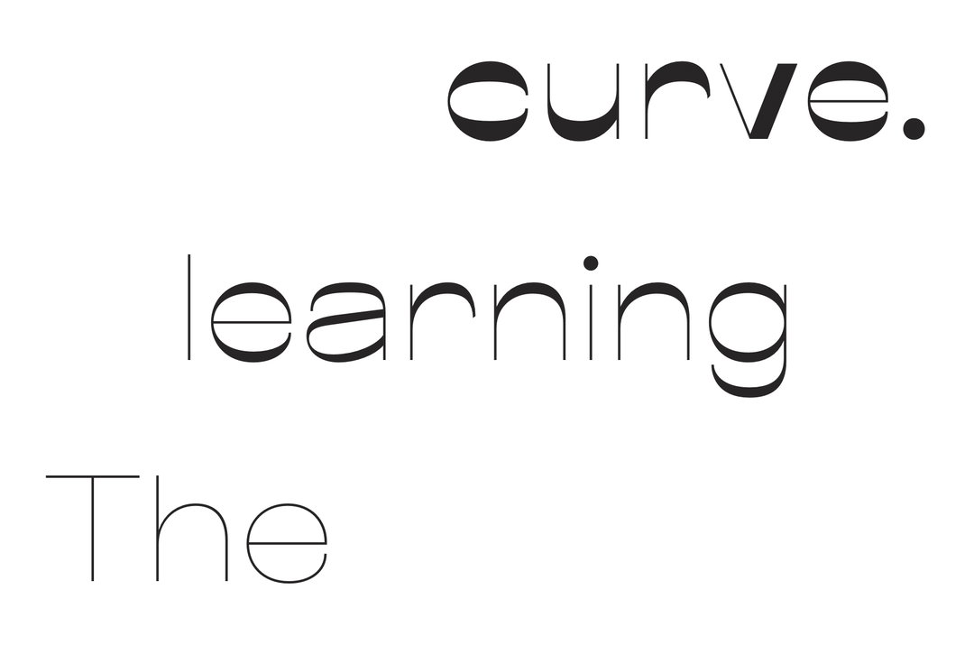
Or Type: Boogie School Sans
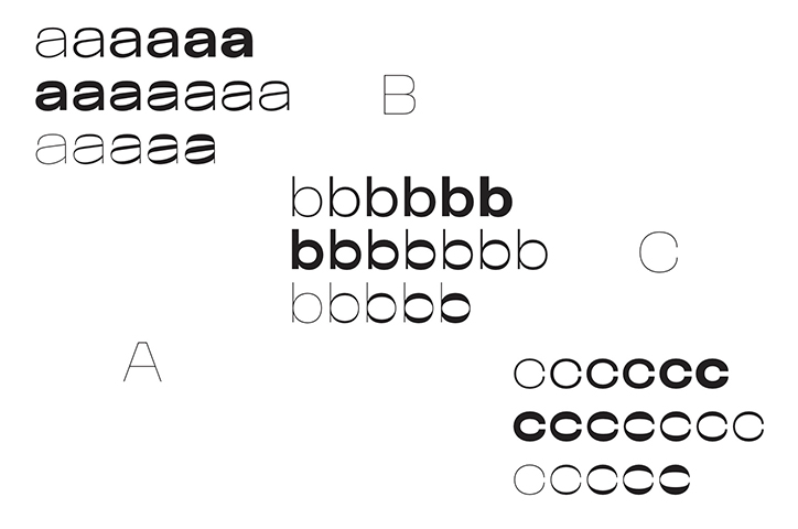
Or Type: Boogie School Sans
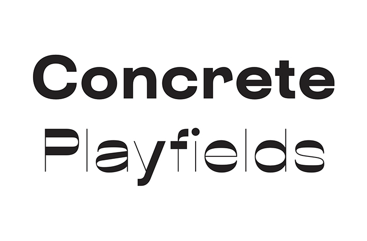
Or Type: Boogie School Sans
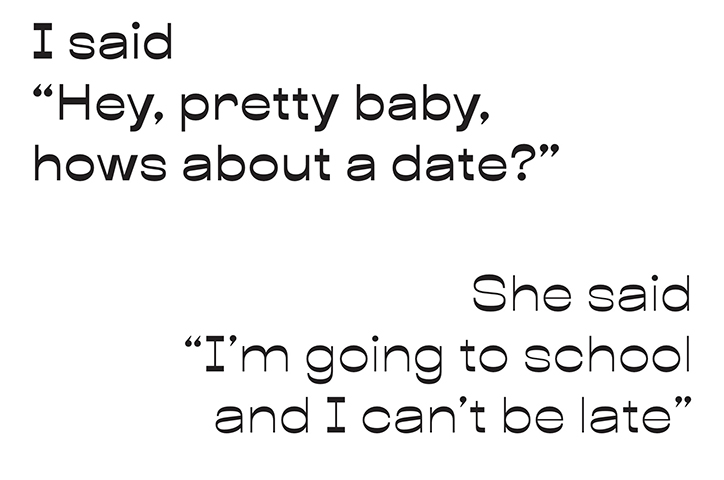
Or Type: Boogie School Sans
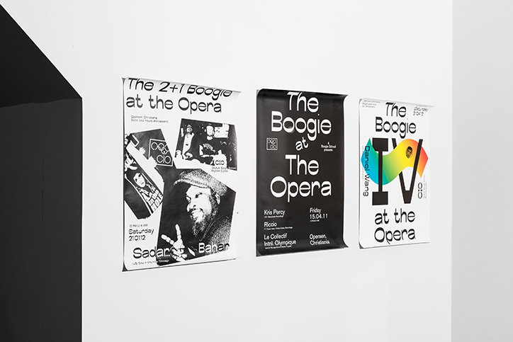
Or Type: Boogie School Sans, Boogie at the Opera
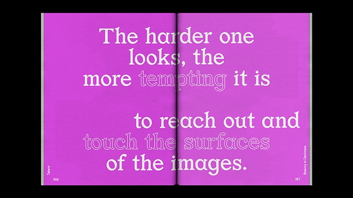
Or Type: Or Lemmen, Foam Talent #42, magazine design by Hamid Sallali and Floris van Driel (Vandejong)
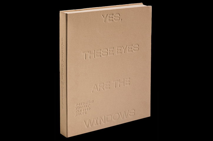
Or Type: Boogie School Sans, Saskia Olde Wolbers, book design by Côme De Bouchony
Share Article
Further Info
About the Author
—
Jynann joined It’s Nice That as an editorial assistant in August 2018 after graduating from The Glasgow School of Art’s Communication Design degree. In March 2019 she became a staff writer and in June 2021, she was made associate editor. She went freelance in 2022.