





Otherway gives Fortnum & Mason its first bespoke font
300 years in the making, this custom type family captures the brand’s unique historic details and quintessentially British quirks.
Longtime collaborators with the home of hampers and luxury tea boxes, Otherway has continued its development of British department store Fortnum & Mason’s iconic brand identity with a bespoke typeface. Having worked with the company for over ten years, the creative agency has been “dusting down the brand” and making Fortnum’s “more relevant, to more people, more often”. One thing that was missing though was a bespoke letterset for the quintessentially British fine foods store.
Opening its doors all the way back in 1707, (over 300 years ago), the store has never had its very own custom font before. So, the bespoke type project was a pretty big deal. A custom letterset for Fortnum & Mason would mean that the brand would now truly own its written identity and have “control over its usage on a global scale”, says Otherway partner Ben Lewin. With the idea to carve out this individuality, “the brand needed to move away from the increasingly generic and overused Gill font” and “build a new serif that had better readability and personality, from button to billboard”.
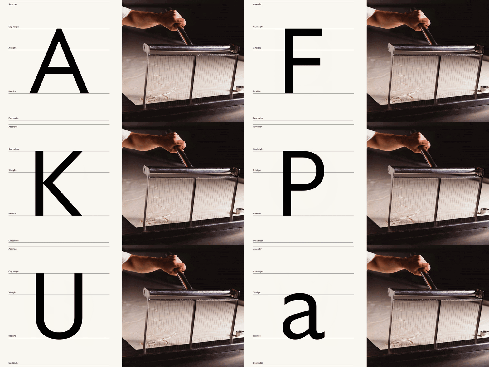
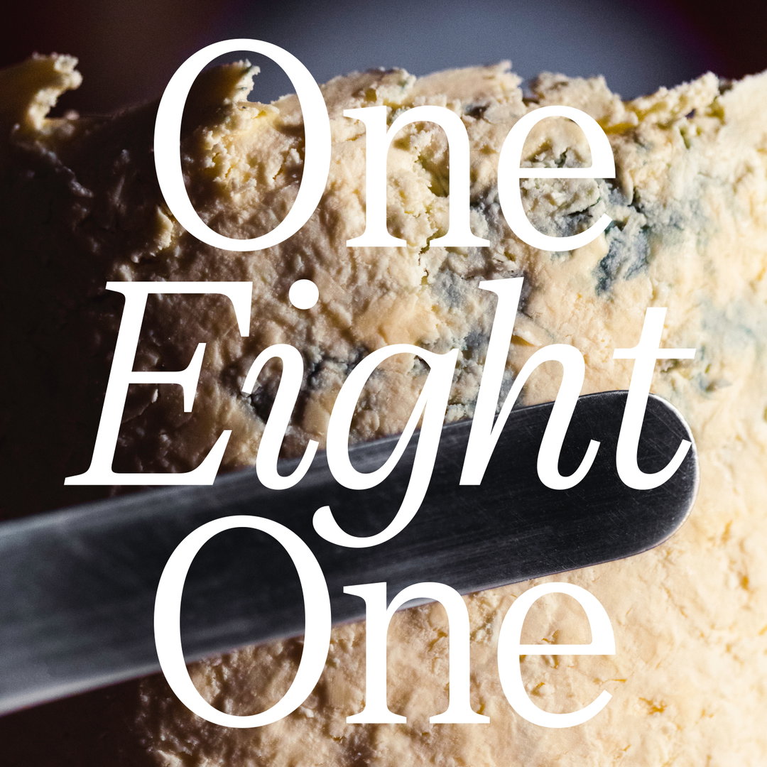
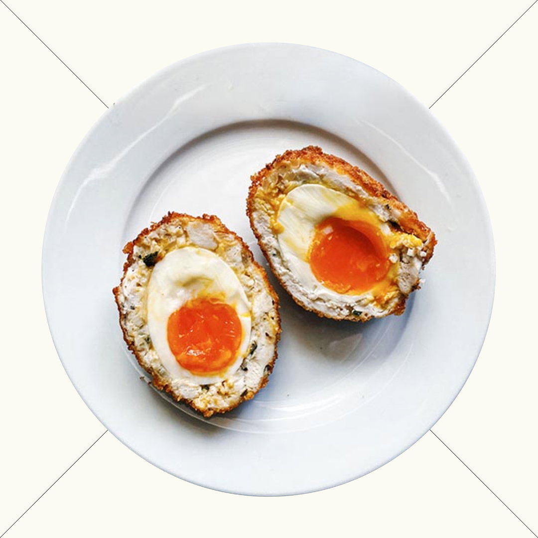
Otherway: Fortnum & Mason typeface (Copyright © Otherway, 2024)
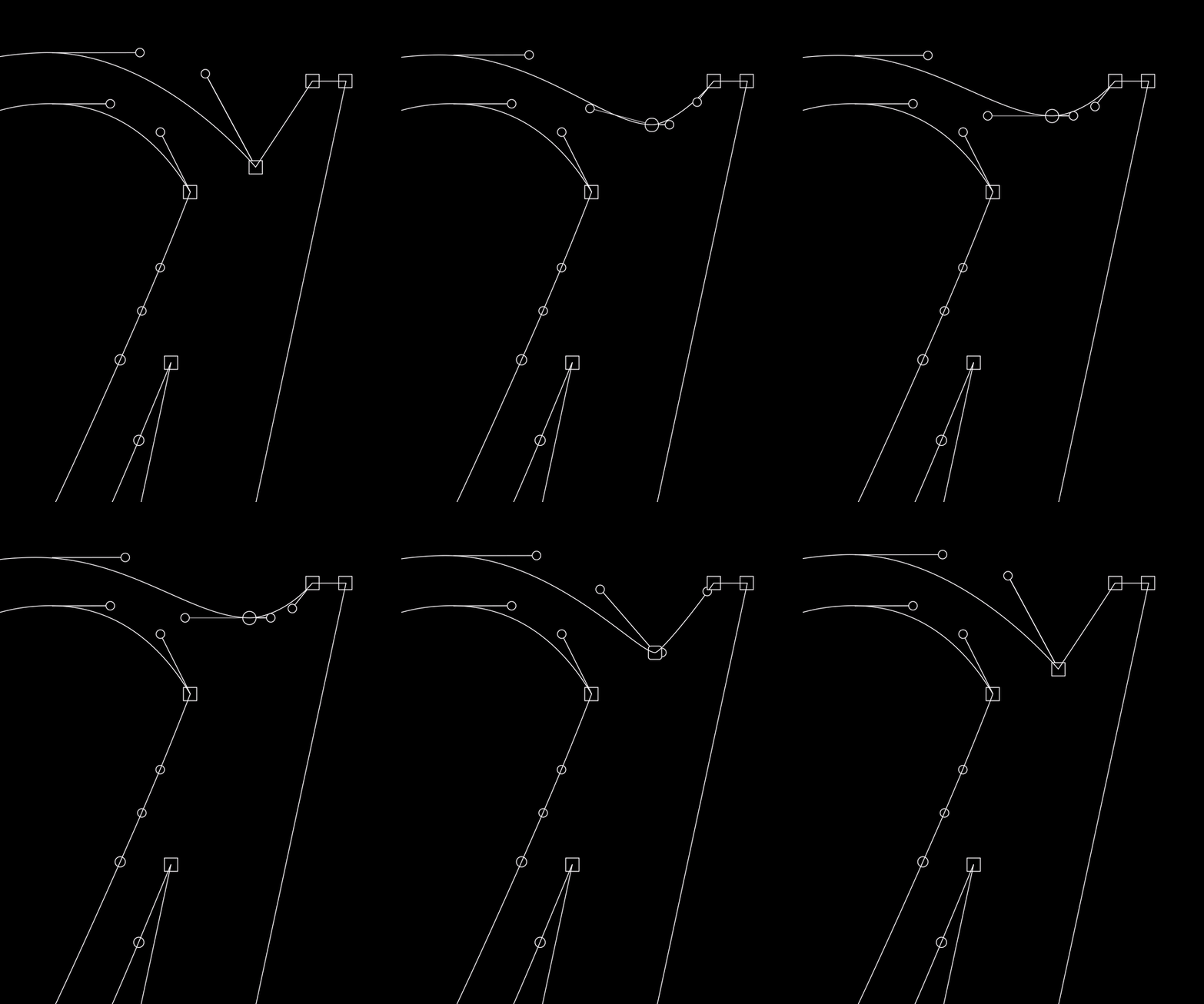
“Being a British brand, typography has always been at the heart of Fortnum’s design system,” Ben shares. “We delved into the Fortnum’s archive for inspiration – finding details and quirks that would build a robust set of design principles to draw from.” The aim of the game for the design of the typeface then, was to maintain the brand’s “eccentric English personality” in its letterforms whilst crafting something that was “readable, inclusive and accessible to all”.
When Otherway set the brief on this basis, the person for the project was type specialist and design director at Otherway, Brad Rose, who worked closely with the design team at Fortnum’s to “distil 300 years of history into a clear and simple visual guide and set of design principles”, Ben explains. The agency then partnered up with Colophon Foundry, starting with Gill and Century on their drawing board, to iteratively develop a more bespoke serif.
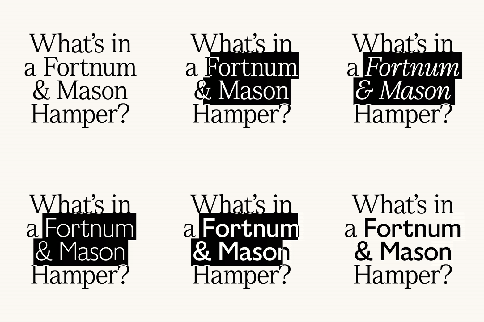
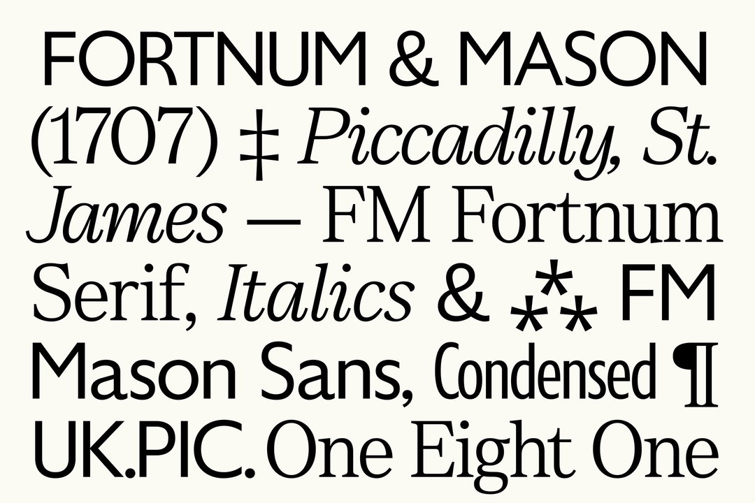
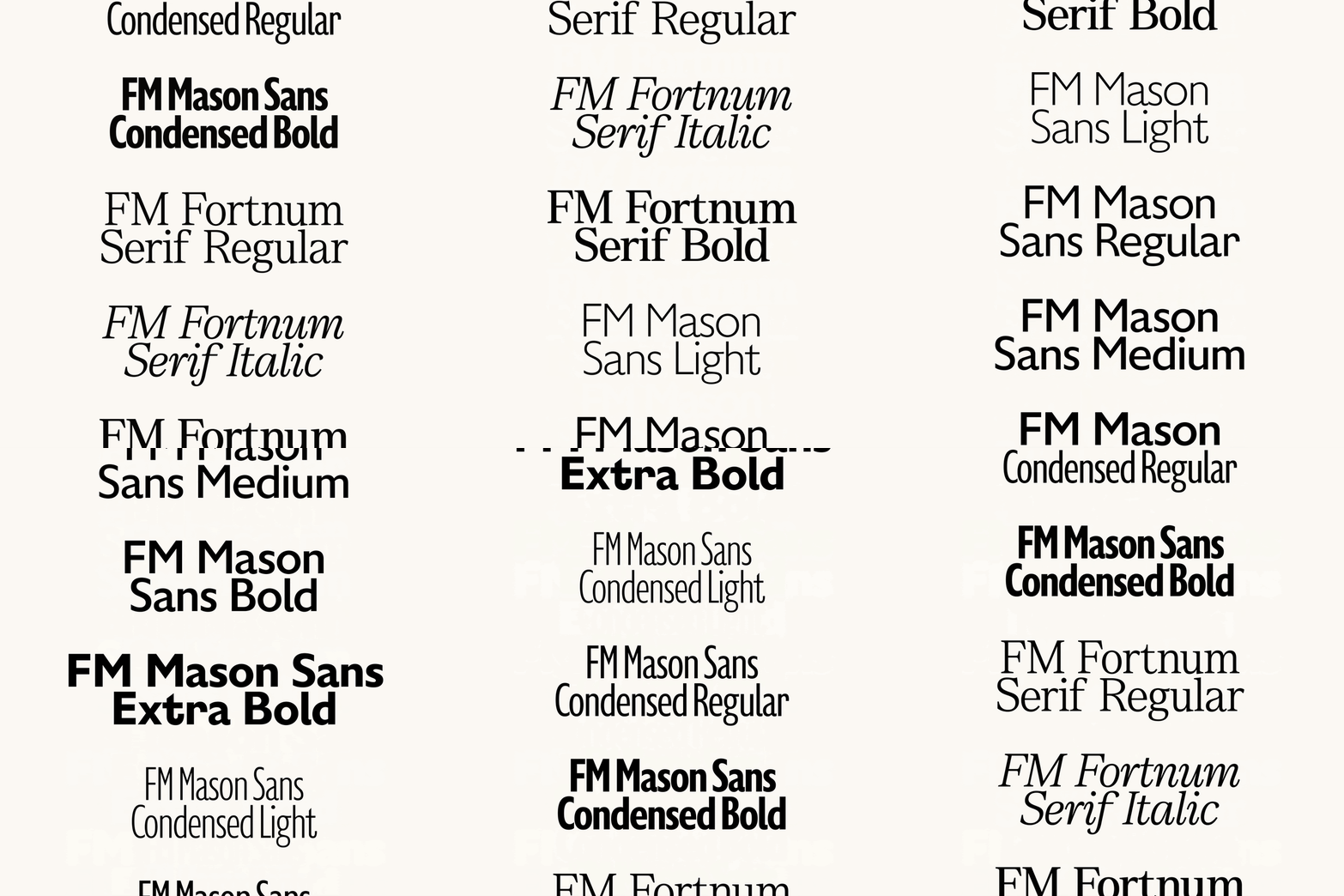
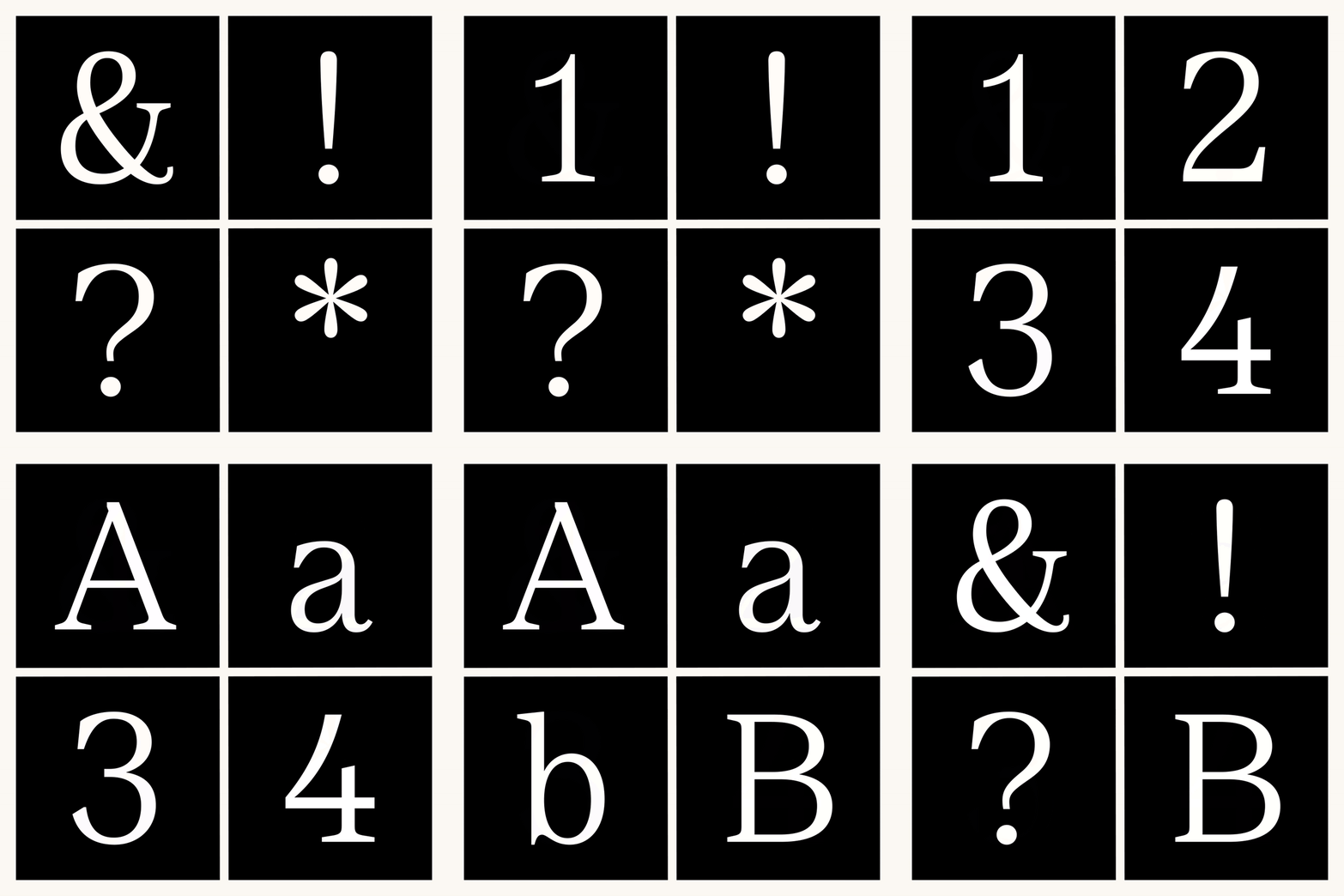
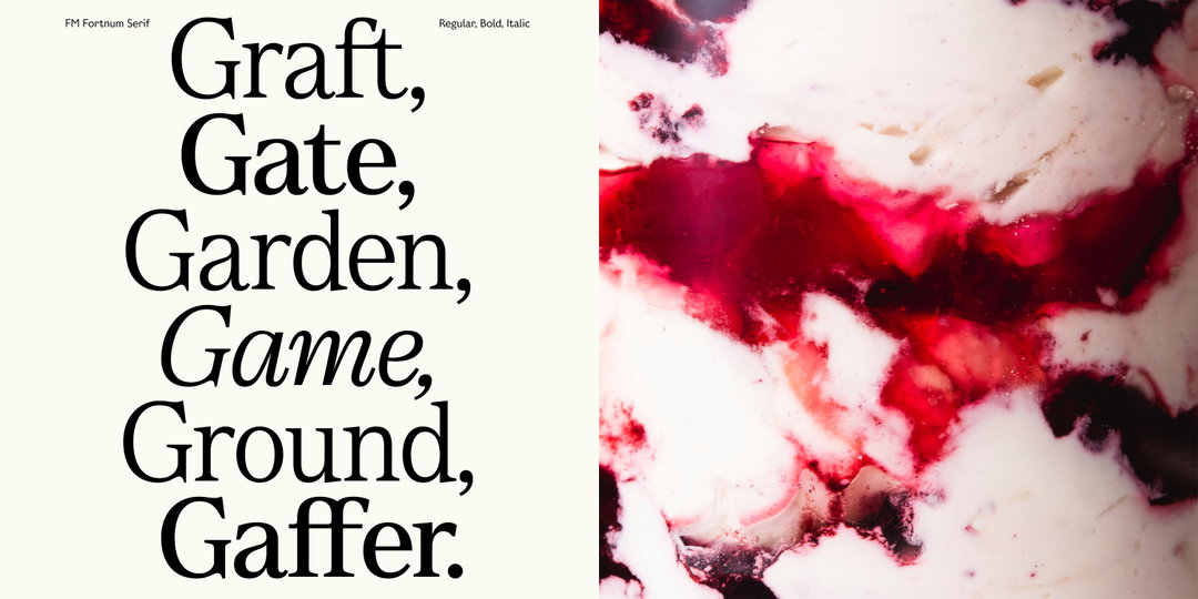
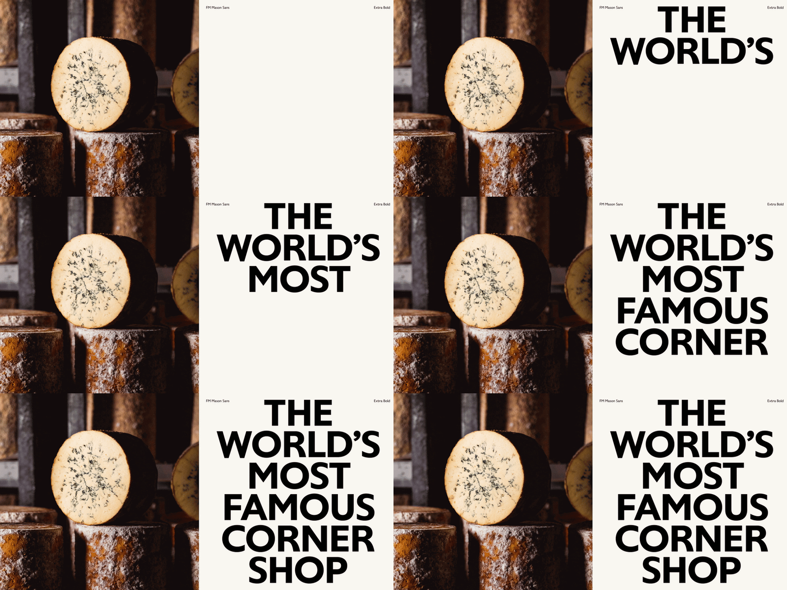
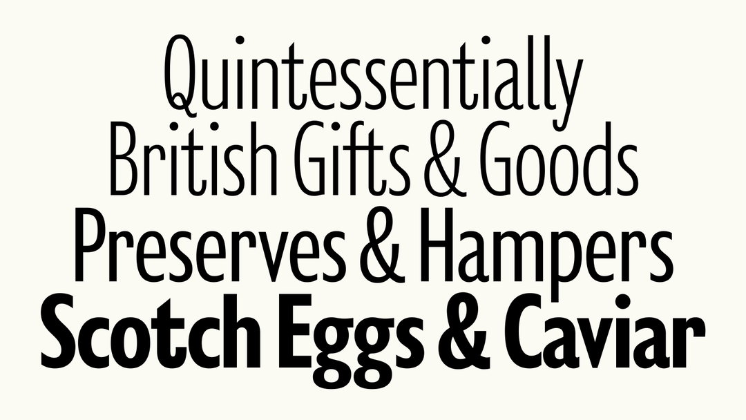
The results were an entire family of type that holds three collections: “a sans serif (FM Mason), its condensed counterpart and a serif (FM Fortnum) totalling 12 styles” says Brad. Designed to “evoke a sense of heritage”, whilst remaining fit for the future of the brand, all letterforms were cut and kerned to have a “timeless quality” that nods to craft. The family’s condensed collection channels the font’s style into more functional outputs like packaging, making the family flexible enough to adapt to a bunch of different touchpoints. The custom font is “a very agile and responsive typeface whatever the requirements thrown at it”, concludes Ben.
GalleryOtherway: Fortnum & Mason typeface (Copyright © Otherway, 2024)
Hero Header
Otherway: Fortnum & Mason typeface (Copyright © Otherway, 2024)
Share Article
About the Author
—
Ellis Tree (she/her) is a staff writer at It’s Nice That. She joined as a junior writer in April 2024 after graduating from Kingston School of Art with a degree in Graphic Design. Across her research, writing and visual work she has a particular interest in printmaking, self-publishing and expanded approaches to photography. ert@itsnicethat.com
To submit your work to be featured on the site, see our Submissions Guide.





