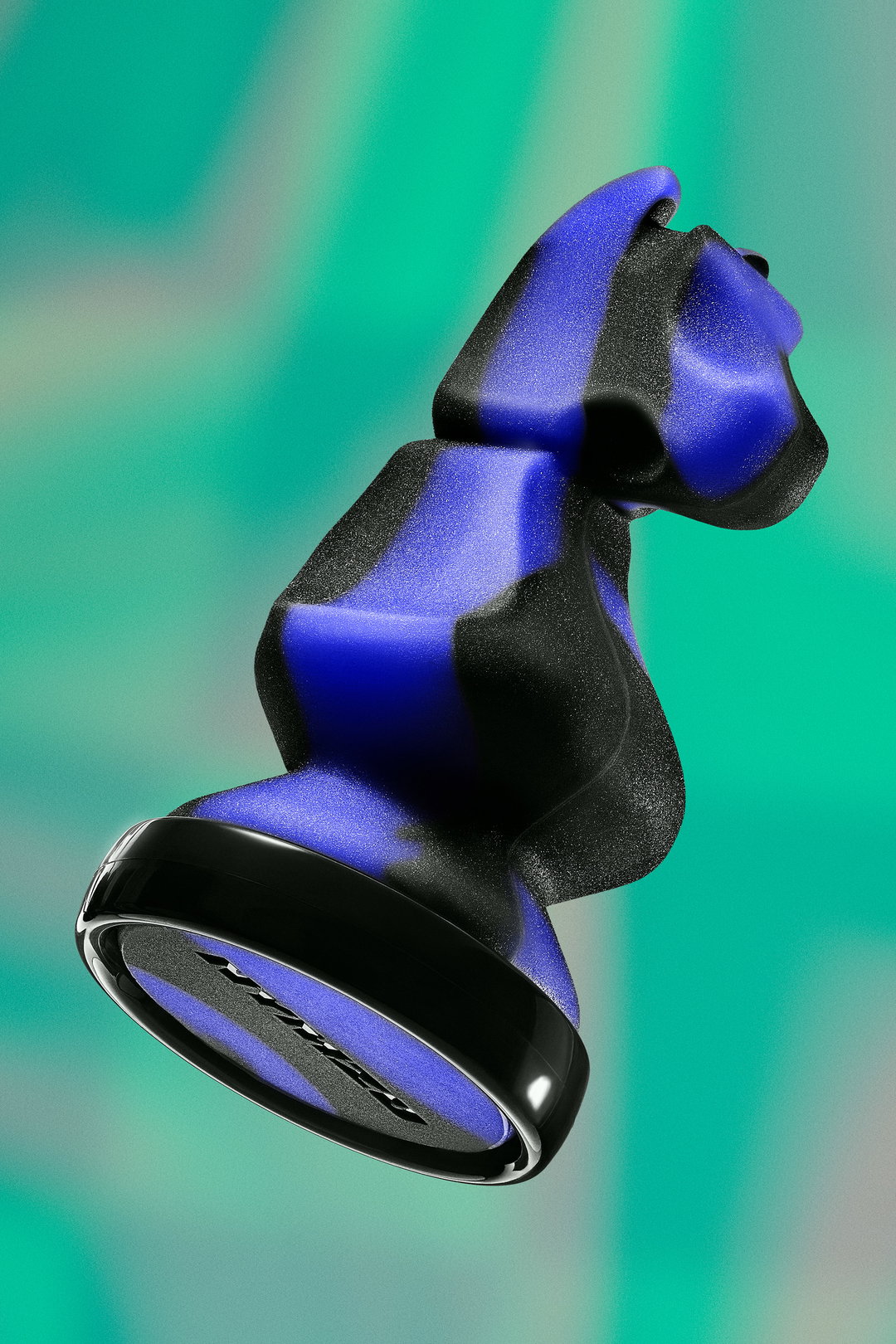
Plus Mûrs is a slick and experimental studio founded on a love for collaboration, curiosity and scanners
Nassim Bouaza and Méric Chaperon founded the studio in 2012 and work on a medley of projects in the realms of editorial, branding, music, fashion and art.
Share
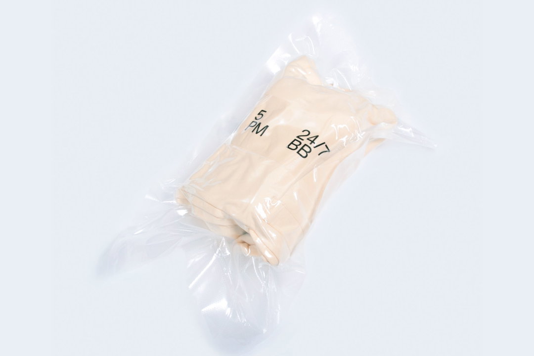
Some time has passed since we last heard from Plus Mûrs, a graphic design studio founded by Nassim Bouaza and Méric Chaperon. In fact, it’s been nearly five years, and of course the studio has undergone a new changes. First of all, they made some amendments to the way they work – notably the “meaning and professionalism” behind each and every project, which has inadvertently refined and matured the studio’s aesthetic. As such, the studio has had the pleasure of working with brands (“big and small”) and countless artists too. But it doesn't stop quite there; it's launched a clothing shop with its friends called 5PM, released a publishing house titled LFPS, given numerous lectures, taken part in exhibitions and produced countless collaborations with studios it's always dreamed of working with.
“Well indeed it’s been a while now,” says Nassim of the time between our last encounter. “Things are a tiny bit different now; we moved from Nantes, Méric is living in Bordeaux now and I live in Paris. We try to see each other twice a month to work together and keep the essence of what Plus Mûrs is, a perpetual sharing process.” Otherwise, the studio has continued to stick by its slick and technical style of working, onboarding a plethora of projects for a whole host of clients such as Nike, Adidas, H&M, Lee, Redbull Music Academy, Kappa and Asics – “and we are glad to be here with you again,” adds Nassim.
Having launched the studio in 2012, Nassim and Méric have been working alongside each other for nearly a decade. But it’s not just about professionalism, they met at a party during their third year of design school – “this part is blurry”, says Méric – before the meeting quickly blossomed into an enduring friendship. “At this moment,” says Nassim, “we were doing nothing but drinking beers and getting wasted. But we understood one thing: complement is a plus in the design process, so we decided to share our skills in one entity.” After uni, they both threw themselves into internships in different parts of the world to learn as much as they could about the design industry. But it wasn’t long until they finally rejoined on their own terms, under guise of the studio Plus Mûrs.
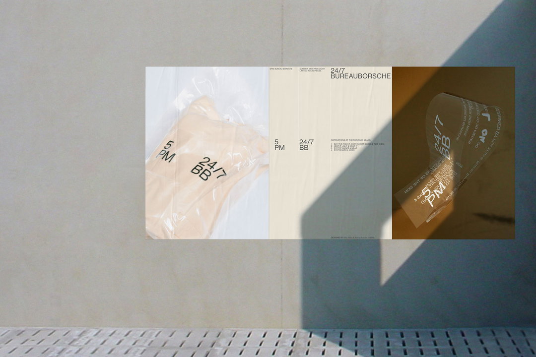
Plus Mûrs: 5PM (Copyright © Plus Mûrs, 2021)
With years of working together under their belt, it’s no denying that these two match in harmony. So much so they decided to follow the ethos of Hort's Eike König and his list of ground rules: “Don’t work with assholes, get paid, always have personal or collaboration projects, do not plagiarise, be independent, respect the work of others,” Méric tells It’s Nice That. Although, there is one rule they intend to keep, explains Nassim, and that’s how they never say no to any project – because they strive off curiosity and seek to find out more about a project. “Diversity drives us, working for an international fashion brand is as important and enriching as working for a Chocolate Maison in South-West France. Every project is a 50:50 sharing process of knowledge – we could live with that for years.”
This curiosity starts with the brief and goes right through to the process, which follows a phase-like order of things. Kicking off with mood boarding, the second phase involves developing the creative concept and deciding who to collaborate with. Then finally, they finish off the development and thus the “end of the dialogue”, says Nassim. Working predominantly with inDesign, Illustrator, Glyphs, Photoshop, Sketch, C4D, Marvelous Designer and Dropbox, the studio spends most of its time experimenting with new forms and technical advances, including things like animations, renders and 3D design. Oh and let’s not forget the scanner, one of Nassim’s favoured hacks that’s simple and easy to embellish any given work, adding a “randomness” and uniqueness to the end result.
A recent example of this free-flowing and tech-centred approach is its collaboration with Madrid-based studio Naranjo-Etxeberria. Tasked to give a new lease of life to clothing and accessories, both teams decided to create a DIY pack of six fabric patches, named ReMake. Of the reasons behind the title, Nassim says it’s “in reference to the reinterpretation of each others work; the collaboration between the two design studios is intended to be an ongoing dialogue, with a second complimentary drop in the works.”
Additionally, the studio produced a series of printed publications titled Les Fichiers Photographiques, where each issue characteristically celebrates just one photographer in its pages. The fourth issue is no different and lenses the photographer Léonard Méchineau, whose minimalist image-making compliments the textural form of the issue with clear cohesion. The studio achieves this through the curvy, serif font from WiseType, named WT Monarch, which is paired with the neutral sans Neue Haas Grotesk.
Otherwise, it's also finished up a series of A5 heat sensitive cocktail cards for tea company Chaiboy, an identity for creative studio and management team Ourros, and has plans to release a medley of varying projects in the very near future. “We’re working with a new perfume brand that will be launching at the end of 2021, a clothing brand that will be launching in a couple of months and a collaboration with a design studio coming this year too,” concludes Méric. “We are also discussing Les Fichiers Photographiques issue five. If you're still reading this, thank you.”
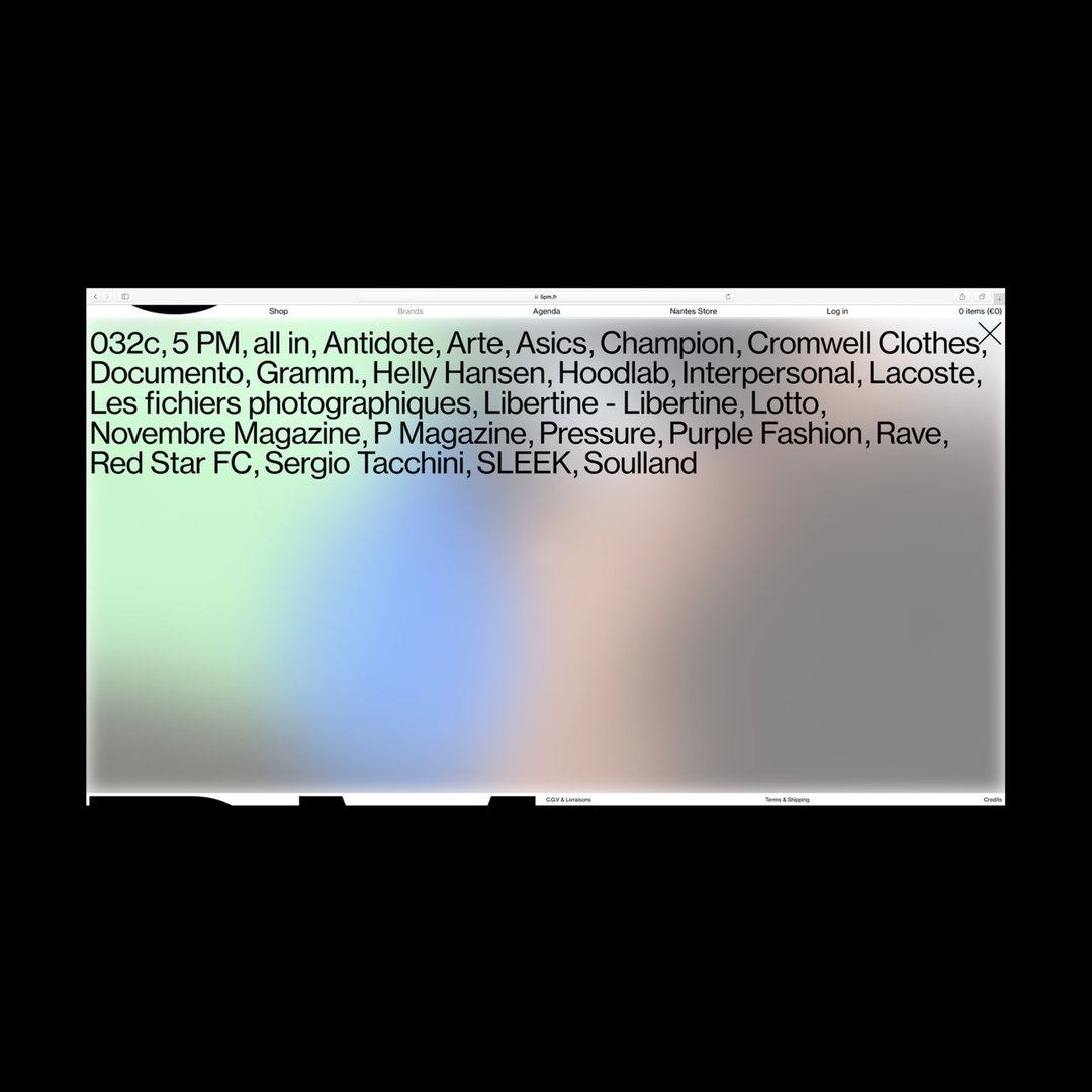
Plus Mûrs: 5PM (Copyright © Plus Mûrs, 2021)
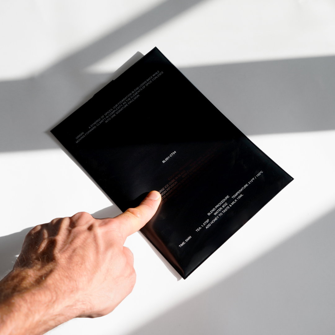
Plus Mûrs: Chaiboy (Copyright © Plus Mûrs, 2021)
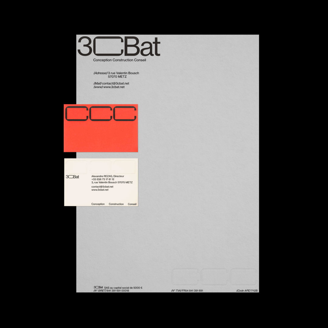
Plus Mûrs: 3CBAT (Copyright © Plus Mûrs, 2021)
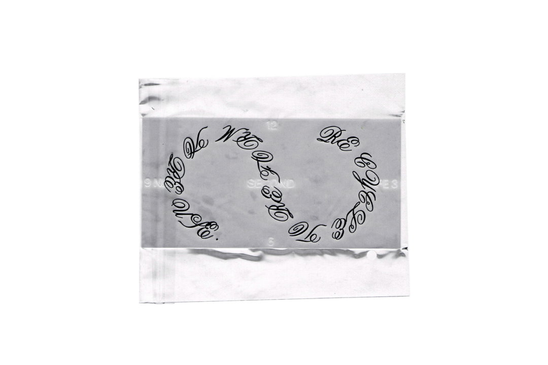
Plus Mûrs and Naranjo Etxeberria (Copyright © Plus Mûrs and Naranjo Etxeberria, 2021)
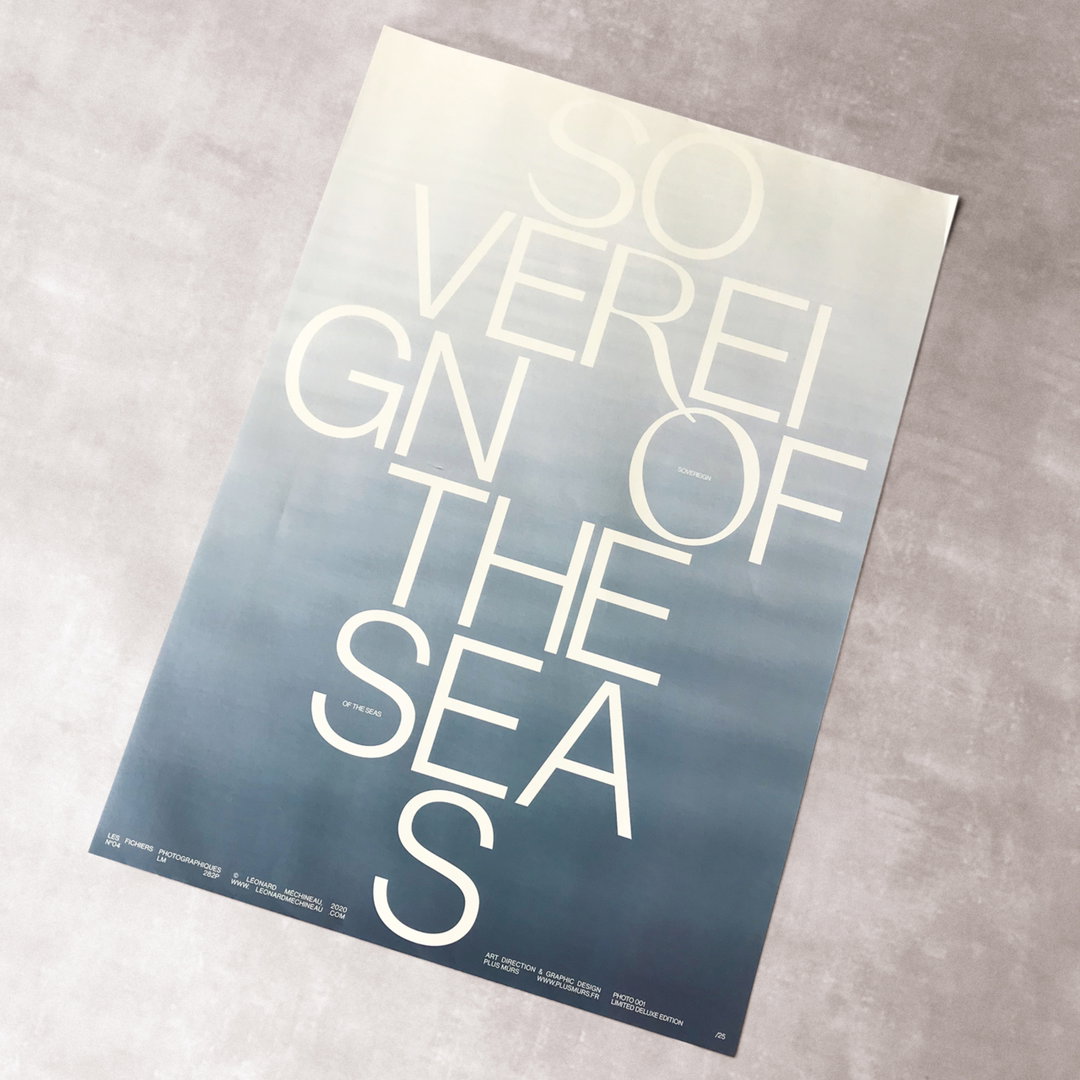
Plus Mûrs: Les Fichiers Photographiques, Issue Four (Copyright © Plus Mûrs, 2021)
Plus Mûrs: Les Fichiers Photographiques, Shop (Copyright © Plus Mûrs, 2021)
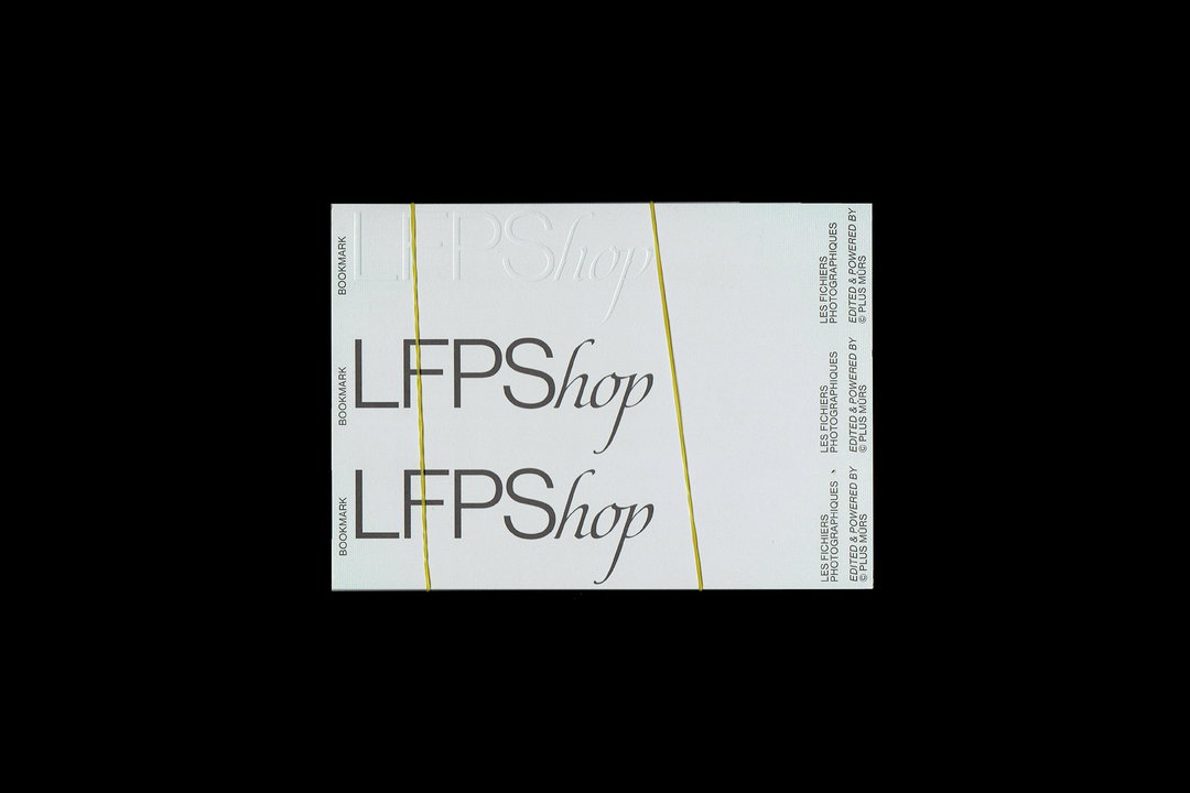
Plus Mûrs: Les Fichiers Photographiques, Shop (Copyright © Plus Mûrs, 2021)
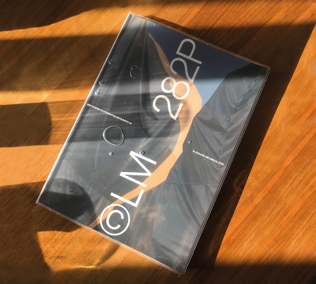
Plus Mûrs: Les Fichiers Photographiques, Issue Four (Copyright © Plus Mûrs, 2021)
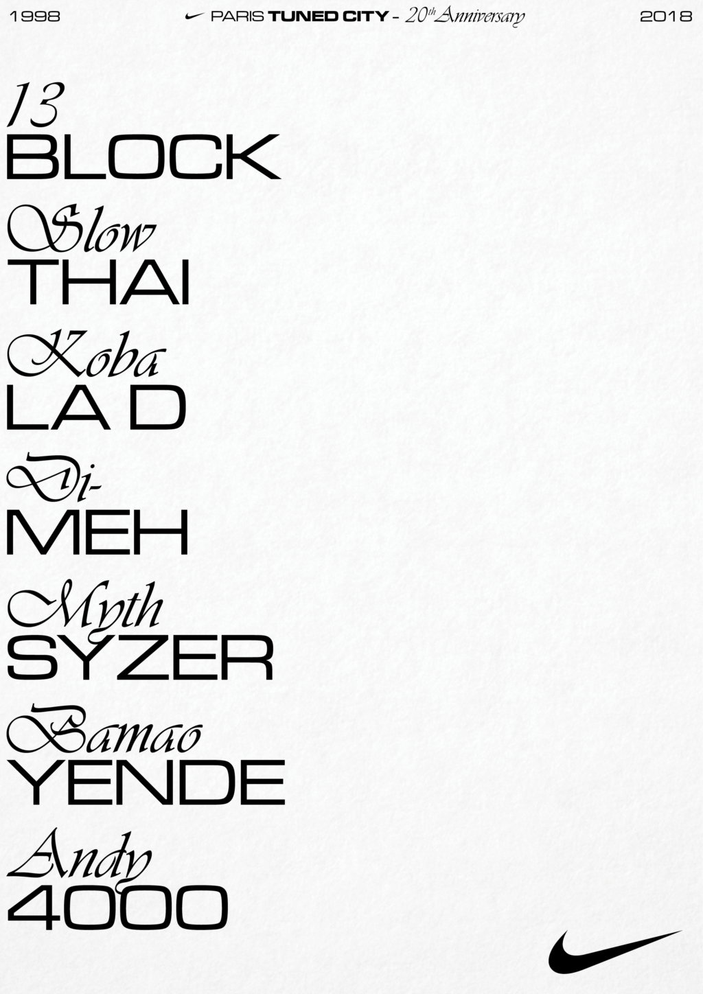
Plus Mûrs: Nike Tuned (Copyright © Plus Mûrs, 2021)
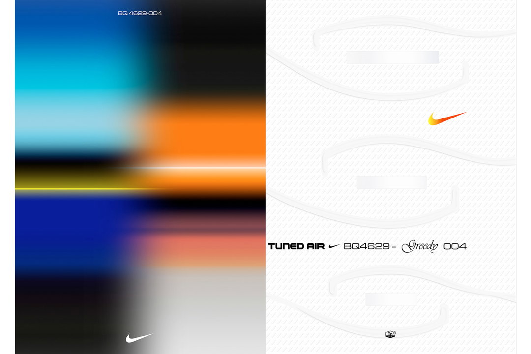
Plus Mûrs: Nike Tuned (Copyright © Plus Mûrs, 2021)
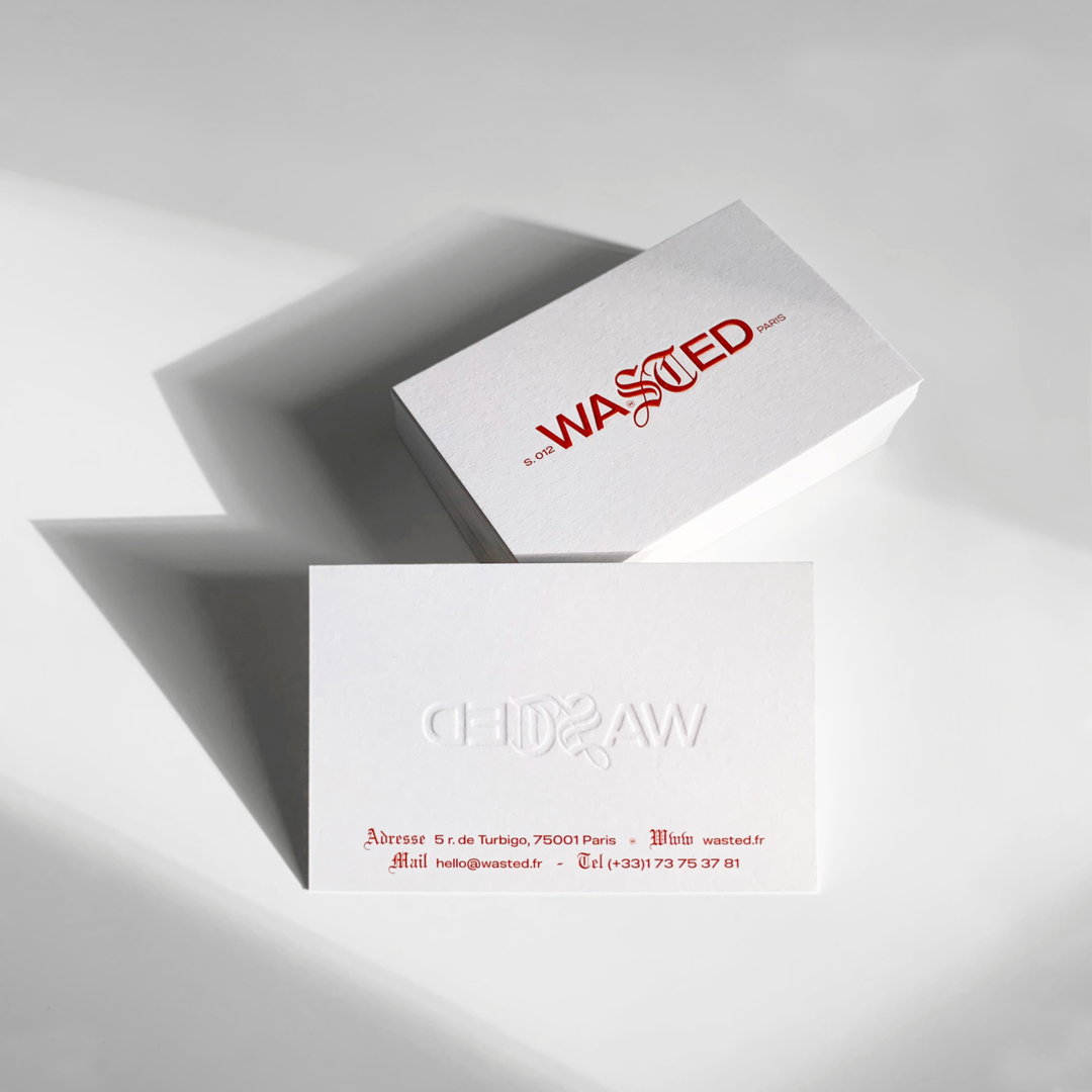
Plus Mûrs: Wasted (Copyright © Plus Mûrs, 2021)
Become an Extra Nice Supporter
Unlock an inspiring new way to explore It’s Nice That, get your hands on exclusive perks, and help bring meaningful creative projects to life.
Hero Header
Plus Mûrs: 5PM (Copyright © Plus Mûrs, 2021)
Share Article
Further Info
About the Author
—
Ayla is a London-based freelance writer, editor and consultant specialising in art, photography, design and culture. After joining It’s Nice That in 2017 as editorial assistant, she was interim online editor in 2022/2023 and continues to work with us on a freelance basis. She has written for i-D, Dazed, AnOther, WePresent, Port, Elephant and more, and she is also the managing editor of design magazine Anima.