Launch Recite Me assistive technology
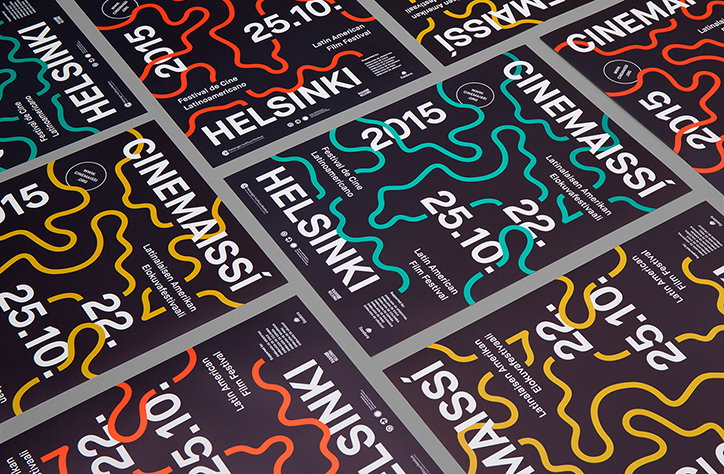
A collection of graphic posters for the “Latin American Film Festival” in Helsinki. The designs feature bold typography and wavy, colourful lines on a dark background.

Simple, adaptable Helsinki film festival identity by Pol Solsona

—
Date
19 October 2015

Perhaps there’s something in the chilly water over in Helsinki, but boy do they know how to create an identity for a festival. Earlier this year we brought you Kokoro & Moi’s colourful Helsinki Design Competition identity and now we’re celebrating some more work from the Finnish capital by Pol Solsona. It was Catalan designer Pol’s identity for Cinemaissí, a Helsinki-based Latin American film festival that caught our eye, with simple lines of colour against a black backdrop. Its limited colour palette and bold typography makes it adaptable but instantly recognisable across a variety of different colourways, with the line elements extracted for different applications such as on coffee cups and bags. Pol says: “The festival needed an upgrade that would support the curation and quality of the film selection and at the same time connect with the Finnish target audience without losing the Latin American spirit.” We reckon he’s done a grand job.
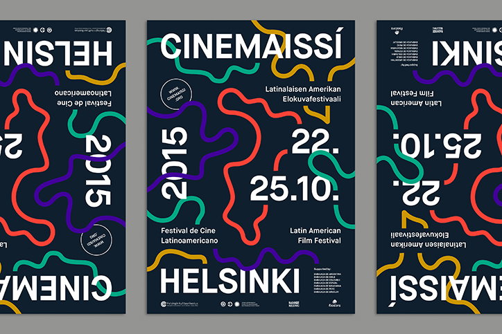
Three posters for the Latin American Film Festival in Helsinki. Bold white typography reads “Cinemaissí” and “Helsinki” against a dark blue background, overlaid with colourful, winding lines.
Above

Pol Solsona: Cinemaissí

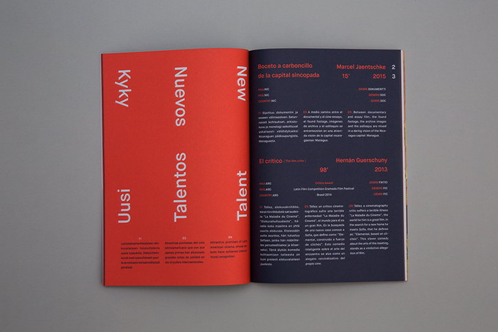
An open book with a bright red left page and a black right page. The red page features vertical white text reading “Kyky”, “Uusi”, “Nuevos Talentos” and “New Talent”.
Above
Left

Pol Solsona: Cinemaissí

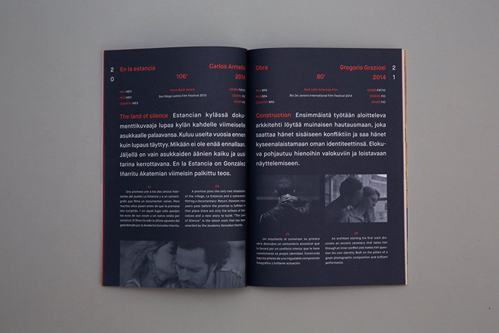
An open book with a black background and red and white text. The left page features a film titled “En la estancia”, while the right page describes a work titled “Obra”.
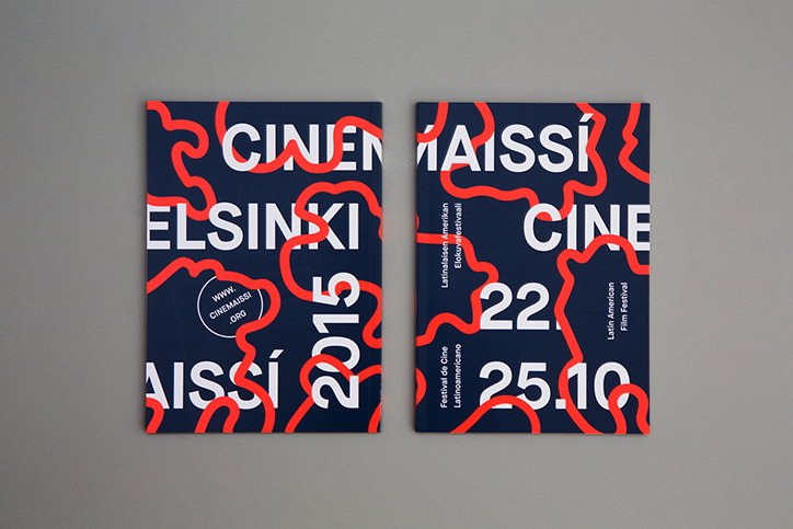
Two dark blue posters with bold white typography and flowing red lines. They feature the text “Cinemaissi”, “Helsinki”, “2015” and “22–25.10”.
Above

Pol Solsona: Cinemaissí

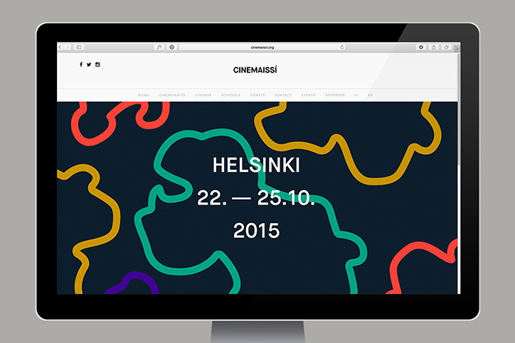
A computer monitor displays the website for “Cinemaissi”. The homepage features a dark blue background with colourful, organic line drawings and the text “Helsinki 22. – 25.10. 2015”.
Above

Pol Solsona: Cinemaissí

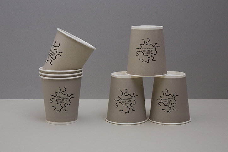
Five grey paper cups are arranged in two small clusters against a plain grey background. Each cup features a black squiggly line and the text “CINEMAISSI 22 – 25.10 2015”.
Above

Pol Solsona: Cinemaissí

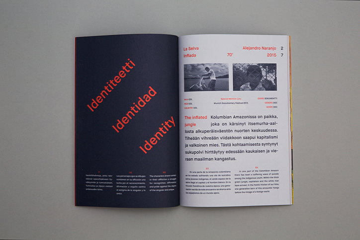
An open book shows a layout with a dark blue left page and a yellow right page. The left page features the word “Identiteetti”, “Identidad” and “Identity” stacked in different colours. The right page contains black and white photographs and text in Finnish, Spanish and English.
Above
Left

Pol Solsona: Cinemaissí

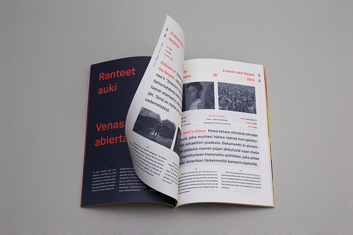
An open magazine with a red cover and white pages. One page features a black and white portrait of a person and Finnish text including the headline “Devil’s Elbow”.

Share Article

Further Info

About the Author

Emily Gosling

—

Emily joined It’s Nice That as Online Editor in the summer of 2014 after four years at Design Week. She is particularly interested in graphic design, branding and music. After working It's Nice That as both Online Editor and Deputy Editor, Emily left the company in 2016.


It's Nice That Newsletters

Fancy a bit of It's Nice That in your inbox? Sign up to our newsletters and we'll keep you in the loop with everything good going on in the creative world.