By leaving traces of his process in his work, Roydon Misseldine “gives it some depth”
Originally from Wellington, but now based in London, the graphic designer jumps around different tools and techniques in his skate-inspired portfolio.
Share
Back in the day, Roydon Misseldine procured a cracked version of Illustrator and started using it to create logos for online Counter Strike teams. “I’d charge $5 NZD a logo thinking it was great money. Pretty quickly after that I was spending more time making logos than playing the game,” he tells It’s Nice That. “I didn’t know Photoshop at the time, so a lot these ‘logos’ involved me creating custom type from the teams initials.” While it was a fun pastime during his youth in New Zealand, for Roydon, it introduced him to the world graphic design and the discipline he now works within full-time.
Originally from Wellington, Roydon made the move to London towards the end of 2019. Having worked at Strategy Creative, an agency with offices across New Zealand, in Australia and also in Tokyo, he was keen to give freelancing a go. “New Zealand has a great creative scene but felt like I was ready to get uncomfortable again,” he explains. The risk clearly paid off as since settling in London, Roydon has been working non-stop on freelance projects, as well as undertaking short stints at Pentagram, Droga5, Greenspace and more.
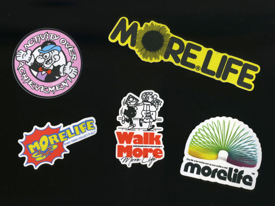
While gaming had a big influence of his career choice, skateboarding has had as big of an impact of his aesthetic tastes. In fact, when he made the move from one side of the world to the other, one of the things he made sure to bring with him was a box of stickers and pins he’s collected over the years: “I’ve been skateboarding a lot of my life (though the years don’t show for it), and have always loved the visual culture associated with it, stickers, custom grip tape, board graphics – it’s all heavy visuals. I’ve still got a shoebox full of stickers and pins that I’ve collected over the years. When I moved over to London I couldn’t bring a lot of bigger stuff like books and posters, so that shoebox was the first to go into suitcase.” This influence gives Roydon’s work a DIY aesthetic, as if posters have been ripped out of the pages of Thrasher or stickers given out free with a copy of Slap.
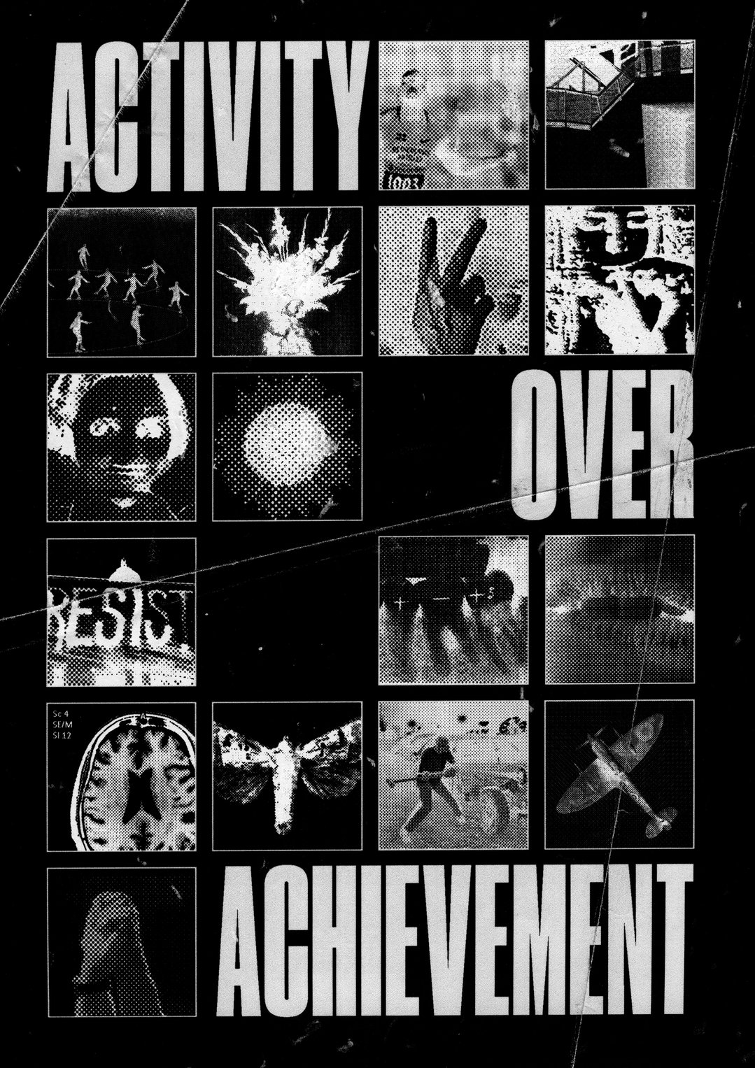
Roydon Misseldine: Atomic by Seapunch Zine submission
In terms of the projects Roydon takes on, you’d be pushed to try and pin it down. “I tend to jump around different tools and techniques,” he explains, “whether it’s motion graphics, coding or just getting out the glue stick and scissors. We recently got a giant Riso printer in our flat and I got obsessed with that for a few days. I was printing out things big and small, seeing how it could be used in the digital projects I had going on at the time.” In fact, technology, and having the opportunity to be working with it, is one of the factors which keeps him so attracted to graphic design. With the ability to incorporate “face filters, motion, glow in the dark ink, memes,” into his projects, “it’s a sweet time to be designing anything,” he adds.
Roydon’s fascination with the technological side of the medium stems from a young age, as he grew up enjoying maths. Being able to align shapes together to create something new mirrored the subject. It’s no surprise to hear then, that for Roydon, the process is often more important than the final product. “It’s more fun creating something when you’re not sure exactly how it’s going to turn out. It means the results are much more satisfying when they do turn out,” he adds when discussing this point. He therefore makes no attempt to hide any “workings out”, embracing the hallmarks of process instead: “I don’t like to hide the techniques I’ve used in my work. This means the work can be a little rough around the edges, but I think that gives it some depth, being able to see how it’s created.”
This was a technique Roydon employed recently when working on photographer Jackson Bowley’s website. “A lot of Jackson’s work uses layers to change the outcome of the photograph. We loved the idea of having the design of the site mess with the imagery in the form of the layer,” he explains. When scrolling on the website therefore, content interacts with each other, mimicking the layers of Jackson’s work. “I’ve been coding the website myself, which always a lot of trail and error for me, but that’s part of fun.” It’s a smart experimentation into allowing a portfolio to reflect the work, and not the other way around. And is indicative of Roydon’s working processes on a wider scale.
Currently, Roydon’s making the most of his newfound time indoors while “not feeling the pressure to be creative every minute of it.” That said, he does have a few projects on the go – a recipe book for a friend, a new typeface for a media company “with heaps of variable characters” and a campaign for the release of an EP. Not content with all this, in the future, he’s planning on trying out yet more new techniques and “printing more stickers!”
GalleryRoydon Misseldine
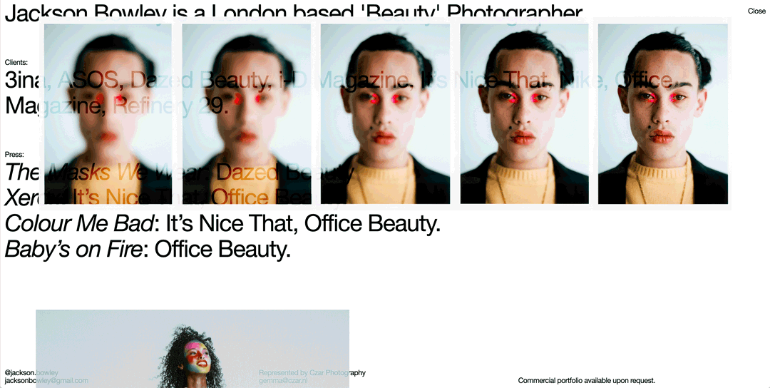
Jackson Bowley’s website
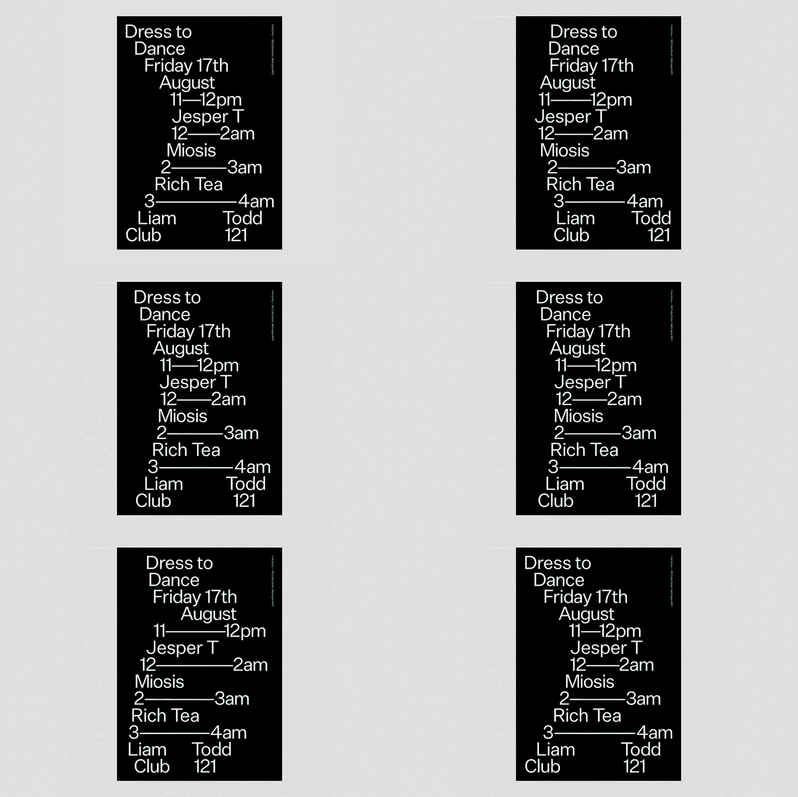
Club 121 Dress to Dance Poster
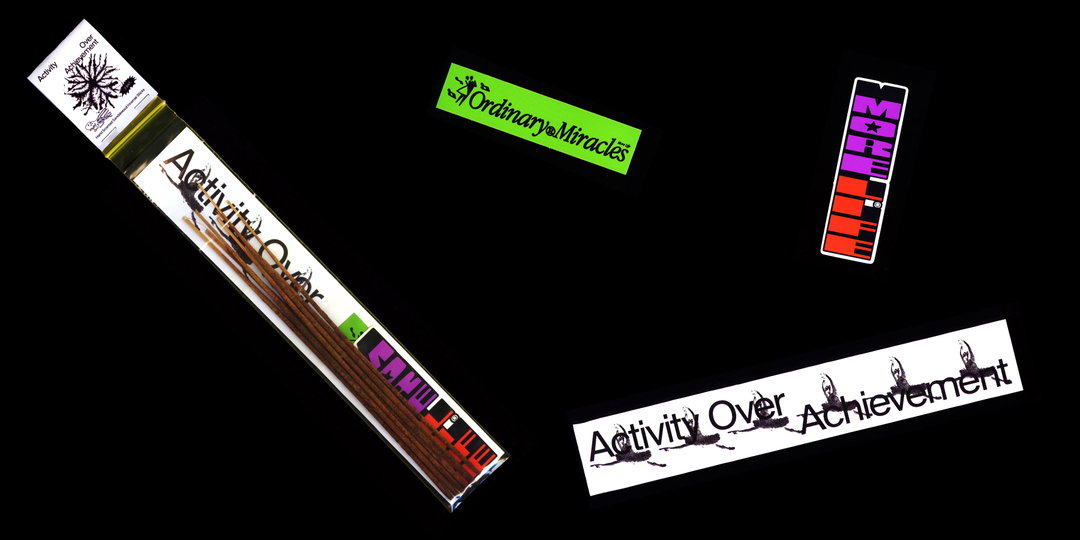
Handscented Sandalwood Incense
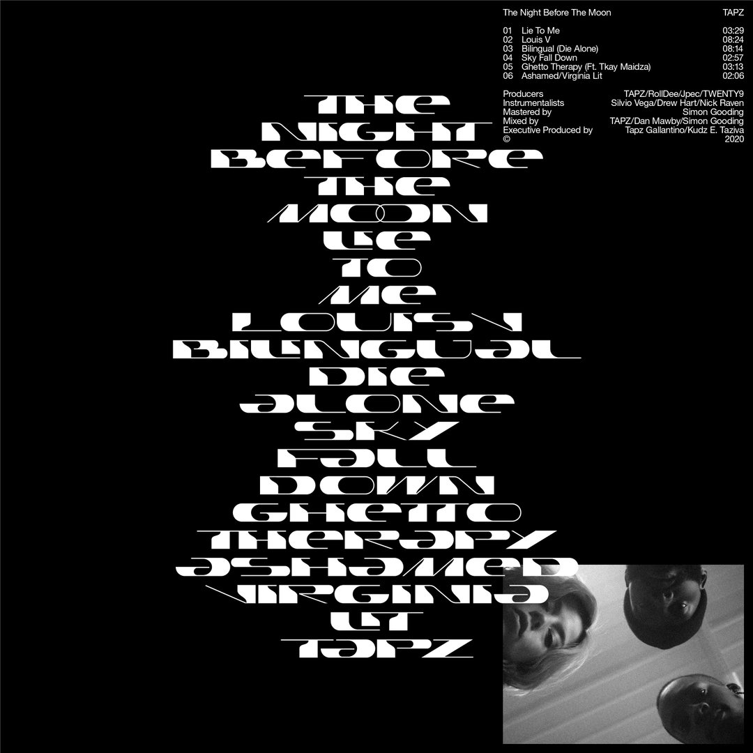
Tapz EP Artwork
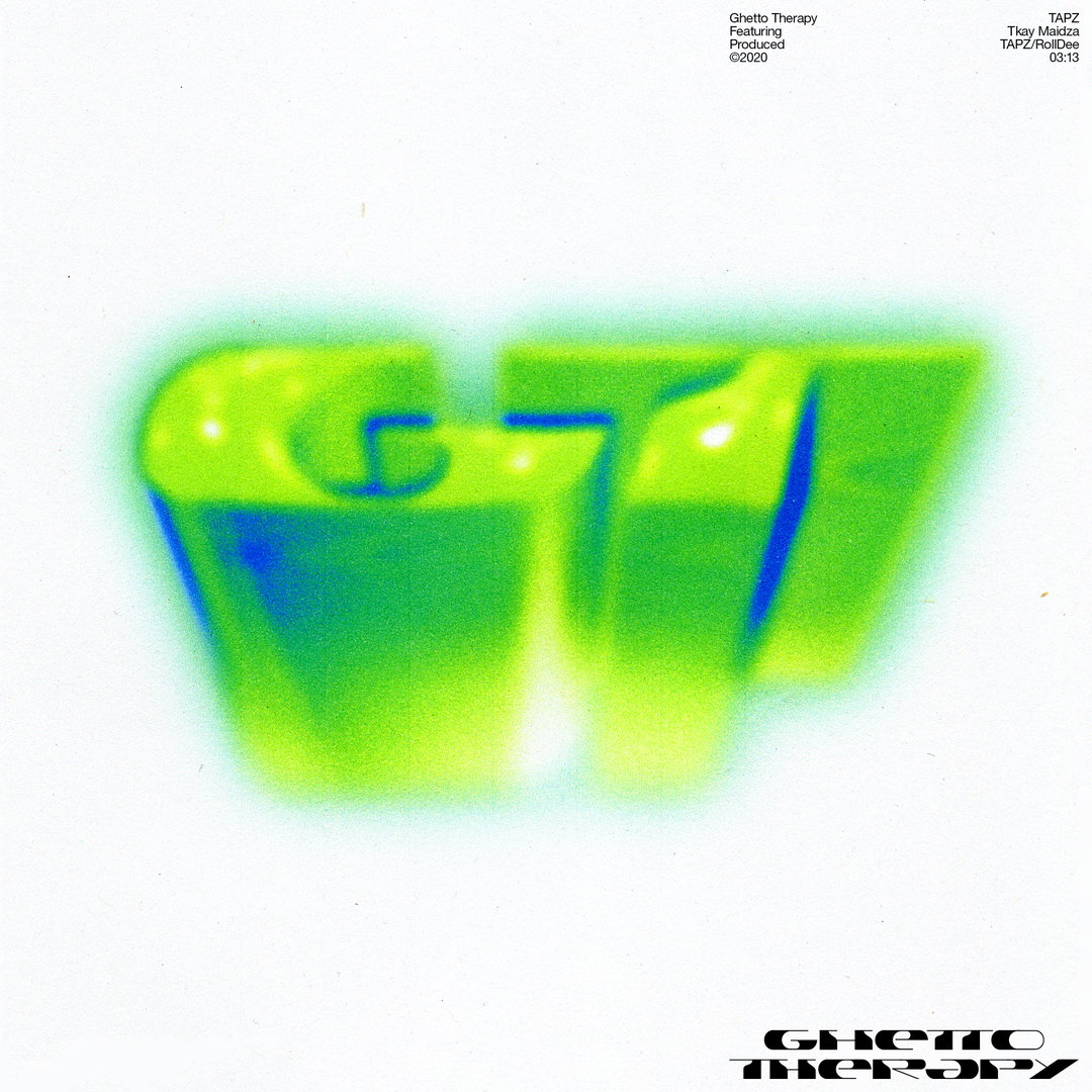
Tapz Single Artwork
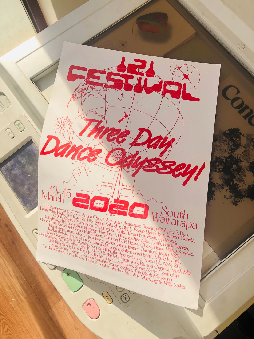
121 Festival 2020 Riso Poster
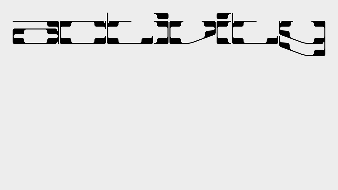
Activity Type
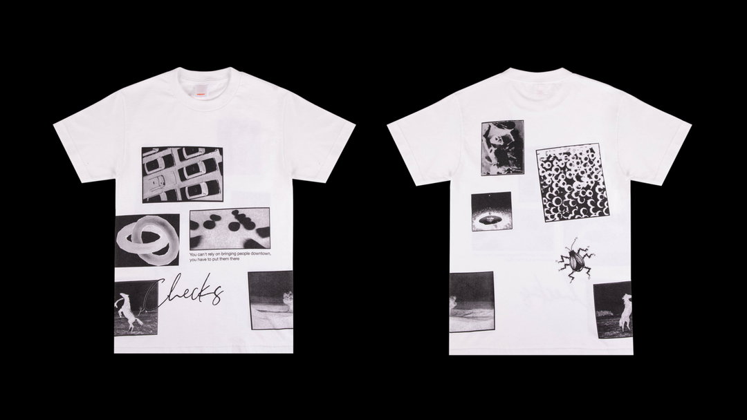
Checks Downtown Screenprinted T-shirt
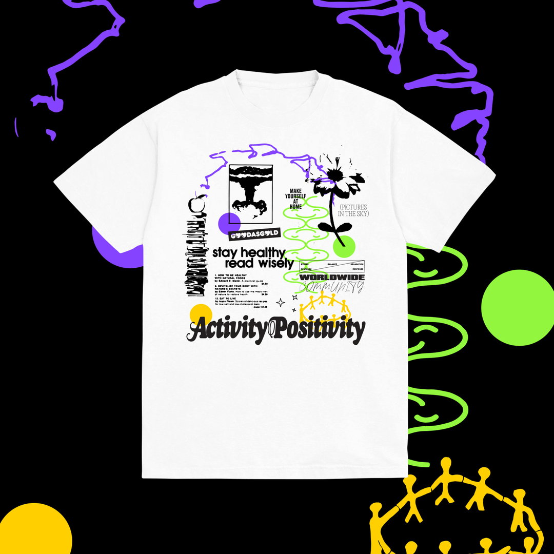
Good As Gold Positivity Tee
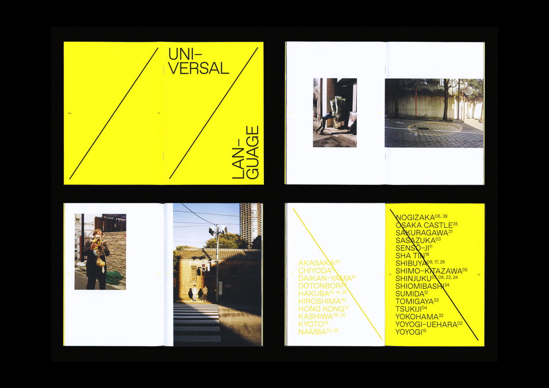
Universal Language Publication
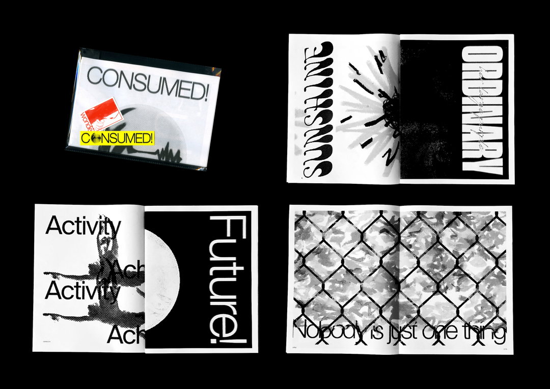
Consumed! Pull-a-part Newspaper
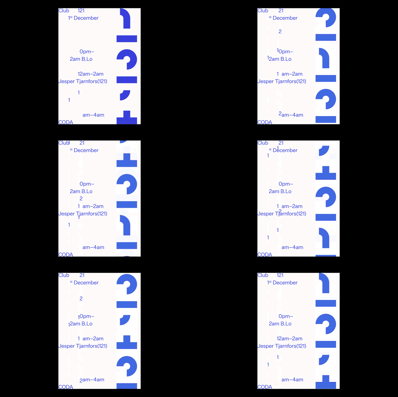
Club 121 Animated Poster
Hero Header
More Life Stickers
Share Article
Further Info
About the Author
—
Ruby is Senior Creative at It's Nice That, overseeing our visual output across platforms and projects. Before that, she was associate editor on the editorial team, after joining in September 2017 following graduation from Central Saint Martins.