Saint Urbain’s brand for hotel Now Now has “soul and story” behind it
Balancing the human and the metropolitan, the modular brand combines warmth with rigour to create a typographically led identity that’s as introspective as its guests.
Share
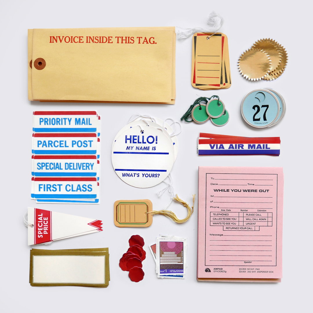
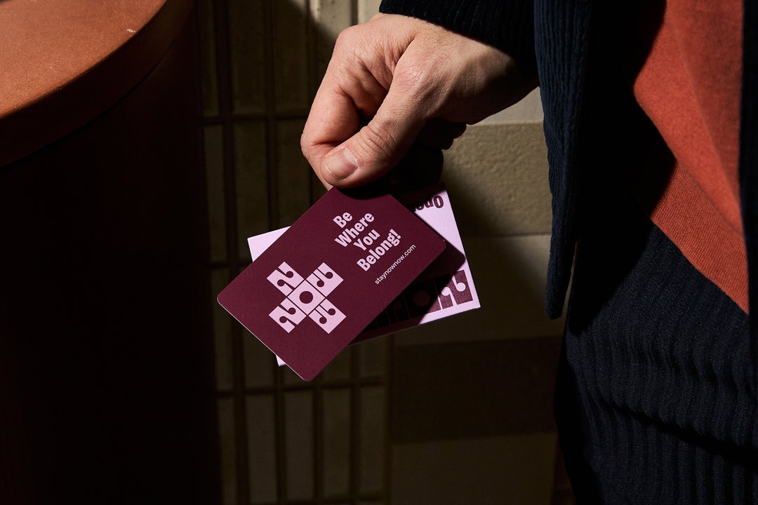
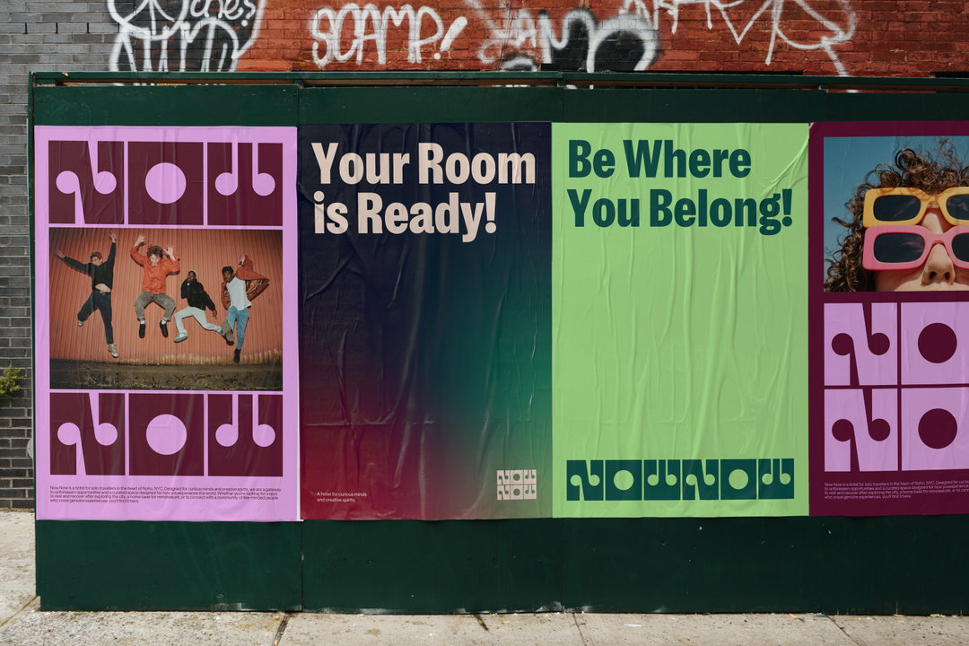
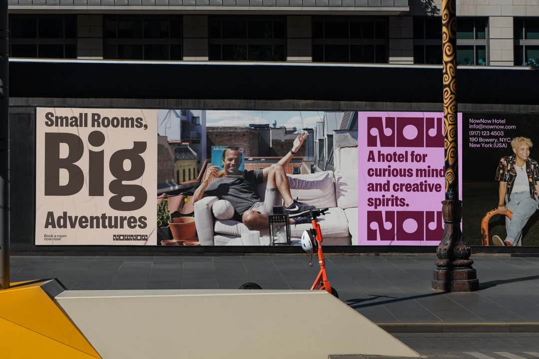
Saint Urbain has created a playful, modular brand for the new hotelier based in New York’s NoHo neighbourhood, Now Now. “At its core, Now Now is about living in the now, if you will,” Alex Ostroff, founder and creative director of Saint Urbain, says. “It describes itself as a lodging club, and that spirit of quiet community is central to the brand.” Launching with the strapline, ‘Be Where You Belong’, the hotel offers a welcoming space for the solo traveller – a tone captured through both the brand’s strategic messaging and it’s inclusive, reflective identity.
The identity is shaped by the consumer profile, which leans toward younger adventures that want to spend more time in real life and less time looking at a screen. It straddles an organic human touch and something altogether more structured, embodying the relationship between the hotel and the guest. “The brand identity, design elements, and copywriting all needed to feel open, immediate, and full of possibility, like a portal into something new,” Alex says. “We wanted this project to have social and exploratory energy,” he continues, “so we injected more introspection,” mirroring the greater self-awareness of younger generations.
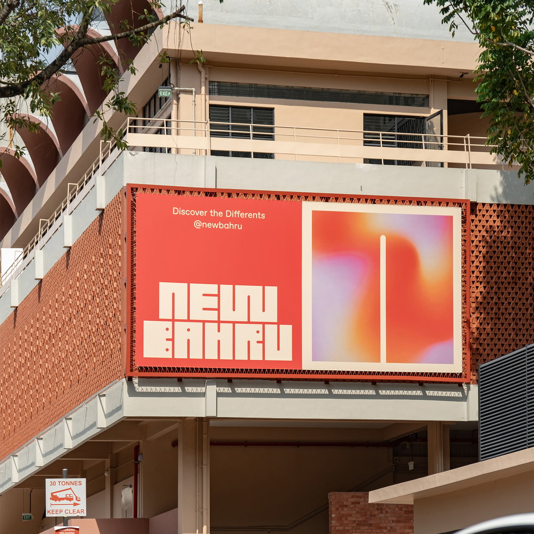
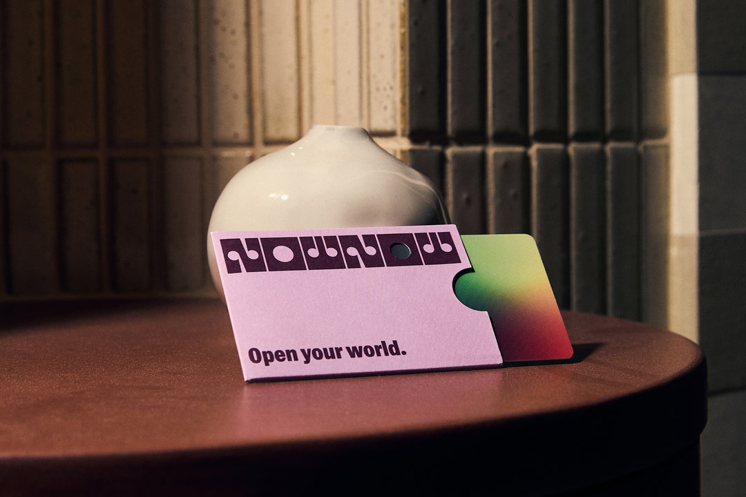
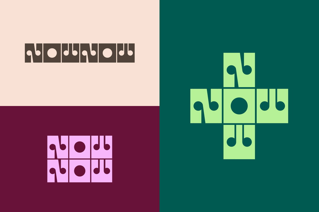
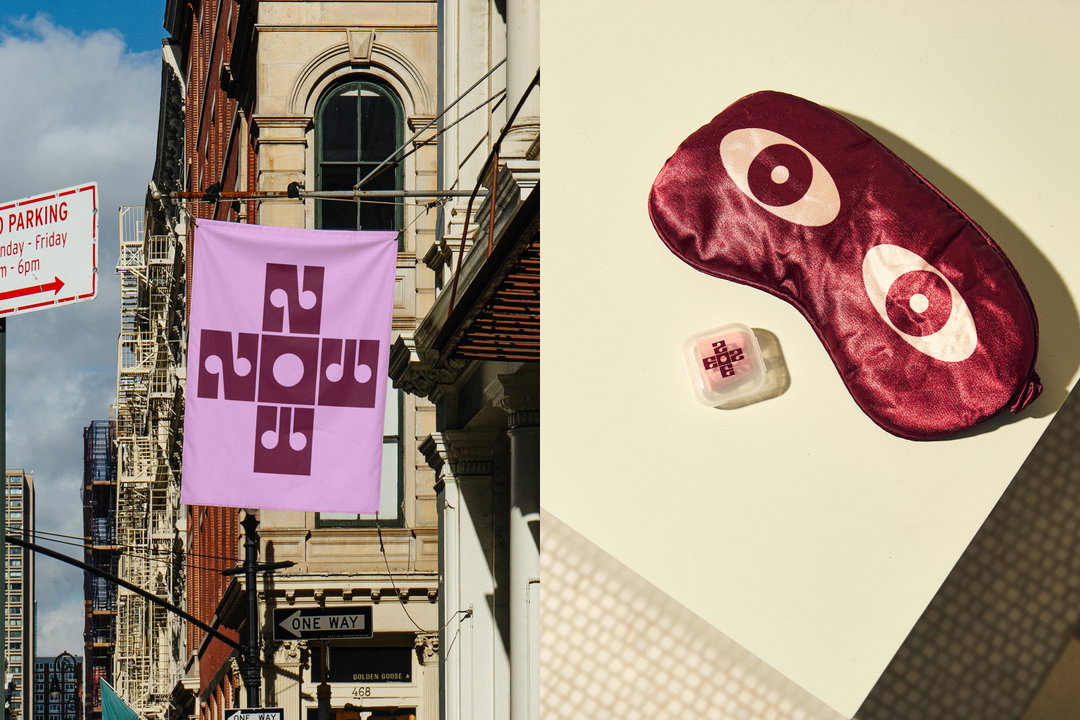
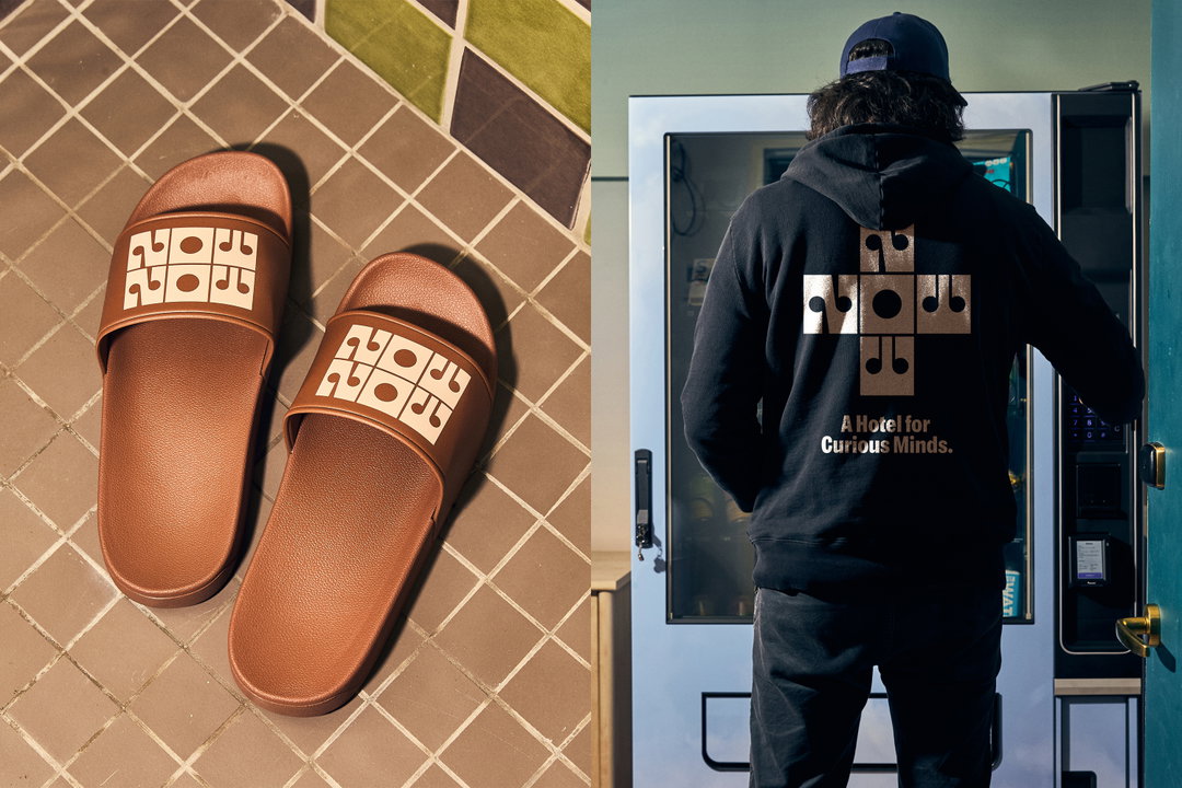
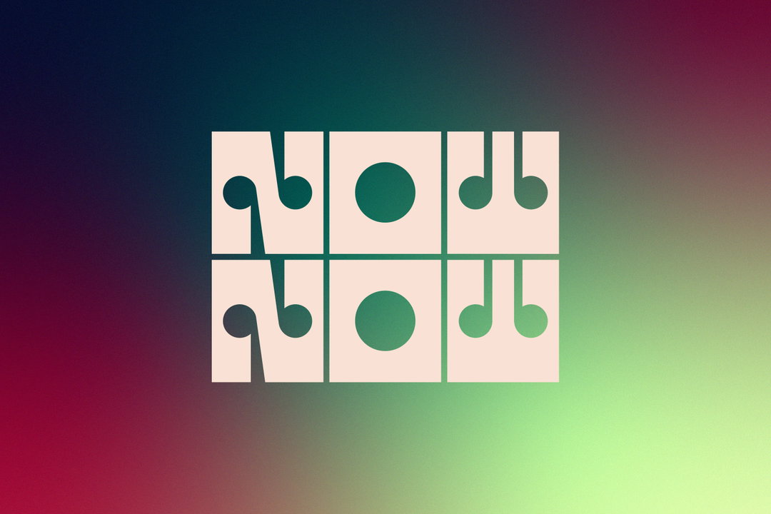
The identity is led by a modular wordmark which also acts as a narrative “portal”; it’s curved and angular forms evoke the efficient scale of Now Now’s rooms. “The lettering needed to feel like a gateway into a new experience,” Alex says, resulting in the letterform’s open counters, reminiscent of keyholes. “There’s a warmth to it, while also having a futuristic feeling,” he continues It’s designed with three different arrangements that adjust to varying applications. “This really matched the tone we were trying to strike, somewhere between otherworldly and modern, we wanted something distinctive, something that didn’t feel like it could belong to any other hotel,” Alex says.
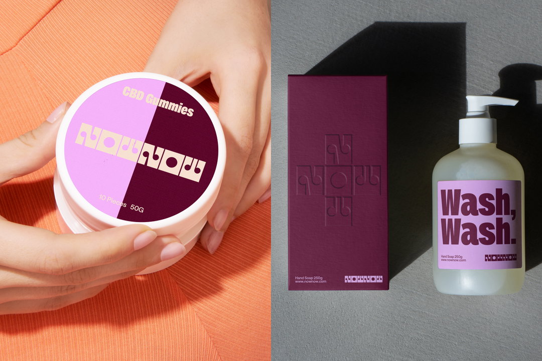
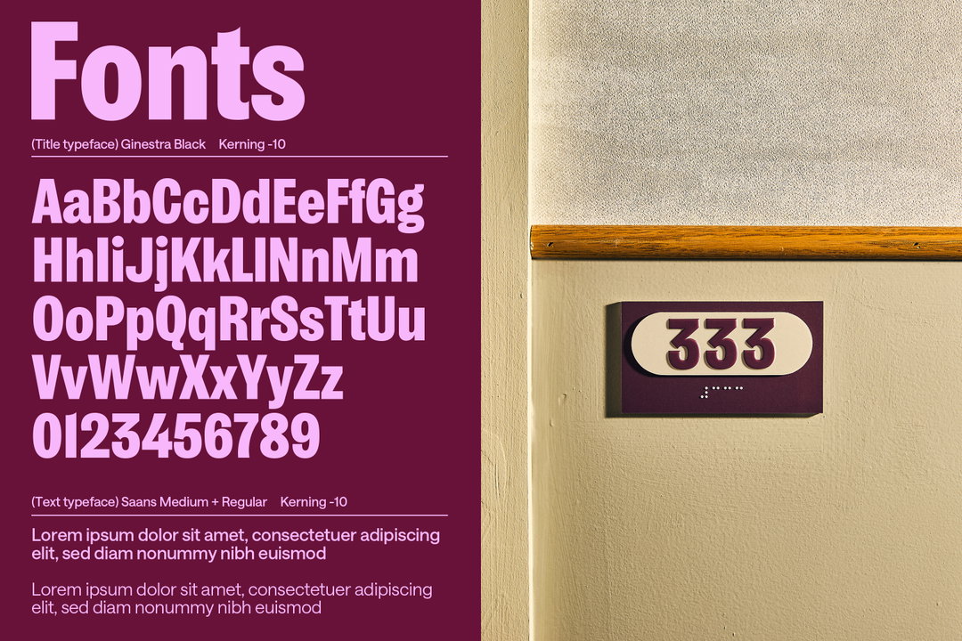
To maintain the accessible, friendly tone of the brand whilst also embodying Now Now’s balance between traveller and metropolis, Saint Urbain opted for Ginestra from Íñigo Jerez, a condensed, humanist sans serif. “It’s confident and expressive, but still super readable,” Alex says, making it ideal for both the brand’s digital and physical applications, “and it also carries real emotional weight,” he adds. The typeface is inspired by 19th century poster design and was created in memory of Nacho Ginestra, creative director of the agency &Rosàs. “They were kind enough to let us use it for this project, which felt like a meaningful addition – something with soul and a story behind it.”
The soulful, personable element of the brand didn’t stop at type. In fact, the brand’s approach to colour accentuates the human behind the hotel. Instead of opting for a single defining colour, Saint Urbain went for a more mindful, gradient-like perspective. “The whole idea of Now Now is about motion and presence,” Alex says, “so we wanted the palette to sort of feel like a mood ring.” As such, the brand’s use of gradients became central to its messaging, going beyond a decorative role to become a device for setting a tone. “We kept saying the brand shouldn’t feel static, and the gradient helped us to make it feel like a vibe you move through,” Alex ends, “it holds a lot of emotion without being too literal.”
GallerySaint Urbain: Now Now (Copyright © Saint Urbain, 2025)
Hero Header
Saint Urbain: Now Now (Copyright © Saint Urbain, 2025)
Share Article
Further Info
About the Author
—
Hailing from the West Midlands, and having originally joined It’s Nice That as an editorial assistant in March 2020, Harry is a freelance writer and designer – running his own independent practice, as well as being one-half of the Studio Ground Floor.