Balancing between editorial and artistic, Studio Airport flourishes at the intersection of print and film
With a creative process rooted in moving image, Studio Airport's output is derived from a different kind of storytelling.
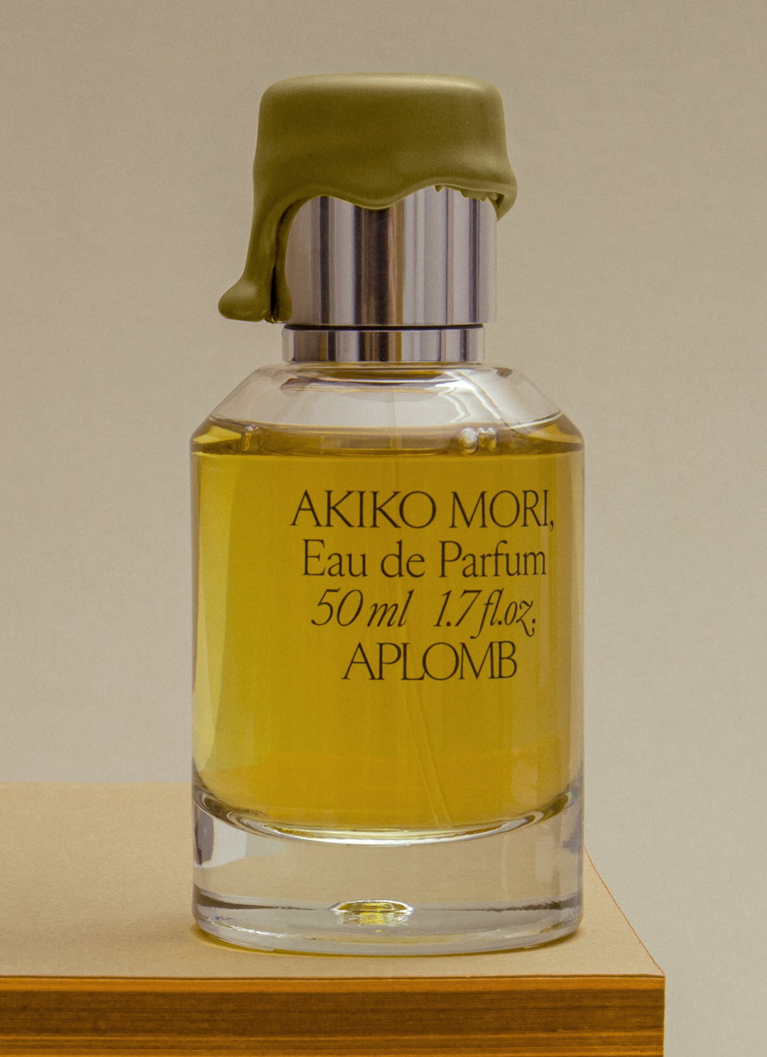
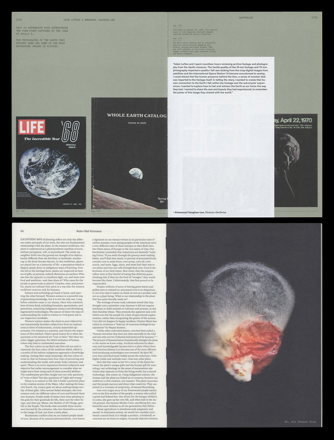
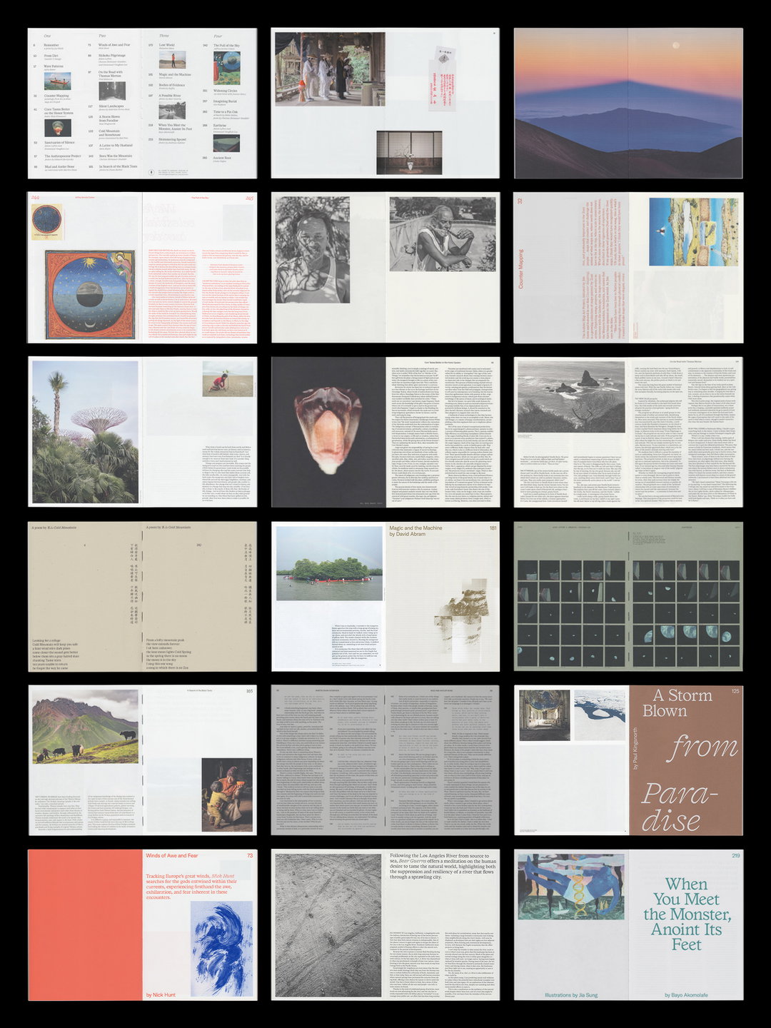
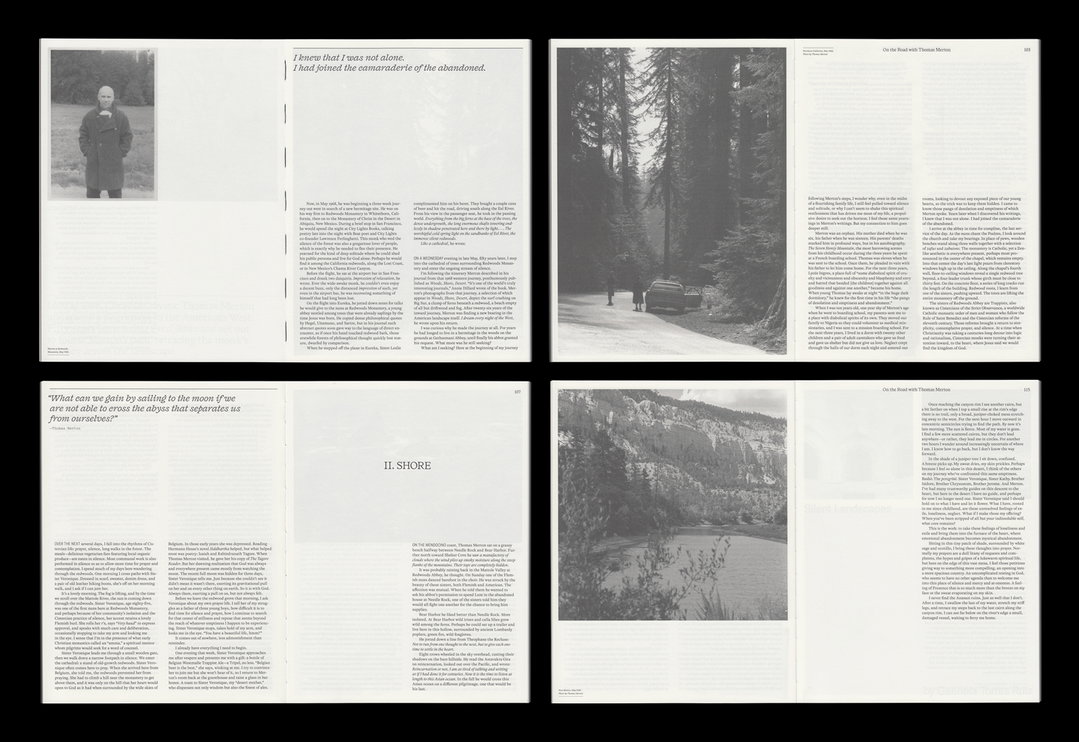
Practicing at the intersection of graphic design and film, Studio Airport is a contemporary Dutch studio founded by Bram Broerse and Maurits Wouters. In the past eight years, its garnered both national and international awards, while its clients include the likes of Emergence Magazine, Stedelijk Museum Breda, Greenpeace International, Amsterdam Art Council and the University of the Arts Utrecht; the institution where the two founders first met. Having both studied graphic design, Bram and Maurits became friends in the final year of their studies, recognising a “certain dedication in each other’s approach and work which attracted us to one another,” Bram tells It’s Nice That.
Without a single collaboration under their belt, the two designers established Studio Airport in spite of the odds. It’s a decision that’s proved to be a fruitful creative endeavour as seen in its highly refined archive. Maurits tells us more: “Our education was pretty conceptual within the perception of ‘Dutch design’ traditions and therefore was also quite classical. Once we started the studio in 2011, we integrated that approach in different media.” Though Studio Airport is not yet a decade old, when it was first established, Bram and Maurits discovered a niche part of the industry to flourish in, separating itself from the pack with a unique interdisciplinary approach.
“There was a lot of space to set ourselves apart,” says Bram looking back on areas such as web design on the cusp of creative revolution. They took these chances which in turn opened the studio up to interesting, international assignments. One of its major projects was for the biggest public cemetery in New York for example – The Hart Island Project – a project which kicked off Studio Airport’s US client base. Over time, the practice has evolved creatively but with a small, dedicated team at the core of the work. Its projects have become in-depth mechanisms of storytelling across film and print in particular, balancing between the editorial and artistic throughout its work.
Studio Airport
“As graphic designers it can be fruitful to start a process by thinking from moving images,” adds Maurits. “By doing so, the process can lead us to different solutions and outcomes.” The two founders often find themselves charmed by things that aren’t necessarily intended to be design. Drawing inspiration from the somewhat unexpected or the spontaneous, it’s these simple qualities that set something in motion for the team at Studio Airport. Design ingredients are stripped down to their bare minimum, and from these deconstructions, the designers then ask themselves: when is something ready? Invested in detail, minute tweaks to perfect a design are a staple of Studio Airport and the studio have learnt to rely on gut instinct to recognise when a piece of work is ready to go or not.
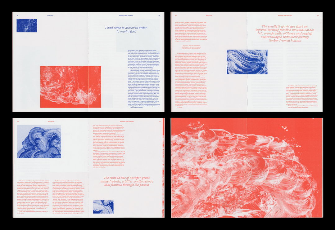
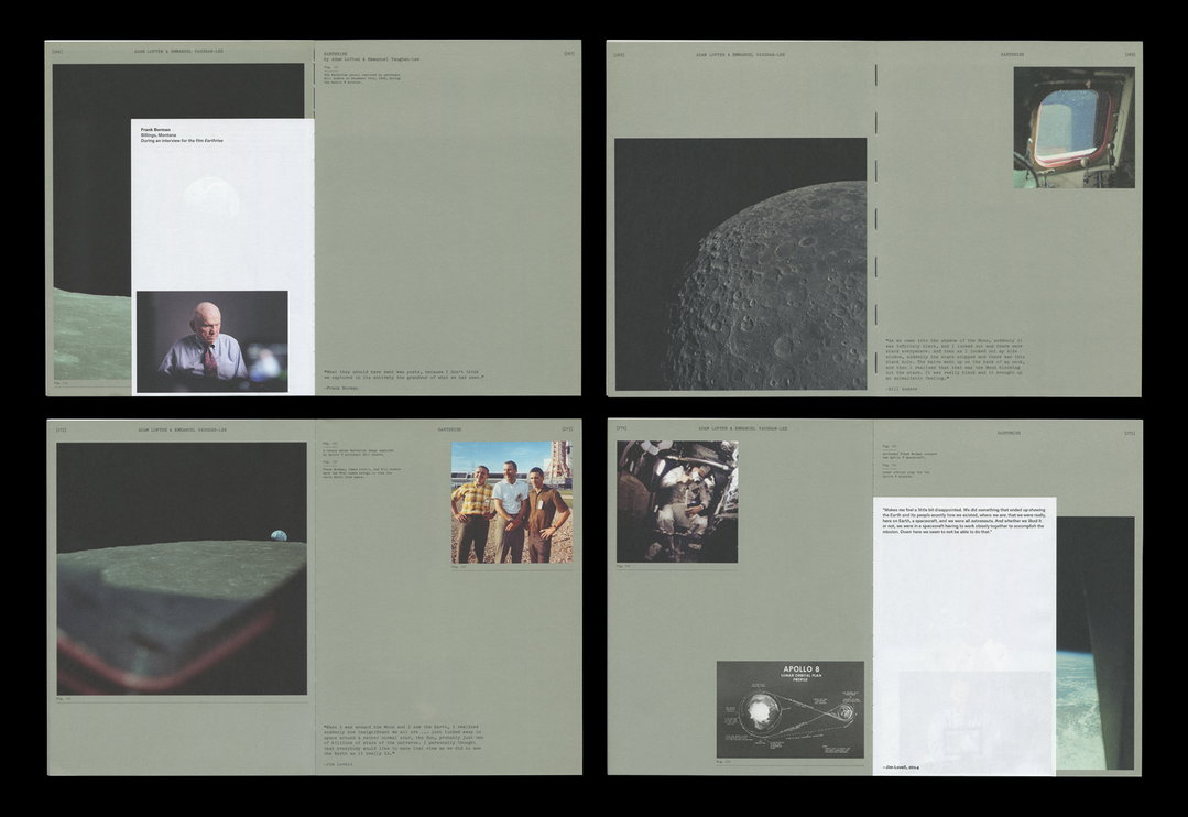
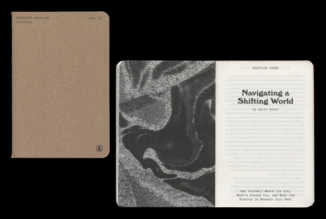
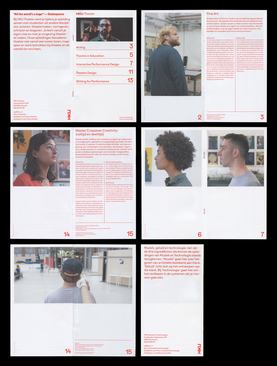
It’s an intricate methodology seen across the studio’s output, from its design of the annual print publication Emergence Magazine (an ongoing job for the past three years and issues), to an identity for Bram and Maurits’ alma mater. “It’s quite ’a thing’ to design for your former academy,” says Bram of the honorary commission. The expectations are high and the possibilities are rife with the different kinds of departments housed under one roof. The predominant challenge for studio airport was to come up with something ‘new’ while still hinting to the previous brand identity. The biggest art institution in Europe, University of the Arts Utrecht consists of eight buildings and 42 pathways, and encapsulating the breadth of the university was no mean feat. In the end however, “we always end up having lots of fun,” adds Maurits on the project, a trait visible in the end result.
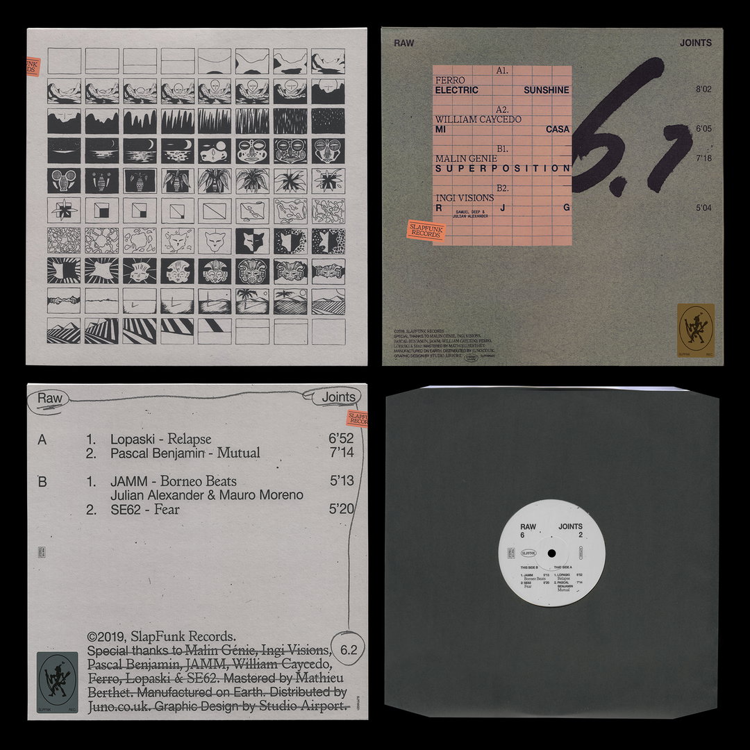
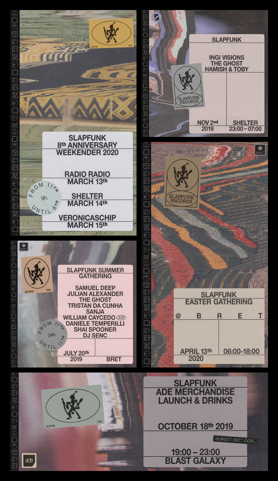
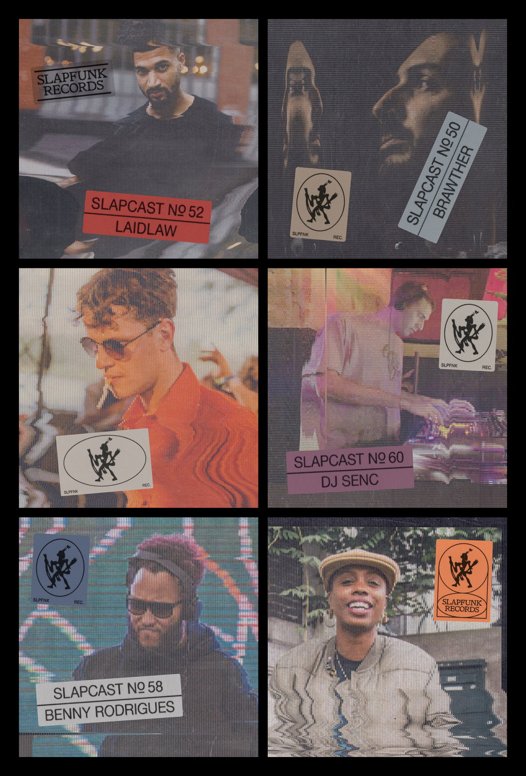
In other work, the founders talk us through the identity for Slapfunk Records, a label that’s been around for the same amount of time as Studio Airport whom Bram and Maurits have become close to. They met at the illegal parties they used to throw in the city and it was there that the two creative houses became close. Initially, they resonated with each other because of a mutual dedication and persistence to their respective crafts. Slapfunk represents a versatile genre, an outpost for a niche style of house that can be heard from “a Berlin minimal DJ to a New York techno head or anyone looking for some old school garage-influences house,” explains Bram.
Described by the designers as a “one-stop shop for anyone looking for lean, minimalist grooves,” Studio Airport aimed to encapsulate this diversity of sound in its identity design. Referencing old school house scene aesthetics in the identity, the designers also incorporate sound glitching motifs by way of manually moving their scanner around and matched this with cool diluted hues exuding the tones of the music. Taking things day by day – which is how Bram and Maurits find they work best creatively – that’s it for now on this speedy Studio Airport lowdown. Together, the co-founders finally go on to say, “We hope to keep doing what we’re doing for a while and practice what we preach by taking our time.”
GalleryStudio Airport
GalleryStudio Airport
Share Article
Further Info
About the Author
—
Jynann joined It’s Nice That as an editorial assistant in August 2018 after graduating from The Glasgow School of Art’s Communication Design degree. In March 2019 she became a staff writer and in June 2021, she was made associate editor. She went freelance in 2022.