



Launch Recite Me assistive technology
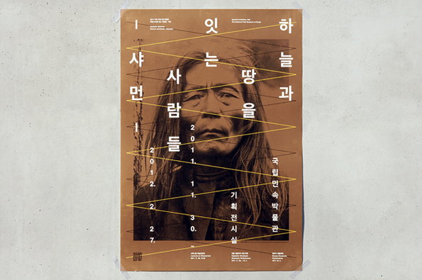
A poster featuring a close-up portrait of a person with long hair and a weathered face. Yellow lines zig-zag across the image, intersecting with vertical columns of Korean text.

Seoul-based studio fnt have a particularly clean and consistent body of work

—
Date
3 April 2012

Seoul-based studio fnt are purveyors of a fine design vernacular, particularly effective when seen on posters for the likes of Myung-dong theatre and The Pains of being Pure at Heart. With a consistently clean and strong gamut of graphics, theirs is a safe place to look for quality design.
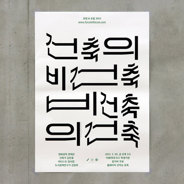
A minimalist poster featuring bold, black Korean typography on a white background. The characters are stylised with thick, geometric lines and sharp angles. Small text at the top and bottom provides event details and a website address.
Above

Poster for Junglim Foundation – Forum & Forum 2012: Arch. & anArch. (v.v.)
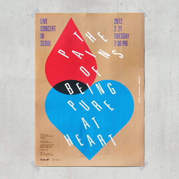
A poster on a concrete wall features a red teardrop shape overlapping a blue heart. White text across the shapes reads “The Pains of Being Pure at Heart”. Additional text in the corners reads “Live Concert in Seoul” and “2012. 2.21 Tuesday 7:30 PM”.
Above

Poster for the concert – Round & Round vol. 14: ‘The pains of Being Pure at Heart’ in Seoul
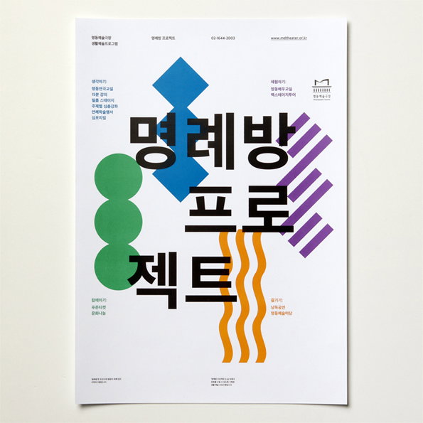
A graphic poster featuring bold, black Korean typography centered on a white background. The text is surrounded by abstract geometric shapes, including three green circles, a blue diamond, purple diagonal stripes, and orange wavy lines.
Above

Poster series for the Myung-dong theater
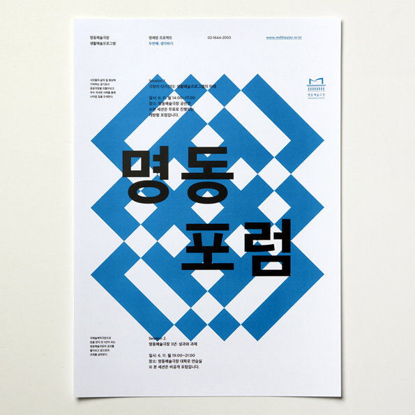
A graphic poster featuring a bold blue and white geometric pattern of interlocking diamonds. Large black Korean characters are layered over the centre, with smaller blocks of text and a logo positioned at the top and bottom.
Above

Poster series for the Myung-dong theater
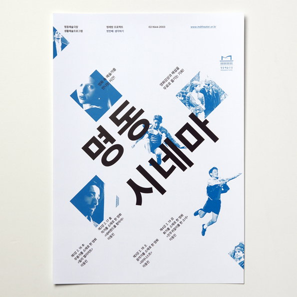
A blue and white poster featuring a collage of cinematic figures and bold Korean typography. The central text reads “명동 시네마”, surrounded by smaller text and fragmented images of people in dynamic poses.
Above

Poster series for the Myung-dong theater
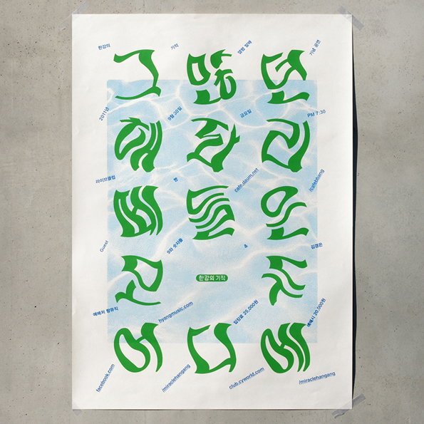
A poster featuring bold, green Korean typography arranged in a grid over a light blue, watery background. Small black text and URLs are scattered around the edges of the central design.
Above

Poster for the concert ‘Where Have All the Jellyfish Gone?’

Share Article

Further Info

About the Author

Bryony Quinn

—

Bryony was It’s Nice That’s first ever intern and worked her way up to assistant online editor before moving on to pursue other interests in the summer of 2012.


It's Nice That Newsletters

Fancy a bit of It's Nice That in your inbox? Sign up to our newsletters and we'll keep you in the loop with everything good going on in the creative world.

