Studio Phenomena looks at syllable-based writing, lost dreams and sensory experiences
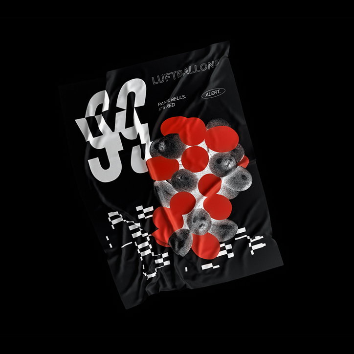
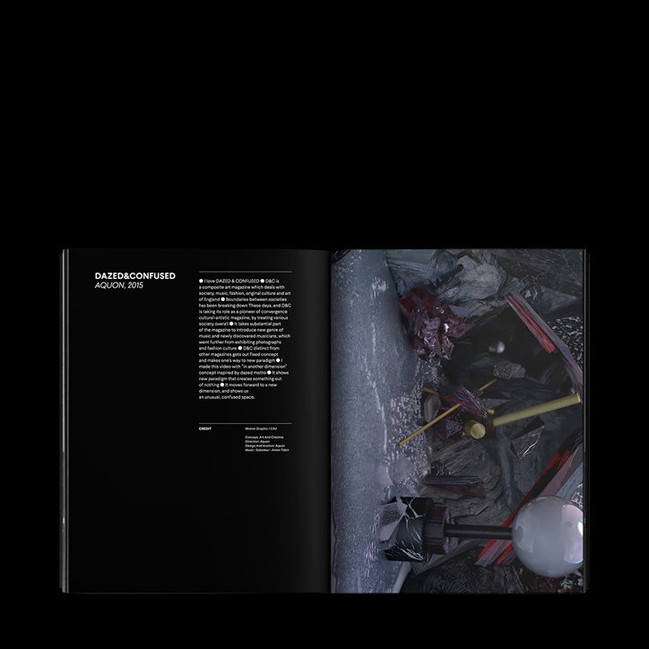
Working across visual representations of syllable-based writing, lost dreams and hopes and industrial motifs, Seoul-based Irang Lim founded Studio Phenomena this year as what she sees as her next step from working as a freelance designer. Doing multi-disciplinary design work that includes visual identities, branding, poster design, publication design, art direction and packaging, Irang was inspired by her peers who found a more continuous creative direction working as an independent studio.
“As a freelance designer, I mostly co-worked with design studios and agencies for commercial projects. As time went by, I became eager to work on something more continuous with full control of the direction of the design process by myself,” Irang tells It’s Nice That. “There were many friends around me who were running independent graphic studios. I got a lot of advice from them and finally opened the studio.” As opposed to the unobservable events, the name Studio Phenomena comes from the practice of transforming concepts and intuitions into sensory experiences, mostly through an observable visual language.
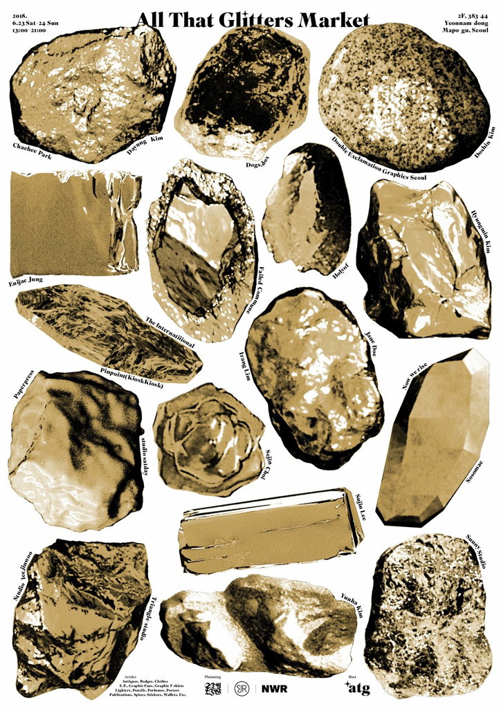
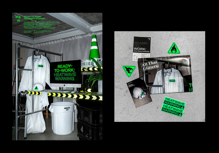
“Though I’m running the studio alone, I frequently collaborate with colleagues regardless of their field to expand the base of design with them,” Irang says. One of her current projects, run with Jinwoo Lee of Studio Lift-off and Gilwoong Jung of Studio Now We Rise, is a platform where designers can directly sell apparel and other physical items called All That Glitters. “Finding a particular context in graphic design and transforming it into a new form is not only cultural, but also depends very much on the individual experience. It’s interesting to me that there can be as many forms as stories of any designer,” she says.
Studio Phenomena
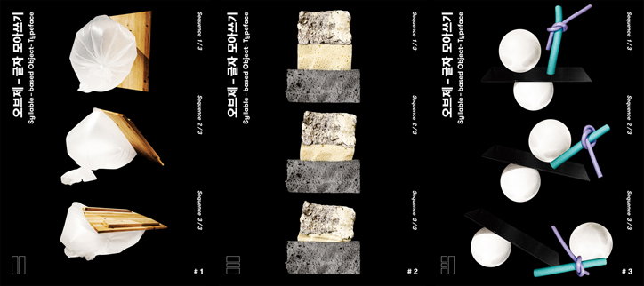
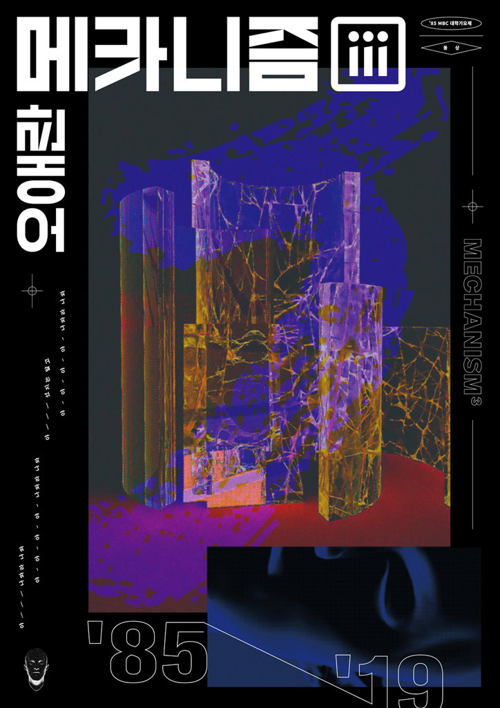
Much like the studio’s name, Irang’s approach often takes what we see and experience and transforms it into analogous visual images, like a remix of the concepts that she’s been challenged to visualise. One of the studio’s notable works is the Syllable-Based Object-Typeface poster series for the Polyhedron section of the sixth Typojanchi this year, the international typography biennale.
With the exhibition focusing on how concrete objects are related to typography, Irang analyses Hangul, the Korean syllable-based writing system, through three-dimensional objects. “I took pictures of objects with different physical properties, combined them with the main structure of Hangul as the basis and let them be transformed into diverse shapes just by its nature,” she says. Using porous stones of different colours, inflated plastic bags and knotted foam, Irang re-orientates these physical objects into the formal structure of Hangul.
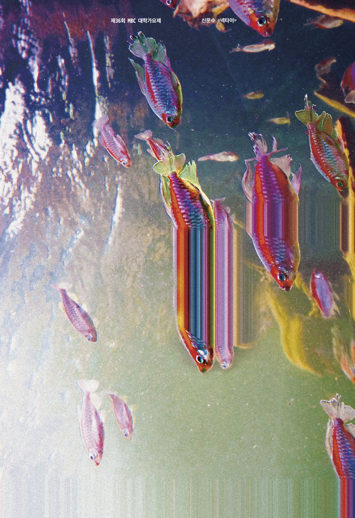
Another project, Necktie, was created for the BigRiver Poster Festival last year based on a song by Sin Moon-Soo about the lost youth. “Young people in the song desperately wear neckties to survive as grown-ups like their fathers and end up with a stable but boring life. The fish heading in the same direction represent the obedient youths of the song, and I extended the neck of a fish to express the situation metaphorically,” Irang explains. The saturated colours of the poster, with the scales of the fish reminding us of chromatic aberrations, is meant to represent the lost dreams and hopes. Blurring the boundaries of type, graphics and physicality, Studio Phenomena’s work contains the playfulness we look for in new graphic design work.
Studio Phenomena
Studio Phenomena
Studio Phenomena
Studio Phenomena
Studio Phenomena
Studio Phenomena
Studio Phenomena
Studio Phenomena
Share Article
Further Info
About the Author
—
Alif joined It's Nice That as an editorial assistant from September to December 2019 after completing an MA in Digital Media at Goldsmiths, University of London. His writing often looks at the impact of art and technology on society.