Designing the identity for an art institution that contradicts the all-too-familiar capitalist narrative
The Stuttgart-based Studio Tillack Knöll talk us through the “huge endeavour” behind the identity for Kunst, Verein, wagen, Halle.
Back in 2018 we met a pair of designers Steffen Knöll and Sven Tillack, a talented duo whose ultimate goal was to communicate, and not design for design’s sake. Operating under the name Studio Tillack Knöll, much has changed since we first featured the Stuttgart-based pair. For one, there was the realisation “that we should focus on being generalists rather than specialists,” Steffen tells us.
Previously, we delved into the studio’s latest projects including a Risograph publication written, designed, published and financed by Sven; an identity for an architecture school; not to mention posters and a project with Nike. Now, on the other hand, Studio Tillack Knöll has broadened its spectrum of clients and design tasks. “We want to do it all,” says Sven on this expansion, noting the brilliance of a fellow design studio aptly titled WeShoudDoItAll. Not only does it craftily design projects these days, Studio Tillack Knöll is also developing design solutions on paper, digitally and the 3D realm.
Since this change, there have been several highlights for Steffen and Sven. The duo have published two books with the Leipzig-based Spector Books (Exploriso: Low-tech Fine Art and NASA Apollo 11 – Man on the Moon), given a talk at the Shanghai World Expo Museum, taken on their first employees and intern, as well as completing a number of identities including the notable Kunst, Verein, wagen, Halle; a project three years in the making.
Discussing the aforementioned project, which involved the visual system for one of Stuttgart’s main art institutions, Studio Tillack Knöll tackled the “huge endeavour” which needed to be both experimental and highly accessible at the same time. An enterprise involving around 150 members from artists to curators, actors, musicians, architectures and more; Kunst, Verein, wagen, Halle has grounds stretching over an area of around 20 football fields. In spite of the fact that it takes up huge amounts of physical space in the heart of the city, the art institution contradicts the all-too-familiar capitalist narrative of space-shortage and rent-exploitation.
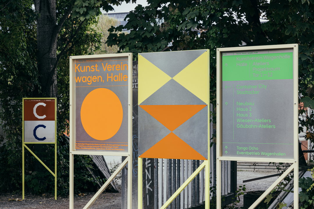
Studio Tillack Knöll: KVWH together with Nam Huynh, Hans-Jörg Seidler and Levin Stadler (Copyright © Studio Tillack Knöll, 2020)
“Basically,” says Steffen, “it is an experiment or rather an antithesis to the capitalistic needs to be productive in a financial sense.” Sven adds: “Rent, for example, is subsidised by the municipality for the next 30 years, which gives a lot of breathing space for artists to develop new concepts and collaborations.” Having recently completed a large-scale renovation, the institution was redesigned to feature a variety of media. In turn, the studio came up with the visual design system from scratch. As members of Kunst, Verein, wagen, Halle, the pair along with collaborators Nam Huynh, Hans-Jörg Seidler and Levin Stadler (who are also members) tapped into the needs and desires of the creatives using the space to inform the identity.
There was a wealth of outputs to design – stationary, merchandise, website, leaflets, invitations, silkscreen editions, posters, animations, a bespoke typeface, not to mention a signage system and environmental graphics. This was by no means an easy undertaking for even the most experienced of designers. On top of all this, the project also marked a deeply personal affiliation for the team of creatives, a place so close to home and culturally significant to their home city. With this in mind, a lot of unpaid time went into the project to achieve that extra mile. “At one point,” recalls Steffen, “after installing the signage system for eight hours straight in drizzling rain, we couldn’t feel our fingers and we were close to giving up.” But, as Sven puts it, “as this was a group effort you take a good night’s sleep and continue in the morning.”
In a year where the creative industry has been hit hard, this collaborative mentality has helped Studio Tillack Knöll survive. “After a phase of country-wide lockdowns and not being able to get work done,” says co-founder Sven, “it helped to talk to our colleagues, friends and partners, share our concerns and fears, and realised that we are all in this together. That formed a new kind of solidarity and gave the feeling of looking out for each other, which was heart warming.”
After absorbing the initial shock of the pandemic, the duo were able to focus on what makes them happy: designing and working with and for people. Something that’s also helped them understand the situation better is that “during the lockdown you are not working from home, but trying to,” a line from Shit Show Berlin, an agency focused on mental health in the workplace.
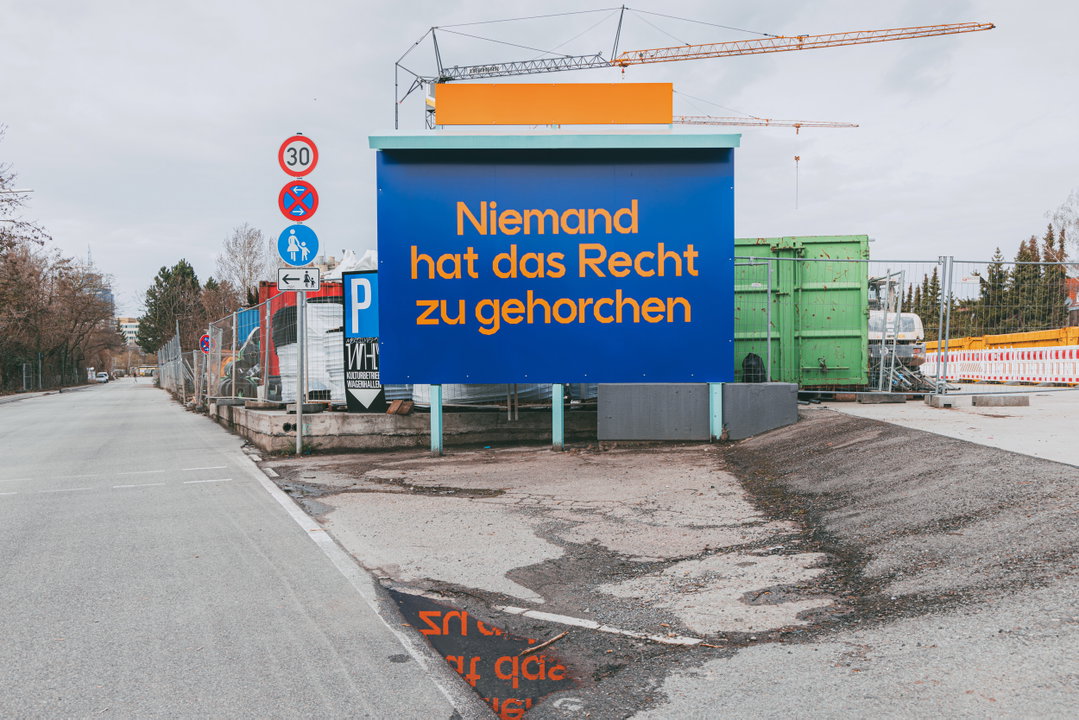
Studio Tillack Knöll: KVWH together with Nam Huynh, Hans-Jörg Seidler and Levin Stadler (Copyright © Studio Tillack Knöll, 2020)
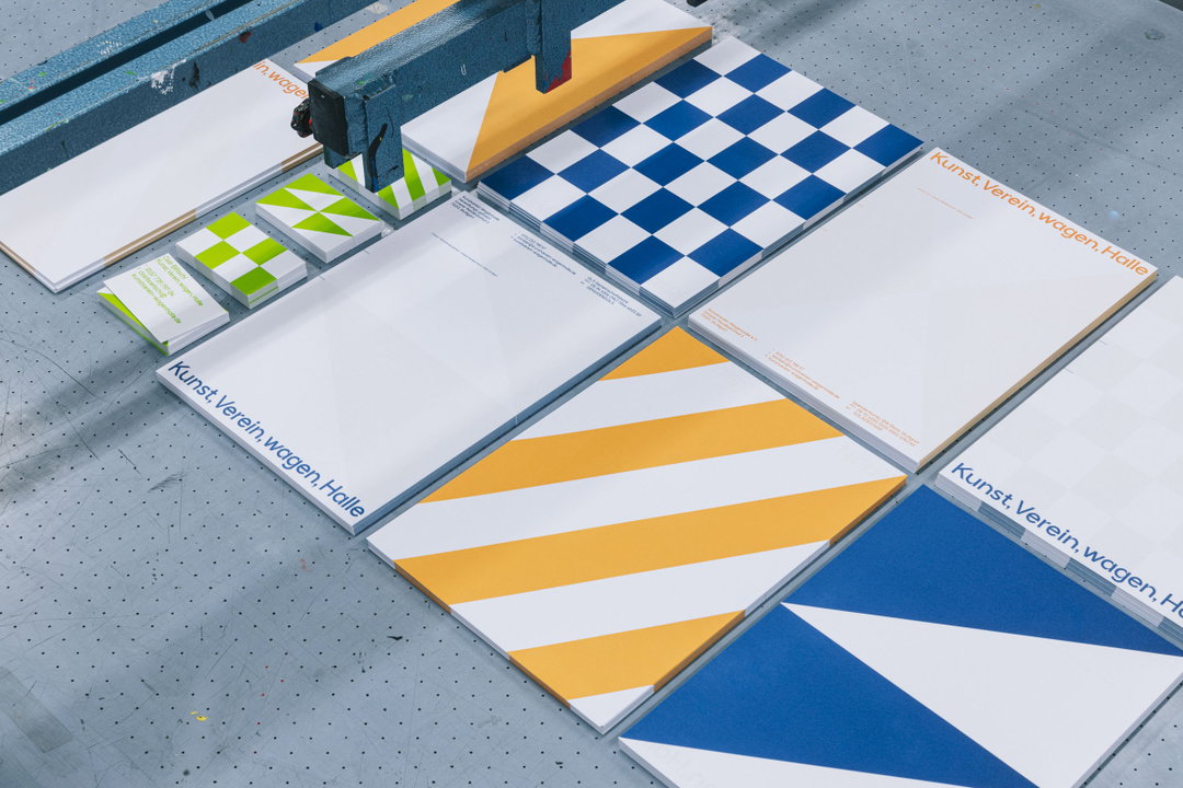
Studio Tillack Knöll: KVWH together with Nam Huynh, Hans-Jörg Seidler and Levin Stadler (Copyright © Studio Tillack Knöll, 2020)
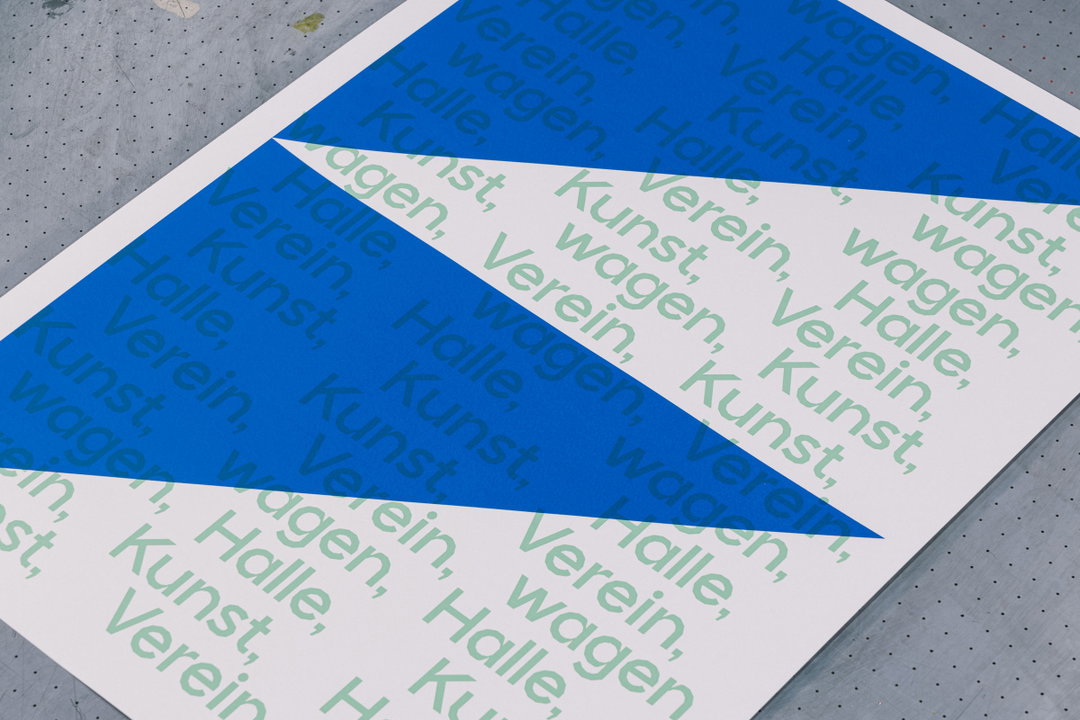
Studio Tillack Knöll: KVWH together with Nam Huynh, Hans-Jörg Seidler and Levin Stadler (Copyright © Studio Tillack Knöll, 2020)
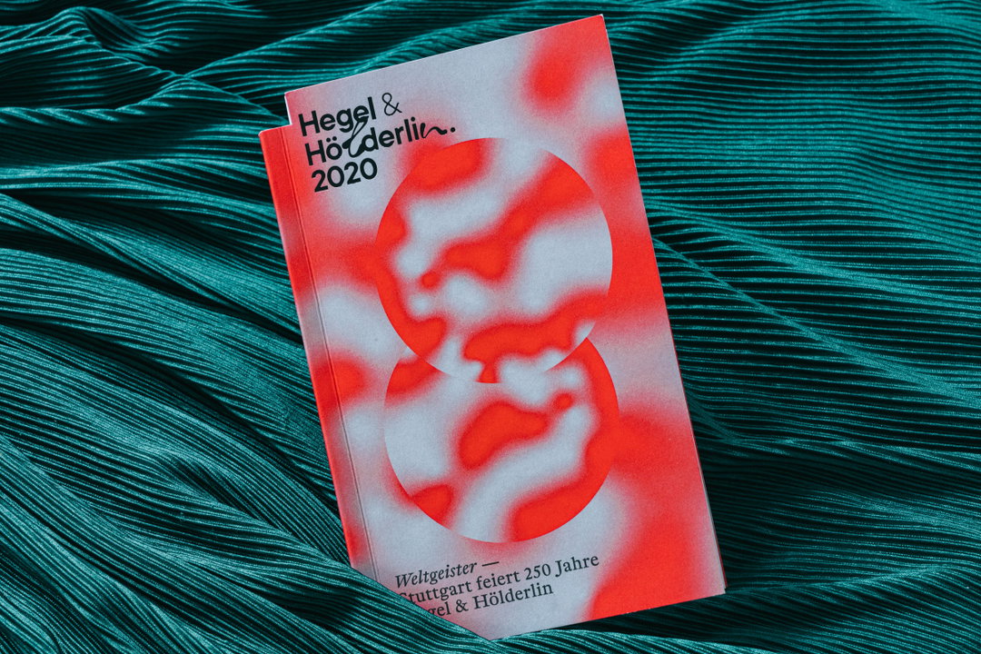
Studio Tillack Knöll: Weltgeister with the help of Niklas Berlec and Marius Rother (Copyright © Studio Tillack Knöll, 2020)
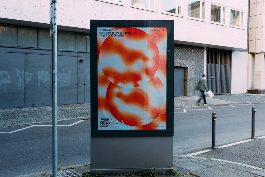
Studio Tillack Knöll: Weltgeister with the help of Niklas Berlec and Marius Rother (Copyright © Studio Tillack Knöll, 2020)
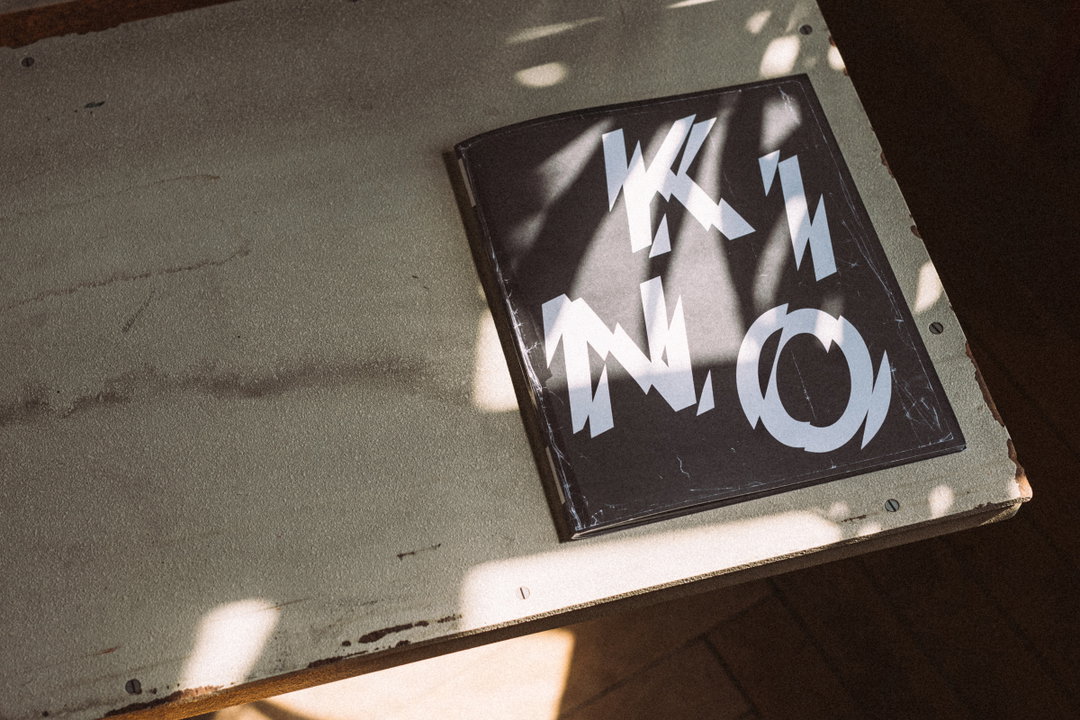
Studio Tillack Knöll: Kino in collaboration with Ricarda Roggan and Bernd Kuchenbeiser (Copyright © Studio Tillack Knöll, 2020)
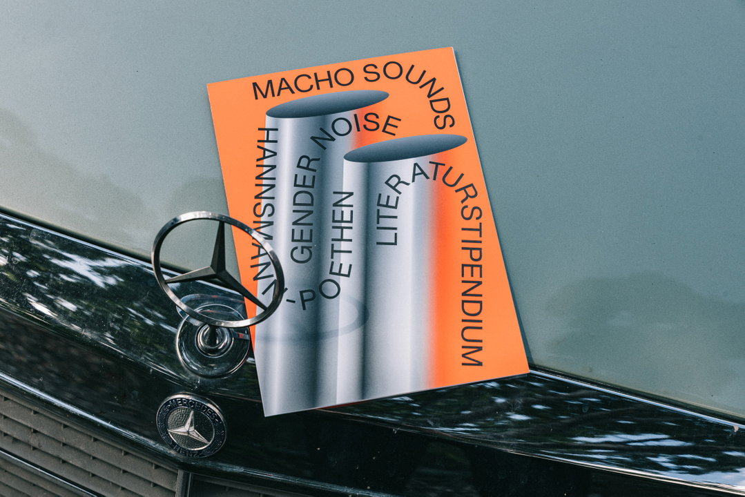
Studio Tillack Knöll: MSGN together with Nam Huynh (Copyright © Studio Tillack Knöll, 2020)
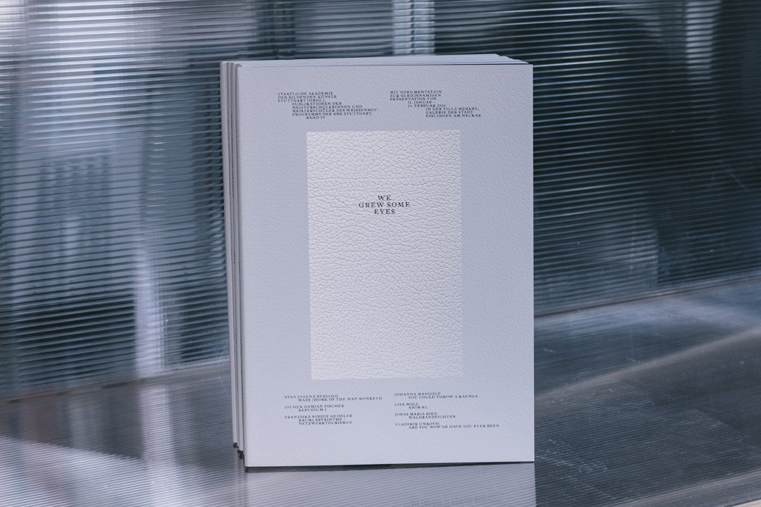
Studio Tillack Knöll: We Grew Some Eyes with the help of Vincent Herbet (Copyright © Studio Tillack Knöll, 2020)
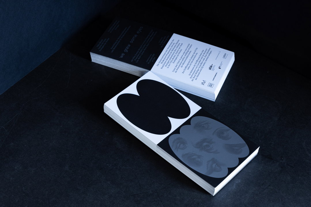
Studio Tillack Knöll: We Grew Some Eyes with the help of Vincent Herbet (Copyright © Studio Tillack Knöll, 2020)
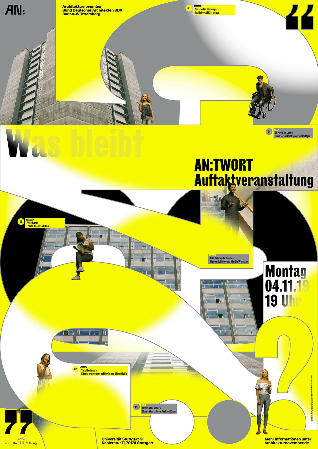
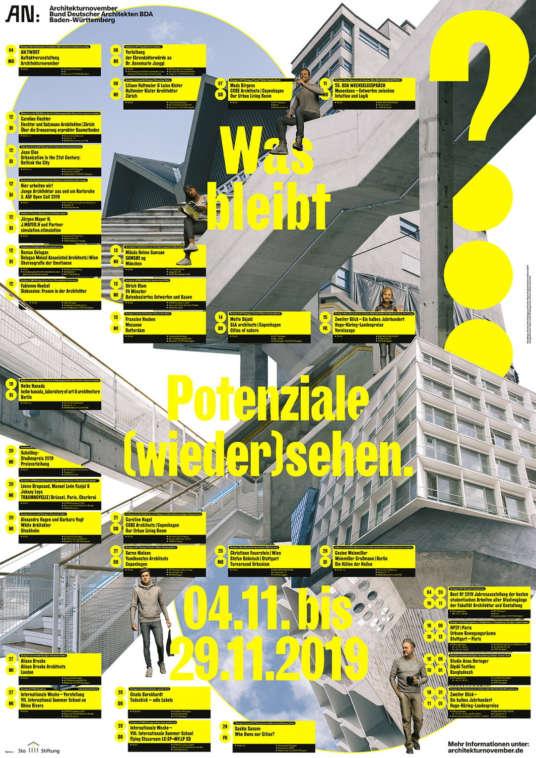
Studio Tillack Knöll: AN2019 together with Studio Terhedebrügge (Copyright © Studio Tillack Knöll, 2020)
Hero Header
Studio Tillack Knöll: AN2019 together with Studio Terhedebrügge (Copyright © Studio Tillack Knöll)
Share Article
About the Author
—
Jynann joined It’s Nice That as an editorial assistant in August 2018 after graduating from The Glasgow School of Art’s Communication Design degree. In March 2019 she became a staff writer and in June 2021, she was made associate editor. She went freelance in 2022.