Forget about success or failure, learning is the key for graphic designer Sunny Li
Delve into this extensive portfolio featuring book design, identities and constant experimentation from the LA-based Sunny Li.
Before pursuing graphic design, Sunny Li dabbled in a fair few different mediums before deciding on the pathway that so many of us enjoy here on It’s Nice That. Before moving to LA in 2015 where she enrolled at ArtCenter College of Design, Sunny previously studied fine art in her birth city of Beijing followed by short illustration courses at New York’s famed School of Visual Arts. It was there, during a short course, that one of Sunny’s tutors suggested she try her hand at graphic design. And, it’s safe to say, she took extremely well to the new medium.
“That was my first time hearing that term [graphic design],” Sunny tells us. “I follow my feelings most of the time,” and intrigued by her tutor’s suggestion, she delved into this new experience. A self-professed quiet person, Sunny uses her silence to enhance skills of observation and creativity. When first introduced to graphic design, she remembers her eagerness for fresh creative experiences. “I didn’t know exactly what I wanted,” but with this openness and lack of expectation in mind, she found a new mode of creativity.
Having recently graduated at the end of April, Sunny’s four and half years of study have been a bit of a rollercoaster. In her first year, she “found graphic design freaking hard, especially the communication aspect.” She goes on, “As an introverted artist, I never tried to connect and present my thoughts to people before.” Realising the fear of this new challenge, she discovered a risk-taker. And to her surprise, she found herself revelling in a newfound fearlessness, trying out new things even if it felt uncomfortable or awkward.
“Learning new things became the most exciting moment,” says Sunny, “no matter if it was from a failure or success.” Because of this, now, Sunny feels like she’ll never lose her passion for graphic design. It ties into so many other disciplines including technology; a feat that’s constantly evolving with so many avenues to learn over time. That being said, it’s the design of books and publications that really gets Sunny’s attention. As an avid collector of various printed goods, she jumps at the thought of translating her ideas into various graphic languages.
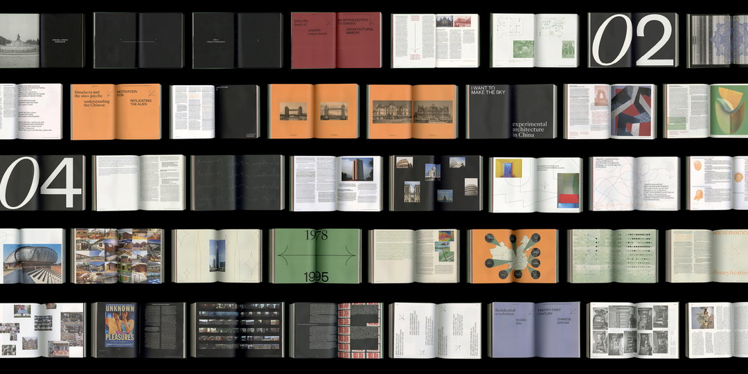
Sunny Li: A Simulacra of Place
Attuned to what’s going on around her, the designer absorbs her surroundings and uses them in her work. “As a designer, I’m able to observe things critically,” she adds. “I want to show my appreciation of interactions between cultures, humans, urban landscapes and natural environments in my work.” Starting out all her projects with concept and thinking at the fore, Sunny consistently tries to push herself to work outside her comfort zone, something she exhausted during her studies with experimentation at the heart of each project.
Seen in a recent branding for Arte Luise Hotel, Sunny designed the cross-media identity that reflects the personality of the Berlin-based establishment. Aiming to build interactions with the audience by creating an identity that speaks to everyone, Sunny wanted the branding “to offer different levels of experiences.” Incorporating hand drawn elements into the design to tap into the “artistic soul and spirit of the city,” Sunny implemented a clean and organised system of body copy coupled with expressive typography and graphic language throughout the whole system.
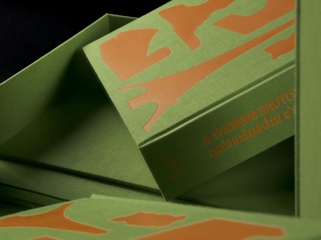
Elsewhere, she designed a book inspired by her experiences travelling in China. Having visited a number of small cities, she witnessed a number of world-famous landmarks lifted from Europe and cheaply replicated in a new Asian setting. “The cheaply made, out of proportion architecture caught my attention,” she adds, commenting on the incoherence of these European landmarks in China. Finding an apt term for it, “Duplitecture”, where entire townships appear to have been airlifted from their historic and geographic foundations and spot-welded to Chinese cities, at its core, the book examines two fundamental questions: How does architecture reflect a country’s urbanisation process? And how does urbanisation influence the development of architecture? To find out more about the answer to these questions, have a gander through Sunny’s powerful exploration of the subject below.
GallerySunny Li
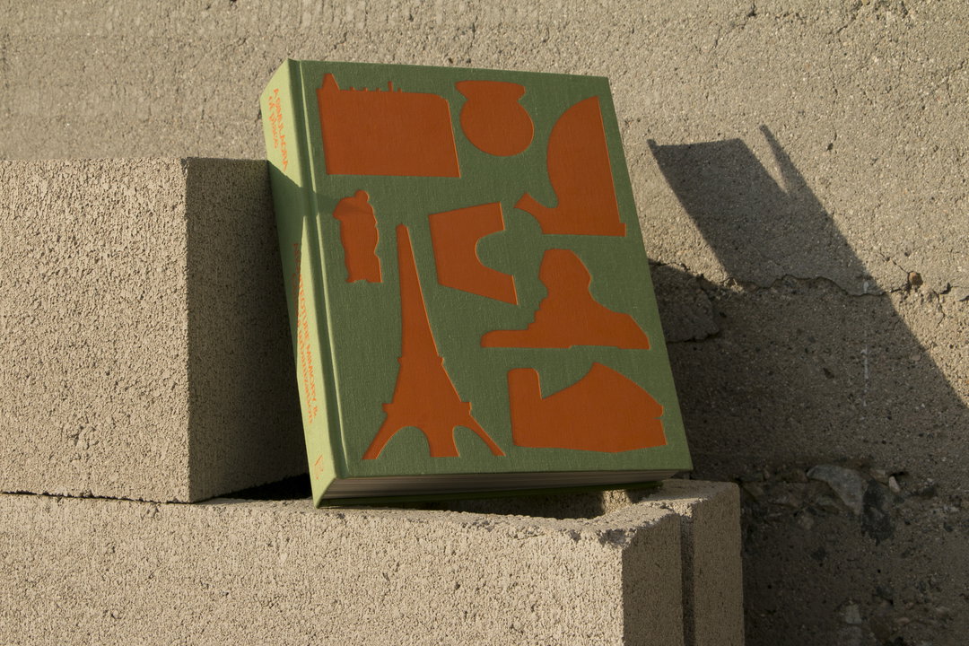
A Simulacra of Place
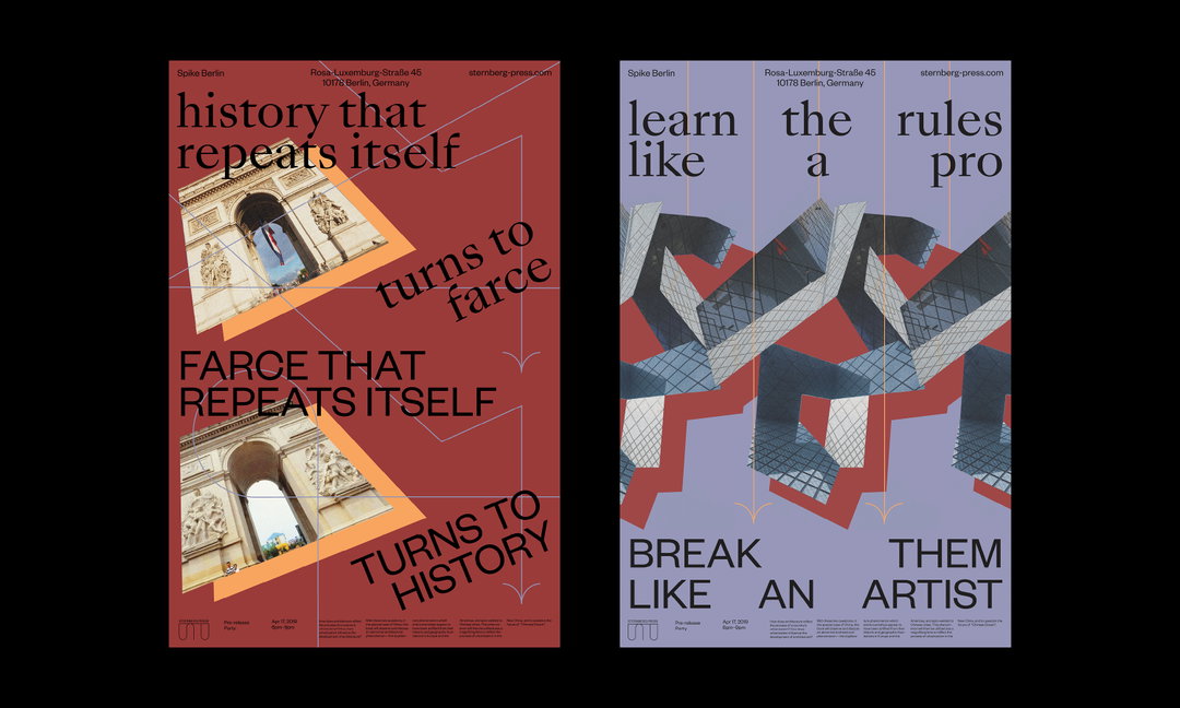
A Simulacra of Place
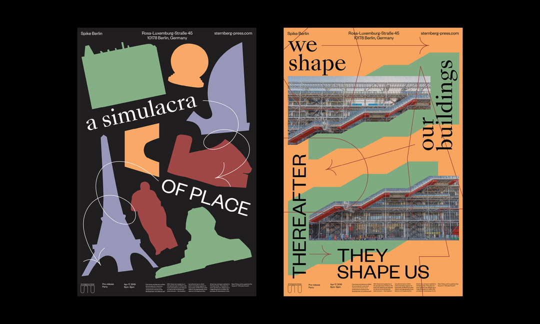
A Simulacra of Place
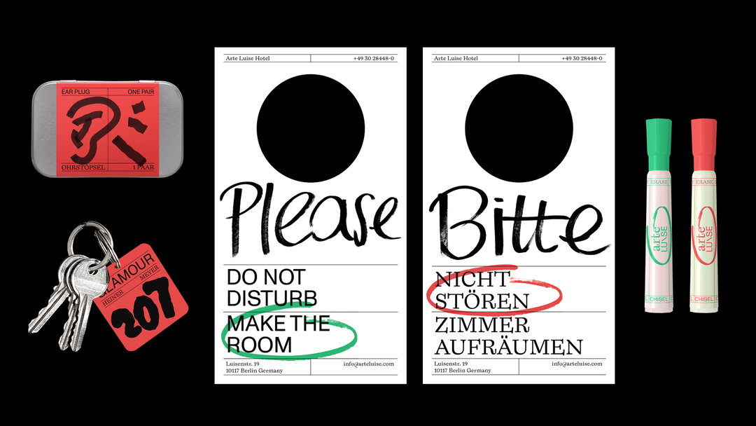
Arte Luise Hotel
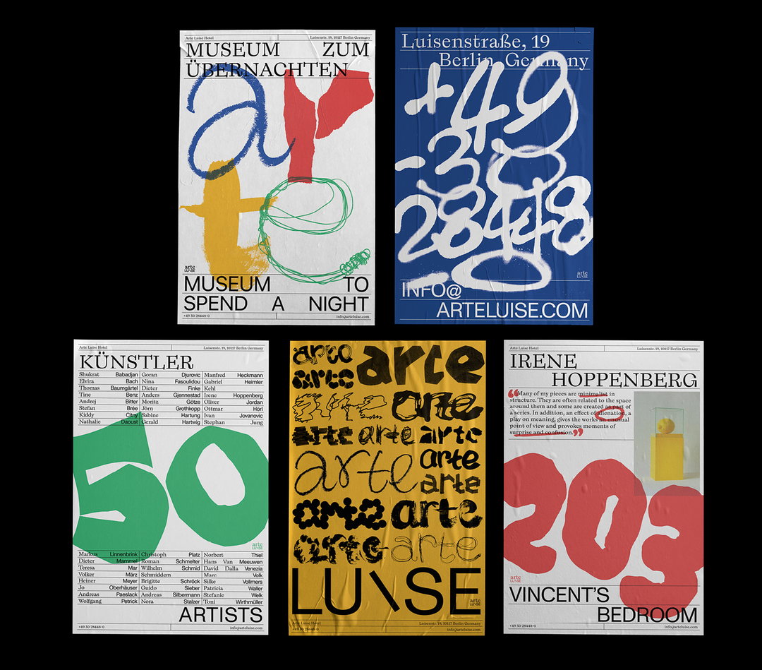
Arte Luise Hotel
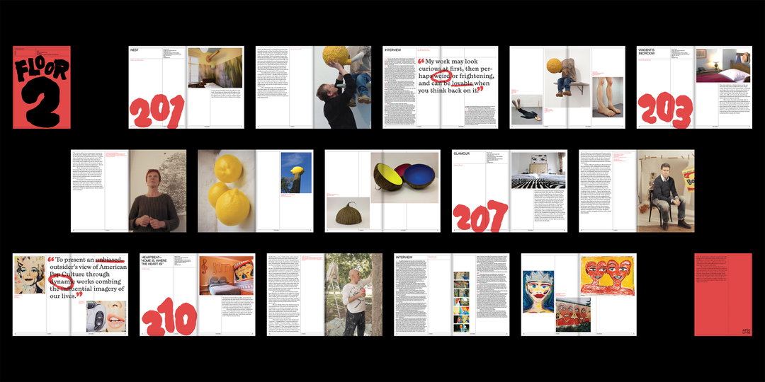
Arte Luise Hotel
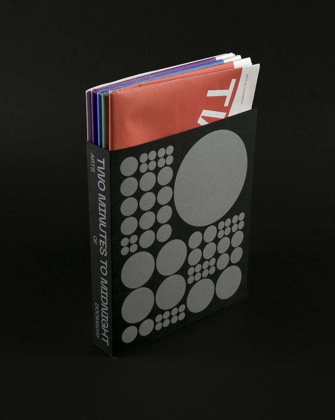
Two Minutes to Midnight
Share Article
Further Info
About the Author
—
Jynann joined It’s Nice That as an editorial assistant in August 2018 after graduating from The Glasgow School of Art’s Communication Design degree. In March 2019 she became a staff writer and in June 2021, she was made associate editor. She went freelance in 2022.