Launch Recite Me assistive technology
A graphic collage featuring large, orange letters “C” and “r” layered over a purple and white background. Fragmented black and white typography and halftone dot patterns are scattered across the composition.

Very slick, very Swiss graphic design from Supero

—
Date
23 June 2016

Supero by name, super by nature, this graphic design studio has an idyllic-sounding existence from its homes between La Chaux-de-Fonds, on the Jura mountains in Switzerland and Basel. With an aesthetic informed by “The International Typographic Style, also known as the Swiss Style”, the studio says: “It is an art of simple, efficient composition and it is still relevant. It is a timeless style which we enjoy playing with. Indeed, the great difficulty of a graphic exercise isn’t to produce something fashionable, pretty and fun, but to succeed in creating a timeless visual. A work that could come out years later and would still be relevant.”

It’s an approach that serves them well, as showcased in a portfolio that’s both colourful and refined. Among Supero’s projects are the visual identity and poster designs for Neuchâtel’s Musée d’art et d’histoire, printed materials for La Chaux-de-Fonds’ Nuit de la photo and designs for IBA Basel 2020.
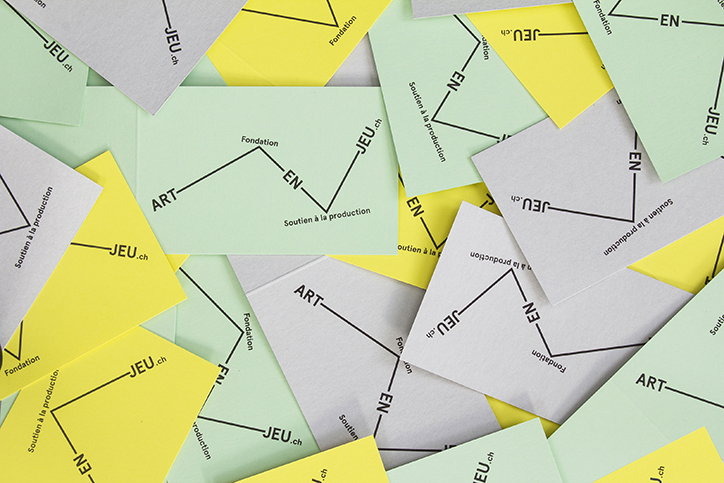
A scattered pile of small yellow, green and white cards. Each card features a black zig-zag line connecting the words “ART”, “Fondation”, “EN”, “Soutien à la production” and “JEU.ch”.
Above

Supero

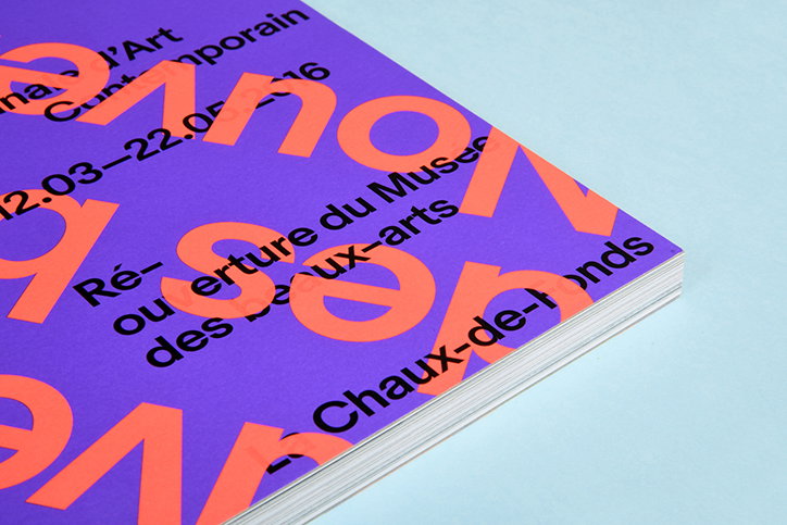
A close-up of a purple booklet with bold, oversized orange typography. Black text reads “Réouverture du Musée des beaux-arts” and “Chaux-de-Fonds”.
Above

Supero

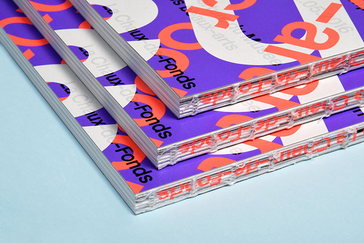
A stack of three magazines with purple and orange covers. The text “la Chaux-de-Fonds” is printed in a bold, black sans-serif font.
Above

Supero

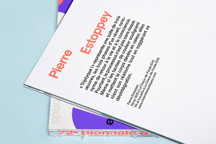
A close-up of a printed page featuring the name “Pierre Estoppey” in bold orange text. Below, a paragraph of French text describes a triptych, followed by a short biography and a website address.
Above

Supero

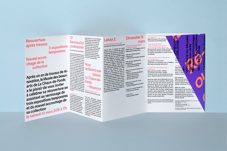
A folded brochure with a white background and blue, red and purple accents. The French text announces the reopening of the Musée des beaux-arts de la Chaux-de-Fonds on “le samedi 12 mars 2016”.
Above

Supero

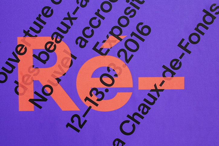
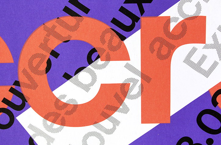
A close-up of a purple poster featuring a large, orange “Re–” in a bold sans-serif typeface. Black text is layered over the graphic at an angle, including the date “12–13.03.2016” and the location “La Chaux-de-Fonds”.
Above

Supero

A graphic collage featuring large, orange letters “C” and “r” layered over a purple and white background. Fragmented black and white typography and halftone dot patterns are scattered across the composition.
Above

Supero

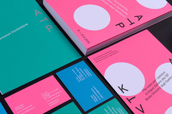
A collection of bright pink and teal printed materials, including booklets and business cards. The covers feature the letters “ATP” and “KTV” in a clean, sans-serif typeface.
Above

Supero

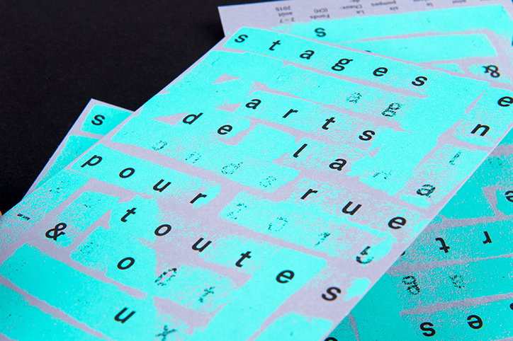
A close-up of overlapping turquoise printed sheets featuring fragmented black typography. The legible words include “stages”, “arts de la rue” and “pour toutes”.
Above

Supero

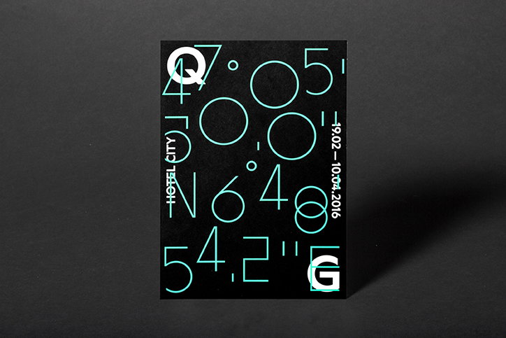
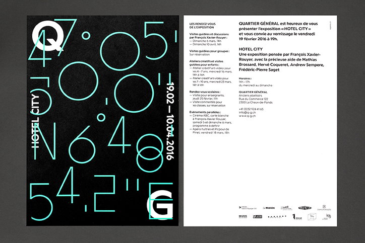
A black poster featuring large, abstract typographic elements in mint green and white. The design includes coordinates and the text “HOTEL CITY” and “19.02–10.04.2016”.
Above

Supero

A graphic design layout featuring a black poster and a white information sheet. The poster displays large, cyan typographic characters and the vertical text “HOTEL CITY” alongside the date “19.02 – 10.04.2016”.
Above

Supero

Share Article

Further Info

About the Author

Emily Gosling

—

Emily joined It’s Nice That as Online Editor in the summer of 2014 after four years at Design Week. She is particularly interested in graphic design, branding and music. After working It's Nice That as both Online Editor and Deputy Editor, Emily left the company in 2016.


It's Nice That Newsletters

Fancy a bit of It's Nice That in your inbox? Sign up to our newsletters and we'll keep you in the loop with everything good going on in the creative world.