Protests, cute culture and the UK’s fruit market: Suzy Chan on her innovative design practice
Despite the fact that Suzy Chan is still a student at UAL’s London College of Communication, she has already created an enviable body of work that many experienced graphic designers will be most impressed with. As a designer whose crafted her portfolio around social affairs with a strong impetus on critical thinking, Suzy’s work so far boasts a variety of skill, technical ability and artistry that seems far beyond her years.
Before coming to London, Suzy spent her childhood between Canton, Beijing and Macau. When she first started exploring the field of graphic design in China, Suzy “accumulated a lot of commercial knowledge” but over time, she began to appreciate the artistry within the discipline, stating, “I started to realise that graphic design can be a public platform of personal expression, not just a tool of commerce.”
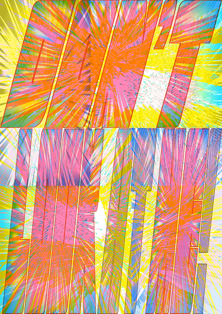
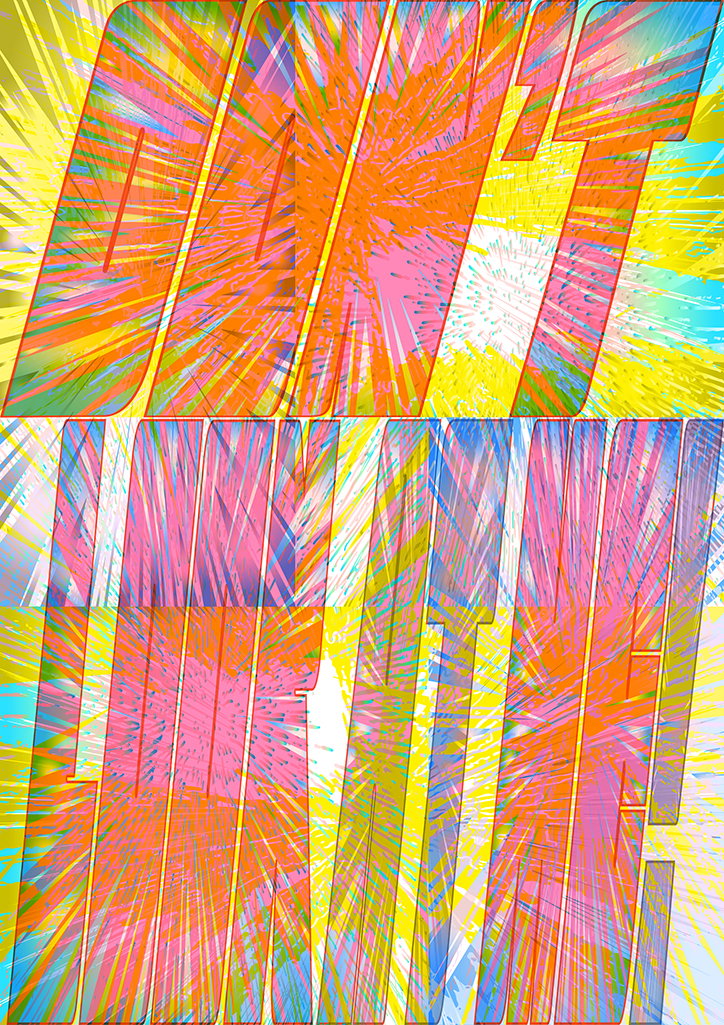
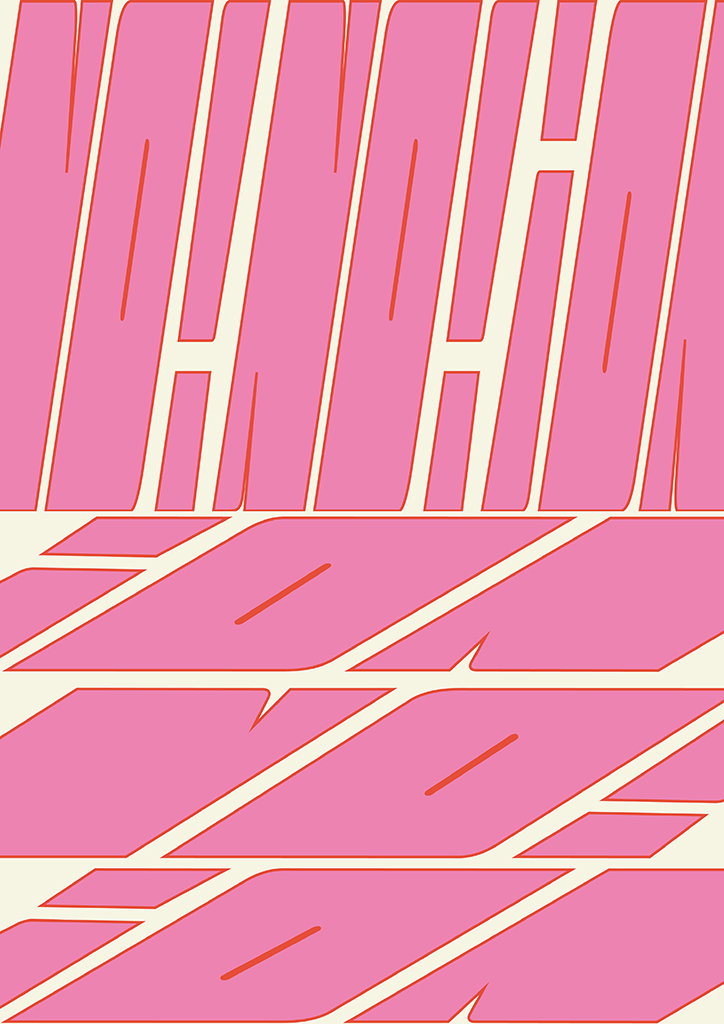
Suzy’s recent projects span type design, web design and print. Not only creating wonderfully vibrant work in terms of aesthetics, but also paying close attention to relevant sociopolitical intentions. She’s created an adjustable typeface (both in length and width) designed to appear on protest placards and reflect the protestors’ angry voices. “The design was inspired by a protest in London’s Chinatown last summer,” explains Suzy. “I found that the layout on the protest board couldn’t accurately express how angry they were. So I made this typeface which can be used directly on posters and campaigns to amplify a strong voice.” In addition, the typeface’s adjustability makes it easy to apply the letters onto any kind of proportion, appearing emphatically powerful no matter how it’s stretched and pulled.
Suzy Chan: Type Hacker
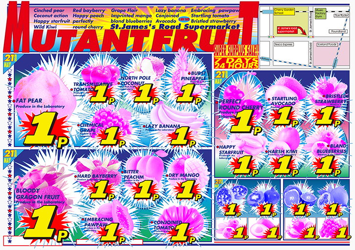
In another project Type Hacker, Suzy explores the UK’s fruit market. She comments on how, “most of the fruits I can buy in the UK are very small and super dry. Sometimes I see weirdly big strawberries with no taste at all.” The designer became interested in how these fruits are labelled “fresh” or “perfect” or “juicy” but are anything but, further researching into how much of UK’s fruit is cultivated in greenhouses and often grown unnaturally, offseason. As a result, Suzy plays on the irony of this marketing through graphic design. “I decided to ‘hack into’ this phenomenon with an existing design language,” says Suzy. She uses triggering words and images to embed a third meaning into the context of fruit packaging and food advertising; creating a “cheap, chaotic and noisy tone in order to satirise the current criteria for ‘perfect fruit’”.
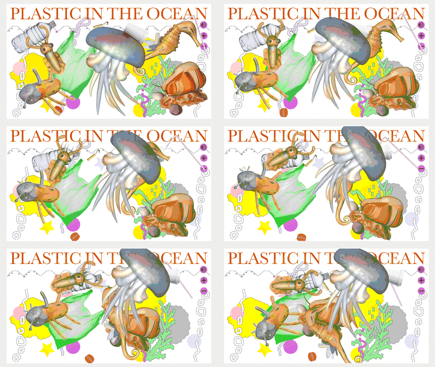
By contrast, in Plastic in the Ocean, Suzy creates a sweet aesthetic to sardonically tell a sad story about environmentalism. Having spoken to her design engineer friend about the dangers of microplastics to marine life, Suzy wanted to make a piece of work around the subject, regardless of whether she was contributing to a design cliche or not. In turn, she designed a “salvage site” of dead sea life. Once on the website, the visitor would embark on four steps; firstly entering the ocean, followed by salvaging dead sea creatures, confirming their deaths and then continuing to salvage. Though a rather morbid topic, Suzy offers up a different aesthetic to give the dead animals “more dignity.”
Suzy Chan: Plastic in the Ocean
And in the final project that Suzy’s shared with us Kawaii Styling Salon, the designer explores her childhood obsession with the character of Hello Kitty and in turn, kawaii culture. “The purchase of Hello Kitty products can be considered as a trend in Asia,” says Suzy. Like many others, Suzy was “addicted to all Hello Kitty peripheral products” as a child which has sparked a creative interest in “cute culture and consumerism” in Suzy’s current graphic design practice. “I began to wonder if my previous obsession was a consumerist trap” ponders the designer, and so, she’s created an interface that opens up these ideas by allowing the viewer to dress up in an array of cute outfits. In a collaboration with her friend Zheyun Chen, Suzy “engages the audience through an open design to create awareness around cute culture and consumerism”.
With hopes to move to Amsterdam after she graduates this summer, Suzy ends our interview with her aspirations for the future. “I want to be a calm madman”, she says on her future intentions to work with “seemingly low-level themes which are full of deeper meaning and complexity”. Hoping to continue working on social personal projects even after she graduates, Suzy’s ultimate creative goals revolve around becoming “a part of the ‘hammer’ that shapes society” – through innovative graphic design no doubt.
Suzy Chan: Adjustable Tyepface
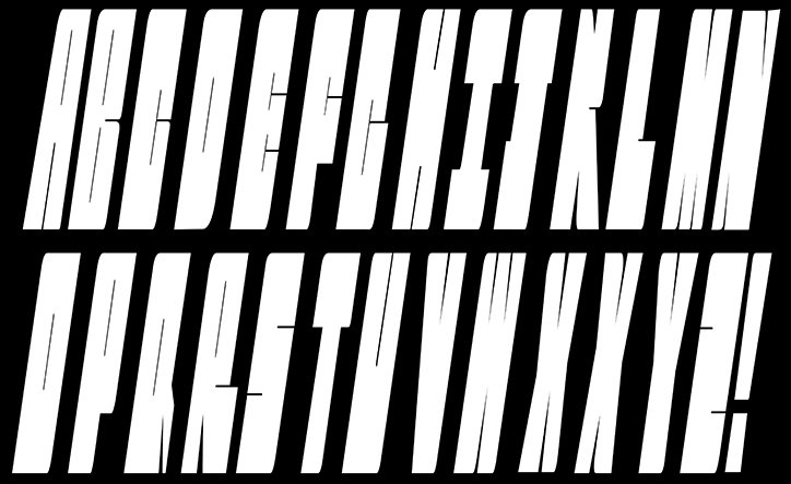
Suzy Chan: Adjustable Tyepface
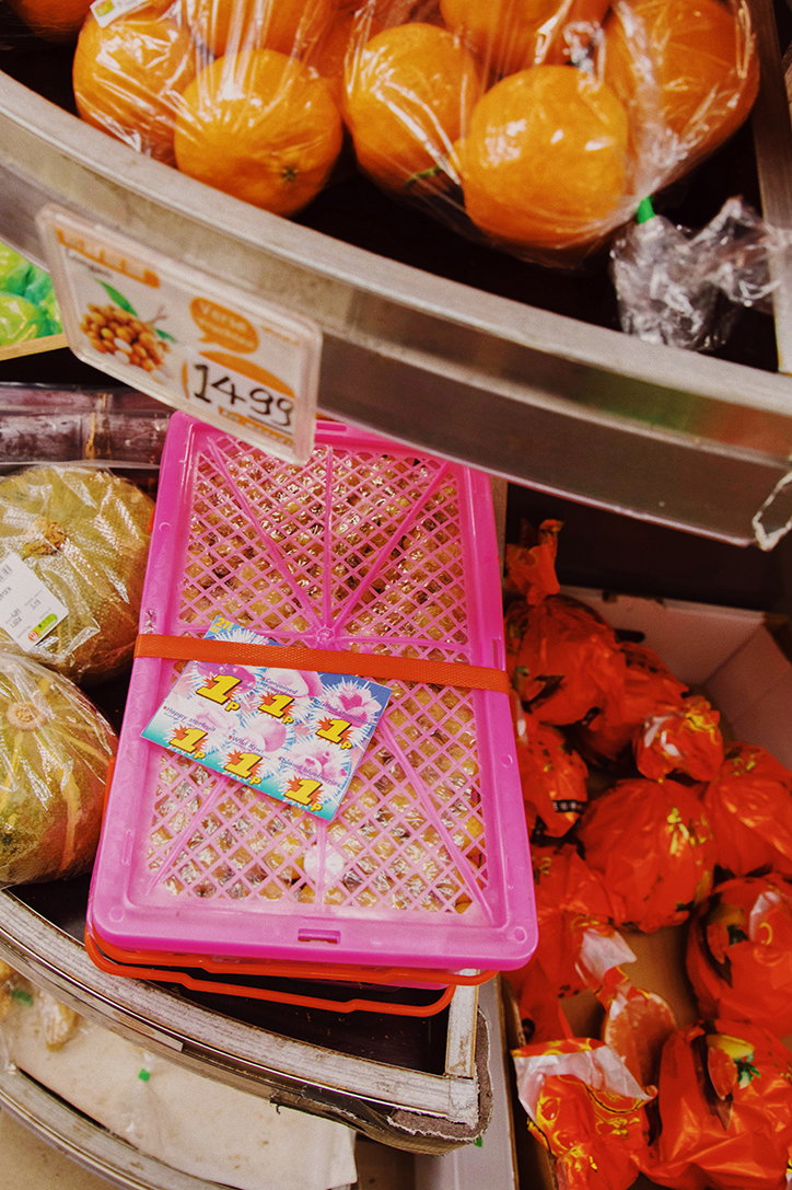
Suzy Chan: Type Hacker
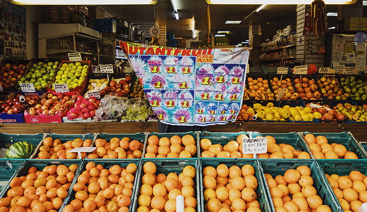
Suzy Chan: Type Hacker
Suzy Chan: Plastic in the Ocean
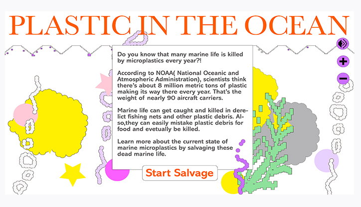
Suzy Chan: Plastic in the Ocean
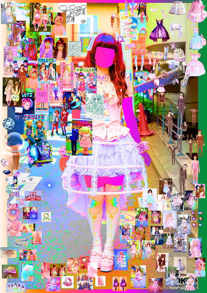
Suzy Chan: Kawaii Styling Salon
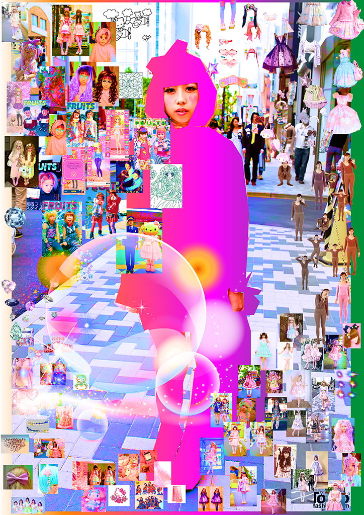
Suzy Chan: Kawaii Styling Salon
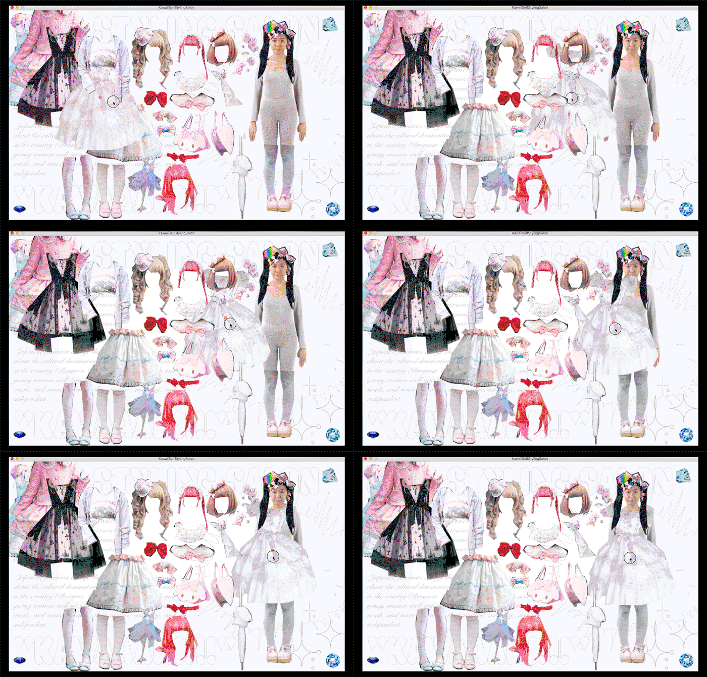
Suzy Chan: Kawaii Styling Salon
Share Article
Further Info
About the Author
—
Jynann joined It’s Nice That as an editorial assistant in August 2018 after graduating from The Glasgow School of Art’s Communication Design degree. In March 2019 she became a staff writer and in June 2021, she was made associate editor. She went freelance in 2022.