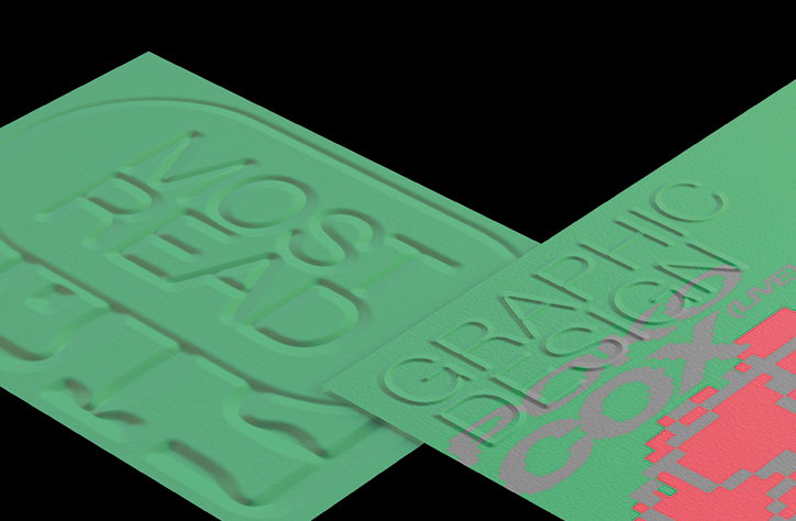
Volume presents a long-overdue monograph on Japanese type master Takenobu Igarashi
Iconic graphic and type designer Takenobu Igarashi rose to prominence in the 1970s with his groundbreaking poster designs featuring hand-drawn, three-dimensional typographic drawings. Recognising the design worth in Takenobu’s designs, Volume, a new crowdfunded publishing platform, are publishing the first book on his work, looking into the designer’s three-dimensional type in forensic detail. Titled Takenobu Igarashi: A to Z, there are several ways to support and be involved in the project’s production. By donating to the campaign, those seeking an original collector’s edition can choose their own letter to feature on the cover which will also be signed by Takenobu as part of the limited-time campaign.
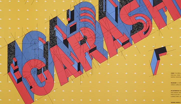
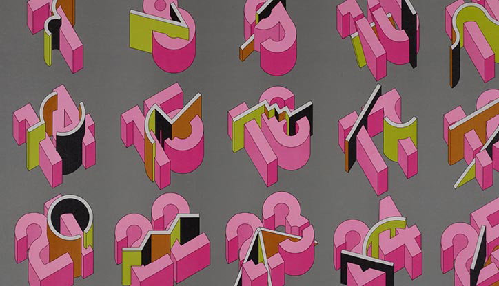
Born in 1944, Takenobu’s celebrated posters developed a new typographic language, featuring geometric type to evoke a heightened sense of depth using rigid grids and strict systems of perspective planes. Although created in the 1970’s, Takenobu’s designs feel contemporary and exciting by today’s industry standards, reflecting how good design stands the test of time. The posters gained Takenobu international recognition, resulting in collaborations with design giants Massimo Vignelli and Alan Fletcher, as well as commissions from New York’s Museum of Modern Art.
Graphic design historian Steve Heller points out how “Takenobu Igarashi monumentalised type and typography when most of us were still living in Gutenberg’s shadow. With his unprecedented 3D type, Takenobu created an even larger shadow that brought the old world together with the future one”. Although finding commercial success in the West, Takenobu found a deep engagement with Japanese crafts and found a passion for producing experimental sculptures and artworks based on letterforms in various materials and sizes.
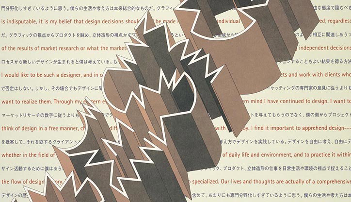
Takenobu Igarashi: A to Z is the first major publication on the ins and outs of Takenobu’s monumental career. Produced in close collaboration with the designer and with exclusive access to his personal archives, the book documents a distinctive insight into this master’s 3D typographic workings. The monograph’s layout is playful, reflecting the experimental nature of Takenobu’s creative approach as seen through the book’s content which mixes landmark designs with previously unseen works. Additionally, A to Z records the designer’s unused concepts, pen-and-pencil mark-up boards and the detailed perspective drawings underpinning Takenobu’s aesthetic.
A to Z is an accessible and inspiring book for any creative looking into meticulously crafted design. Illuminating one of the most innovative design minds of the last half-century, the book celebrates the Japanese master’s iconic axonometric alphabets in the pre-digital era. The book’s release is a timely addition to the increasingly digital design industry as it offers an exclusive understanding of how the hand-drawn type masters operated using purely their analogue skills. Painstakingly accurate drawing skills like Takenobu’s are a fundamental understanding of typographic history that are often taken for granted in today’s industry which is increasingly reliant on computer software and digital technology.
You can donate to this long overdue campaign here. There is also an opportunity to pledge for an A1 reproduction of Takenobu’s famous Design News Magazine cover illustration, as well as a signed screen print only available through this campaign.
Takenobu Igarashi: A to Z, published by Volume
Takenobu Igarashi: A to Z, published by Volume

Takenobu Igarashi: A to Z, published by Volume
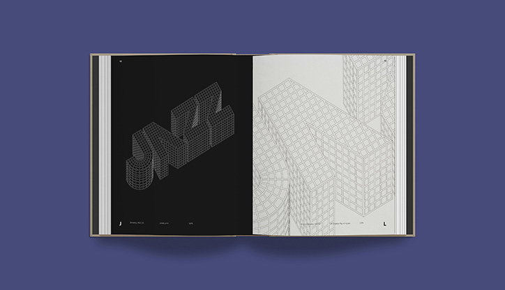
Takenobu Igarashi: A to Z, published by Volume
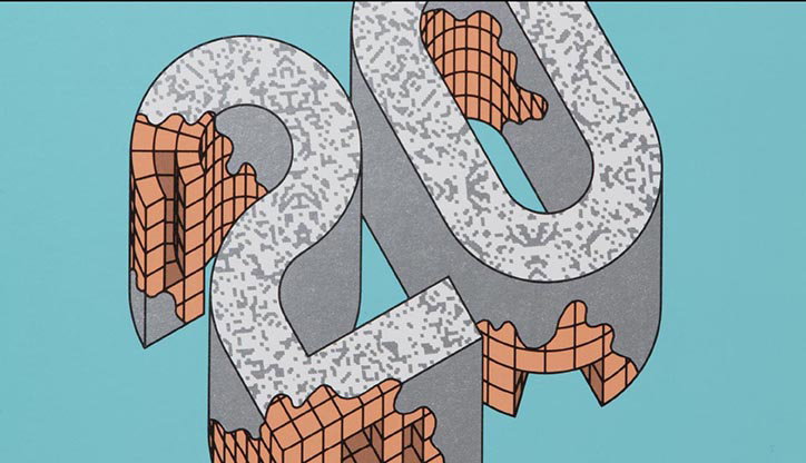
Takenobu Igarashi: A to Z, published by Volume
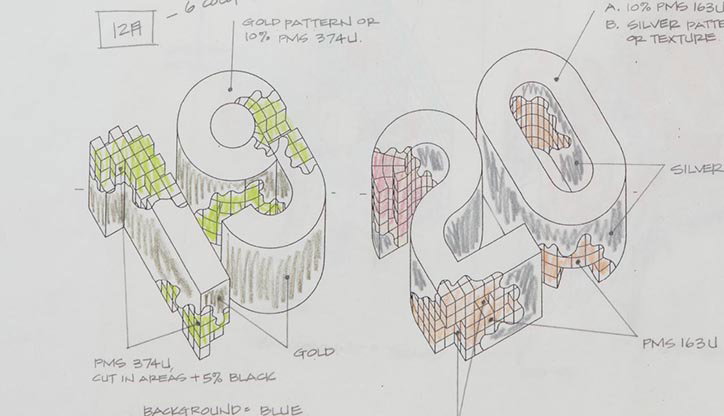
Takenobu Igarashi: A to Z, published by Volume
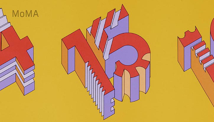
Takenobu Igarashi: A to Z, published by Volume
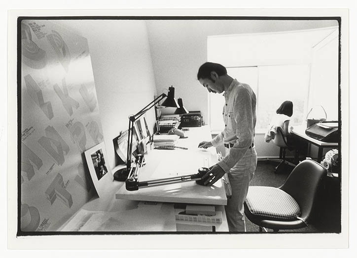
Takenobu Igarashi: A to Z, published by Volume
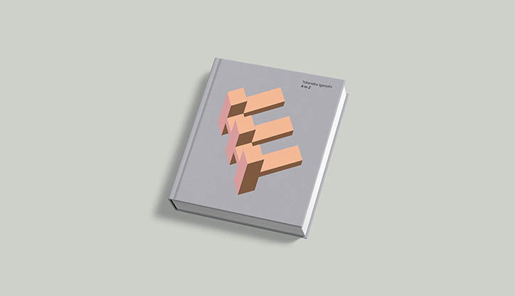
Takenobu Igarashi: A to Z, published by Volume

Takenobu Igarashi: A to Z, published by Volume

Takenobu Igarashi: A to Z, published by Volume
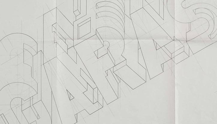
Takenobu Igarashi: A to Z, published by Volume

Takenobu Igarashi: A to Z, published by Volume
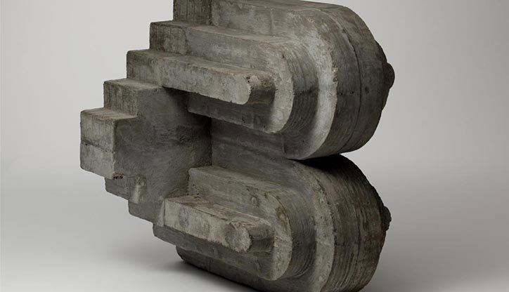
Takenobu Igarashi: A to Z, published by Volume
Share Article
Further Info
About the Author
—
Jynann joined It’s Nice That as an editorial assistant in August 2018 after graduating from The Glasgow School of Art’s Communication Design degree. In March 2019 she became a staff writer and in June 2021, she was made associate editor. She went freelance in 2022.