




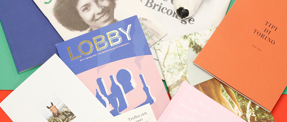
Get ready for a rollercoaster of postal goodness. Things is back again!
The last time I wrote a Things round-up was back in December 2011 so please forgive me if I’m out of practice. Of course I’ve been furiously tearing into the post on a daily basis since my last instalment, but I’ve not been able to wax lyrical about it as regularly as I’d like. I’m going to relish this opportunity. So without further ado here’s my top ten tasty treats from the plentiful pile of post this month. Somebody stop me!
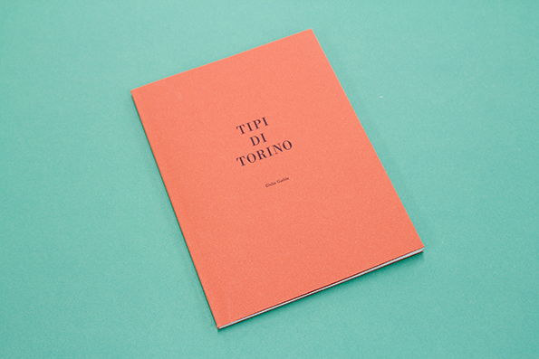
Giulia Garbin: Tipi Di Torino
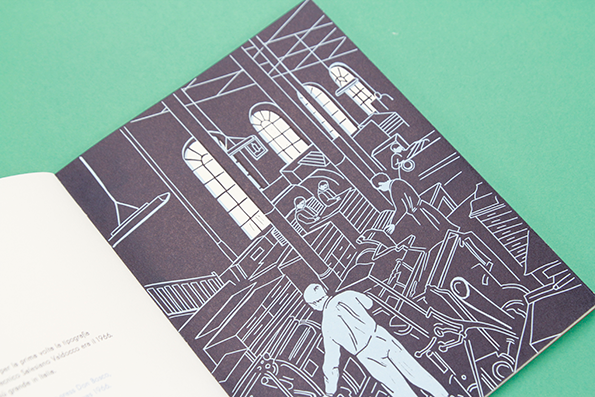
Giulia Garbin: Tipi Di Torino

Giulia Garbin: Tipi Di Torino
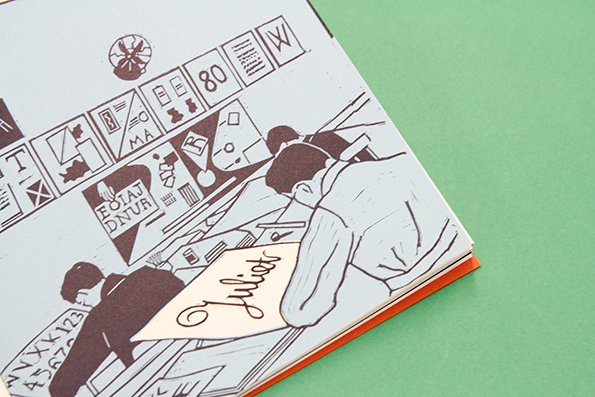
Giulia Garbin: Tipi Di Torino
Giulia Garbin: Tipi Di Torino
Ex-RCA designer Gulia Garbin has just produced this little stunner of a book that tells the stories of five type designers throughout history. It’s written in Italian and English and uses five specially-produced letterpress typefaces to accompany each story. Everything about this has been carefully considered, from the beautifully hand-created illustrations to the moveable type smelted in Torino specifically for use on this project. Nice!
www.giuliagarbin.com
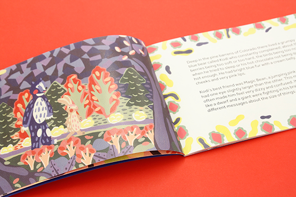
Artmeal: Kodi and Magic Bean
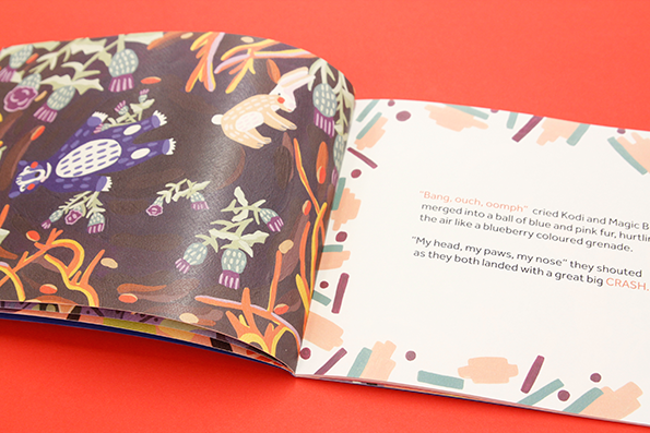
Artmeal: Kodi and Magic Bean
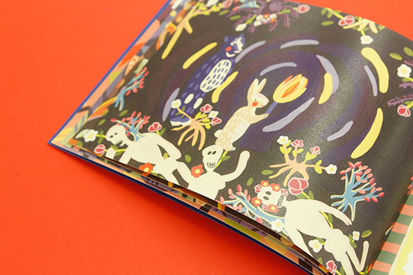
Artmeal: Kodi and Magic Bean
Artmeal: Kodi and Magic Bean
To describe a children’s book too specifically is to ruin its storyline (they’re all pretty simple) so all you need to know about Kodi and Magic Bean is that it features a badger and a rabbit on a vibrant woodland adventure. Kodi’s the Badger, and Magic Bean is the rabbit. There are no actual magic beans to be found anywhere in the story.
www.artmeal.co.uk
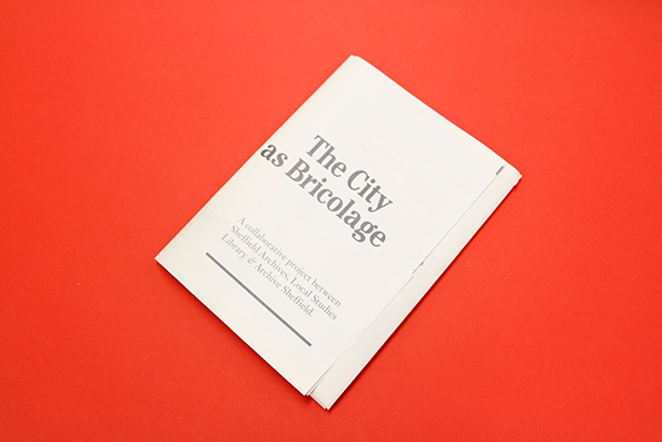
Dust: The City As Bricolage
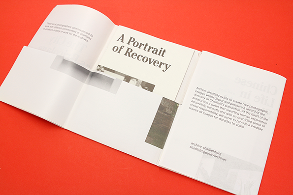
Dust: The City As Bricolage
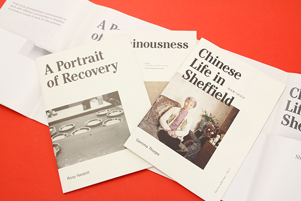
Dust: The City As Bricolage
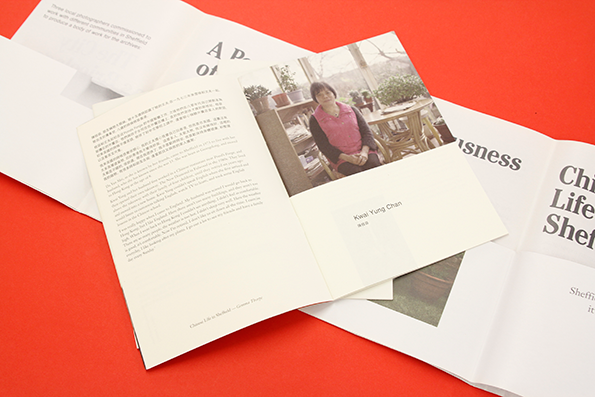
Dust: The City As Bricolage
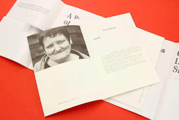
Dust: The City As Bricolage
Dust: The City As Bricolage
Dust is a collective of designers and educators from Sheffield providing consultancy, design and development for cultural and environmental concerns. The City as Bricolage is a collaborative project between Dust, Sheffield Archives, the Local Studies Library and Archive Sheffield that showcases three diverse lifestyles within the city. It takes the form of three photobooks, each exploring a different theme: Chinese life, divinity and recovery from addiction. The portraits within are supplemented with interviews with the subjects, providing an incredibly personal portrait of Sheffield’s overlooked subcultures. It’s great to see the Arts Council is still funding these kinds of community-minded projects.
www.du.st
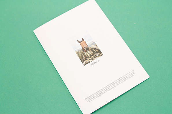
Josh Hight and Julian Ganio: Personal 01
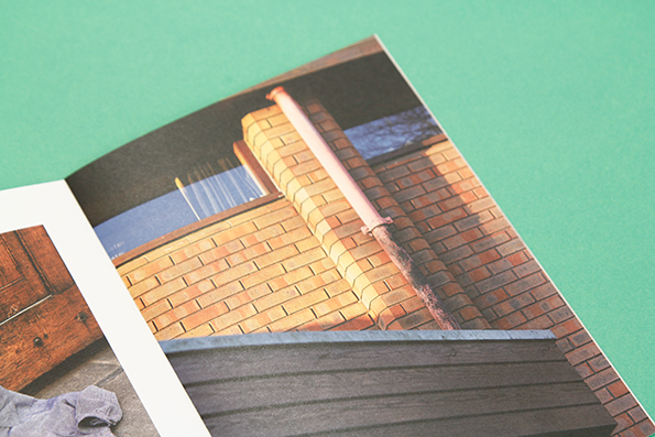
Josh Hight and Julian Ganio: Personal 01
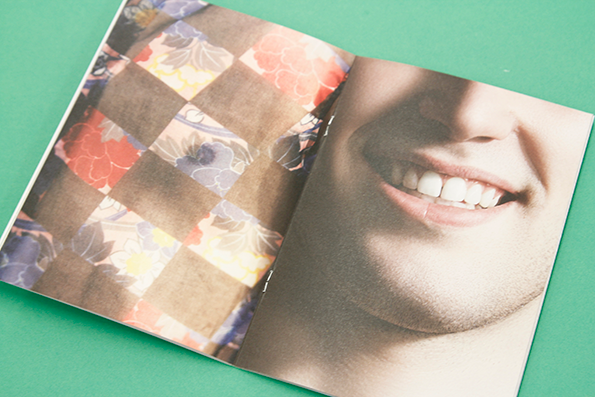
Josh Hight and Julian Ganio: Personal 01
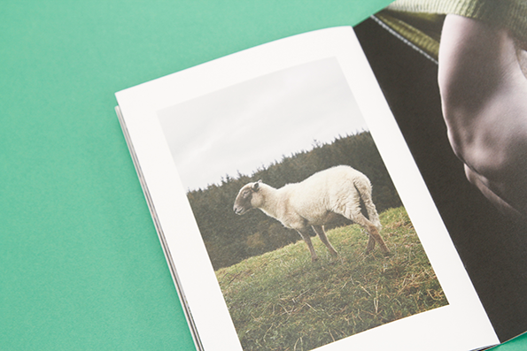
Josh Hight and Julian Ganio: Personal 01
Josh Hight and Julian Ganio: Personal 01
Lovely bit of photography here from Josh Hight and Julian Ganio in the form of Personal 01, a zine of imagery shot by Josh and styled by Julian. It’s an interesting mix of architectural abstracts shot on location and some considered fashion styling – and one cheeky horse peering over a drystone wall.
www.hightandirons.com
www.julianganio.com
The Bartlett School of Architecture: Lobby
The Bartlett School of Architecture: Lobby
The Bartlett School of Architecture: Lobby
The Bartlett School of Architecture: Lobby
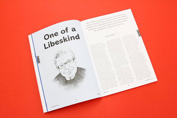
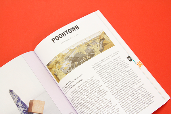
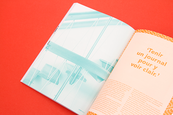
The latest institution to create its own magazine is UCL’s Bartlett School of Architecture, and their new-ish title is called Lobby. It exists as a medium for the prestigious course to engage in criticism and debate about contemporary architecture, giving a distinctly different voice to a discipline whose press is either oversaturated with luxurious imagery or weighed down with its own self-importance. Lobby is neither of these – it embraces illustration and even uses puns in its article titles. The second issue deals with the theme of clairvoyance and features a particularly interesting article by FAT Architecture’s Sam Jacob.
www.bartlett.ucl.ac.uk
Marta Claret: Harpos
Marta Claret: Harpos
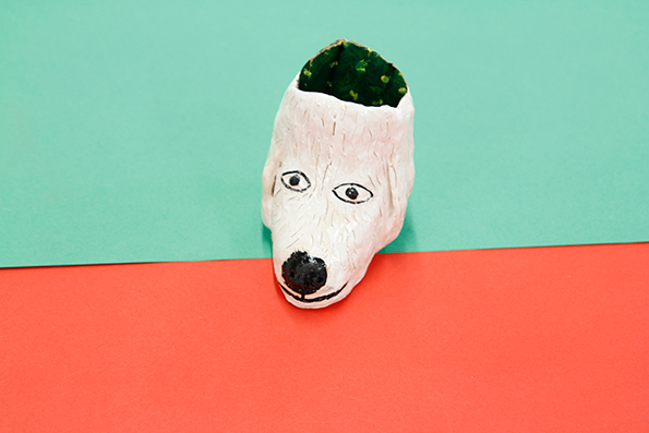
Marta Claret made us this ceramic dog head and sent it in with clear instructions. It’s a vessel designed for growing cacti that makes your succulent appear to be part of the dog’s head. What a gem!
www.martaclaret.blogspot.co.uk
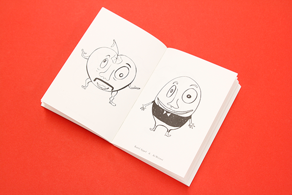
Martin Fengel and Milan Till: Treffen sich zwei Künstler
Martin Fengel and Milan Till: Treffen sich zwei Künstler
Martin Fengel is a man with his fingers in many pies – photography, art direction, print, digital, Mirko Borsche, Herburg Weiland – you name it, he’s done it, and most likely in collaboration with some fantastically talented German peers. This time it’s a little book of surreal sketches produced with Milen Till, showing the fictitious meetings of pairs of artists. It’s hard to say how Milen and Martin arrived at these final illustrations – many of the compositions make little to no sense – but the imagined scenarios are charming in their execution, particularly the meeting of George Grosz and Yves Klein, which is just downright hilarious.
www.martinfengel.com
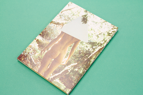
Magdalena Wosinska: The Experience Volume 1.
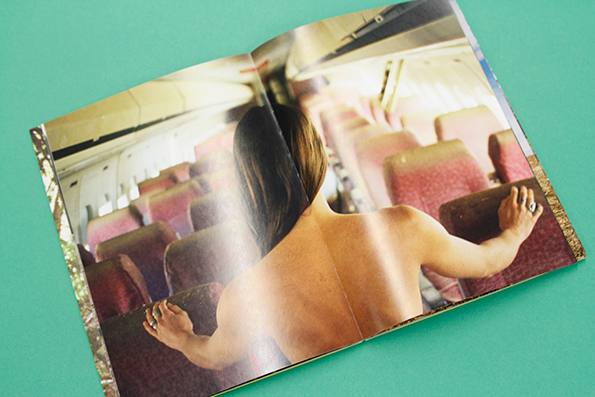
Magdalena Wosinska: The Experience Volume 1.
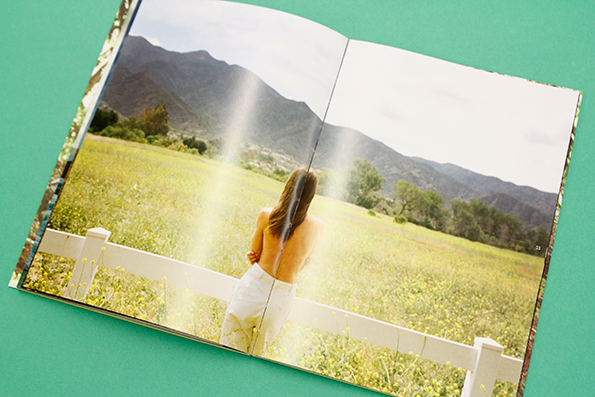
Magdalena Wosinska: The Experience Volume 1.
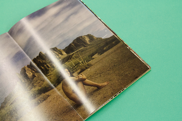
Magdalena Wosinska: The Experience Volume 1.
Magdalena Wosinska: The Experience Volume 1.
As well as shooting advertising photography for huge international brands like Converse, album covers for Bruce Springsteen and editorial for Nylon, Magdalena Wosinska squeezes plenty of personal projects into her schedule. Most notably she shoots tastefully nude self-portraits in the great American outdoors. The Experience Volume 1. is a book bringing together a cross-section of these images on the occasion of her first London show at the Webber Gallery. It was designed by Printed Pages’ very own Joe Burrin. Needless to say, we’re into it.
www.magdalenawosinska.com
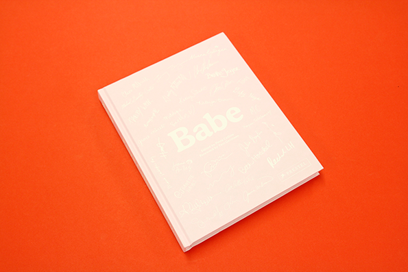
Petra Collins: Babe
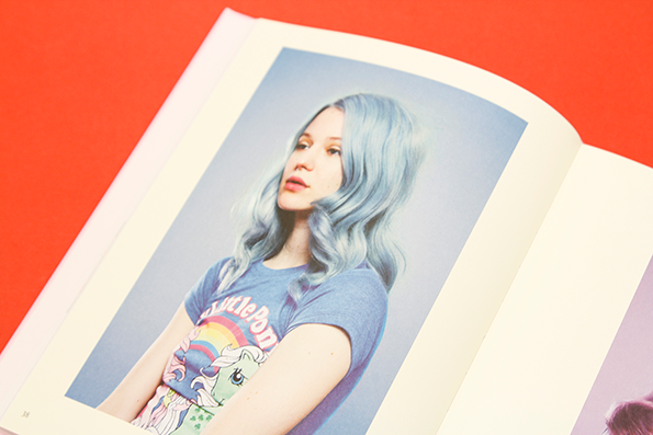
Petra Collins: Babe
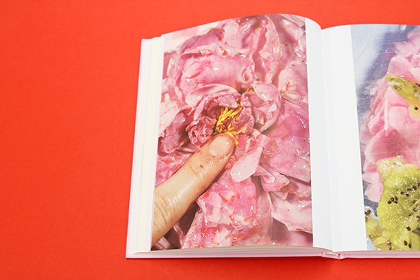
Petra Collins: Babe
Petra Collins: Babe
Petra Collins: Babe
Petra Collins: Babe
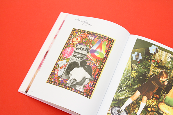
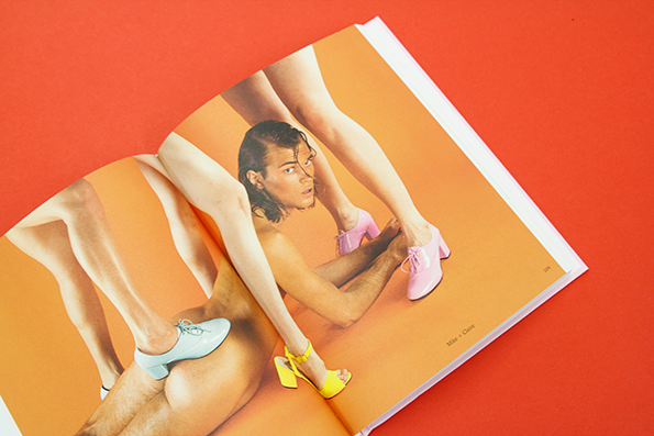
Since 2012 photographer Petra Collins has been running The Ardorous, a website dedicated to challenging the structure of a male-dominated art world by promoting and supporting a collective of talented female practitioners. As with everything Petra turns her hand to, it’s been a tremendous success. She’s just released Babe, a hardback book published by Prestel that brings together the work of 30 of her Ardorous contributors, some of whom will be household names to you by now. Others won’t, so Babe offers the opportunity to discover some phenomenally talented young artists.
www.petracollins.com
www.theardorous.com
Subway Magazine Issue 4
Subway Magazine Issue 4
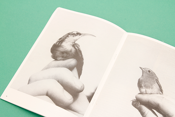
Subway Magazine Issue 4
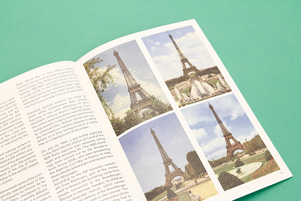
Subway Magazine Issue 4
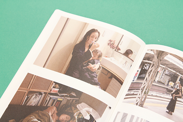
Subway Magazine Issue 4
Subway Magazine Issue 4
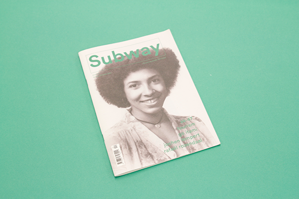
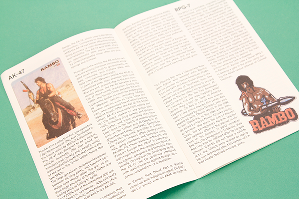
Subway’s a pretty unusual little magazine that doesn’t really conform to any traditional editorial models. It reads more like excerpts from an antiquated encyclopaedia, explaining objects and ephemera, animals and world events in the matter-of-fact fashion of an educational document. Then it throws in an interview or photo series for good measure. This issue features Rafaël Rozendaal, tourism, Go Itami and the AK-47. It’s surreal and I love it.
www.4478zine.com
Share Article
Further Info
About the Author
—
James started out as an intern in 2011 and came back in summer of 2012 to work online and latterly as Print Editor, before leaving in May 2015.

