Launch Recite Me assistive technology
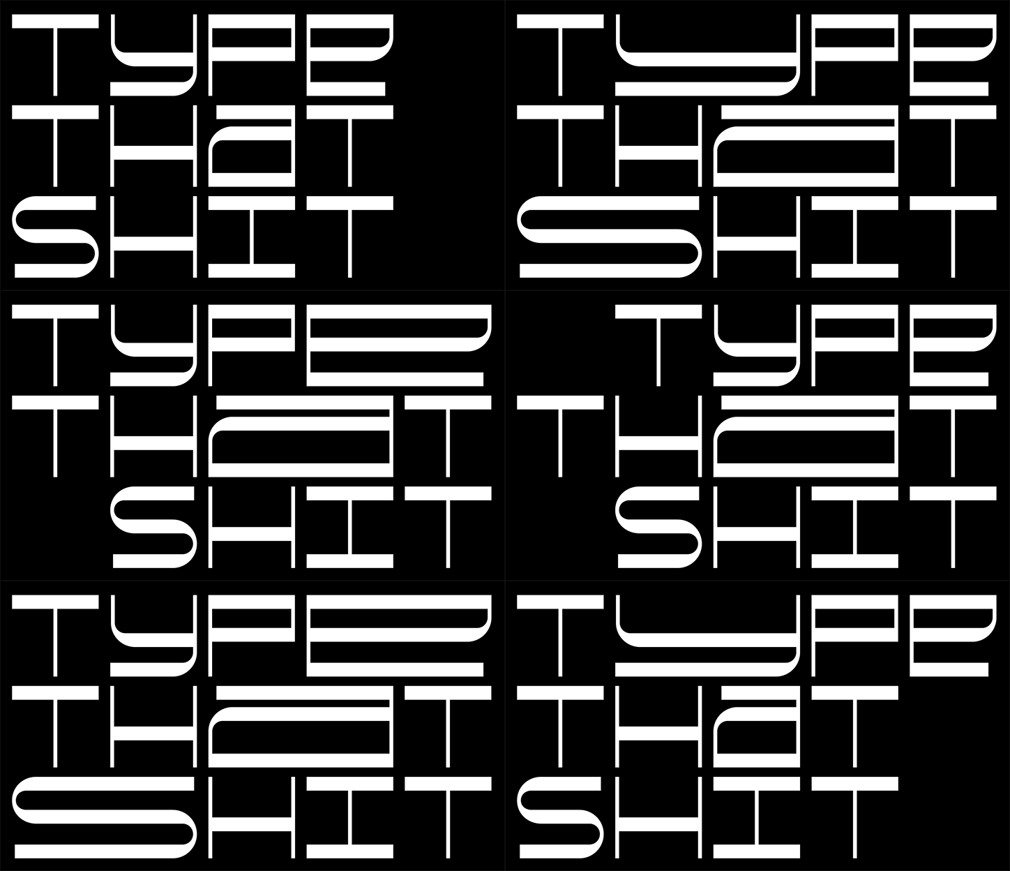
An animation in which bold, white typographic text reads “TYPE THAT SHIT” against a black background. The letters subtly shift and stretch in a rhythmic, fluid motion.

Tor Weibull's latest typeface replicates the game of badminton

—
Date
30 November 2017

Graphic designer Tor Weibull doesn’t pull from the usual resources to create his typefaces. When we’ve previously praised the Swedish designer for his experimental work it was for a typeface made from tubular metal, but now the designer has turned to sports for inspiration, designing Bad Mono, a typeface based on badminton.

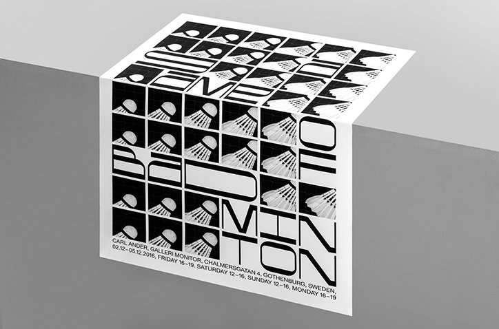
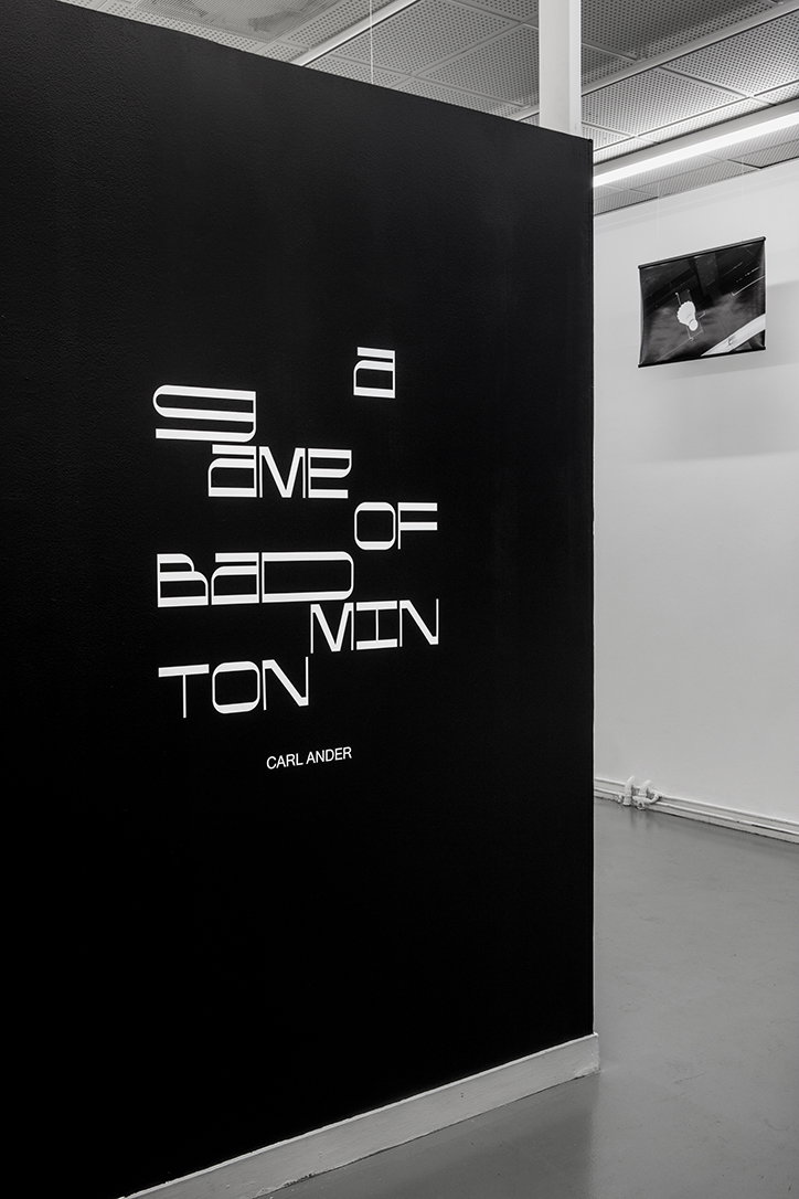
A custom-made typeface for the visual identity of A Game of Badminton, an exhibition by Carl Anders, the typeface mirrors the movements and grid system of the sport. “Working closely with Carl during the development of the visual identity of his exhibition I quickly came to the conclusion that it could be nice to develop a typeface for it,” Tor tells It’s Nice That.

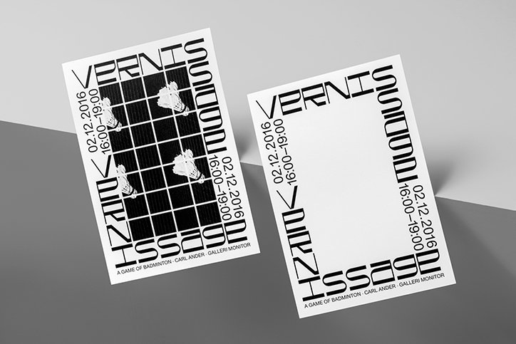
Each of the posters and invitation cards for the exhibition’s opening were built upon the idea of the repetition that consumes badminton, as well as “the strict grid of the net and also the court as a static format of where the game takes place,” says Tor. “A monospaced typeface felt like it could suit for the job and work with the initial ideas for the printer material, but I did also want it to have something more to it than being an ordinary monospaced typeface.”

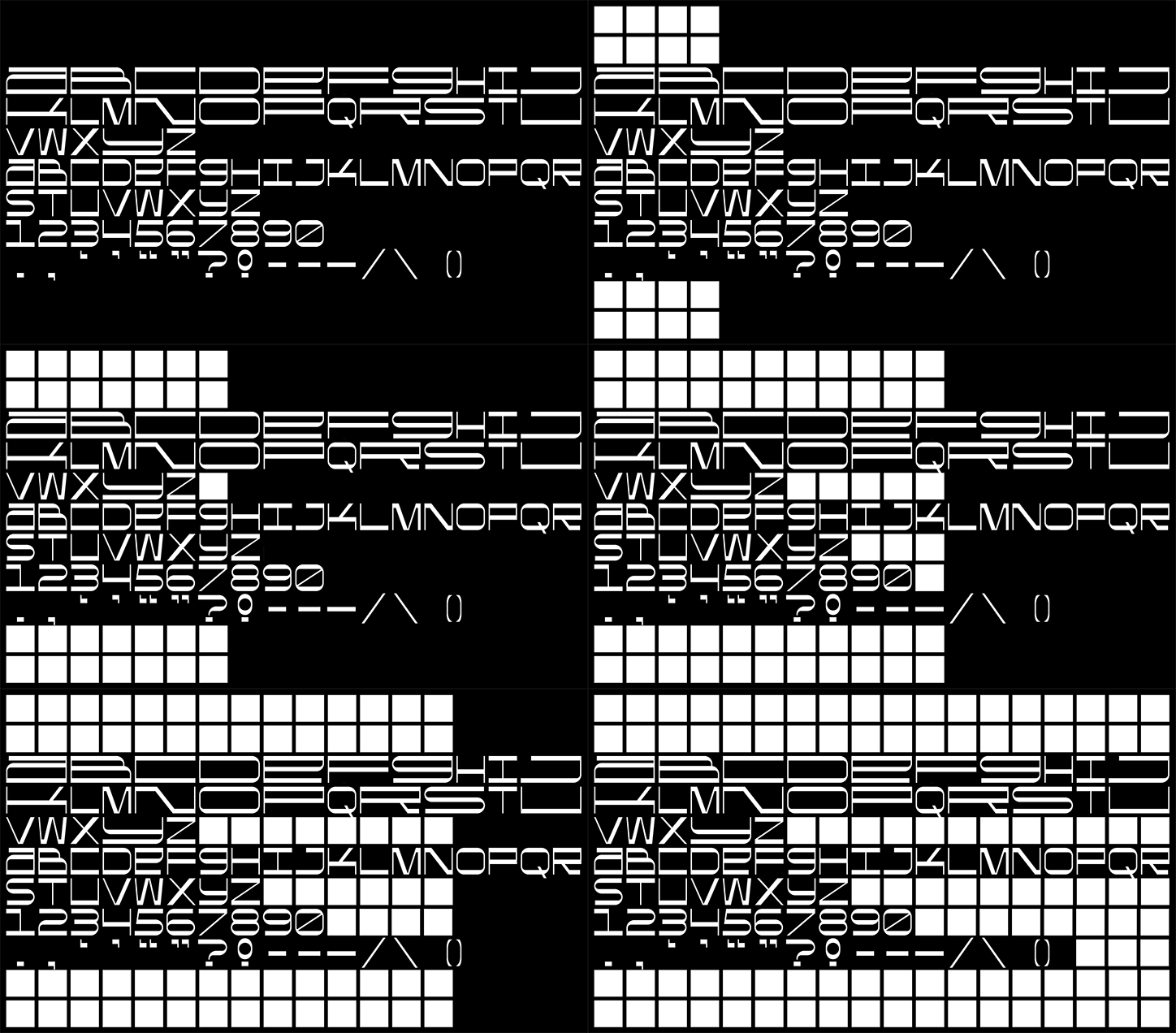
The result is Bad Mono, a squared typeface that still includes a slight curve, “based on the rhythm of the game and the grid of the net,” Tor explains. “As the feather ball hits the net the grid squares expand and therefore most of the uppercase letters have the double letter width of the lowercase letters.” Consequently the designer has designed a typeface that replicates a moment “as if the ball just smashed in to them and extended them”.
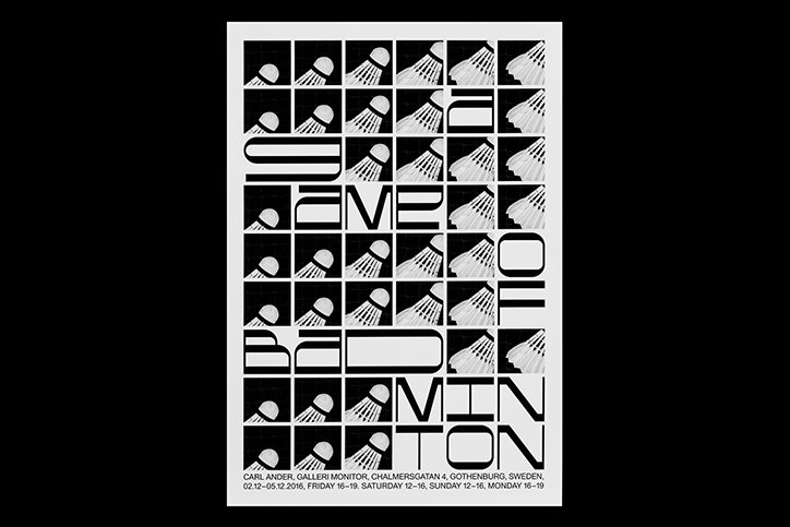
A black and white typographic poster for a badminton exhibition. The word “badminton” is broken across the grid in a bold, stylised font, interspersed with abstract geometric illustrations of shuttlecocks. Small text at the bottom reads “Carl Ander, Galleri Monitor, Chalmersgatan 4, Gothenburg, Sweden” and lists dates in December 2016.
Above

Tor Weibull: Bad Mono

An animation in which a white, high-tech alphabet, number set and punctuation marks are displayed against a black background. White grids at the top and bottom expand horizontally across the screen.
Above

Tor Weibull: Bad Mono

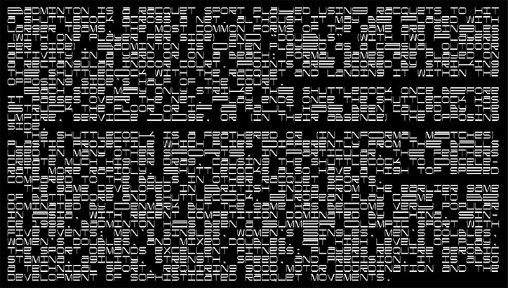
A black and white typographic image where text about badminton is distorted by horizontal white bars. The fragmented letters create a glitchy, digital effect across the entire frame.
Above

Tor Weibull: Bad Mono

An animation in which two white cards with the words “BAD MONO” in a bold, linear typeface tilt and shift against a black background. The cards alternate in size and position, creating a rhythmic, flickering effect.
Above

Tor Weibull: Bad Mono

Two black and white posters for an exhibition titled “Vernissage”. One poster features a grid of four black squares containing white figures, while the other is blank in the centre. Both include the date “02.12.2016” and the text “A game of badminton – Carl Ander – Galleri Monitor”.
Above

Tor Weibull: Bad Mono

A black and white graphic poster folded over a grey edge. Bold, fragmented typography reads “BADMINTON”, interspersed with a grid of stylised shuttlecocks. Small text at the bottom lists the artist “Carl Ander”, the gallery and the dates in Gothenburg, Sweden.
Above

Tor Weibull: Bad Mono

A black wall in a gallery features white, fragmented typography that reads “Game of Badminton”. The name “Carl Ander” is printed in a smaller font below the main text.
Above

Tor Weibull: Bad Mono

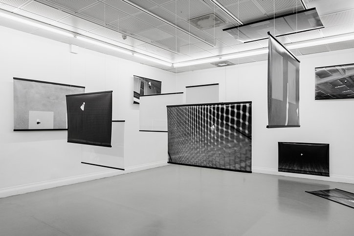
A black and white photograph of an art installation in a white gallery. Several rectangular screens of varying sizes and transparency hang from the ceiling at different heights and angles.
Above

Tor Weibull: Bad Mono

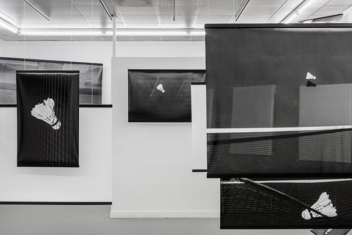
A black and white photograph of an art installation featuring several black rectangular panels suspended in a gallery. Each panel displays a white shuttlecock in a different position, as if captured in mid-flight.
Above

Tor Weibull: Bad Mono

Share Article

Further Info

About the Author

Lucy Bourton

—

Lucy (she/her) was part of the It’s Nice That team from 2016–2025, first joining as a staff writer after graduating from Chelsea College of Art with a degree in Graphic Design Communication, eventually becoming a senior editor on our editorial team, and most recently at Insights, a research-driven department with It’s Nice That.
It's Nice That Newsletters

Fancy a bit of It's Nice That in your inbox? Sign up to our newsletters and we'll keep you in the loop with everything good going on in the creative world.